개요
오늘은 TS를 이용한 토이 프로젝트, Quiz open api를 받아서 간단한 quiz 프로젝트를 만들어봤다.
이전의 TS 탐방기 1,2 ( 보러가기👉 1, 2 ) 에서는 기능을 구현하면서 기존의 JS로 하는 코딩과는 다른 점이나 몰랐던 기능에 대해 정리를 해 보았다.
오늘은 CSS를 입히며 알게된 새로운 기능 ( feat, styled-component )에 대해 정리해보았다.
styled-components
styled-components는 css를 컴포넌트화 시킨 태그로 만들어 사용했다. TS라서 이점이 크게 바뀌거나 하는 것은 없었지만..
Css의 기능? 잘 몰랐던 속성을 한번 사용해보며 정리하도록 하겠다.
(즉, TS랑 큰 상관이 없음 😅)
createGlobalStyle
css를 적용하려고 할때 back-ground 와 같이 코드 전체에 적용하려고 할때 createGlobalStyle를 사용하면 된다!
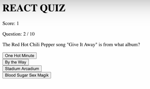
이렇게 되어있는 UI에서 App.ts에 적용을 한다면
//App.styled.ts
export const GlobalStyle = createGlobalStyle`
    html {
    	//html 파일 전체를 의미
        height : 100%;
    }

    body {
    	//pubilc -> index.html 안에서 적용됨.
        background-image: url(${Img});
        background-size: cover;
        margin: 0;
        padding: 0 20px;
        display: flex;
        justify-content: center
    }

    * {
    	// css 전체 선택자
        box-sizing: border-box;
        font-family: 'Poppins' , sans-serif;
    }
`

//App.ts
...
return(
<>
<GlobalStyle/> //Global이기 때문에 이렇게 넣어도 모든 파일에 적용됨.
</>
)
...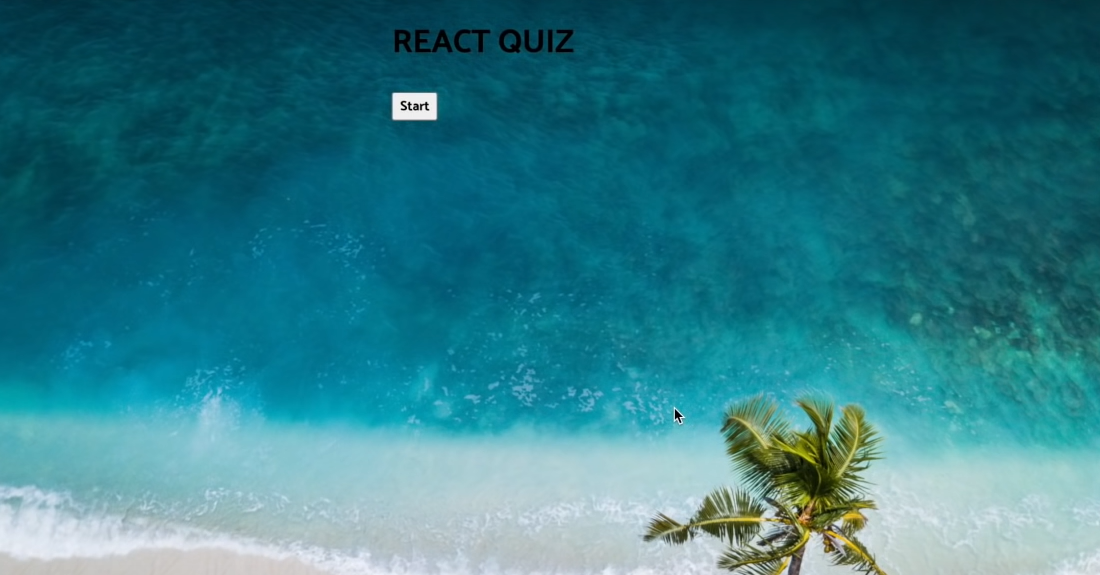
요렇게 적용이 된다!!😎
CSS
linear-gradient
gradient의 한 종류로
- linear-gradient
- radial-gradient
- repeating-gradient
이렇게 3종류가 있다.
background-image :linear-gradient(180deg, #fff, #87f1ff);
//이런 식으로 표현을 하는데 (각도, 시작 색, 종료 색) 으로 동작. 각도는 0 deg의 경우 👆
webkit
css를 적용할 때 붙는 접두어 속성 (webkit , moz, ms, o) 중 하나로 크로싱 브라우저를 위해 필요함.
- webkit : 구글 , 사파리 브라우저에서 적용.
- moz : 파이어폭스 브라우저에 적용.
- ms : 익스플로러에 적용 (보통 생략)
- o : 오페라 브라우저에 적용
 h1{
        font-family : Roboto Inline, Haettenschweiler, 'Arial Narrow Bold', sans-serif;
        background-image : linear-gradient(180deg, #fff, #87f1ff);
        background-size: 100%;
        background-clip: text;
	// 배경을 텍스트 위에만 그림. (ms)

        -webkit-background-clip: text;
        -webkit-text-fill-color: transparent;
        // 배경을 텍스트 위에만 그리고 텍스트의 색은 투명하게.

        -moz-background-clip: text;
        -moz-text-fill-color: transparent;
        // 위와 마찬가지 in 파이어 폭스

        filter : drop-shadow(2px 2px #0085a3);

        font-size: 70px;
        font-weight: 400;
        text-align: center;
        margin: 20px;
    }
filter
이미지에 효과를 주는 것을 의미함.
( blur , grayscale , sepia , saturate , hue-rotate , drop-shadow ...)
filter : drop-shadow(2px 2px #0085a3);
//이미지에 그림자를 추가해줌 drop-shadow(offset-x offset-y blur-radius color)
function 사용
styled component에서는 속성으로 함수가 올 수 있는데 거기서 받는 인자 역시 ts이기 때문에 타입을 정해줘야 한다.
type ButtonWrapperProps = {
    correct : boolean;
    userClicked: boolean;
}

export const ButtonWrapper = styled.div<ButtonWrapperProps>`
    transition : all 0.3s ease;
    :hover {
        opacity: 0.8;
    }

    button {
        cursor: pointer;
        user-select: none;
        font-size: 0.8rem;
        width: 100%;
        height: 40px;
        margin: 5px 0;
        // 아래 처럼 ${}안에 함수, 변수 등이 올 수 있다.
        background: ${({correct, userClicked}) =>
            correct ?
            `linear-gradient(90deg,#56ffa4,#59bc86)`
            : !correct && userClicked ?
            `linear-gradient(90deg,#ff5656,#c1686)`
            : `linear-gradient(90deg,#56ccff,#6eafb4)`
        };
        border: 3px solid #fff;
        box-shadow: 1px 2px 0px rgba(0,0,0,0.1);
        border-radius: 10px;
        color: #fff;
        text-shadow: 0px 1px 0px rgba(0,0,0,0.25);
    }
`
호기심많은 개발자