반응형 웹 이전 단계
(flex, transform & transition, hover...)
(html)
<!DOCTYPE html>
<html lang="ko">
<head>
<meta charset="UTF-8" />
<meta
name="viewport"
content="width=device-width, user-scalable=no, initial-scale=1.0, maximum-scale=1.0, minimum-scale=1.0"
/>
<meta http-equiv="X-UA-Compatible" content="ie=edge" />
<title>Welcome to my shop</title>
<link rel="stylesheet" href="lecture.css" />
</head>
<body>
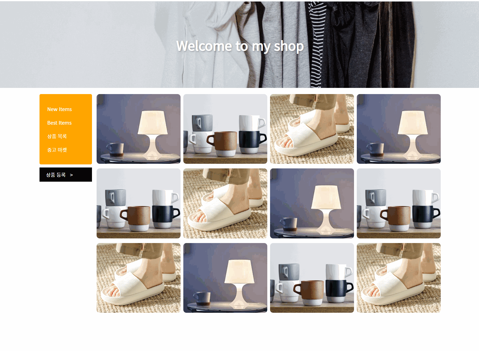
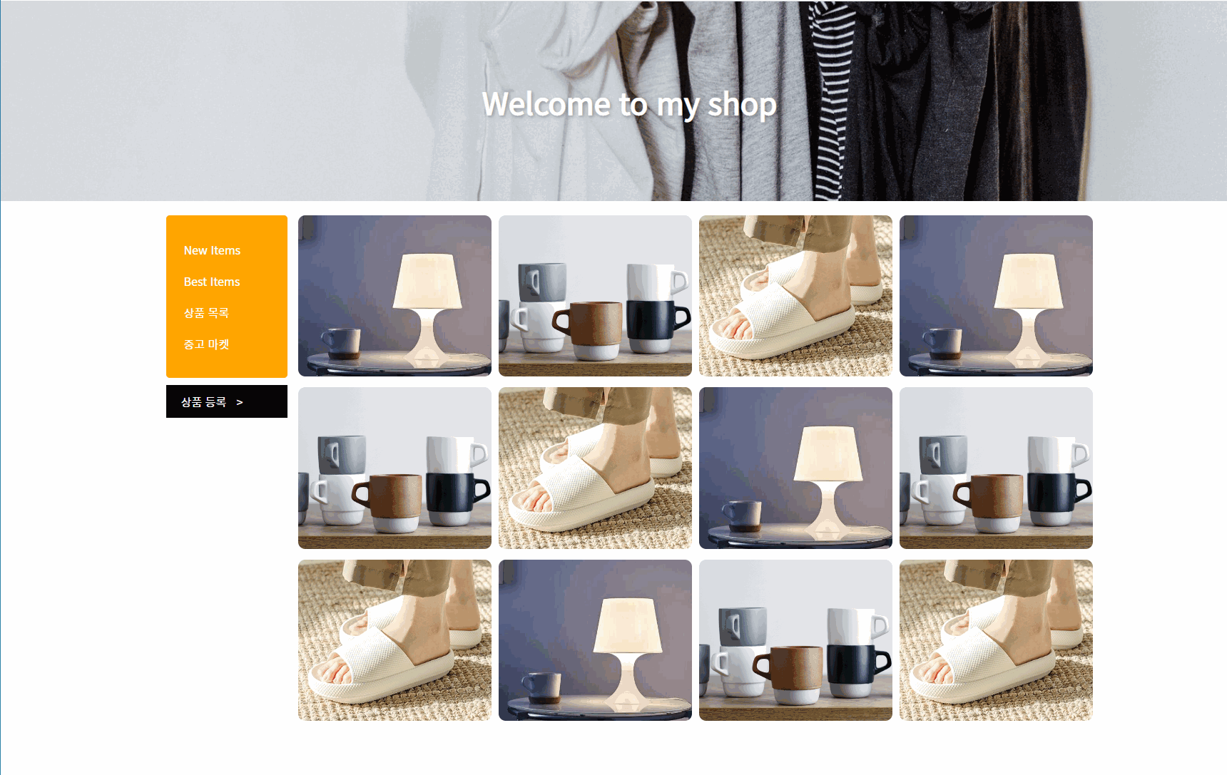
<section class="main-banner">
<h1 class="text">Welcome to my shop</h1>
</section>
<div class="container">
<section class="wrapper">
<div class="sidebar">
<nav class="main-menu">
<ul>
<li><a href="">New Items</a></li>
<li><a href="">Best Items</a></li>
<li><a href="">상품 목록</a></li>
<li><a href="">중고 마켓</a></li>
</ul>
</nav>
<div class="writeBtnBox">
<button class="writeBtn">상품 등록 <span class="arrow">></span></button>
</div>
</div>
<div class="itemWrap">
<div class="item">
<div class="imgBox">
<img src="../img/item1.jpeg" alt="탁상용 조명" />
</div>
<div class="textBox">
<p class="textBox-name">탁상용 조명</p>
<p class="textBox-price">260,000 원</p>
</div>
</div>
<div class="item">
<div class="imgBox">
<img src="../img/item2.png" alt="머그컵" />
</div>
<div class="textBox">
<p class="textBox-name">머그컵</p>
<p class="textBox-price">32,000 원</p>
</div>
</div>
<div class="item">
<div class="imgBox">
<img src="../img/item3.jpeg" alt="거실용 슬리퍼" />
</div>
<div class="textBox">
<p class="textBox-name">거실용 슬리퍼</p>
<p class="textBox-price">28,000 원</p>
</div>
</div>
<div class="item">
<div class="imgBox">
<img src="../img/item1.jpeg" alt="탁상용 조명" />
</div>
<div class="textBox">
<p class="textBox-name">탁상용 조명</p>
<p class="textBox-price">260,000 원</p>
</div>
</div>
<div class="item">
<div class="imgBox">
<img src="../img/item2.png" alt="머그컵" />
</div>
<div class="textBox">
<p class="textBox-name">머그컵</p>
<p class="textBox-price">32,000 원</p>
</div>
</div>
<div class="item">
<div class="imgBox">
<img src="../img/item3.jpeg" alt="거실용 슬리퍼" />
</div>
<div class="textBox">
<p class="textBox-name">거실용 슬리퍼</p>
<p class="textBox-price">28,000 원</p>
</div>
</div>
</div>
</section>
</div>
</body>
</html>
(css)
@import url('https://fonts.googleapis.com/css2?family=Noto+Sans+KR&display=swap');

* {
    box-sizing: border-box;
    font-family: "Noto Sans KR", "돋움", sans-serif;
}

html, body, h1 {
    margin: 0;
    padding: 0;
}

a {
    text-decoration: none;
}

.main-banner {
    width: 100%;
    height: 280px;
    background-image: url("../img/banner.jpg");
    background-size: cover;
    display: flex;
    flex-direction: row;
    justify-content: center;
    align-items: center;

    margin-bottom: 20px;
}

.main-banner .text {
    font-size: 42px;
    font-weight: 700;
    color: white;
    text-shadow: 2px 2px 5px rgba(0, 0, 0, 0.3);
    animation: titleText 1s ease-in-out;
}


@keyframes titleText {
    0% {
        transform: translateY(70px);
        opacity: 0;
    }
    92% {
        transform: translateY(-10px);
    }
    100% {
        transform: translateY(0);
        opacity: 1;
    }
}

.container {
    display: flex;
    flex-direction: row;
    justify-content: center;
    align-items: flex-start;
}

.wrapper {
    /* 반응형에서 이렇게 너비 잡기 */
    width: 100%;
    max-width: 1320px;
    /* 반응형에서 이렇게 너비 잡기 */

    display: flex;
    flex-direction: row;
    justify-content: space-between;
    align-items: flex-start;

    padding: 0 10px;
}

.sidebar {
    width: 170px;
}

.main-menu {
    background: orange;
    border-radius: 5px;
    padding: 10px 15px;
}
.main-menu ul {
    padding: 0;
    display: block;
}

.main-menu ul li {
    list-style: none;
    display: block;
}

.main-menu ul li a {
    padding: 10px;
    display: block;
    color: white;
    border-radius: 20px;
}
.main-menu ul li a:hover {
    background: darkorange;
    padding-left: 20px;
    color: white;
    transition: all 0.3s ease-in-out;
}

.writeBtnBox {
    margin-top: 10px;
}
.writeBtn {
    width: 100%;
    background: black;
    color: white;
    border: 1px solid black;
    padding: 10px 20px;
    text-align: left;
    font-size: 16px;

    transition: all 0.3s ease-in-out;
}
.writeBtn .arrow {
  /*	span태그는 inline이므로 바꿔줘야 transform 적용됨	*/
    display: inline-block;
    padding-left: 10px;
    transition: all 0.3s ease-in-out;
}
.writeBtn:hover {
    background: white;
    color: black;
}
.writeBtn:hover .arrow {
    transform: translateX(50px);
}

.itemWrap {
    width: calc(100% - 170px);
    display: flex;
    flex-direction: row;
    justify-content: space-between;
    align-items: flex-start;
    flex-wrap: wrap;

    padding-left: 15px;
}

.item {
    width: calc(25% - 7px);
    aspect-ratio: 6 / 5;
    position: relative;
    overflow: hidden;
    border-radius: 10px;
    margin-bottom: 15px;
}

.imgBox {
    width: 100%;
    height: 100%;
}

.imgBox img {
    width: 100%;
    height: 100%;
    object-fit: cover;
}

.textBox {
    width: 100%;
    height: 100%;
    position: absolute;
    top: 0;
    left: 0;
    display: flex;
    flex-direction: column;
    justify-content: flex-end;
    align-items: flex-start;
    padding: 20px;
    z-index: 3;
}

.textBox p {
    color: white;
    margin: 5px 0 0;
}

.textBox-name {
    font-size: 22px;
    font-weight: 500;
    opacity: 0;
    transform: translateY(50px);
}
.textBox-price {
    font-size: 16px;
    font-weight: 400;
    opacity: 0;
    transform: translateY(50px);
}

.item:after {
    content: "";
    display: block;
    width: 100%;
    height: 100%;
    background: rgba(0, 0, 0, 0.2);
    position: absolute;
    top: 0;
    left: 0;
    z-index: 2;
    opacity: 0;
}

.item:hover:after {
    opacity: 1;
}

.item:hover .imgBox img {
    transform: scale(1.1);
    filter: blur(3px);
}

.item:hover .textBox-name {
    opacity: 1;
    transform: translateY(0);
}

.item:hover .textBox-price {
    opacity: 1;
    transform: translateY(0);
}

.item:after,
.item .imgBox img,
.item .textBox-name {
    transition: all 0.4s ease-in-out;
}

.item .textBox-price {
    transition: all 0.4s ease-in-out 0.15s;
}
@@@다음에 반응형 웹으로 수정할 것
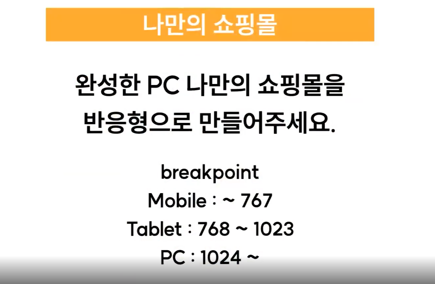
-
모바일에서만 hover 효과 제거
모바일에서는 터치 효과가 필요 없으므로 제거한다.
=> 강의에서는 hover 효과를 미디어쿼리로 PC size에만 적용하는 것으로 수정 (내가 생각한 방법과 같음) -
display:none vs visibility:hidden vs opacity:0
display:none 존재 자체를 없앰 (자리 차지X)
나머지 둘은 자리 차지O 보이지만 않음 -
item에 hover 했을 때 text 떠오르던 것 모바일, 태블릿에서 해제
=> 만들었던 방법을 떠올리면 (position: absolute로 만들어 겹쳤음, overflow:hidden 적용)
=> position: relative로 해제하고, overflow:visible로 수정
.item {
        width: calc(50% - 7px);
        overflow: visible;
}
.textBox {
  position: relative;
  width: 100%;
  height: auto;
}
.textBox p {
  color: black;
}

.textBox-name {
  font-size: 18px;
  opacity: 1;
  transform: translateY(0);
}
.textBox-price {
  font-size: 12px;
  opacity: 1;
  transform: translateY(0);
}
(css) 프로젝트 완성
@import url("https://fonts.googleapis.com/css2?family=Noto+Sans+KR&display=swap");
* {
  box-sizing: border-box;
  font-family: "Noto Sans KR", "돋움", sans-serif;
}
html,
body,
h1 {
  margin: 0;
  padding: 0;
}
a {
  text-decoration: none;
}
.main-banner {
  width: 100%;
  height: 280px;
  background-image: url("../img/banner.jpg");
  background-size: cover;
  display: flex;
  flex-direction: row;
  justify-content: center;
  align-items: center;
  //
  margin-bottom: 20px;
}
.main-banner .text {
  font-size: 42px;
  font-weight: 700;
  color: white;
  text-shadow: 2px 2px 5px rgba(0, 0, 0, 0.3);
  animation: titleText 1s ease-in-out;
}
@keyframes titleText {
  0% {
    transform: translateY(70px);
    opacity: 0;
  }
  92% {
    transform: translateY(-10px);
  }
  100% {
    transform: translateY(0);
    opacity: 1;
  }
}
.container {
  display: flex;
  flex-direction: row;
  justify-content: center;
  align-items: flex-start;
}
.wrapper {
  /* 반응형에서 이렇게 너비 잡기 */
  width: 100%;
  max-width: 1320px;
  /* 반응형에서 이렇게 너비 잡기 */
  display: flex;
  flex-direction: row;
  justify-content: space-between;
  align-items: flex-start;
  //
  padding: 0 10px;
}
.sidebar {
  width: 170px;
}
.main-menu {
  background: orange;
  border-radius: 5px;
  padding: 10px 15px;
}
.main-menu ul {
  padding: 0;
  display: block;
}
.main-menu ul li {
  list-style: none;
  display: block;
}
.main-menu ul li a {
  padding: 10px;
  display: block;
  color: white;
  border-radius: 20px;
}
.writeBtnBox {
  margin-top: 10px;
}
.writeBtn {
  width: 100%;
  background: black;
  color: white;
  border: 1px solid black;
  padding: 10px 20px;
  text-align: left;
  font-size: 16px;
  cursor: pointer;
//
  transition: all 0.3s ease-in-out;
}
.writeBtn .arrow {
  display: inline-block;
  padding-left: 10px;
  transition: all 0.3s ease-in-out;
}
.writeBtn:hover {
  background: white;
  color: black;
}
.writeBtn:hover .arrow {
  transform: translateX(50px);
}
.itemWrap {
  width: calc(100% - 170px);
  display: flex;
  flex-direction: row;
  justify-content: space-between;
  align-items: flex-start;
  flex-wrap: wrap;
//
  padding-left: 15px;
}
.item {
  width: calc(25% - 7px);
  aspect-ratio: 6 / 5;
  position: relative;
  overflow: hidden;
  border-radius: 10px;
  margin-bottom: 15px;
}
.imgBox {
  width: 100%;
  height: 100%;
}
.imgBox img {
  width: 100%;
  height: 100%;
  object-fit: cover;
}
.textBox {
  width: 100%;
  height: 100%;
  position: absolute;
  top: 0;
  left: 0;
  display: flex;
  flex-direction: column;
  justify-content: flex-end;
  align-items: flex-start;
  padding: 20px;
  z-index: 3;
}
.textBox p {
  color: white;
  margin: 5px 0 0;
}
.textBox-name {
  font-size: 22px;
  font-weight: 500;
  opacity: 0;
  transform: translateY(50px);
}
.textBox-price {
  font-size: 16px;
  font-weight: 400;
  opacity: 0;
  transform: translateY(50px);
}
/*  mobile  */
@media screen and (max-width: 767px) {
    .main-banner {
        height: 160px;
        margin-bottom: 0;
    }
    .main-banner .text {
        font-size: 26px;
    }
    .wrapper {
        flex-direction: column;
        padding: 0;
    }
    .sidebar {
        width: 100%;
    }
    .main-menu {
        padding: 0;
        border-radius: 0;
    }
    .main-menu ul {
        display: flex;
        flex-direction: row;
        justify-content: center;
        align-items: center;
        margin: 0;
    }
    .main-menu ul li a{
        font-size: 14px;
        padding: 12px 10px;
    }
    .writeBtnBox {
        display: none;
    }
    .itemWrap {
        width: 100%;
        margin-top: 12px;
    }
    .item {
        width: calc(50% - 7px);
        overflow: visible;
        border: 1px solid #dddddd;
    }
    .textBox {
        position: relative;
        width: 100%;
        height: auto;
    }
    .textBox p {
        color: black;
    }
    .textBox-name {
        font-size: 18px;
        opacity: 1;
        transform: translateY(0);
    }
    .textBox-price {
        font-size: 12px;
        opacity: 1;
        transform: translateY(0);
    }
}
/*  tablet  */
@media screen and (min-width: 768px) and (max-width: 1023px){
    .item {
        /*width: calc(50% - 7px);*/
        overflow: visible;
        border: 1px solid #dddddd;
    }
    .textBox {
        position: relative;
        width: 100%;
        height: auto;
    }
    .textBox p {
        color: black;
    }
    .textBox-name {
        font-size: 18px;
        opacity: 1;
        transform: translateY(0);
    }
    .textBox-price {
        font-size: 12px;
        opacity: 1;
        transform: translateY(0);
    }
}
@media screen and (min-width: 1023px) {
    .main-menu ul li a:hover {
        background: darkorange;
        padding-left: 20px;
        color: white;
        transition: all 0.3s ease-in-out;
    }
    .item{
        cursor: pointer;
    }
    .item:after {
        content: "";
        display: block;
        width: 100%;
        height: 100%;
        background: rgba(0, 0, 0, 0.2);
        position: absolute;
        top: 0;
        left: 0;
        z-index: 2;
        opacity: 0;
    }
    .item:hover:after {
        opacity: 1;
    }
    .item:hover .imgBox img {
        transform: scale(1.1);
        filter: blur(3px);
    }
    .item:hover .textBox-name {
        opacity: 1;
        transform: translateY(0);
    }
    .item:hover .textBox-price {
        opacity: 1;
        transform: translateY(0);
    }
    .item:after,
    .item .imgBox img,
    .item .textBox-name {
        transition: all 0.4s ease-in-out;
    }
    .item .textBox-price {
        transition: all 0.4s ease-in-out 0.15s;
    }
}
프로젝트 완성본
keep growing as a web developer!🧃