1) 학습한 내용
1.그리드 레이아웃 디자인
가변 그리드 레이아웃
->너비 값 고정 후 백분율과 같은 가변 값으로 지정
float 속성
flex box layout
css 그리드 레이아웃
-> 2차원 배치(수평/수직으로 몇 개의 박스를 얼마의 크기로 배치할 지)
2.원페이지 사이트 만들기(과제)
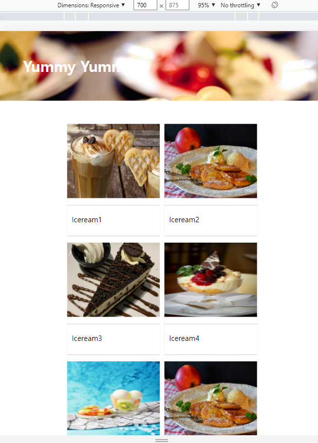
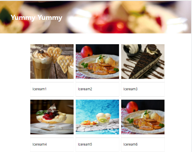
실습 : column-count
<!DOCTYPE html>
<html lang="en">
<head>
    <meta charset="UTF-8">
    <meta http-equiv="X-UA-Compatible" content="IE=edge">
    <meta name="viewport" content="width=device-width, initial-scale=1.0">
    <title>css grid layout</title>
    <link rel="stylesheet" href="style.css">
</head>
<body>
    <!--다단 컬럼-->
    <h1>Yummy Yummy</h1>
    <div id="wrapper">
    <div id="columns">
        <div class="card">
            <img src="./img1.jpg" alt="">
            <p>Iceream1</p>
        </div>
        <div class="card">
            <img src="./img2.jpg" alt="">
            <p>Iceream2</p>
        </div>
        <div class="card">
            <img src="./img3.jpg" alt="">
            <p>Iceream3</p>
        </div>
        <div class="card">
            <img src="./img4.jpg" alt="">
            <p>Iceream4</p>
        </div>
        <div class="card">
            <img src="./img5.jpg" alt="">
            <p>Iceream5</p>
        </div>
        <div class="card">
            <img src="./img2.jpg" alt="">
            <p>Iceream6</p>
        </div>
        <div class="card">
            <img src="./img3.jpg" alt="">
            <p>Iceream7</p>
        </div>
        <div class="card">
            <img src="./img4.jpg" alt="">
            <p>Iceream8</p>
        </div>
    </div>
</div>
</body>
</html>
CSS :
@charset "utf-8";
*{
padding: 0;
margin: 0;
}
h1{
width: 100%;
height: 150px;
line-height: 150px;
padding-left: 50px;
background: url("./img6.jpg") no-repeat left top;
background-size: cover;
color: #fff;
}
#wrapper{
width: 90%;
max-width : 1400px;
min-width: 760px;
margin: 50px auto;
}
#columns{
column-count: 2;
column-gap: 10px;
margin-left: 100px;
}
.card{
display: inline-block;
width: 200px;
background-color: #fff;
box-shadow: 0 1px 1px #ccc;
padding-bottom: 15px;
margin-bottom: 5px;
}
.card img{
width: 100%;
height: 160px;
border-bottom: 1px solid #ccc;
padding-bottom: 15px;
margin-bottom: 5px;
}
.card p {
padding: 10px;
}
@media (min-width:900px){
#columns{
column-count: 3;
}
}
@media (min-width:1100px){
#columns{
column-count: 4;
}
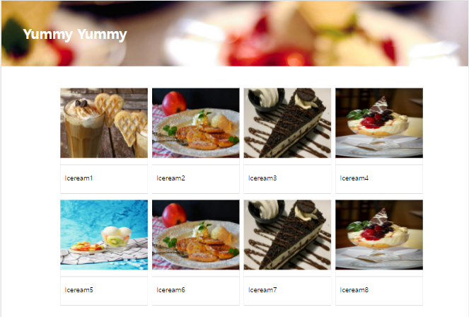
}실습2 : grid-template-colums
html 동일
CSS :
@charset "utf-8";

*{
    padding: 0;
    margin: 0;
}

h1{
    width: 100%;
    height: 150px;
    line-height: 150px;
    padding-left: 50px;
    background: url("./img6.jpg") no-repeat left top;
    background-size: cover;
    color: #fff;
}

#wrapper{
    display: grid;
    grid-template-columns: repeat(2, 200px);
    grid-template-rows: minmax(220px auto);
    grid-gap: 10px 10px;
    justify-content: center;
}

.card{
    display: inline-block;
    width: 200px;
    background-color: #fff;
    box-shadow: 0 1px 1px #ccc;
    padding-bottom: 15px;
    margin-bottom: 5px;
}

.card img{
    width: 100%;
    height: 160px;
    border-bottom: 1px solid #ccc;
    padding-bottom: 15px;
    margin-bottom: 5px;
}

.card p {
    padding: 10px;
}

@media (min-width:900px){
    #wrapper{
        justify-content: center;
        grid-template-columns: repeat(3, 200px);
    }
}

@media (min-width:1100px){
    #wrapper{
        justify-content: center;
        grid-template-columns: repeat(4, 200px);
    }
}
결과값 :
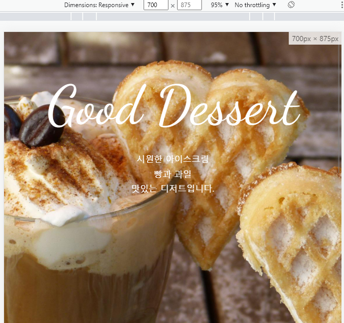
과제 : 화면 크기가 700px보다 작을 때 폰트 사이즈를 64px로 줄여주세요.
<!DOCTYPE html>
<html lang="en">
<head>
<meta charset="UTF-8">
<meta http-equiv="X-UA-Compatible" content="IE=edge">
<meta name="viewport" content="width=device-width, initial-scale=1.0">
<title>원페이지</title>
<link rel="stylesheet" href="./style.css">
<link href="https://fonts.googleapis.com/css2?family=Dancing+Script&display=swap" rel="stylesheet">
<!-- FontAwesome -->
<script src="https://kit.fontawesome.com/f495a41aa7.js" crossorigin="anonymous"></script>
</head>
<div class="container">
<section class="top">
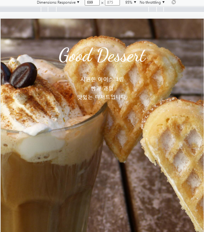
<h1 class="title">Good Dessert</h1>
<p>시원한 아이스크림 <br>빵과 과일 <br>맛있는 디저트입니다.</p>
</section>
<section class="menu">
<h2 class="title">Menu</h2>
</section>
<section class="contact">
<h2 class="title">Contact</h2>
<p>서울시 서초구 서운로 00-00</p>
<p>영업시간 : 8:00 ~ 20:00</p>
<a class="btn" href="#">문의사항</a>
<ul class="contact-sns">
<li><a href="#"><i class="fa-brands fa-instagram-square"></i></a></li>
<li><a href="#"><i class="fa-brands fa-facebook-square"></i></a></li>
<li><a href="#"><i class="fa-brands fa-twitter-square"></i></a></li>
</ul>
</section>
</div>
</body>
</html>CSS :
@charset "utf-8";

*{
    padding: 0;
    box-sizing: border-box;

}

html{
    font-size: 100%;
    line-height: 1.15;

}
body{
    font-family: sans-serif;
    margin: 0;
}
a{
    background-color: transparent;
    text-decoration: none;
}

img{
    border-style: none;
    vertical-align: bottom;
}

h1,h2{
    font-weight: lighter;
    margin: 0;
    color: white;
}
.title{
    font-family: 'Dancing Script',cursive;
    font-size: 7rem;
    margin-bottom: 2rem;
}
p{
    line-height: 1.7;
    font-size: 18px;
    color: #fff;
}
.container{
    height: 100vh;
    overflow: auto;
    scroll-snap-type: y mandatory;
}
.top{
    background-image: url('/img1.jpg');
}
section{
    height: 100vh;
    background-size: cover;
    background-position: center;
    background-repeat: no-repeat;
    padding-top: 10vh;
    text-align: center;
    scroll-snap-align: start;
}
.menu{
    background-image: url('/img2.jpg');
}
.contact{
    background-image: url('/img3.jpg');
}
.btn{
    background-color: #555;
    font-size: 24px;
    color: #fff;
    padding: 16px 56px;
    border-radius: 6px;
    display: inline-block;
    margin: 32px 0 36px;
}

.btn:hover{
    background-color: #777;
}
.contact-sns{
    display: flex;
  justify-content: center;
  list-style: none;
}
.contact-sns a{
display: inline-block;
    background-color: #fff;
    color: #555;
    width: 60px;
    height: 60px;
    margin: 0 8px;
    border-radius: 50%;
    font-size: 32px;
    padding: 12px 0 0 2px;
}

.contact-sns a:hover{
    background-color: rgba(255, 255, 255, 0.5);
}

@media (max-width:699px){
    .title{
        font-size: 64px;
    }
}
결과값 :
2) 학습내용 중 어려웠던 점
X
3) 해결방법
X
4) 학습소감
레이아웃을 하는 방법에도 여러가지 있다는 것을 알게 되었고 원페이지를 작성하면서 scroll을 사용해 보니 좋았습니다.

JAMIHs