
1. grid-row / grid-column
- 행과 열의 어디부터 어디까지 차지할지 지정하는 속성
.container {
  width: 500px;
  height: 500px;
  border: 2px solid greenyellow;
  display: grid;
  grid-template-columns: repeat(3, 1fr);
  grid-template-rows: repeat(3, 1fr);
}

.item:first-child {
  grid-row: 1 / 4;
  background-color: aqua;
}

.item:nth-child(2) {
  background-color: bisque;
  grid-column: 2 / 4;
}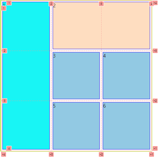
- 1번아이템은 1번부터 4번까지 행을 차지하고, 2번아이템은 2번부터 4번까지 열을 차지한다.
2. auto-fill / auto-fit
- auto-fill : 반응형을 만들때 컨테이너 크기에 따라 가능한 범위 안에서 가장 많은 열 또는 행을 만들어준다.
- auto-fit : 기본적으로 auto-fill과 같이 작동하나 컨테이너의 크기가 콘텐츠의 크기보다 더 커질때 열 또는 행을 만들지 않고 콘텐츠의 크기를 컨테이너에 맞춰 꽉 채운다.
- auto-fill
.container {
  border: 2px solid greenyellow;
  display: grid;
  grid-template-columns: repeat(auto-fill, minmax(100px, 1fr));
  grid-auto-rows: 100px;
}
- 화면이 계속 늘어나면 기존 콘텐츠는 최소크기인 100px로 유지하고 그에 맞게 열을 계속 만든다.
- auto-fit
.container {
  border: 2px solid greenyellow;
  display: grid;
  grid-template-columns: repeat(auto-fit, minmax(100px, 1fr));
  grid-auto-rows: 100px;
}
- 화면이 계속 늘어나면 열을 더이상 만들지 않고 콘텐츠의 크기가 컨테이너 크기에 맞게 1fr비율로 늘어난다.

비 전공 ZEROBASE 개발 꿈나무