마크업에서 가장 많이 사용되는 수평,수직 가운데 정렬을 하는 방법에 대해 공유한다. 내가 사용하려고
<html>
    <style>
        .box{
            width: 100px;
            height: 100px;
            border: 1px solid black;
            text-align: center;
        }
    </style>
    <body>
        <div class="wrap">
            <div class="box"></div>
            <div class="box"></div>
            <div class="box"></div>
        </div>
    </body>
</html>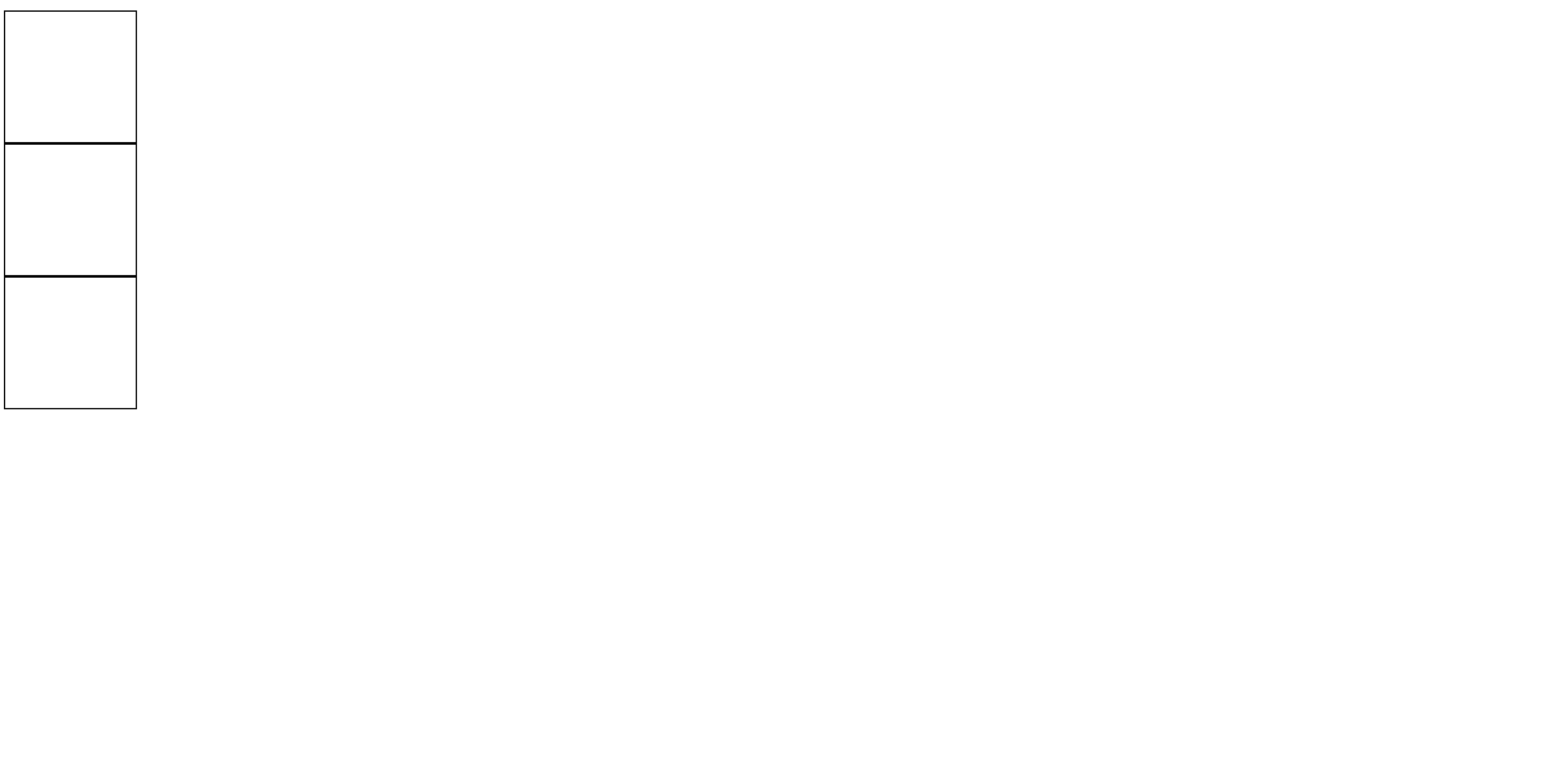
다음과 같이 여러 엘리먼트를 하나의 엘리먼트로 그룹화하여 중앙정렬이 필요한 경우가 종종 발생한다.
margin을 이용한 방법
<html>
    <style>
        .wrap{
            width: 100px;
            margin:0 auto;
        }
        .box{
            width: 100px;
            height: 100px;
            border: 1px solid black;
            text-align: center;
        }
    </style>
    <body>
        <div class="wrap">
            <div class="box"></div>
            <div class="box"></div>
            <div class="box"></div>
        </div>
    </body>
</html>
가장 일반적인 방법은 상위 엘리먼트의 margin값을 0 auto를 주어서 왼쪽과 오른쪽을 자동으로 설정하여 중앙 정렬하는 방법이다.
여기서 단점은 상위 엘리먼트의 width값을 명시를 해주어야 적용이 된다는 것이다. 또한 수평정렬만 가능하다는 점..
flex를 이용한 수평 가운데 정렬
<html>
    <style>
        .wrap{
            display: flex;
            justify-content: center;
        }
        .box{
            width: 100px;
            height: 100px;
            border: 1px solid black;
            text-align: center;
        }
    </style>
    <body>
        <div class="wrap">
            <div class="box"></div>
            <div class="box"></div>
            <div class="box"></div>
        </div>
    </body>
</html>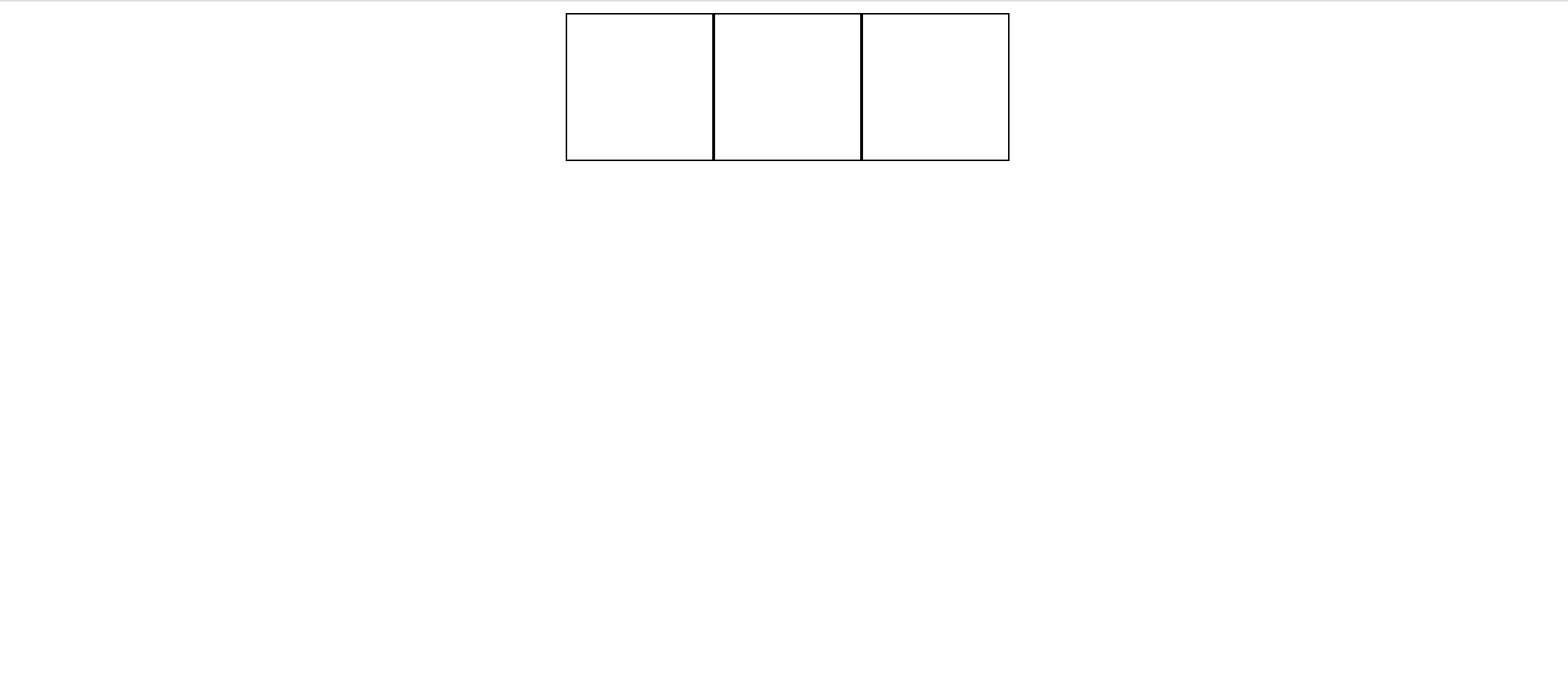
상위 엘리먼트를 flex로 바꾼뒤 justify-content의 값을 center로 주면 손쉽게 가운데 정렬을 할 수 있다. 이때, box들이 세로로 되어있다가 가로로 바뀐 이유는 flex-direction의 기본 값이 row로 되어 있기 때문이다.
<html>
    <style>
        .wrap{
            display: flex;
            flex-direction: column;
            align-items: center;
        }
        .box{
            width: 100px;
            height: 100px;
            border: 1px solid black;
            text-align: center;
        }
    </style>
    <body>
        <div class="wrap">
            <div class="box"></div>
            <div class="box"></div>
            <div class="box"></div>
        </div>
    </body>
</html>
따라서, flex-direction의 값을 column으로 설정하고 justify-content가 아닌 align-items 값을 center로 주면 처음 의도했던 수평정렬을 간편하게 구현할 수 있다.
flex를 이용한 수평, 수직 중앙 정렬
<html>
    <style>
        .wrap{
            height: 100%;
            display: flex;
            flex-direction: column;
            align-items: center;
            justify-content: center;
        }
        .box{
            width: 100px;
            height: 100px;
            border: 1px solid black;
            text-align: center;
        }
    </style>
    <body>
        <div class="wrap">
            <div class="box"></div>
            <div class="box"></div>
            <div class="box"></div>
        </div>
    </body>
</html>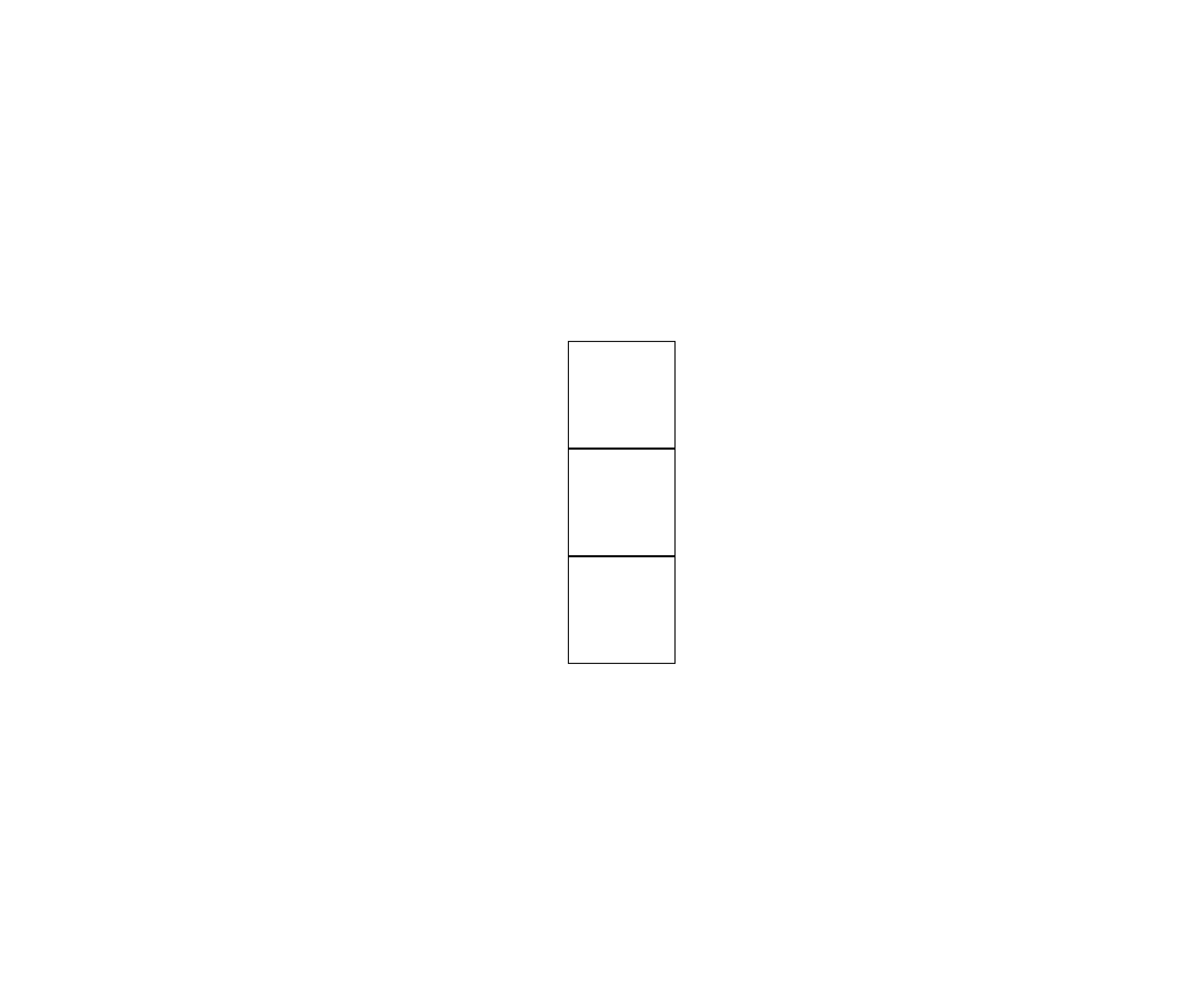
마지막으로 화면내에 수평, 수직 중앙 정렬하는 방법이다. 먼저 상위 엘리먼트의 height값을 100%로 설정하여 작업범위를 넓히고 algin-items와 justify-content값 모두 center로 주면 수직,수평 정렬을 간편하게 구현할 수 있다.
끝!

흐릿한 잉크가 뚜렷한 기억보다 낫다