[chap3] 서울시범죄현황
가정(혹은 '인식')을 검증하고 표현하는 것
방지 : 숫자값들이 콤마(,)를 사용하고 있어서 문자로 인식
단순 나열된 데이터를 원하는 데이터 열로 재배치 할 필요가 있음
1강. 데이터 개요 및 읽어오기
# RangeIndex: 65534 와 310의 불일치 발견 : 수정필요성
> null값 제거한 값을 다시 재설정

<class 'pandas.core.frame.DataFrame'>
RangeIndex: 65534 entries, 0 to 65533
Data columns (total 4 columns):
 #   Column  Non-Null Count  Dtype
---  ------  --------------  -----
 0   구분      310 non-null    object
 1   죄종      310 non-null    object
 2   발생검거    310 non-null    object
 3   건수      310 non-null    float64
dtypes: float64(1), object(3)
3강. pivot_table
1) index, columns, values, aggfunc
2) 밸류값 다 지정해줘야함
3) 특정기능
- nan값 채워주기 : fill_value=0
- 계 만들기 : margins = True
5강. pivot_table 2
1) 
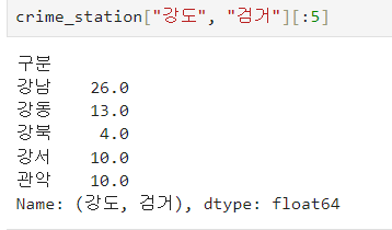
2) 다중컬럼에서 특정 컬럼 제거 : droplevel
crime_staion.columns.droplevel([0,1])
Python 모듈 설치
- pip
- conda
Google maps API
import googlemaps
gmaps_key = "~~"
gmaps = googlemaps.Client(key = gmaps_key)
gmaps.geocode("서울영등포경찰서", language = "ko")
pandas에 잘 맞춰진 반복문용 명령 : iterrows()
- pandas 데이터 프레임은 대부분 2차원임
- 이럴때 for문을 사용하면, n번째라는 지정으 반복해서 가독률이 떨어짐
- pandas 데이터 프레임으로 반복문을 만들때 itterows()옵션을 사용하면 편함
- 받을 때, 인덱스와 내용으로 나누어 받는것만 주의
1) ★★★★★★
1. 경찰서 이름에서 소속된 구이름
2. 구이름과 위도 경도 정보 저장준비
3. 반복문 이용해서 nan채우기
4. iterrows()
count = 0 #작동상황 보라고
for idx, rows in crime_station.iterrows() :
station_name = "서울" + idx + "경찰서"
tmp = gmaps.geocode(station_name , language = "ko")
tmp_gu = tmp[0].get('formatted_address')
lat = tmp[0].get('geometry')['location']['lat']
lng = tmp[0].get('geometry')['location']['lng']
crime_station.loc[idx, "위도"] = lat
crime_station.loc[idx, "경도"] = lng
crime_station.loc[idx, "구별"] = tmp_gu.split(" ")[2]
# print(count)
count += 1
#행, 열 같이 불러올땐 : crime.station.loc[행, 열]2) 컬럼명 정리하기
3) multiindex 에서 특정 level(단계)의 레이블을 추출해야하는 경우 :get_level_values()
구별 데이터로 정리
- 특정 컬럼을 인덱스로 지정하여 불러오기 : index_col = 0
- 다수의 컬럼을 다른 컬럼으로 나누기 : div
#가로축연산 : axis = 0
crime_anal_gu[["강도검거", "살인검거"]].div(crime_anal_gu["강도발생"], axis = 0)- 다수의 컬럼을 다수의 컬럼으로 각각 나누기
crime_anal_gu[den].values **

num = ["강간검거", "강도검거",  "살인검거",  "절도검거",  "폭력검거" ]
den = ["강간발생", "강도발생",  "살인발생",  "절도발생",  "폭력발생" ]
crime_anal_gu[num].div(crime_anal_gu[den].values)
3-1. 새로운 컬럼에 넣기까지
target = ["강간검거율", "강도검거율",  "살인검거율",  "절도검거율",  "폭력검거율" ]
crime_anal_gu[target] = crime_anal_gu[num].div(crime_anal_gu[den].values)  * 100
3-2. 다중컬럼 조건에 해당하는 값만 바꾸기
crime_anal_gu[crime_anal_gu[target]>100] = 100코드를 입력하세요데이터 정렬을 위한 데이터 정리
- 정규화 : 최댓값은 1, 최솟값은 0
구하려면??
#단일 컬럼
crime_anal_gu['강도'] / crime_anal_gu['강도'].max()

#다중 컬럼
col = ["살인", "강도", "강간", "절도", "폭력"]
crime_anal_norm = crime_anal_gu[col] / crime_anal_gu[col].max()
crime_anal_norm.head()-
새로운 불러와 내용 계속 추가하기
-
행과 열의 평균구하기 : np.mean()
np.mean(np.array([516.0,39.0,5.0,3587.0,4002.0]))

np.mean(np.array(
    [[0.357143,1.000000,1.000000,0.977118,0.733773],
    [0.285714, 0.358974,0.310078,0.477799,0.463880]]
), axis = 1
       ) #numpy 행이 axis = 1, 열이 0
seaborn
- figure > plot > show
- 여러개의 함수 그리기
x = np.linspace(0,14,100)
y1 = np.sin(x)
y2 =  2 * np.sin(x + 0.5)
y3 =  3 * np.sin(x + 1.0)
y4 =  4 * np.sin(x + 1.5)
plt.figure(figsize = (10, 6))
plt.plot(x, y1, x, y2, x, y3, x, y4)
plt.show()- 뒷배경바꾸기 : sns.set_style
#sns.set_style() white, grid, dark, darkgrid, -
예시데이터 불러오기 : tips = sns.load_dataset("tips")
-
그래프 종류 : 사용시에는 example 열어서 보기
1) boxplot()
A box plot (aka box and whisker plot) uses boxes and lines to depict the distributions of one or more groups of numeric data. Box limits indicate the range of the central 50% of the data, with a central line marking the median value. https://blog.naver.com/parksdatalab/223467108993
2) swarmplot()
A swarm plot can be drawn on its own, but it is also a good complement to a box or violin plot in cases where you want to show all observations along with some representation of the underlying distribution.
3) lmplot()
lmplots are basically scatter plots with overlaid regression lines.
A regression line can be used to predict the value of y for a given value of x. Regression analysis identifies a regression line. The regression line shows how much and in what direction the response variable changes when the explanatory variable changes
4) heatmap()
