
휘몰아치고 끝나는 CSS 수업ㅋㅋㅋ 아이콘이 글씨처럼 취급될 수 있는 게 제일 신기했음
다단 배치
grid로 갈 수록 최신 기술(최신 기술일 수록 적용 안되는 환경이 많음)
caniuse.com에서 확인
- position(absolute)으로 다단 배치를 구현하는 것은 어렵고 기타 여러 문제들이 있기 때문에 비선호 방식으로 자리잡음
float
- 모든 환경에서 사용 가능
배치
- float를 쓰는 순간 display가 다 바뀌므로 미리 display 설정을 바꾸지 않아도 됨. 공중에 떠 있는 요소로 전환됨
문제점
- div 영역을 벗어남(연관 배치가 아님)
- float가 float가 아닌 영역에 포함되지 않음
- 특히 float와 float가 아닌 요소들을 섞어서 배치할 때 문제 발생
- 기존의 레이아웃과 조화롭게 쓸 수 있는 법 필요
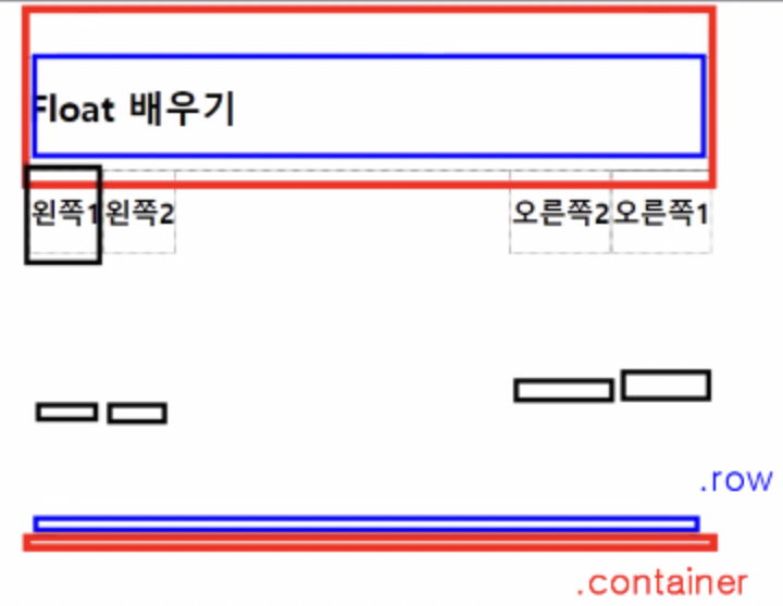
- 검정색 네모들이 float. float가 아닌 .container나 .row에 속하지 않음
해결책
- float가 끝나는 시점에 float를 제거하는 속성인 clear 사용
- float가 float가 아닌 영역에 포함되도록 설정
[1] clear
- 방향을 지정할 수 있지만 both 사용
```css
/*css*/
.clear {
	 clear: both; /* float:left와 float:right를 모두 초기화*/
}
```

```html
<!--html-->
<div class="clear"></div>
```
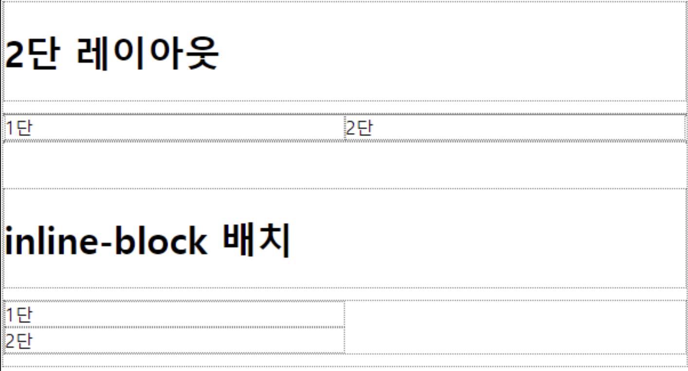
2단 배치
- 폭을 50%로 설정
- 일반적으로 left, right를 섞어 쓰지는 않음
- right를 쓰면 1단이 오른쪽에 나옴
<!--html-->
<div class="row mt-40">
    <h1>2단 레이아웃</h1>
</div>

<div class="row">
    <div class="float-left w-50">1단</div>
    <div class="float-left w-50">2단</div>
</div>
inline-block으로 배치(x)
- 반반으로 나뉘지 않고, 다음 줄로 넘어감
- inline은 바꿀 수 없는 기본 margin이 있기 때문
- inline은 바꿀 수 없는 기본 margin이 있기 때문
[2] float만의 영역 생성
- 매번 clear 귀찮음
- float만 들어갈 수 있는 별도의 영역을 만들기
- .float-container 클래스 설정
- 해당 영역(.float-container) 종료 시 자동으로 clear 되도록 처리
- 가상의 영역(: 가상 선택자)을 만들어서 clear 설정
virtual selector
- 가상의 영역 선택자
- ::after, ::before를 주로 사용
- 영역을 반드시 먼저 만들어야 함
가상의 영역 생성
content: “”; display: block;- empty string으로 영역을 만든다는 의미 (null과 empty string을 구분해야 하는 이유)
- div를 만드는 것과 같은 역할을 하게 됨
/*css*/
.float-container {}
.float-container::after {
    content: "";
    display: block;
    clear: both;
}
<!--html-->
<div class="row mt-40">
<h1>최종(float-container 사용)</h1>
</div>
<div class="row float-container">
<div class="float-left w-33">1단</div>
<div class="float-left w-33">2단</div>
<div class="float-left w-33">3단</div>
</div>flex (flexbox)
-
float를 대체할 수 있음
-
display: flex- 기존 항목과 조화롭게 쓸 수 있음
-
개별 항목이 아니라 영역 자체에 설정하는 것
-
배치 방향 설정(flex-direction 속성)
- 왼쪽/오른쪽 섞어쓰려면 개별 설정해야 하는 float 사용
-
폭을 지정하지 않으면 자동으로 비율로 할당되도록 구현할 수 있음(개별 설정): flex-grow
.first > div { flex-grow: 1; } /* 알아서 항목 수/100 비율로 나눠 줌 */ -
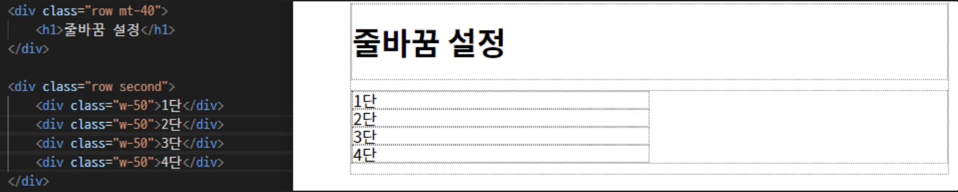
줄바꿈
- 허용/불가 설정 가능: flex-wrap
- no wrap: 아래 코드에서 도합 200%인데 줄바꿈 비허용이므로 100% 기준으로 4등분 됨
- wrap: 1 2 / 3 4 한 줄에 두 개씩 나오게 됨
-
정렬 기준을 손쉽게 설정할 수 있음
- justify-content로 내부 항목의 가로 배치 형식을 설정
- align-items로 내부 항목의 세로 배치 형식을 설정
-
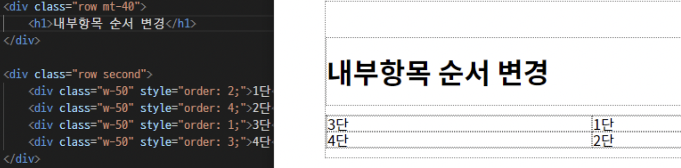
내부 항목들의 배치 순서를 변경할 수 있음(개별 설정): order
inline-flex
- 나는 inline, 그 아래는 flex
flex만의 기능
정중앙 배치
-
flex는 가운데 정렬 쉽게 해줌
-
float에서는 높이가 개별적으로 설정됐었는데, flex는 전체 높이 한 번에 늘어남
-
ex. input과 이미지를 한 줄에 배치할 때 flex 쓰면 정렬이 딱 맞게 됨
-
이미지가 높이를 맞춰도 input보다 아래에 위치하게 되는 문제를 해결할 수 있음
.third {
    display: flex;
    height: 200px;

    justify-content: center; /* 가로 정렬(왼/오/양쪽/가운데 정렬 모두 됨) */
    align-items: center; /* 세로 정렬 */
}
-
내부 항목 배치 순서
- 내부 항목들의 배치 순서 변경 가능(개별 설정)
- order 속성
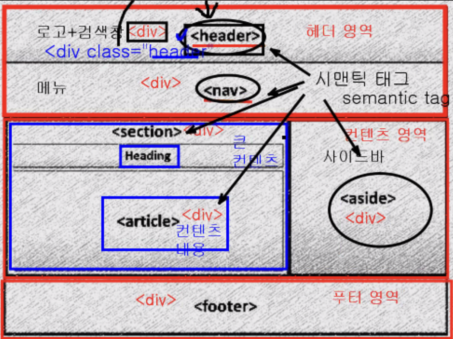
레이아웃
시맨틱 태그
- html5에서 등장
- 의미가 있는 클래스를 태그로 만들어서 역할을 부여한 것
- 원래 다 <div>로 만들었었음
유의사항
- 레이아웃에는 margin이 있으면 안됨
- 클래스 사용을 권장하지 않음
- 시맨틱 태그는 한 번만 사용하므로 태그에 직접 디자인
- 레이아웃용 css 파일로 분리해서 사용할 것을 권장
css reset
-
css reset style 검색 시, 이미 유명한 스타일들을 찾아볼 수 있음
- 모든 태그의 여백을 다 없앰
- 시맨틱 태그를 div와 동일하게 처리해주는 설정
-
내가 필요한 것만 남길 수 있도록 해야 함
- reset.css 파일로 분리
- 이미 구현해 둔 스타일이 있다면 reset.css에서 제거
-
css 파일 import할 때 불러온 순서대로 적용됨
- reset을 가장 먼저 불러와야 함
- commons나 layout은 순서 크게 상관 없음
web font
- 보통 html 태그에 폰트 스타일 지정함
- reset.css에서 자동으로 font-family:inerit으로 상속 받음
- 로컬에만 설치된 폰트 사용 시, 모든 환경에서 동일하게 나오지 않음
폰트 파일 업로드
- 폰트 파일 자체를 업로드하는 방법
- 저작권 무료인 폰트 찾기 등 번거로움
웹 폰트 import
- CDN 방식(Content Delivery Network) 사용
- ex. 구글 폰트
web icon
- icon vs. img
- 이미지는 용량이 너무 큼
- 이미지보다 강력한 커스터마이징 가능
직접 구현
- 도형을 만들어서 이미지 대체하기
- ::after, ::before
- css-tricks.com
- 도형 수준에 그침
## 링크 태그
- tabler icon
- svg: 복붙으로 끝
- 단점: 관리가 어려움(import 하기 위한 태그가 너무 복잡함)
라이브러리
fontawesome 6
- 라이브러리 설치
- fontawesome CDN 검색
min.css
- minify 버전
- 용량을 줄이기 위해서 공백 모두 제거한 버전
- CDN은 보통 일반, min 같이 배포함
- 코드를 자세히 보려면 min 지우고 주소 치면 알아보기 쉬움
아이콘 삽입
- fontawesome에서 html 태그 복사, html 파일에 원하는 곳에 붙여넣기
크기 커스터 마이징
기본 제공 크기
- fa-nx
- 2≤n≤10
폰트 사이즈와 동일하게
- 아이콘이 글자처럼 인식됨
- 폰트 사이즈와 동일하게 설정 가능
- .custom-size
색상 커스터마이징
폰트 컬러로 색상 변경 가능
- 클래스로 제어 가능
애니메이션 적용
- fa-spinner, fa-beat, fa-shake,…
- 기타 애니메이션, 애니메이션 커스텀은 공식문서 참고
애니메이션
- @keyframes: 애니메이션 효과 지정
- 중첩 가능
색상 변경
- 다른 색상으로 변경되기(반짝거리기) color A to B
- 깜빡거리기: opacity 1 to 0
- 부드럽게 전환되기: animation-deirection: alternative
/* 애니메이션 생성 */
@keyframes blingbling {
    from {
        color: rgb(255, 38, 219);
    }
    to {
        color: rgb(153, 29, 255);
    }
}

.glow-text{
    /* animation: blingbling 1s ease-in-out 0s 10; */
    animation-name: blingbling;
    animation-delay: 0s;
    animation-duration: 1s;
    animation-timing-function: ease-in-out;
    animation-iteration-count: infinite;
    animation-direction: alternate;
}
회전
- 회전/이동/확대 등 모두 transform 속성 활용
bounce
- translate: 이동
- rotate: 회전
- scale: 확대
- from to를 0~100%로 지정해서 중간단계를 설정할 수 있음
