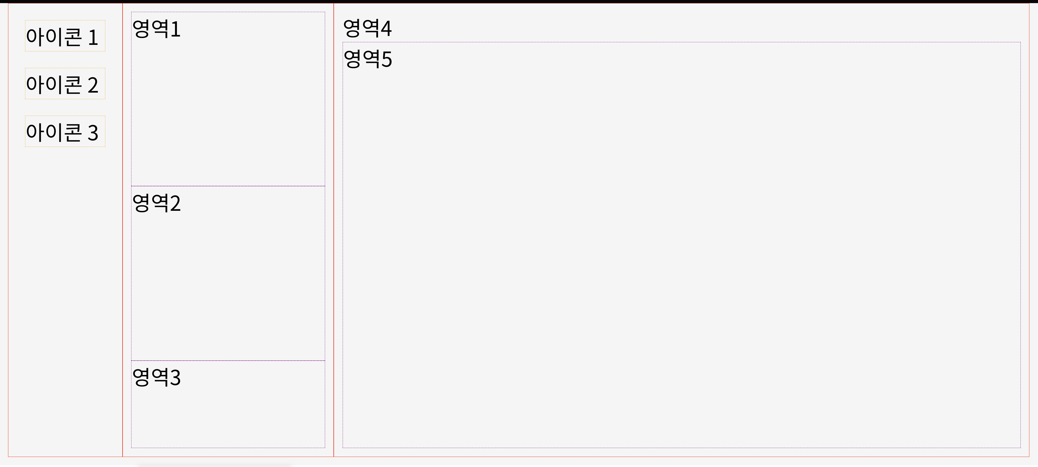
- HTML: index.html
<!DOCTYPE html>
<html lang="en">
<head>
  <meta charset="UTF-8">
  <meta http-equiv="X-UA-Compatible" content="IE=edge">
  <meta name="viewport" content="width=device-width, initial-scale=1.0">
  <link rel="stylesheet" href="index.css">
  <title>Document</title>
</head>
<body>
  <div id="container">
    <div class="col w10">
      <div class="icon">아이콘 1</div>
      <div class="icon">아이콘 2</div>
      <div class="icon">아이콘 3</div>
    </div>
    <div class="col w20">
      <div class="row h40">영역1</div>
      <div class="row h40">영역2</div>
      <div class="row h20">영역3</div>
    </div>
    <div class="col w70">
      <div class="row h80">영역4</div>
      <div class="row h20">영역5</div>
    </div>
  </div>
</body> - CSS: index.css
* {
  box-sizing: border-box;
  margin: 0;
  padding: 0;
  font-size: 40px;
}

body {
  padding: 0;
  background: white;
}

#container {
  display: flex;  //w10 w20 w70 자식 박스이다.//
  min-height: 100vh;
  background: whitesmoke;
  padding: 0.4rem;
  margin: 0.4rem;
}

.icon {
  margin: 0.4rem;
  border: 1px dashed orange;
}

.col {
  display: flex; // h40
  /* flex container가 되는 겁니다. */
  flex-direction: column;
  padding: 0.4rem;
  border: 1px solid red;
}

.row {
  border: 1px dashed purple;
}

.w10 {
  flex: 1 0 0;
}
.w20 {
  flex: 2 0 0;
}
.w70 {
  flex: 7 0 0;
}

.h20 {
  flex: 2 0 0;
}

.h40 {
  flex: 4 0 0;
}

.h80 {
  flex: 8 0 0;
}
- container박스의 자식박스: .col .w10 .w20 .w70
- col박스의 자식박스: .icon .row .h20 .h40 .h80
- display: flex
자식들까지만 되고 후손까지는 안된다
그렇기 때문에,
container에 dislpay: flex가 사용된 경우는 그 자식한테까지만 적용된다.
그래서 col박스에 display: flex를 다시 사용한다.

출처: 코드스테이츠

끝까지 ... 가면 된다.