개요
관리자 페이지와 결제 페이지를 구현하는데 조금 이쁜 UI가 없을까 하다가 요즘 핫한, shadcn-ui를 접했다.
조금 소개해보자면,
Radix UI 및 Tailwind CSS를 사용하여 구축된 재사용 가능한 컴포넌트.
컴포넌트 라이브러리가 아니라, 앱에 복사하여 붙여넣을 수 있는 재사용 가능한 컴포넌트 모음이다.
공통 컴포넌트 UI를 사용하고 싶어서 도입을 결정했고, 더 자세한 사용법은 docs에 가면 된다.
간단하게 Next.js에서 사용할 수 있는 방법을 작성하겠다.
(https://ui.shadcn.com/docs)
사용법
npx shadcn-ui@latest init
다음과 같은 명령어를 커맨드에 입력하고,
Would you like to use TypeScript (recommended)? no / yes
Which style would you like to use? › Default
Which color would you like to use as base color? › Slate
Where is your global CSS file? › › app/globals.css
Do you want to use CSS variables for colors? › no / yes
Are you using a custom tailwind prefix eg. tw-? (Leave blank if not) ...
Where is your tailwind.config.js located? › tailwind.config.js
Configure the import alias for components: › @/components
Configure the import alias for utils: › @/lib/utils
Are you using React Server Components? › no / yes
기본 설정인데, 마음내키는대로 설정해준다. (나의 경우 import alias 를 바꿔주었다)
그리고 사용하고 싶은 컴포넌트를 Installation 하면 되는데,
예시로, alert-dialog 컴포넌트를 사용하고 싶다면
npx shadcn-ui@latest add alert-dialog 를 커멘드에 입력하면, import alias 로 설정한 곳에 컴포넌트들의 코드가 작성이 되어있다.
그리고 내가 사용하고 싶은 컴포넌트에서,
import React from 'react';

import {
  AlertDialog,
  AlertDialogAction,
  AlertDialogCancel,
  AlertDialogContent,
  AlertDialogDescription,
  AlertDialogFooter,
  AlertDialogHeader,
  AlertDialogTitle,
  AlertDialogTrigger,
} from '@shared/components/shadcn/ui/alert-dialog';

const shadcn = () => {
  return (
    <div>
      <h1 className='text-2xl'>shadn</h1>
      <br />

      <AlertDialog>
        <AlertDialogTrigger>Open</AlertDialogTrigger>
        <AlertDialogContent>
          <AlertDialogHeader>
            <AlertDialogTitle>Are you absolutely sure?</AlertDialogTitle>
            <AlertDialogDescription>
              This action cannot be undone. This will permanently delete your account and remove
              your data from our servers.
            </AlertDialogDescription>
          </AlertDialogHeader>
          <AlertDialogFooter>
            <AlertDialogCancel>Cancel</AlertDialogCancel>
            <AlertDialogAction>Continue</AlertDialogAction>
          </AlertDialogFooter>
        </AlertDialogContent>
      </AlertDialog>
    </div>
  );
};

export default shadcn;
다음과 같이 작성 후 실행하면,
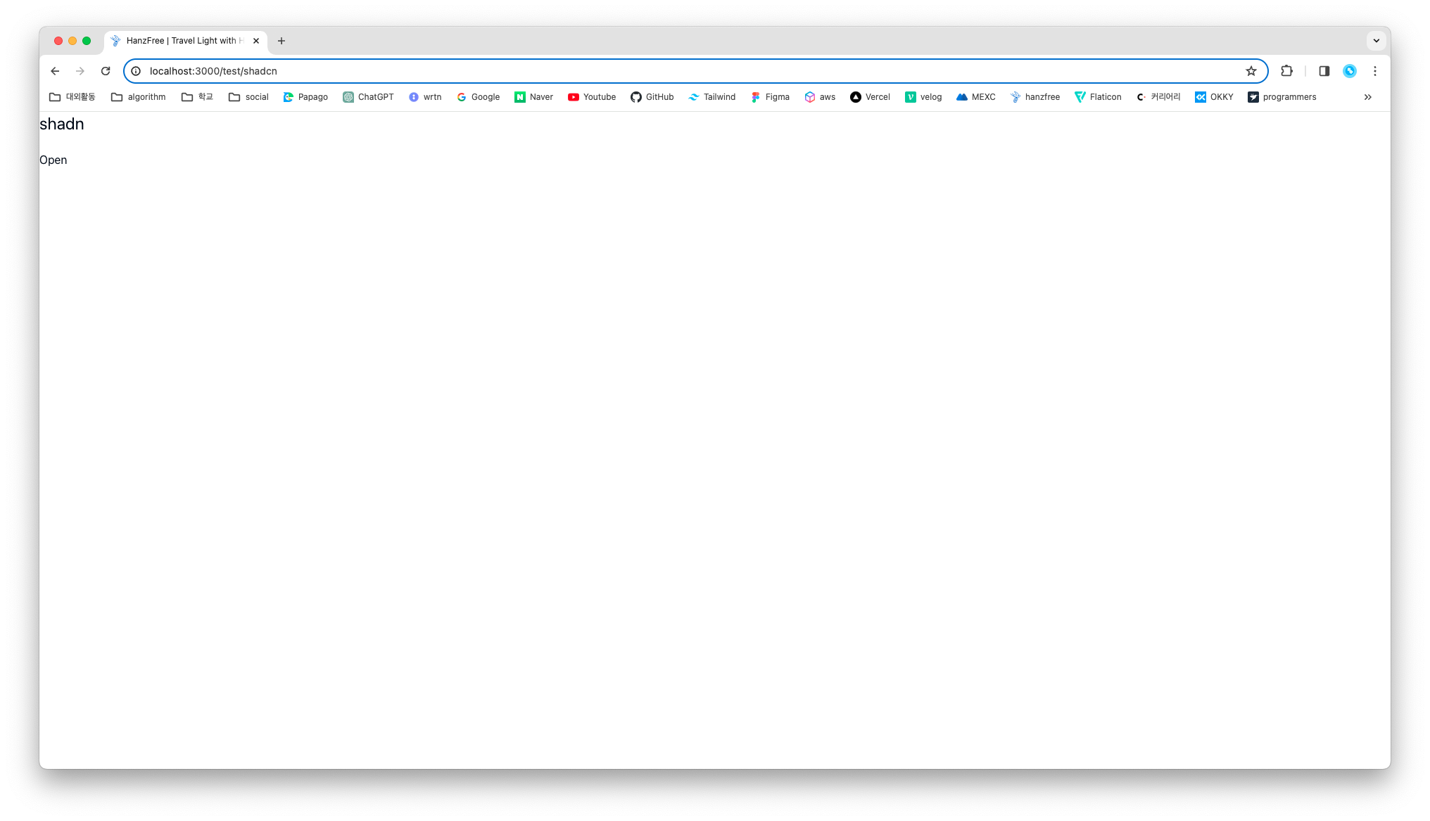 여기서 open을 클릭하면,
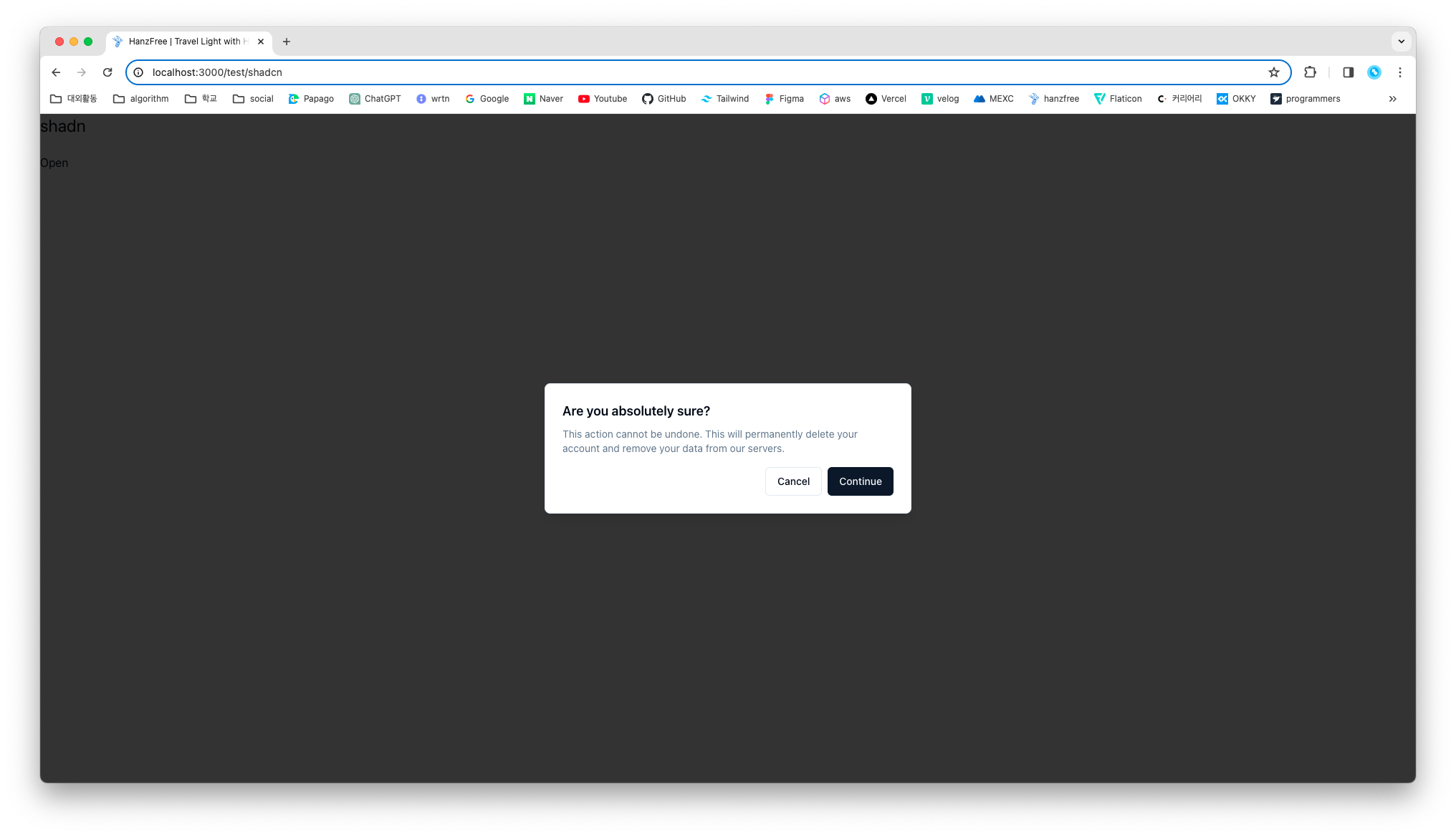 다음과 같이 alert-dialog가 잘 나오는 모습을 확인할 수 있다!
추가로 tailwind로 스타일을 사용할 수 있는데,
<AlertDialogAction className='bg-blue-500'>Continue</AlertDialogAction>이렇게 컴포넌트의 className으로 전달하면,
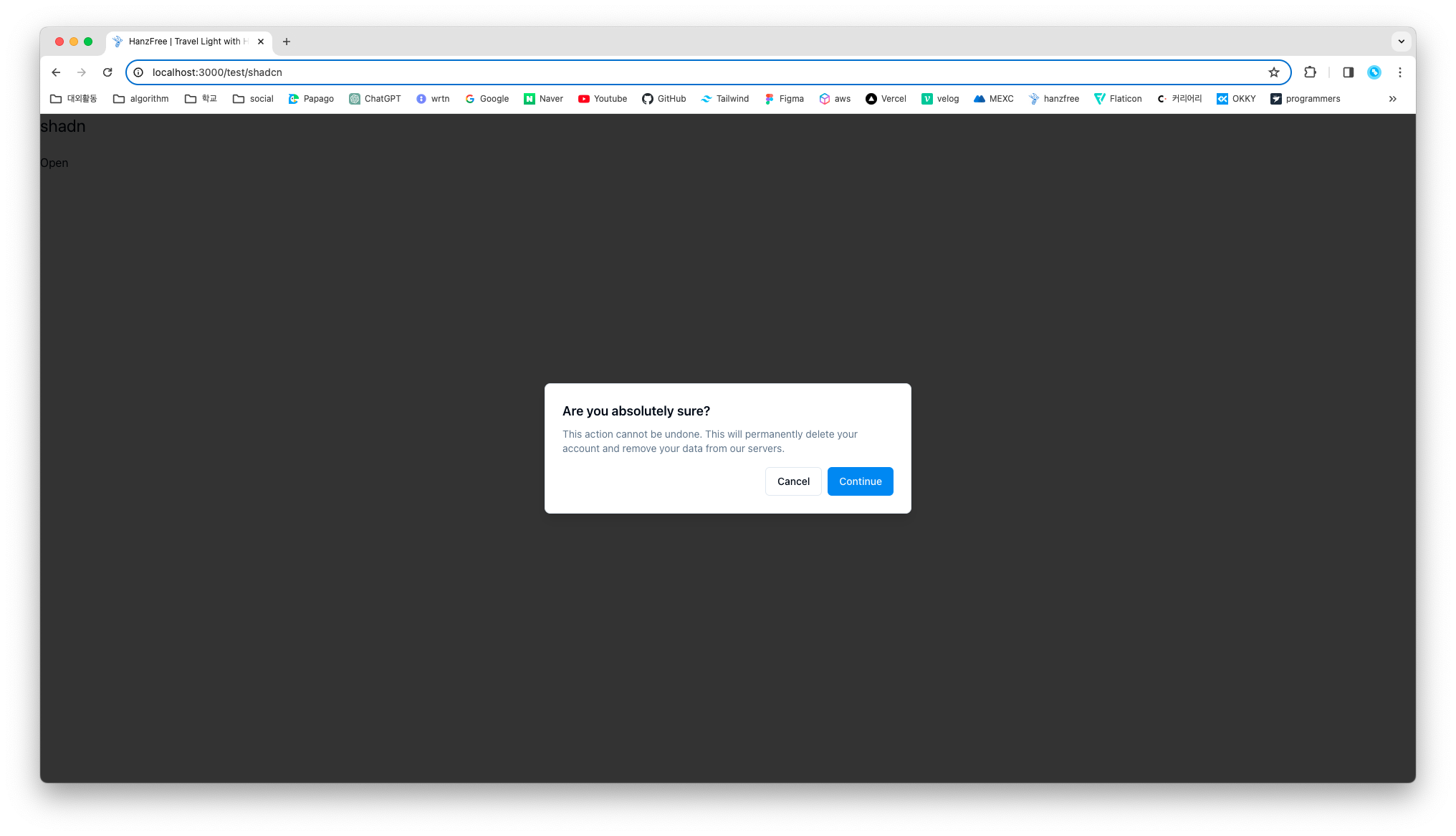
다음과 같이 Continue 버튼이 파란색으로 변한 것을 확인할 수 있다!
이렇게 EventListener 도 props로 전달해서 사용할 수 있다!
후기
shadcn에서 제공하고 있는 컴포넌트들이 좀 이뻐(?) 보이고, 트렌디해서 자주 사용하려고 한다. 끝 ~