Grid
두 방향(가로-세로) 레이아웃 시스템 (2차원)
flex와 비슷하지만 더 복합적인 레이아웃 표현 가능하다.
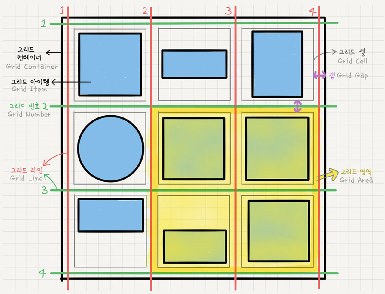
부모요소 container 에 설정해주는 요소
display: grid
컨테이너가 주변요소들과 어떻게 어울어질지에 대한 결정grid-template-rows행의 배치
grid-template-columns열의 배치
컨테이너에 grid 트랙(열, 행)의 크기들을 지정해주는 속성- 1fr 1fr 1fr : 균일한 fraction 을 1:1:1 비율인 3개의 column 생성
- 100px 2fr 1fr : 첫번째 column은 100px로 고정, 두세번째 column은 2:1의 비율로
- repeat(반복횟수, 반복값)
repeat(5,1fr) === 1fr : 1fr : 1fr : 1fr : 1fr - minmax(최소, 최대)
minmax(100px ,auto): 최소한 100px 확보하고 내용이 많아 100px이 넘어가면 알아서 늘어나도록 auto-fillauto-fit: row 나 column의 개수를 미리 정하지 않고 설정된 너비가 허용하는 한 최대한 셀을 채우는 것, fill은 공간이 남을 수도 있지만 fit은 남은 공간을 꽉꽉 채운다.
row-gapcolumn-gapgapgrid-gap: 그리드 셀 사이 간격 설정grid-auto-columnsgrid-auto-rows:grid-template-columns(rows)의 통제를 벗어난 위치에 있는 트랙의 크기 지정align-items세로방향정렬 :stretchstartcenterendjustify-items가로방향정렬stretchstartcenterendplace-items : (align-items), (justify-items)단축속성
자식 요소 item 에 설정해주는 요소
-
grid-column-startgrid-column-endgrid-column
grid-row-startgrid-row-endgrid-row
각 셀의 영역 지정
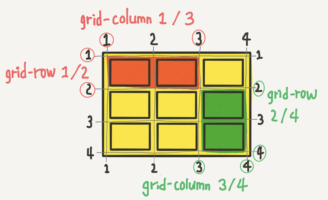
.item:nth-child(1){ //빨간색 영역 grid-column-start : 1; grid-column-end : 3; grid-row-start:1; grid-row-end:2; grid-column : 1 / 3; grid-row : 1 / 2; } ``` -
grid-template-areas영역 이름으로 그리드
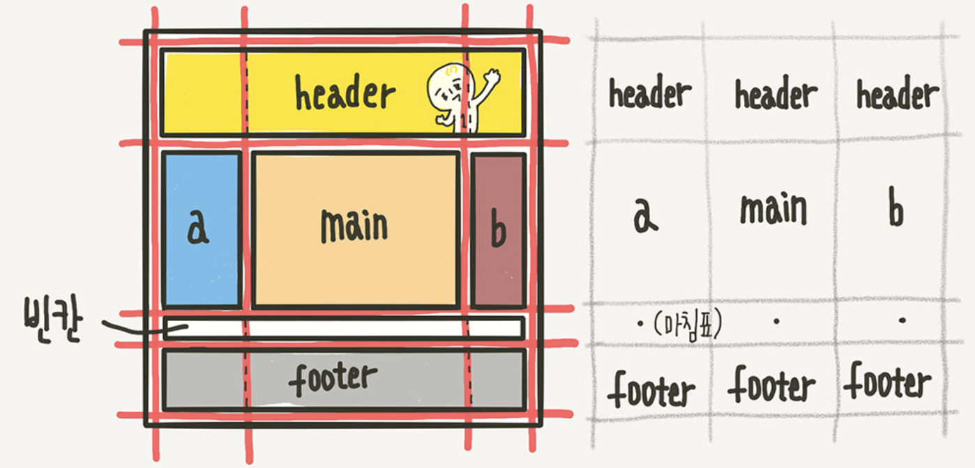
.container{ /*부모요소*/ grid-template-areas: "header header header" " a main b " " . . . " //마침표 or none "footer footer footer"; } /*자식요소*/ .header { grid-area : header;} .sidebar-a { grid-area : a;} .main-content { grid-area : main; } .sidebar-b { grid-area: b; } .footer { grid-area : footer; } ``` -
grid-auto-flow자동배치
rowcolumndenserowdensecolumndense -
grid 아이템 정렬
-align-contentstretchstartcenterendspace-betweenspace-aroundspace-evenly
grid 아이템들의 높이의 합 < grid 컨테이너 높이 일 경우 아이템들을 통째로 세로 정렬
-justify-contentstartcenterendspace-betweenspace-aroundspace-evenly
grid 아이템들의 너비의 합 < grid 컨테이너 너비 일 경우 아이템들을 통째로 세로 정렬
-place-content: (align-content), (justify-content)단축속성 -
개별 아이템 정렬
-align-self세로
-justify-self가로
-place-content: (align-content), (justify-content) -
order배치순서 => 작은 수일수록 먼저 배치 -
z-indexz축 정렬 => 큰 수 일수록 위로 배치
flex 에 적응이 되려고 할 참에 grid 도 공부
컨테이너 > grid 아이템 > 개별 아이템
정렬에 따라 또 바뀌는 느낌이 들어서 아직까지는 어렵다!