flex
컨텐츠를 정렬하거나 공간을 나눌수 있는 CSS속성의 집합
display의 속성이다.
// block, inline-block과 유사
display: flex;
display: inline-flex;- flex-direction - 정렬 방향을 결정
flex-direction: row;
flex-direction: row-reverse;
flex-direction: column;
flex-direction: column-reverse;- justify-content - 축을 기준으로 배열의 위치를 조종하거나 아이템 간의 간격을 설정
justify-content: flex-start;
justify-content: flex-end;
justify-content: center;
justify-content: space-between;
justify-content: space-around;
justify-content: space-evenly;- align-items - 세로축(cross-axis)을 기준으로 이동
(+ align-content - flex-container 의 세로축(cross-axis)의 아이템들이 여러줄 일때 사용 가능)
align-items: stretch; // 기본값
align-items: center;
align-items: flex-start;
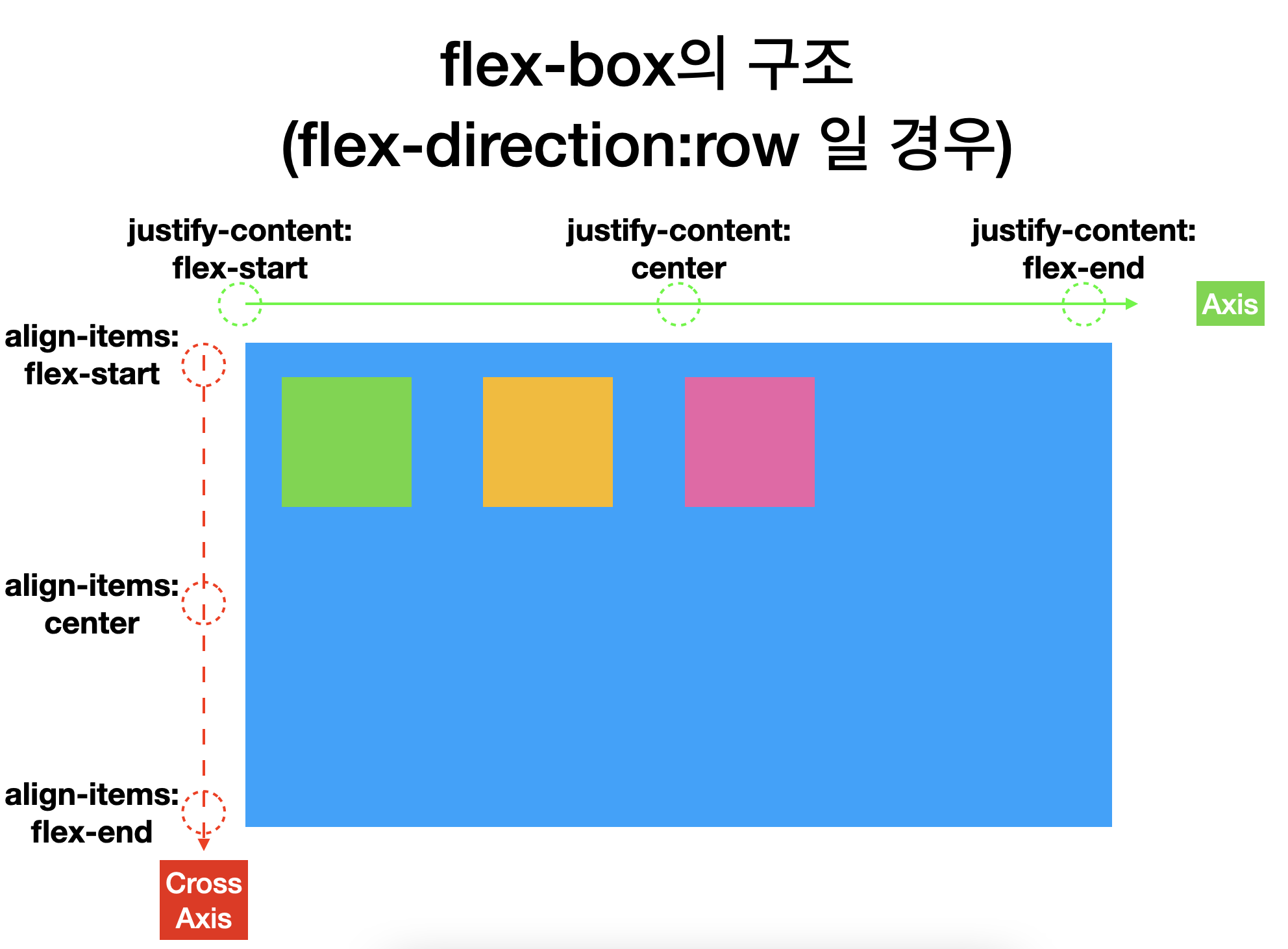
align-items: flex-end;flex-box 구조 한눈에 보기
그 밖의 속성들
- flex-wrap: 자식요소를 감싸주는 기능
- flex-basis: flex item들의 크기를 특정, 축(axis) 방향에 따라 달라진다. (자식요소에 사용)
- flex-grow: flex-basis의 값에서 더 늘어나도 되는지 지정, 할당된 값에따라 자신을 감싸는 컨테이너의 공간을 할당하도록 한다. (자식요소에 사용)
ex)
flex-grow: 1 -> 자식 요소들이 모두 동일한 크기의 공간을 할당받음
flex-grow: 2 -> 특정한 하나의 자식에게만 줄 경우 다른 자식요소보다 두배의 공간을 할당받음 - flex-shrink: flex-grow에 반대되는 개념, flex-basis의 값에서 더 줄어들어도 되는지 지정하는 값, 크기를 고정하거나 줄이는 역할
- align-self, order ...
Grid
- 테이블처럼 세로 열과 가로 행을 기준으로 요소를 정렬할 수 있다.
- Flex보다 더 복합적인 레이아웃 표현이 가능하다.
display: grid;
컨테이너에 적용하는 속성
1. 그리드 형태 정의

// 열 세개 1fr로 생성
grid-template-columns: 1fr 1fr 1fr;
grid-template-columns: repeat(3, 1fr);

// 행 세개 100px로 생성
grid-template-rows: 100px 100px 100px;
grid-template-rows: repeat(3, 100px);


2. 간격 만들기

row-gap: 10px;
column-gap: 20px;
gap: 10px;  // row, column 10px씩
아이템에 적용하는 속성
- 첫번째 칸 2x2 만들기

1. 시작번호 1~3 지정
grid-column-start: 1;
grid-column-end: 3;
grid-row-start: 1;
grid-row-end: 3;

grid-column: 1 / 3;
grid-row: 1 / 3;

2. 몇개의 셀 차지할 것인지 지정
grid-column: 1 / span 2; // 1번 라인에서 2칸
grid-row: 1 / span 2; // 1번 라인에서 2칸
+ 용어
- fr - 그리드 트랙 사이즈로 사용되는 단위, 유연한 단위로 그리드 - 컨테이너의 여유 공간을 비율로 나눠 설정합니다.
- 그리드 컨테이너 : 그리드의 가장 바깥영역
- 그리드 아이템 : 그리드 컨테이너의 자식 요소들
- 그리드 트랙 : 그리드의 행(row) 또는 열(column)
- 그리드 셀 : 그리드의 한 칸 (개념적인 정의)
- 그리드 라인 : 그리드 셀을 구분하는 선
- 그리드 넘버 : 그리드 라인의 각 번호
- 그리드 갭 : 그리드 셀 사이의 간격
- 그리드 에어리어 : 그리드 셀의 집합

Frontend Engineer.