✔ flexbox
inline-block : block 요소를 가로로 나열할 수 있게한다
inline : 말그대로 그냥 선! text
부모가 자식의 위치를 이동시킬 수 있게 된다.
display: flex를 적고 원하는 속성을 적는다.
justify-content, align-items
flex-direction이 row일 때
main axis(가로)하고 싶을 때는 justify-content사용한다.
cross-axis(세로)하고 싶을 때는 align-item한다.
-
justify-content
flex-start: 요소들을 컨테이너의 왼쪽으로 정렬한다.
flex-end: 요소들을 컨테이너의 오른쪽으로 정렬한다.
center: 요소들을 컨테이너의 가운데로 정렬한다.
space-between: 요소들 사이에 동일한 간격을 둔다.
space-around: 요소들 주위에 동일한 간격을 둔다. -
align-items
flex-start: 요소들을 컨테이너의 꼭대기로 정렬한다.
flex-end: 요소들을 컨테이너의 바닥으로 정렬한다.
center: 요소들을 컨테이너의 세로선 상의 가운데로 정렬한다.
baseline: 요소들을 컨테이너의 시작 위치에 정렬한다.
stretch: 요소들을 컨테이너에 딱 맞도록 늘린다.
cf. align-items: center은 flex일 때 기본값이다.
cf. align-self: align-center 와 비슷하지만 다른 점은 특정 자식만 골라 디자인 적용할 수 있다는 점이다.
flex-direction
row: 요소들을 텍스트의 방향과 동일하게 정렬합니다.
row-reverse: 요소들을 텍스트의 반대 방향으로 정렬합니다.
column: 요소들을 위에서 아래로 정렬합니다.
column-reverse: 요소들을 아래에서 위로 정렬합니다.
order
- html를 바꿀 수 없을 때 order를 사용하면 block의 순서를 바꿀 수 있다.
- default order는 0이다.
- 그러므로 특정 block에 order:1을 적용하면 순서가 뒤로 이동한다.
align-content
align-content는 여러 줄들 사이의 간격을 지정하며, align-items는 컨테이너 안에서 어떻게 모든 요소들이 정렬하는지를 지정한다.
flex-start: 여러 줄들을 컨테이너의 꼭대기에 정렬한다.
flex-end: 여러 줄들을 컨테이너의 바닥에 정렬한다.
center: 여러 줄들을 세로선 상의 가운데에 정렬한다.
space-between: 여러 줄들 사이에 동일한 간격을 둔다..
space-around: 여러 줄들 주위에 동일한 간격을 둔다.
stretch: 여러 줄들을 컨테이너에 맞도록 늘린다.
예제 코드
<!DOCTYPE html>
<html>
  <head>
    <title>CSS Master!!</title>
    <meta charset="UTF-8" />
    <link href="CSS/styles.css" rel="stylesheet">
  </head>

  <body>
    <div class="father">
        <div class="child">1</div>
        <div class="child">2</div>
        <div class="child">3</div>
    </div>
  </body>
</html>
.father {
display: flex;
justify-content: space-between;
height: 100vh;
align-items: flex-start;
}
.child {
width: 200px;
height: 200px;
background: peru;
color: white;
}
.child:nth-child(2){
align-self: center;
}
.child:nth-child(2){
align-self: felx-end;
}결과
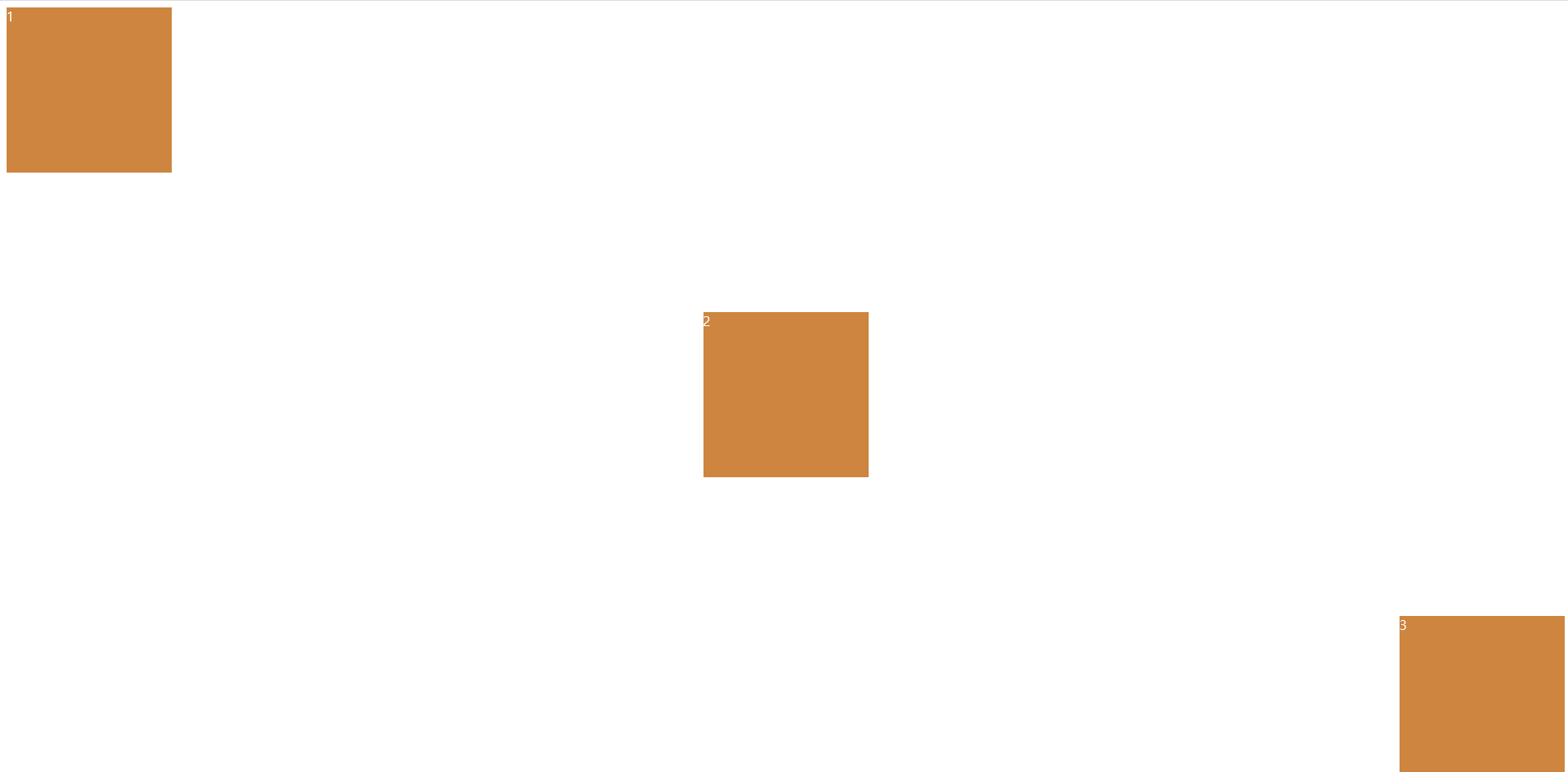
기억할 점 : align-items를 이용하려면, 부모의 height를 지정해주어야 적용된다.
flexbox는 width를 크게 신경쓰지 않는다. (width를 깨트려서라도 되게함)
cf. align-center: 개별 요소에 적용할 수 있는 또 다른 속성이다. 이 속성은 align-items가 사용하는 값들을 인자로 받으며, 그 값들은 지정한 요소에만 적용된다.
flex-wrap: nowrap / wrap
nowrap: 모든 요소들을 한 줄에 정렬한다.
wrap: 요소들을 여러 줄에 걸쳐 정렬한다.
wrap-reverse: 요소들을 여러 줄에 걸쳐 반대로 정렬한다.
flex-grow, flex-shrink (for 반응형 디자인)
: child에게 줄 수 있는 property이다.
: default 값은 0이다.
-
flex-shrink : 화면의 너비가 줄어들 때 특정 block이 다른 너비 배수로 줄어들게 하고 싶을 때 사용한다.
-
flex-grow : 화면의 남은너비를 해당 block이 모두 채우게 된다.
.child:nth-child(2) {
    background: black;
    flex-grow: 2;
}
위와 같이 하면 두번째 child class가 2배 더 줄어드는 것을 볼 수 있다.
.child:nth-child(2) {
    background: black;
    flex-grow: 1;
}
flex-flow
flex-flow: flex-direction과 flex-flow를 한꺼번에 쓰는 것이다.
ex.flex-flow: column wrap; (=>이런식으로 두가지 속성 나열)
flex-basis
flex-basis는 다른 flex 속성(flex-grow, flex-shrink)을 결정할때 기본(basis)가 되는 값이다.
참고자료
노마드 코더 CSSMasterclassflexbox froggy game:
flexbox froggy game: https://flexboxfroggy.com/#ko