여는 글
오늘은 CSS와 JS로 애니메이션을 구현할 때 중요하다고 생각하는 부분들에 대해 적어보려고 한다. 내가 오브젝트에 움직임을 자주 주는 만큼 이번 기회에 정리해보기로 했다.
내가 중요하다고 생각하는 부분 위주로 정리할 것이라서 기본적인 내용은 없을 수도 있다.
CSS Position
header {
  position: static; // default value.
  position: relative;
  position: absolete;
  position: fixed;
  position: sticky;
}
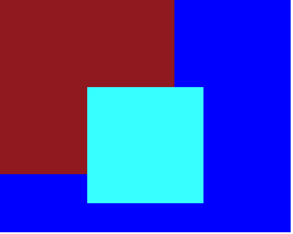
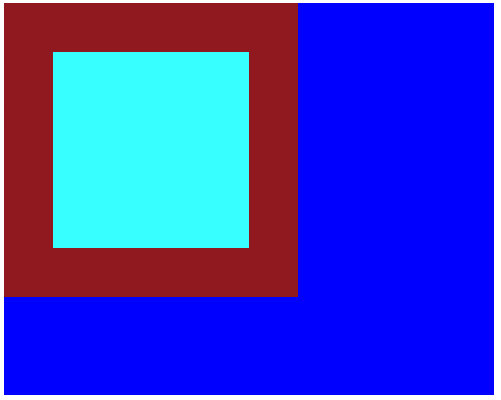
Position에 대한 설명을 위해 준비한 간단한 코드!
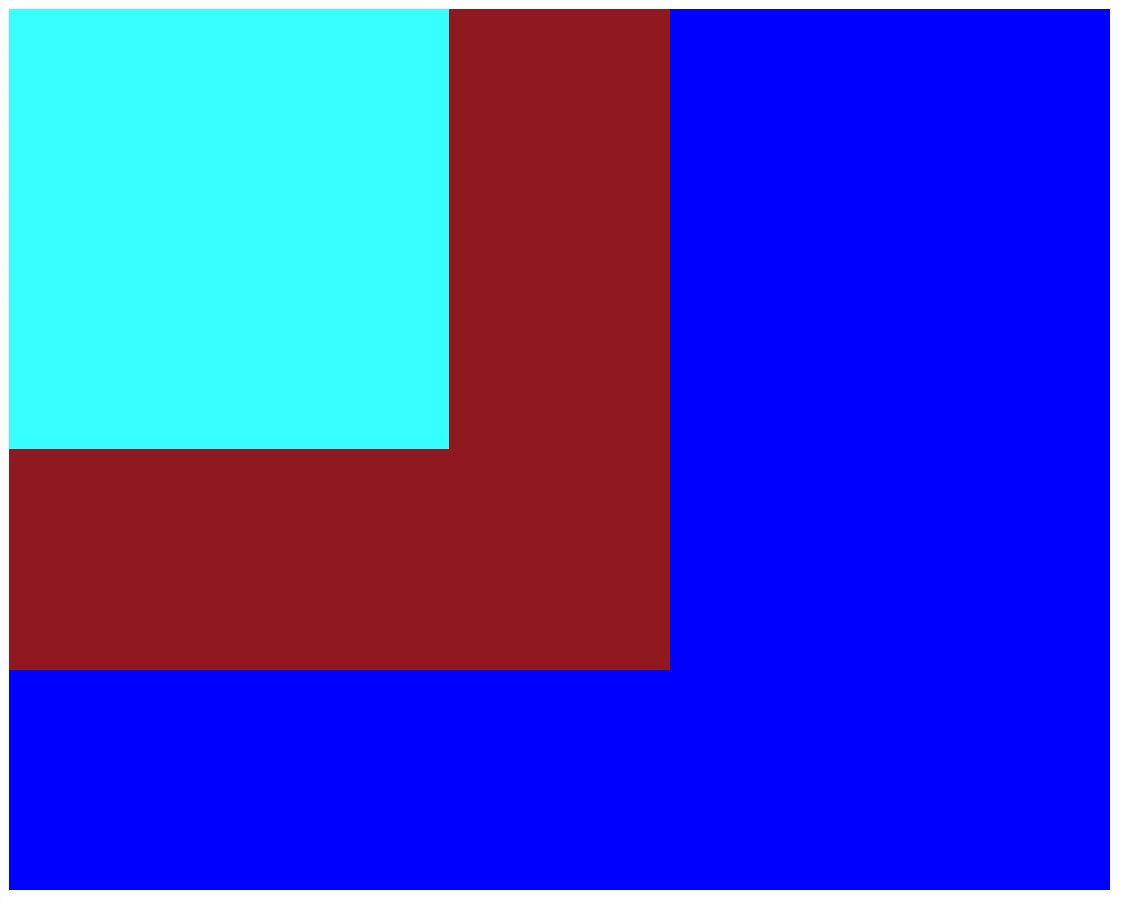
// HTML
<body>
    <div>
      <div class="large-box">
        <div class="medium-box">
          <div class="small-box"></div>
        </div>
      </div>
    </div>
  </body>
// CSS .large-box { width: 1000px; height: 800px; background-color: blue; } .medium-box { width: 600px; height: 600px; background-color: brown; } .small-box { width: 400px; height: 400px; background-color: aqua; }
1. absolute와 중앙 정렬.
header {
	position: absolute;
}
오브젝트들에 움직임을 주다보면 오브젝트를 겹쳐야 할 일이 있어서 position: absolute;를 자주 사용하고는 한다.
예시로써, 토스트가 튀어나오는 저 모션은 세 개의 오브젝트가 겹쳐져 있는 상태이다.
내가 position: absolute를 사용할 때마다 자주 쓰던 습관이 있는데, 그건 position: absolute; 상태인 object를 중앙정렬 시킬 때, left와 transform: translate() 속성을 쓰는 것이다.
가령, 나는 여기서 가장 작은 박스. 즉 small-box라는 class를 가진 박스를 position: absolute; 속성을 사용해서 옮기고 빨간색 배경을 가진 medium-box의 가운데에 두고 싶다고 하자. 그러면 우선 움직이고 싶은 대상인 small-box에게 position: absolute;를 설정해줄 것이다.
.small-box {
  position: absolute;
  width: 400px;
  height: 400px;
  background-color: aqua;
}

우리는 이 상태에서 top, bottom, right, left 등의 속성을 활용하여 상자를 움직일 수 있는데, 그 기준점은 부모 요소 중에서 가장 가까운 위치 지정 요소다. 즉 position에 static이 아닌 다른 속성을 들고 있는 요소들이다.
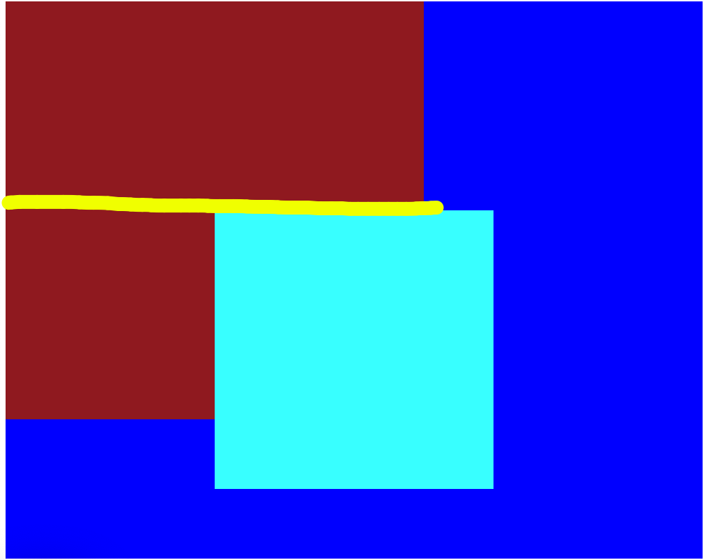
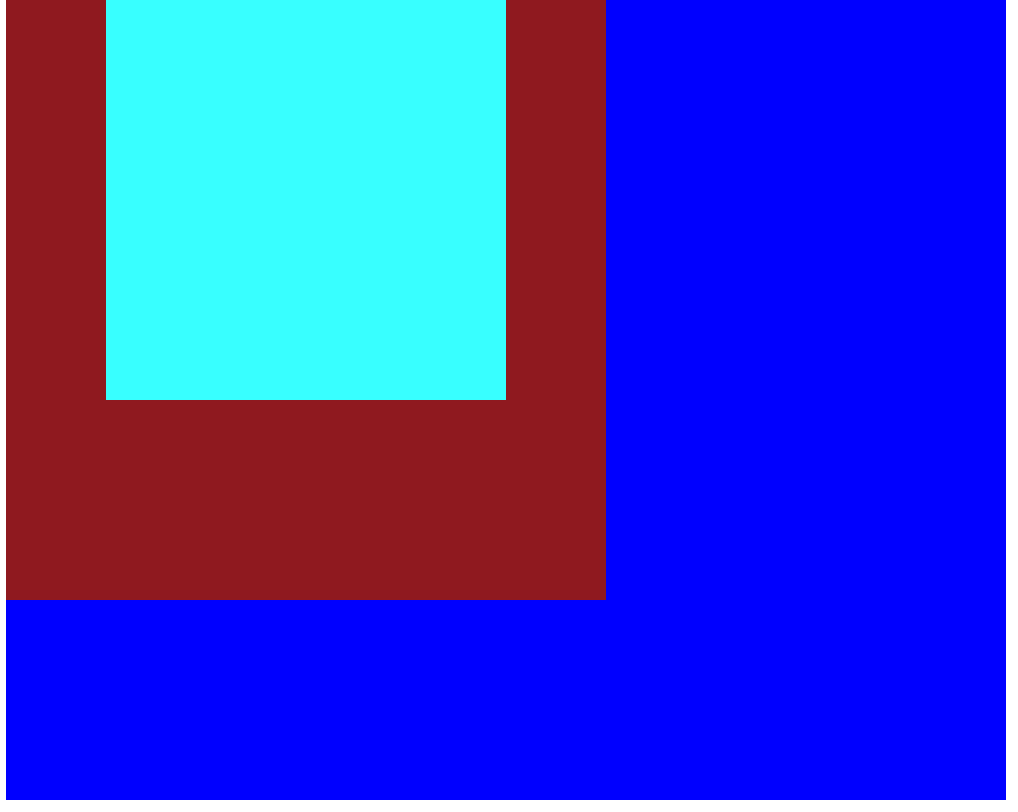
그렇다면 medium-box에 position: relative를 설정하고 left: 50%;와 top: 50%를 준다면 상자가 가운데로 가지 않을까?
.medium-box {
	position: relative;
  	width: 600px;
  	height: 600px;
  	background-color: brown;
}
.small-box {
    position: absolute;
    left:50%;
    top:50%;
    width: 400px;
    height: 400px;
    background-color: aqua;
}
결과를 확인해보면 빨간 상자를 완전히 벗어난 것을 볼 수 있다.
그 이유는 다음 사진을 보면 알 수 있는데,
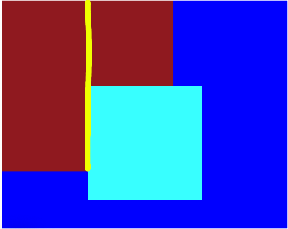
우리가 설정한 50%라는 값은 우리를 중앙으로 데려다 주는 것이 아니라, 해당 방향으로 우리를 부모 요소의 50% 만큼 밀어주는 밀어주는 것이기 때문이다. 그래서 우리는 transform: translate() 과 같은 속성을 함께 사용한다.
.small-box {
  position: absolute;
  left:50%;
  top:50%;
  transform: translate(-50%, -50%);
  width: 400px;
  height: 400px;
  background-color: aqua;
}
transform 속성 안에서는 다양한 값을 지정할 수 있는데, 그 중 translate은 자기 자신을 기준 삼아서 움직임을 준다. 위의 코드는 X와 Y축으로 각각 자기 몸집의 -50% 만큼 이동한다는 의미이다.
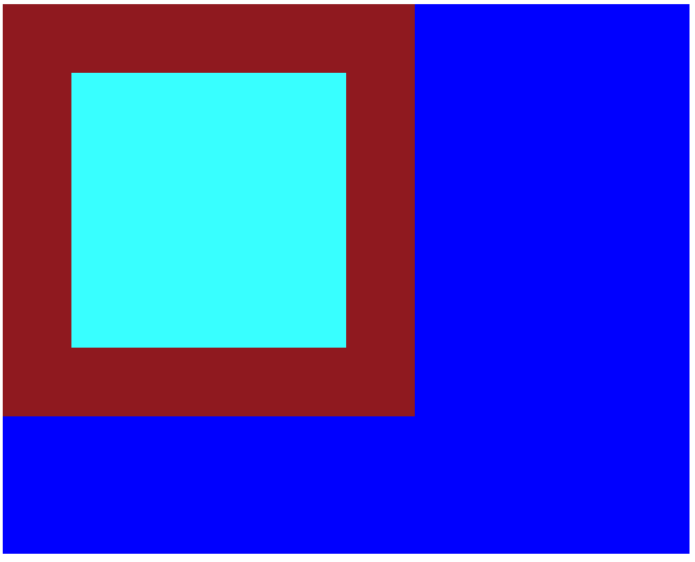
그러면 이렇게 중앙으로 이동시킬 수 있다.
그런데 그것 외에도 small-box의 위치에 영향을 주는 요인이 있는데, 그건 display 속성이다. display는 우리가 flex, grid 같은 속성으로 익숙할텐데 이번에는 flex를 써보도록 하자.
.large-box {
    width: 1000px;
    height: 800px;
    background-color: blue;
}
.medium-box {
    position: relative;
    width: 600px;
    height: 600px;
    background-color: brown;
}
.small-box {
    position: absolute;
    width: 400px;
    height: 400px;
    background-color: aqua;
}
다시 코드를 이와 같이 돌려놓고,
.medium-box {
    position: relative;
    display:flex;
    justify-content: center;
    align-items: center;
    width: 600px;
    height: 600px;
    background-color: brown;
}
medium-box에 위와 같이 중앙정렬을 위한 display: flex; 를 주면,
사진과 같이 small-box가 position: absolute; 상태에서도 flex 배치에 영향을 받아서 가운데에 떠 있는 모습을 볼 수 있다.
이 상태에서 top과 같은 이동 속성을 주면,
.small-box {
  position: absolute;
  top:0;
  width: 400px;
  height: 400px;
  background-color: aqua;
}
top으로 직접 속성에 값을 준 세로 정렬과 관련된 부분을 제외하고는 그대로 flex 배치의 영향을 받는 것을 볼 수 있다. 그래서 position: absolute; 상태에서 중앙 정렬이 필요할 경우 이런 방법을 활용해볼 수도 있다.