참고자료
SOCAR 컬러시스템 구축하기
- 디자인 시스템 구축을 경험해보자는 성격에서 시작한 작업이기 때문에 디자인 적인 내용보다는 이를 코드로 옮기는 것에 초점을 맞추었습니다. 비효율적인 코드나, 명암비가 라이트 / 다크모드에 적합하지 않을 수도 있지만 이는 추후에 수정해볼 예정입니다!
기존의 컬러시스템
export const color = {
	grey_100 : ''
  	grey_200 : ''
  	red_100 : ''
}
기존에는 이런 식으로 컬러를 지정해놓고, emotion 의 theme 을 이용하여 필요한 곳에서 사용하는 방식이었다
<div css={theme => ({color : theme.color.grey_100)}></div>물론 이 방법도 일관된 색상을 적용할 수 있지만, 다크 모드일 경우 어떤 색상을 할지 개발자가 일일이 대응해줘야 한다는 단점이 존재한다
컬러 시스템 업그레이드 하기
- 모든 색상들은 단순히 하나의 색상이 아닌,
light / dark모드일때의 색상을 모두 가지도록 변경하였다
export type Color = typeof color
//베이직 컬러 팔레트
//모든 컬러는 라이트/다크 대응이 되도록 만들기 - 시멘틱이던 베이직이던

export const color = {
  white: { light: "#FFFFFF", dark: "#FFFFFF" },
  blue_100: { light: "#E1F5FF", dark: "#0077C8" },
  blue_200: { light: "#7DD5FF", dark: "#00A9FF" },
  blue_300: { light: "#0C356A", dark: "#0C356A" },

  red_100: { light: "#FFEEF1", dark: "#D73F2F" },
  red_200: { light: "#FF6F61", dark: "#FF6557" },
  red_300: { light: "#E45141", dark: "#FFD3D6" },

  grey_100: { light: "#FEFEFE", dark: "#121212" },
  grey_200: { light: "#F7F8F9", dark: "#2E363A" },
  grey_300: { light: "#646F6C", dark: "#999FA4" },
  grey_400: { light: "#374553", dark: "#C5C8CE" },
  grey_500: { light: "#161D24", dark: "#FDFDFD" },
} as const
그러면 이제 blue_100 을 적용했을 때, 이 색상이 다크모드 일 경우 어떤 색상으로 변하는지 신경쓰지 않아도 자동으로 적용되게 된다
as const를 사용해야 IDE에서 미리보기가 가능해진다
- 시멘틱 컬러 도입하기
이제 다크모드에 대해서 신경쓰지 않아도 되지만, 결국 어떤 색상을 사용해야 하는지에 대해서는 개발자가 고민을 해야 한다는 단점이 남아있다
예를 들어 에러메시지를 표시해야 할 경우, red_100 을 사용할지 200 을 사용해야 할지를 고민해야 한다는 것이다(피그마 같은 툴을 사용한다면 이미 표시가 되어있을 것 같긴 하다..)
이런 고민을 해결해주는 것이 시멘틱 컬러라고 생각한다
명도에 따라 분류된 색상이 아닌, 컬러가 사용되는 목적에 따라 분류된 컬러 시스템을 시멘틱 컬러 시스템이라고 하고, 이를 통해 더욱 효과적인 다크모드 구현이 가능하다
const semanticTheme = {
  bg_main: { light: theme.color.white.light, dark: theme.color.grey_100.dark },
  bg_elevated: {
    light: theme.color.white.light,
    dark: theme.color.grey_200.dark,
  },
  border_basic: {
    light: theme.color.grey_300.light,
    dark: theme.color.grey_200.dark,
  },
  border_basic2: {
    light: theme.color.grey_300.light,
    dark: "none",
  },
  text_primary: {
    light: theme.color.grey_400.light,
    dark: theme.color.grey_400.dark,
  },
  text_secondary: {
    light: theme.color.grey_400.light,
    dark: theme.color.grey_500.dark,
  },
  text_danger: {
    light: theme.color.red_200.light,
    dark: theme.color.red_300.dark,
  },
} as const
시멘틱 컬러라고 해서 아예 새로운 색상이 아니라, 기존의 베이직 컬러를 기반으로 의미만 부여한 색상이라고 생각하면 된다
이제 예를 들어 에러 메시지를 띄워야 된다고 하면,
기존에는 red_100 이라는 색상을 사용했다고 한다면, 이제는 text_danger 을 사용하면 되는 것이다
css 변수로 등록하기
다크 모드 적용 방법은 여러가지가 있지만, 나는 css 변수로 등록해놓는 방법을 선택했다
그리고 사실 시멘틱 컬러만 사용하는 것이 더 좋을 것 같지만, 아직 어떠한 색상들을 시멘틱 컬러로 더 추가해야할지 정하지 못해서 베이직 컬러+시멘틱 컬러를 둘 다 사용하기로 결정했다
코드는 벨로그의 다크모드 적용기 포스트 를 참고했다
type ThemeVariables = Color & typeof semanticTheme

const palette = Object.assign(color, semanticTheme)
//베이직 컬러(color)와 시멘틱 컬러 합치기

type ThemeMode = "light" | "dark"
type VariableKey = keyof ThemeVariables
type TPalette = Record<VariableKey, { light: string; dark: string }>


const buildColorCssVariables = (palette: TPalette) => {
  const cssVariables: Record<ThemeMode, string> = {
    light: "",
    dark: "",
  }
  Object.keys(cssVariables).forEach((str) => {
    Object.entries(palette).forEach(([key, value]) => {
      const mode = str as ThemeMode
      const cssVarName = `--${key.replace(/_/g, "-")}`
      const cssVarValue = value[mode]
      cssVariables[mode] += `${cssVarName}: ${cssVarValue};\n`
    })
  })
  return cssVariables
}
css 변수 네이밍 규칙은 --으로 시작하면서, 중간에 -를 사용하는 것이기 때문에 기존에 text_primary 라는 key값이 있다면 이를 --text-primary 으로 바꿔주는 로직을 추가했다.
그래서 최종적으로 리턴된 값은
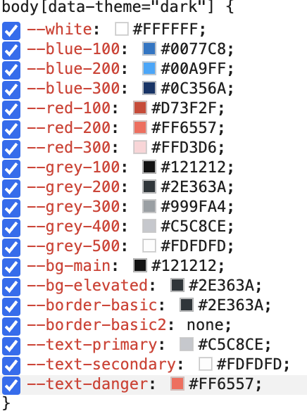
{
dark :
"--white: #FFFFFF;\n--blue-100: #0077C8;\n--blue-200: #00A9FF;\n--blue-300: #0C356A;\n--red-100: #D73F2F;\n--red-200: #FF6557;\n--red-300: #FFD3D6;\n--grey-100: #121212;\n--grey-200: #2E363A;\n--grey-300: #999FA4;\n--grey-400: #C5C8CE;\n--grey-500: #FDFDFD;\n--bg-main: #121212;\n--bg-elevated: #2E363A;\n--border-basic: #2E363A;\n--border-basic2: none;\n--text-primary: #C5C8CE;\n--text-secondary: #FDFDFD;\n--text-danger: #FF6557;\n",
light:
"--white: #FFFFFF;\n--blue-100: #E1F5FF;\n--blue-200: #7DD5FF;\n--blue-300
}
이런 식으로 light / dark라는 key를 가진 하나의 객체이고, 각 value들은 css 변수로 들어갈 string이다
이를 이제 globalStyle에 적용해주면 된다(emotion 사용중)
body {
    ${themeMode.light};
  }

  body[data-theme="light"] {
    ${themeMode.light};
  }

  body[data-theme="dark"] {
    ${themeMode.dark};
  }

  @media (prefers-color-scheme: dark) {
    body {
      ${themeMode.dark}
    }
  }
이제 색상을 사용할 경우 var(--text-danger) 이런식으로 사용하면 되는데, 매번 이런식으로 사용하기는 너무 불편하다
const cssVar = (name: string) => `var(--${name.replace(/_/g, "-")})`

const variableKeys = Object.keys(palette) as VariableKey[]

export const colorPalette: Record<VariableKey, string> = variableKeys.reduce(
  (acc, current) => {
    acc[current] = cssVar(current)
    return acc
  },
  {} as Record<VariableKey, string>,
)
key가 text-danger 이면 value는 var(--text-danger) 이라는 문자열이 저장되어 있는 하나의 객체가 생성된다
<p style={{color : colorPalette['text-danger']}}/>