Styled components
React에 스타일 적용
그냥 css 쓰면 되잖아..?
상관은 없다. 그냥 css 파일 써도 된다.
하지만 특정 컴포넌트에만 적용되기 위한 css를 별도로 작성할 필요는 있다.
예를 들어 app.jsx 내부에 Example 컴포넌트가 들어있다고 치자 Example 내부에는main_text클래스를 가진 p태그가 존재하고 app.jsx 에도 마찬가지로 main_text 클래스를 가진 p tag가 존재한다.
import React from 'react'

function Example() {
    return (
        <div>
            <p className="main_text">잘가요!</p>
        </div>
    )
}

export default Example
import './App.css'
import Example from './components/Example'

function App() {
    return (
        <div>
            <p className="main_text">안녕하세요</p>
            <Example />
        </div>
    )
}

export default App
여기서 app.css에
.main_text {
    color: blue;
}
이런식으로 텍스트의 색을 변경하면 둘다 적용된 모습을 볼수 있다.

같은 클래스는 맞지만, 그래도 서로 다르게 적용하고 싶다면? styled components를 사용하는 것이다.
다양한 컴포넌트 활용을 위해서 vite.config.js 에 아래와 같이 수정한다.
import { defineConfig } from 'vite'
import react from '@vitejs/plugin-react'
import * as path from 'path';

// https://vitejs.dev/config/
export default defineConfig({
  plugins: [react()],
  resolve: { // @ 라는 별칭을 활용해서 컴포넌트 등을 import 할 수 있게 함
    alias: {
      '@': path.resolve(__dirname, './src'),
    },
  },
  server: { // port 설정
    port: 3000,
  },
})
SCSS로 스타일 적ㅇ요해보기
scss?
scss 는 css 의 확장 언어라고 생각하면 된다. 기존 css 와는 다르게 변수 할당, 중첩 구문, 모듈화 등의 기능을 추가적으로 가지고 있습니다.
-
변수 할당
변수를 선언하듯이 값을 지정하고 사용할수 있다.@main-color: #fff; body { color: @main-color; } -
중첩 구문
선택자 간의 nesting이 가능하다
아래와 같이 작성하면 body 내부의 자손p 태그에 대해서만 스타일이 적용된다.$main-color: #ffffff; body { p { color: $main-color; } }
두 선택자가 함께 적용되는 경우에 대해서 스타일을 적용하고자 한다면, 아래처럼 &를 통해서 선택자를 명시해주면된다.
$main-color: #ffffff;
body {
	p {
		color: $main-color;
	}
}- mixin
@mixin과 @include를 사용하면 특정스타일을 그룹단위로 선언하고, 선택자에 지정해줄수 있다.
마치 여러 스타일 구문을 하나의 변수로 선언하는 것과 비슷하다고 생각하면된다.
main-color: #ffffff;

@mixin normal-btn {
  border: 1px solid gray;
  background-color: black;
}

.Button {
  @include normal-btn
}
이 외에도 다양한 연산자, 함수, 다양한 문법은 아래 링크를 참고할것
https://sass-lang.com/documentation/
적용해보기
1.sass 모듈 설치
yarn add sass
이제 버튼 컴포넌트를 생성하고 그에 대응되는 button.scss 파일을 만들어보자.
Button.jsx
import React from 'react'
import '../styles/Button.scss'

function Button({size}) {
  return (
    <button className={`Button ${size}`}>
      <p>버튼</p>
    </button>
  )
}

export default Button
Button.scss
$main-color: #3d3dff;
.Button {
// 버튼에 먹여진 속성 제거
outline: none;
border: none;
// 내부 요소 정렬
display: flex;
align-items: center;
justify-content: center;
// 색상/테두리 스타일 적용
background-color: $main-color;
border-radius: 10px;
color: white;
// 여백 적용
margin: 10px;
// 아래 부분 추가
&.large {
width: 140px;
height: 70px;
font-size: 24px;
}
&.medium {
width: 120px;
height: 60px;
font-size: 20px;
}
&.small {
width: 100px;
height: 50px;
font-size: 16px;
}
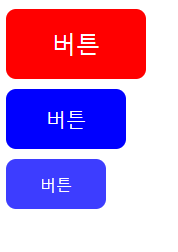
}버튼의 기본 스타일 속성을 설정하고 Button 뒤에 다른 클래스가 있다면 그에대한 스타일 속성을 따로 적용시켰다. (large, medium, small)
App.jsx에서 size를 props 로 받아와서 값에 따른 각기 다른 스타일의 버튼을 렌더링 할수 있다.
이런식으로 크기의 값을 Button 컴포넌트에 적용시키면?
import Button from './components/Button'

function App() {
  return (
    <div>
      <Button size="large" />
      <Button size="medium" />
      <Button size="small" />
    </div>
  )
}

export default App
이렇게 같은 컴포넌트를 사용했지만 사이즈가 다른 버튼을 만들수 있다.
여기에 믹스인 까지 사용해서 자주 사용하는 구문을 mixin형태로 선언해놓고 스타일을 작성한다면 더 효율적인 스타일 작성이 가능해진다.
$main-color: #3d3dff;

// 아래 스타일은 자주 사용되므로 하나의 그룹으로 선언
@mixin flex-center {
  display: flex;
  align-items: center;
  justify-content: center;
}

.Button {
  // 버튼에 먹여진 속성 제거
  outline: none;
  border: none;

  // flex-center mixin 사용
  @include flex-center;

  // 색상/테두리 스타일 적용
  background-color: $main-color;
  border-radius: 10px;
  color: white;

  // 여백 적용
  margin: 10px;

  // & 연산자 사용
  &.large {
    width: 140px;
    height: 70px;
    font-size: 24px;
  }

  &.medium {
    width: 120px;
    height: 60px;
    font-size: 20px;
  }

  &.small {
    width: 100px;
    height: 50px;
    font-size: 16px;
  }
}
여기에 색깔 props를 추가해서 색깔도 바꾸고 싶다면 이렇게 하면 된다. App의 props에 color를 추가하고 color 값을 className에 추가한다.
마지막으로 color 값에 따른 클래스가 존재할때의 스타일 속성을 추가해주면 된다.
import Button from './components/Button'

function App() {
    return (
        <div>
            <Button size="large" color="red" />
            <Button size="medium" color="blue" />
            <Button size="small" />
        </div>
    )
}

export default App
import React from 'react'
import '../styles/Button.scss'

function Button({ size, color }) {
    return (
        <button className={`Button ${color} ${size}`}>
            <p>버튼</p>
        </button>
    )
}

export default Button
 &.red {
        background-color: $red;
    }

    &.blue {
        background-color: $blue;
    }
여기서 더 나아가서 click 이벤트까지 추가하고 싶다면 어떻게 할까?
App 컴포넌트의 Button 컴포넌트에 onClick props를 추가로 작성하고 Button 컴포넌트에는 읽어오는 props 파라미터에 ...rest를 추가한다. 해당 코드를 추가하면 특정 props를 제외한 나머지 props 들을 전부 가져오는 것이다.
<Button size="large" color="red" onClick={() => alert('행복한 하루')} />function Button({ size, color, ...rest }) {
return (
<button className={`Button ${color} ${size}`} {...rest}>
<p>버튼</p>
</button>
)
}CSS Module로 스타일 적용해보기
CSS module의 특징
- 클래스 명마다 고유값을 부여해서 클래스가 중복되는 것을 방지
- 컴포넌트 단위로 스타일 적용이 가능하다.
CSS module 의 경우 사용하기 위해서는 css-loader가 필요한데, vite로 리액트 프로젝트를 만들면 기본적으로 설정이 되어있다.
styles 경로에 Button.module.css를 생성해서 코드를 작성한다.
.Button {
    outline: none;
    border: none;

    display: flex;
    align-items: center;
    justify-content: center;

    background-color: #3d3dff;
    border-radius: 10px;
    color: white;
    width: 100px;

    margin: 10px;
}
css module의 경우 scss와 같은 문법은 사용할 수 없고, 기본 css 문법을 사용해야 한다.
불러온이름. 클래스이름의 형태로 className에 지정을 해주면 된다.
import React from 'react'
import style from '@/styles/Button.module.css'

function Button({ size, color }) {
    return (
        <button className={style.Button}>
            <p>버튼</p>
        </button>
    )
}

export default Button
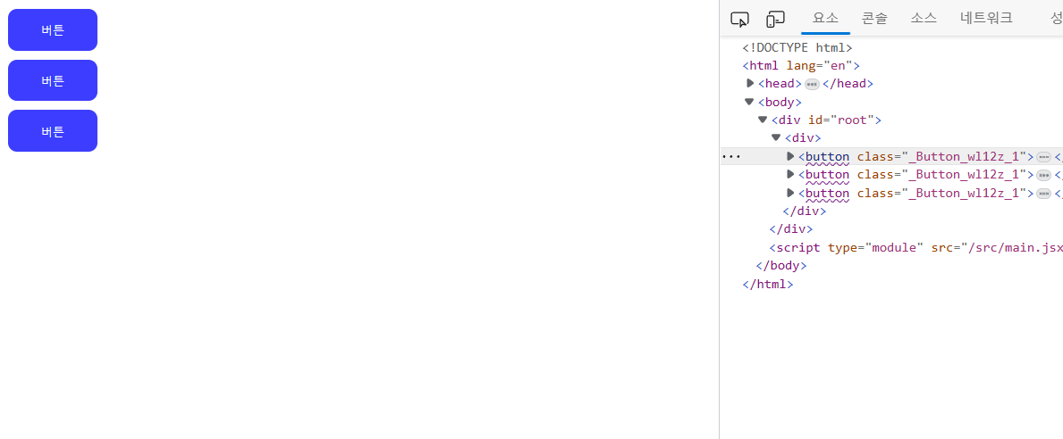
우측의 콘솔 요소를 보면 클래스 이름에 고유 값이 붙어있는 것을 알 수 있다.
css module 의 경우, 특별한 문법이 있는 것은 아니다. 다만 사용하는 과정에 있어서 클래스 이름을 훨씬 더 편하게 지을 수 있다는 장점이 있을 뿐이다.
styled-components로 스타일 적용해보기
styled-components는 말그대로 스타일이 적용된 컴포넌트를 만들수 있게 해주는 모듈을 말한다.
제공 기능
- 테마 설정
- 글로벌 스타일 생성
- props 활용
yarn add styled-components
위 명령어를 입력하여 styled-components를 설치
vscode 확장기능에서vscode-styled-components를 검색하여 설치한다(styled-components 관련 코드 자동완성)
Component 폴더 내부에 컴포넌트 이름 폴더를 만들고 index.jsx와 style.js를 생성한다
import React from 'react'
import * as S from './style'
// 1. jsx 컴포넌트와 구별짓기 위해서 (충돌 방지)

// 2. 가독성
function Button() {
    return (
        <S.Button>
            <p>버튼</p>
        </S.Button>
    )
}

export default Button
import styled from 'styled-components'

export const Button = styled.button`
    outline: none;
    border: none;

    display: flex;
    align-items: center;
    justify-content: center;

    background-color: #3d3dff;
    border-radius: 10px;
    color: white;
    width: 100px;

    margin: 10px;
`
css코드가 작성된 style.js를 import 해서 index.jsx 에서 사용하는 모습이다.
만약 컴포넌트가 너무 많아진다면components 폴더 내부에 index.js 파일을 생성해서 export 관리를 해주면 된다.
components/index.js
import Button from './Button'

export { Button }
이렇게 해주면 App.jsx 에서 Button을 불러올때 좀더 간략한 경로로 불러올수 있게 된다.
@/components
import { Button } from '@/components'

function App() {
    return (
        <div>
            <Button />
        </div>
    )
}

export default App
props 활용하기
styled-components는 props를 받을수 있다는 특징을 가지고 있다.
background-color: ${(props) => props.color || 'blue'};
Button/index.jsx
import React from 'react'
import * as S from './style'

function Button() {
    return (
        <S.Button color="red">
            <p>버튼</p>
        </S.Button>
    )
}

export default Button
이렇게 props를 추가하고 style.js의 Button 스타일의 background-color에
background-color: ${(props) => props.color || 'blue'};이런식으로 작성한다. 만약 props가 없다면 기본값을 blue로 지정한다는 뜻이다.
themeprovider 활용하기
앱 전체에서 공통된 스타일 값을 쓸 수 있또록 도와주는 역할을 담당한다.
앱마다 특정한 색상 팔레트를 정해놓고 해당 팔레트 안에서 요소들의 색을 지정하게 되는데,그런 색상을 미리 통일시켜놓고, 해당 색상만을 사용하도록 하는 것이다.
style/theme.js 파일을 만들어서 아래처럼 작성한다.
const palette = {
  orange: '#FFA500',
  black: '#000000',
}

const common = {
    flexCenter: `
        display: flex;
        justify-content: center;
        align-items: center;
    `,
}

const theme = {
  palette,common
}

export default theme
app.jsx는 아래처럼 작성한다.
import { ThemeProvider } from 'styled-components'
import theme from './styles/theme'
import Button from './components/Button'

function App() {
  return (
    <ThemeProvider theme={theme}>
      <Button />
    </ThemeProvider>
  )
}

export default App
그러면 이제 style.js에
import styled from 'styled-components'

export const Button = styled.button`
    outline: none;
    border: none;

    ${({ theme }) => theme.common.flexCenter}
    background-color: ${(theme) => theme.palette.orrange };
    border-radius: 10px;
    color: white;
    width: 100px;

    margin: 10px;
`
Button/index.jsx 에 theme.js에 작성한 내용들이 적용된다.
keyframes 활용하기
animation을 만들고 싶드면 아래처럼 keyframes를 만들기 위한 함수를 불러와서 사용하면 된다.
import styled, { keyframes } from 'styled-components'import styled, { keyframes } from 'styled-components'
const fadeIn = keyframes`
from {
opacity: 0
}
to {
opacity: 1
}
`
export const Button = styled.button`
outline: none;
border: none;
${({ theme }) => theme.common.flexCenter}
background-color: ${({ theme }) => theme.palette.orange};
border-radius: 10px;
color: white;
width: 100px;
margin: 10px;
&:hover {
opacity: 0.5;
}
animation-name: ${fadeIn};
animation-duration: 1s;
animation-timing-function: ease-out;
`이렇게 해주면 서서히 버튼이 나타나게 된다.
globalstyle 활용해서 폰트 추가하기
앱 전체에 적용하고자 하는 속성이 있다면 createGlobalStyle을 통해서 스타일 컴포넌트를 만들고 해당 컴포넌트를 앱 전체에 적용한다.
보톤은 앱 전체에서 사용하기 위한 폰트를 적용하고 싶다면 폰트 파일을 설치해서 assets/fonts에 파일을 넣어준다.
NotoSansKR-Bold.otf 파일을 받아서 넣었고
style 폴더 안에 globalStyle을 만들고 작성한다.
import { createGlobalStyle } from 'styled-components'
import NotoSansBold from '../assets/fonts/NotoSansKR-Bold.otf'

export default createGlobalStyle`
    @font-face {
        font-family: "NotoSansBold";
        src: url(${NotoSansBold}) format('opentype');
    }
`
폰트 파일 확정자에 따라서 format에 들어가는 값이 다르다!
otf → opentype
ttf → truetype
woff → woff
이제 이렇게 작성을 했으면 app.js에서 ThemeProvider 안에 GlobalStyle을 추가한다.
App.jsx
import { ThemeProvider } from 'styled-components'
import theme from './styles/theme'
import Button from './components/Button'
import GlobalStyle from './styles/globalStyle'

function App() {
  return (
    <ThemeProvider theme={theme}>
      <GlobalStyle />
      <Button />
    </ThemeProvider>
  )
}

export default App
이제 마지막으로 버튼 스타일에 font-family를 설정하면 된다.
components/Button/style.js
font-family: 'NotosansBold';이렇게 하면 폰트가 변경된다.
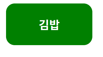
버튼을 클릭하면 색상과 텍스트가 변경되는 버튼을 만들어보자
- isClicked 라는 state 생성
- styled-components의 색상이 isClicked 에 따라서 배경색이 달라지게 구현
- 버튼을 누르면 isClicked 의값이 바뀌도록 구현
Button/index.jsx
import React, { useState } from 'react'
import * as S from './style'

function Button() {
  const [isClicked, setIsClicked] = useState(false)

  return (
    <S.Button isClicked={isClicked} onClick={() => setIsClicked(!isClicked)}>
      {isClicked ? <p>Good!</p> : <p>Nice!</p>}
    </S.Button>
  )
}

export default Button
Button/style.js
background-color: ${({ isClicked }) => (isClicked ? 'orange' : 'violet')};