
Grid (display : grid)
- Container(컨테이너)와 Item(아이템)이라는 두 가지 개념으로 구분된다.
- Container는 Items를 감싸는 부모 요소이며, 그 안에서 각 Item을 배치할 수 있다.
Grid container 속성 (부모 속성)
- grid-template-row :행(Track)의 크기를 정의
- grid-template-columns: 열(Track)의 크기를 정의
- grid-template-areas : 영역 이름을 참조해 템플릿 생성
- grid-template : grid-template-xxx의 단축 속성
- row-gap(grid-row-gap) :행과 행 사이의 간격(Line)을 정의
- column-gap(grid-column-gap): 열과 열 사이의 간격(Line)을 정의
- gap(grid-gap) : xxx-gap의 단축 속성
- grid : grid-template-xxx과 grid-auto-xxx의 단축 속성
- align-content : 그리드 콘텐츠(Grid Contents)를 수직(열 축) 정렬
- justify-content : 그리드 콘텐츠를 수평(행 축) 정렬
- align-items 그리드 아이템(Items)들을 수직(열 축) 정렬
- justify-items 그리드 아이템들을 수평(행 축) 정렬
Grid item 속성 (자식 속성)
- grid-row-start :그리드 아이템(Item)의 행 시작 위치 지정
- grid-row-end :그리드 아이템의 행 끝 위치 지정
- grid-row :grid-row-xxx의 단축 속성(행 시작/끝 위치)
- grid-column-start :그리드 아이템의 열 시작 위치 지정
- grid-column-end :그리드 아이템의 열 끝 위치 지정
- grid-column : grid-column-xxx의 단축 속성(열 시작/끝 위치)
- grid-area :영역 이름을 설정하거나, grid-row와 grid-column의 단축 속성
- align-self :단일 그리드 아이템을 수직(열 축) 정렬
- justify-self : 단일 그리드 아이템을 수평(행 축) 정렬
- order : 그리드 아이템의 배치 순서를 지정
- z-index : 그리드 아이템의 쌓이는 순서를 지정
grid-template-xxx속성
grid-template-row
grid-template-columns
grid-template-areas
grid-template
grid-template-columns: auto 200px 300px;
이렇게 하면 오른쪽 200px, 300px 먼저 할당되고 남은 부분 자동 할당
auto 는 컨텐츠 높이 만큼 잡아줌
grid-template-columns: 1fr 2fr 3fr 4fr; 처럼 fr 로도 설정 가능
(fr = fraction)
grid-template-rows: 100px 200px
grid-template-rows: 1fr 2fr; 도 마찬가지
grid: row /coulmn
grid 하나로 행,열 다 조절 가능
grid: 100px 50px/ 1fr 2fr 3fr; 처럼 쓴다. 왼쪽이 행, 오른쪽이 열
gap속성 : 간격조절 가능
row-gap(grid-row-gap) :행과 행 사이의 간격(Line)을 정의
column-gap(grid-column-gap): 열과 열 사이의 간격(Line)을 정의
gap(grid-gap) : xxx-gap의 단축 속성
column-gap: 30px;
row-gap: 70px; 처럼 쓴다
 .container { border: 5px solid black;
             display: inline-grid;
             grid-template-columns: 1fr 2fr 3fr 4fr;
             width: 100%;
            column-gap: 30px;
            row-gap: 70px;
를 실행하면
된다. 4열(1fr 2fr 3fr 4fr) 하고 열의 간격은 30px, 행의 간격은 70px 이다~~
정렬속성 (justify-items / align-items)
align-content : 그리드 콘텐츠(Grid Contents)를 수직(열 축) 정렬
justify-content : 그리드 콘텐츠를 수평(행 축) 정렬
align-items : 그리드 아이템(Items)들을 수직(열 축) 정렬
-------------->start, center, end, stretch
justify-items : 그리드 아이템들을 수평(행 축) 정렬
-------------->start, center, end, stretch
.container { border: 5px solid #000; width: 900px; height: 300px;
background-color: aquamarine;
display: grid; grid-template-columns: 1fr 1fr;}

.container>div {width: 100px; height: 100px; background-color: seagreen;}

.container1 {justify-items: center;
             align-items: center;}
.container2 {justify-items: end;
             align-items: end;}
를 실행하면
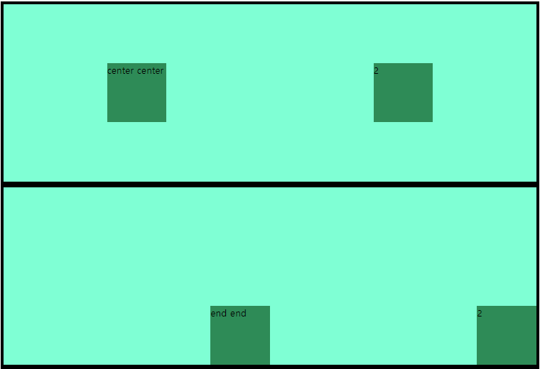
이 된다.
위에는 justify-items : center ; align-items : center 해서 둘 다 가운데, 아래는 둘 다 end end 해서 각각 div의 끝에 정렬됨
align-self/justify-self
align-self :단일 그리드 아이템을 수직(열 축) 정렬
----------->normal /start / center / end/ stretch
justify-self : 단일 그리드 아이템을 수평(행 축) 정렬
----------->normal /start / center / end/ stretch
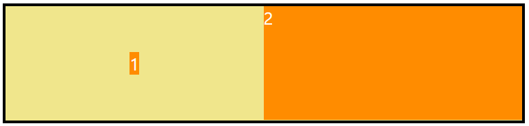
의 코드
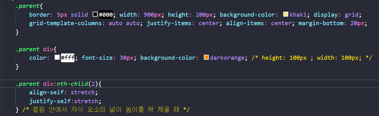
.parent{
	border: 5px solid #000; width: 900px; height: 200px;
	background-color: khaki; display: grid;
	grid-template-columns: auto auto;

 	justify-items: center;
	align-items: center;}

.parent div:nth-child(2){ //2번 div
	align-self: stretch;
   justify-self:stretch;}
   /* 컬럼 안에서 자식 요소의 넓이 높이를 꽉 채울 때
   align-self와 justify-self 다 stretch준다 */
grid-coulumn/row/area 속성
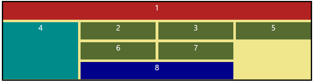
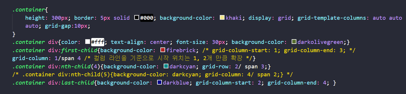
.container{height: 300px; border: 5px solid #000; background-color: khaki;
display: grid; grid-template-columns: auto auto auto; grid-gap:10px;}

.container div:first-child{background-color: firebrick;
	grid-column: 1/span 4 /* 컬럼 라인을 기준으로 시작 위치는 1, 4개 만큼 확장 */}

.container div:nth-child(4){background-color: darkcyan; grid-row: 2/ span 3;}
//2번에서 시작해서 3칸 차지

.container div:last-child{background-color: darkblue;
	grid-column-start: 2; grid-column-end: 4; }
    //2번 행에서 시작해서 4번행에서 끝난다.
grid-column-start: 1; grid-column-end: 3;처럼 start와 end 를 각각 지정해 줄 수 있고, grid-column: 1/span 4 처럼 span으로 얼마만큼 확장할지 쓸 수 있다.
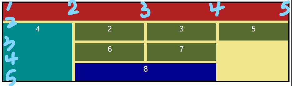
행, 열 위치는 1번부터 왼->오, 위->아래로 이어짐
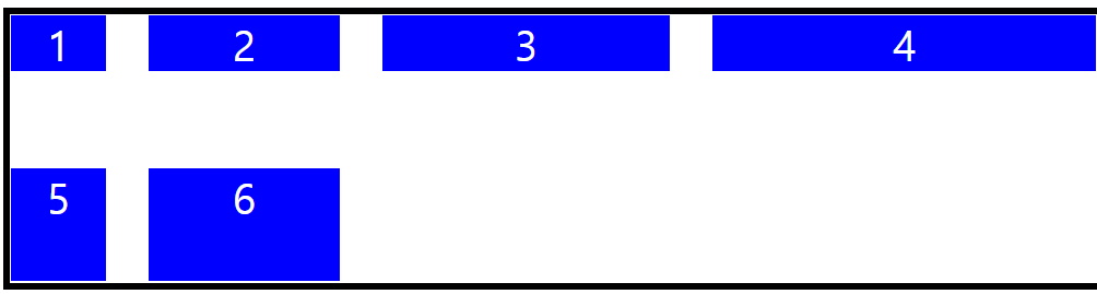
grid 실습
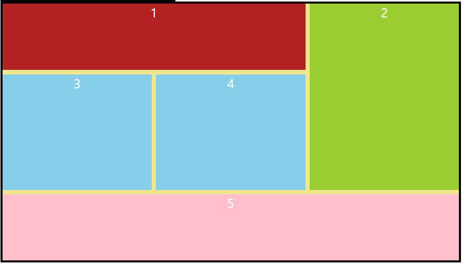
.container{width: 800; height: 600px; background-color: khaki; display:grid;
grid-template-columns: auto auto auto; grid-gap:10px;border: 5px solid #000;}
.container div{background-color: firebrick;color: white; font-size: 30px; text-align: center;}
.container div:first-child{grid-column-start: 1; grid-column-end: 3;}
.container div:nth-child(2){grid-column:3/span 1;grid-row: 1 /span 3;
background-color: yellowgreen;}
.container div:nth-child(3){grid-row: 2/ span 2;
background-color:  skyblue;}
.container div:nth-child(4){grid-row: 2/ span 2;
background-color:  skyblue;}
.container div:last-child{grid-column-start: 1; grid-column-end: 4;
background-color: pink;}
grid-area
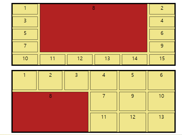
(위)container2 (아래)container3
.container2{background-color: khaki; display: grid; grid-template-columns: auto auto auto auto auto auto;
grid-gap:10px;width: 800px;height: 300px; margin: auto; margin-top: 20px; border: 5px solid #000; text-align: center; font-size: 25px;}
.container2 div{border: 1px solid #000;}
.container2 .item{background-color: firebrick; grid-column: 2 /span 4; grid-row:1 /span 4;
/* grid-area: 시작가로/시작세로/끝 가로/끝 세로; */ grid-area: 1/2/5/6;}


.container3{background-color: khaki; display: grid; grid-template-columns: auto auto auto auto auto auto;
 grid-gap:10px;width: 800px;height: 300px; margin: auto; margin-top: 20px; border: 5px solid #000; text-align: center; font-size: 25px;}
.container3 div{border: 1px solid #000;}
.container3 .item{grid-area:2/1/4/4;background-color: firebrick;}
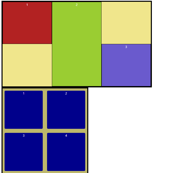
(위) container5 (아래) container4
grid-area : n/n/n/n 시작과 끝의 대각선 좌표
.container4{width: 400px; height: 400px; background-color: darkkhaki;
border: 5px solid #000; display: grid;}
.container4 div{color: #fff; text-align: center; margin: 10px;
border-radius: 5px; background-color: darkblue;}
.container4 div:nth-child(1){grid-area: 1/1/2/2}
.container4 div:nth-child(2){grid-area: 1/2/2/3}
.container4 div:nth-child(3){grid-area: 2/1/3/2}
.container4 div:nth-child(4){grid-area: 2/2/3/3}

.container5{width: 700px; height: 400px; background-color: khaki; border: 5px solid #000; display: grid;}
.container5 div{color: #fff; text-align: center; border: 1px solid #000;}
.container5 div:nth-child(1){grid-area: 1/1/2/2;background-color: firebrick;}
.container5 div:nth-child(2){grid-area: 1/2/3/3;background-color: yellowgreen;z-index: 1;}
.container5 div:nth-child(3){grid-area: 2/3/3/4;background-color: slateblue;}