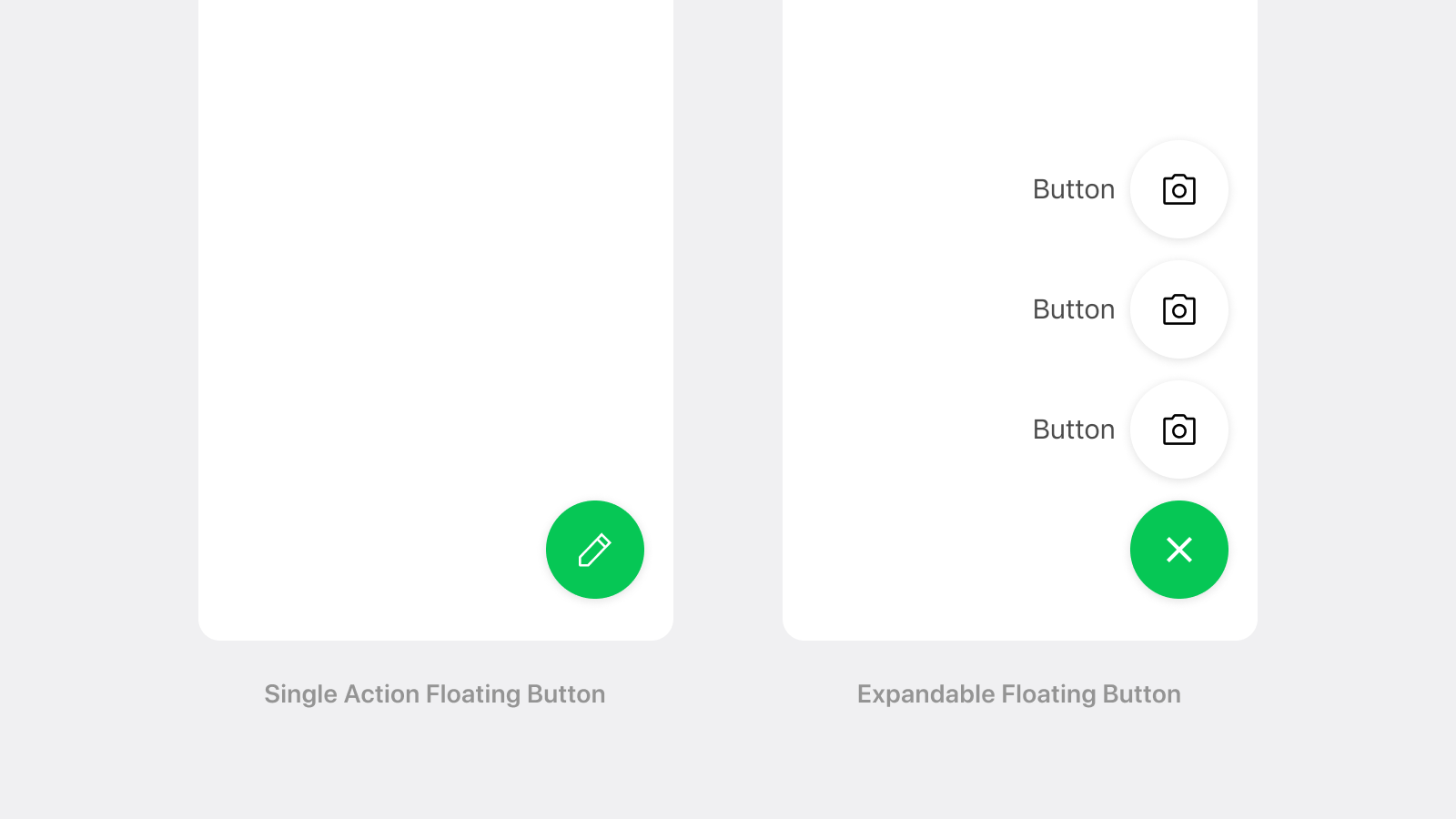
FAB란?
FAB는 Floating Action Button의 줄임말로, 화면 위에 떠 있는 원형 버튼
특징
- 화면 콘텐츠 위에 떠 있음: 일반 버튼과 달리 스크롤이나 레이아웃에 묶이지 않고 항상 떠 있음.
- 주요 행동 유도: 화면에서 가장 중요한 핵심 액션(예: "추가", "작성", "만들기")을 유도할 때 사용.
- 일반적으로 원형이고, 아이콘 중심으로 디자인됨
개발 과정
React Native에 관련 라이브러리도 react-native-floating-action와 react-native-paper에서 제공하는 FAB가 있었지만, 커스텀이 어려워
https://www.youtube.com/watch?v=XgXEvqQ8Bs8
이 영상을 보고 따라하면서 구현했다.
const FAB = (): JSX.Element => {
const DURATION = 300; // 애니메이션 지속 시간 (밀리초 단위)
const TRANSLATE_Y = -120; // Y축 이동 값 (세로)
const ROTATE = 45; // 회전 각도 (도 단위)
const OVERLAY = 1;
// 애니메이션 변환을 위한 공유 값들
const transYOptions = useSharedValue(0); // 세로 이동을 제어하는 값
const transRPlus = useSharedValue(0); // 회전을 제어하는 값
const overlayOpacity = useSharedValue(0);
// 옵션 리스트의 애니메이션 스타일 (옵션들이 나타나고 사라지는 애니메이션)
const rOptionsAnimationStyles = useAnimatedStyle(() => {
return {
transform: [
{ translateY: transYOptions.value }, // Y축 이동
{ translateX: interpolate(transYOptions.value, [TRANSLATE_Y, 0], [1, 80]) }, // X축 이동 (Y축 값에 따라 변화)
{ scale: interpolate(transYOptions.value, [TRANSLATE_Y, 0], [1, 0]) }, // 크기 변화 (Y축 값에 따라 크기 변경)
],
};
});
// 플러스 버튼의 애니메이션 스타일 (버튼의 회전과 색상 변화를 처리)
const rPlusAnimationStyles = useAnimatedStyle(() => {
return {
transform: [{ rotateZ: `${transRPlus.value}deg` }], // 회전
backgroundColor: interpolateColor(
transYOptions.value, // Y축 값에 따라 색상 변경
[TRANSLATE_Y, 0],
[colors.white, colors.blue600],
),
};
});
const rOverlayAnimationStyles = useAnimatedStyle(() => {
return {
backgroundColor: interpolateColor(
overlayOpacity.value,
[OVERLAY, 0],
['rgba(0,0,0,0.5)', 'transparent'],
),
};
});
// 버튼의 열림/닫힘 상태를 추적하는 변수
const [isOpened, setIsOpened] = useState<boolean>(false);
// 버튼 클릭 시의 애니메이션 동작
const handlePress = () => {
if (isOpened) {
const config: WithTimingConfig = {
duration: DURATION,
easing: Easing.bezierFn(0.36, 0, 0.66, -0.56),
};
// 버튼이 열려있는 상태일 때
console.log('Closed'); // 닫히는 상태로 전환
transYOptions.value = withTiming(0, config); // Y축을 0으로 변경 (위로 올라감)
transRPlus.value = withTiming(0, { duration: DURATION }); // 회전 값 리셋
overlayOpacity.value = withTiming(0, { duration: 200 });
} else {
// 버튼이 닫혀있는 상태일 때
console.log('Opened'); // 열리는 상태로 전환
const config: WithSpringConfig = { damping: 50 }; // spring 애니메이션 설정
transYOptions.value = withSpring(TRANSLATE_Y, config); // Y축 이동 (옵션 리스트 표시)
transRPlus.value = withTiming(ROTATE, { duration: DURATION }); // 회전 애니메이션
overlayOpacity.value = withTiming(OVERLAY, { duration: 200 });
}
setIsOpened(!isOpened); // 버튼 상태 변경
setVisible(!visible);
};
// 애니메이션 반응을 위한 변수 (버튼 색상 변경)
const [iconColor, setIconColor] = useState(colors.black);
// Y축 값이 변할 때마다 아이콘 색상 변경
useAnimatedReaction(
() => transYOptions.value, // Y축 값 추적
(value) => {
runOnJS(setIconColor)(value !== 0 ? colors.black : colors.white); // 값에 따라 색상 변경
},
[], // 의존성 배열 (없음)
);
useFocusEffect(
useCallback(() => {
// // 화면 떠날 때 애니메이션 초기화
// transYOptions.value = withTiming(0, { duration: DURATION });
// transRPlus.value = withTiming(0, { duration: DURATION });
// isOpened.current = false;
// 컴포넌트 언마운트시에 애니메이션 초기화
return () => {
transYOptions.value = withTiming(0, { duration: DURATION });
transRPlus.value = withTiming(0, { duration: DURATION });
setIsOpened(false);
setVisible(false);
};
}, []),
);
// 애니메이션 효과가 적용된 Pressable 컴포넌트
const ReanimatedPressable = Reanimated.createAnimatedComponent(Pressable);
const onConstructionAddButton = () => {
console.log('pressed!');
};
const onCustomerAddButton = () => {
console.log('pressed!');
};
const [visible, setVisible] = useState(false);
return (
<Portal>
<ReanimatedPressable
onPress={handlePress}
pointerEvents={visible ? 'auto' : 'box-none'}
style={[StyleSheet.absoluteFillObject, rOverlayAnimationStyles]}
>
<View pointerEvents="box-none" style={styles.container}>
<ReanimatedPressable
onPress={handlePress}
style={[styles.plusButton, rPlusAnimationStyles]}
>
<CommonIcon name="add" size={24} color={iconColor} />
</ReanimatedPressable>
<Reanimated.View
pointerEvents={visible ? 'auto' : 'none'} // 바텀 네비게이터 터치 오류 방지
style={[styles.optionList, rOptionsAnimationStyles]}
>
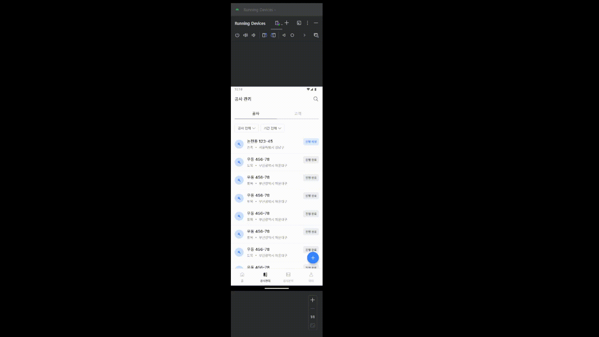
<Pressable style={styles.option} onPress={onConstructionAddButton}>
<CommonIcon name="measure" size={24} />
<CommonText name="t2_m">공사 추가</CommonText>
</Pressable>
<Pressable style={styles.option} onPress={onCustomerAddButton}>
<CommonIcon name="add_person" size={24} />
<CommonText name="t2_m">고객 추가</CommonText>
</Pressable>
</Reanimated.View>
</View>
</ReanimatedPressable>
</Portal>
);
};
export default FAB;
문제상황 1. 오버레이
FAB 컴포넌트를 구현하고 렌더링하는 과정중에 문제가 생겼다. 해당 컴포넌트를 필요한 화면 안에 children으로 렌더링을 하니 오버레이를 띄울때 바텀 네비게이터를 제외한 부분만 차는 것이였다. 그래서 react-native-paper의 portal을 이용하여
	// bottom nav
    <Portal.Host>
       <Tab.Navigator>
      ...screens...
       </Tab.Navigator>
      {showFAB && <FAB />}
    </Portal.Host>
다음과 같은 구조로 만들어주고
	// app.tsx
    <PaperProvider>
      <Stack.Navigator>
      ...screens....
      </Stack.Navigator>
    </PaperProvider>
provider로 상태값을 제공하였다.
문제상황 2. 버튼 오작동
FAB 을 렌더링을 했더니 옵션이 닫혀있는 상황에도 바텀네비게이션의 공사 분석 부분이 작동을 하지 않았다.
애니메이션의 문제임을 확인하고, 해당 부분의 view의 pointerEvents를 상태값에 따라 바꾸어 오류를 방지했다.
| 값 | 설명 |
|---|---|
auto | 기본값. View와 자식 모두 터치 가능 |
none | View와 자식 모두 터치 불가 |
box-only | View만 터치 가능, 자식은 터치 무시 |
box-none | View는 터치 무시, 자식은 터치 가능 |
<Reanimated.View
 pointerEvents={visible ? 'auto' : 'none'} // 바텀 네비게이터 터치 오류 방지
 style={[styles.optionList, rOptionsAnimationStyles]}
>

개발자가 되고싶어요