Flex
웹페이지 레이아웃을 나눌때 사용
레이아웃 배치 기능에 중점을 두고 만들어져 기본 방식 보다 수월하게 퍼블리싱 할 수 있다.
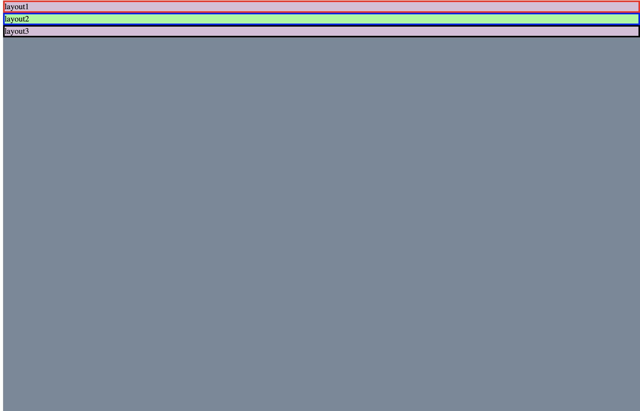
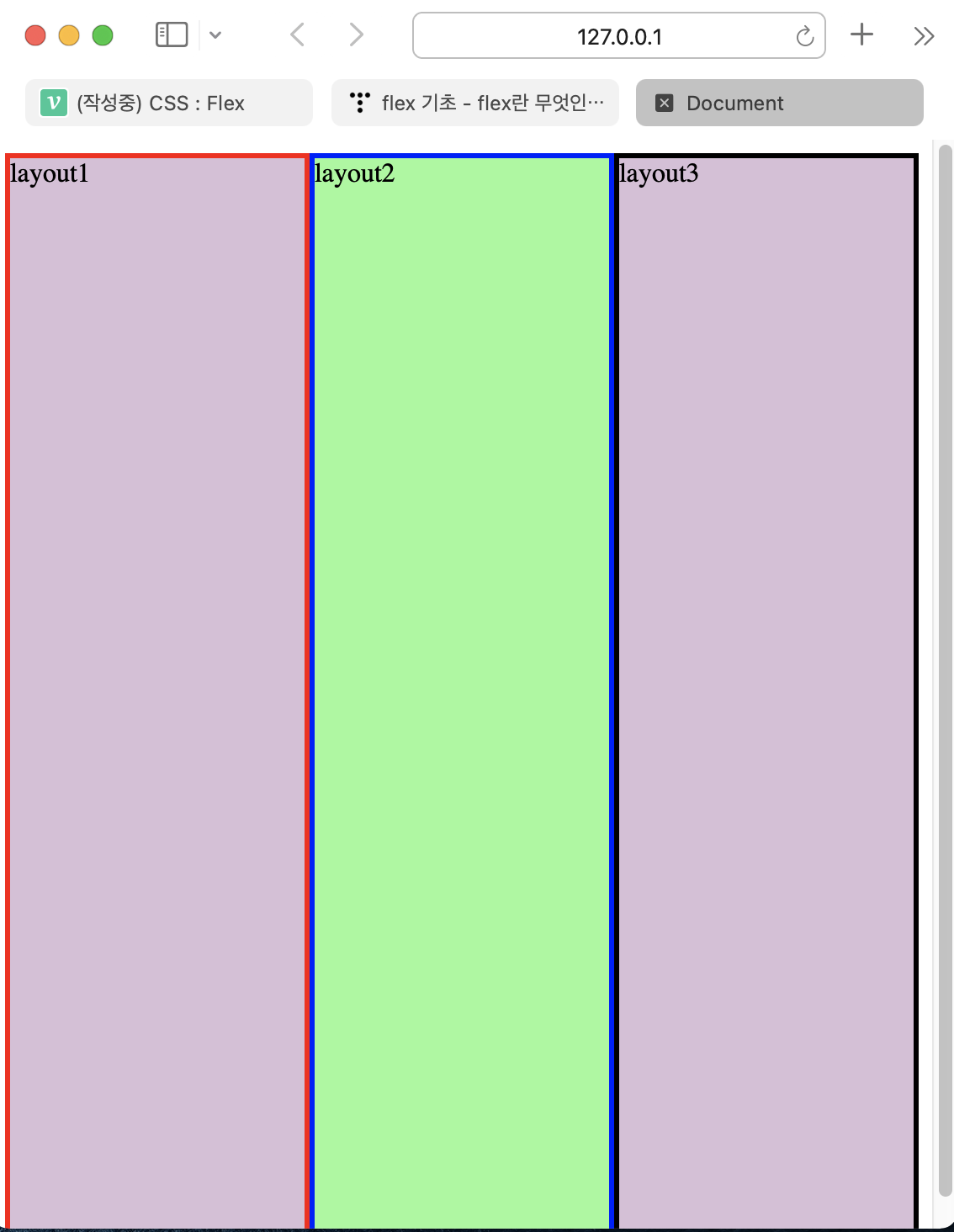
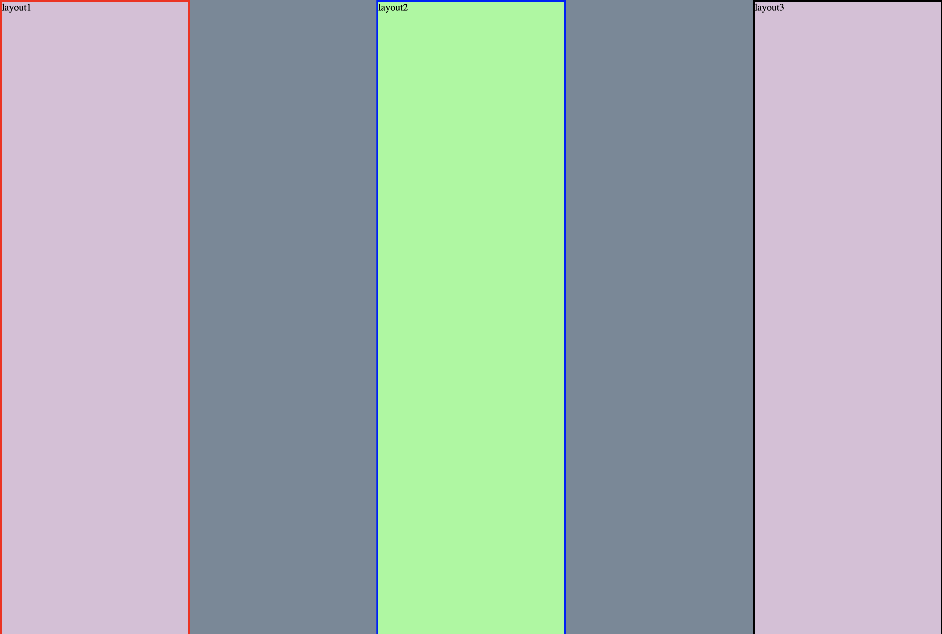
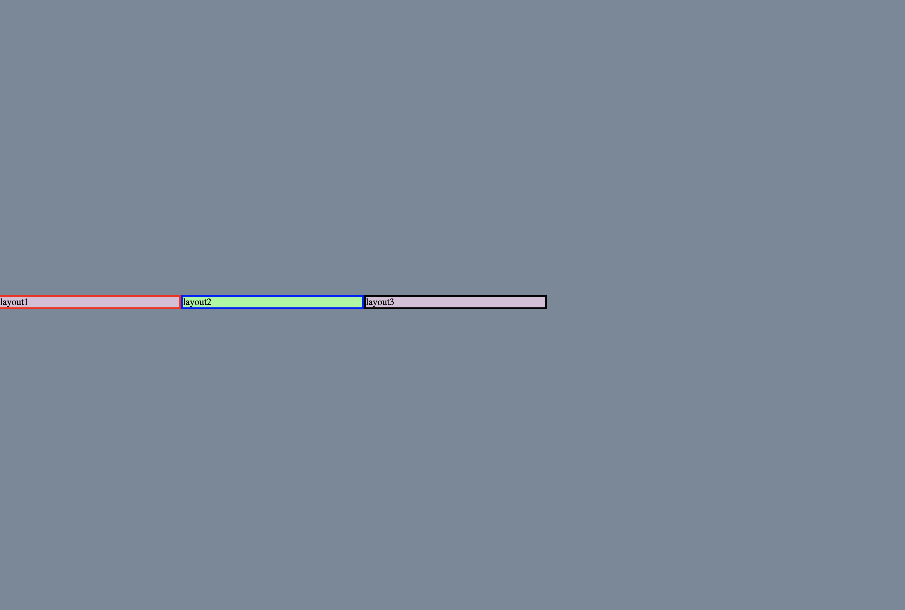
기본
html
    <meta name="viewport" content="width=device-width, initial-scale=1.0">
    <title>Document</title>
</head>
<body>
        <div class="container">
            <div class=box1>layout1</div>
            <div class=box2>layout2</div>
            <div class=box3>layout3</div>
        </div>
</body>
</html>
CSS
.container {
    height: 100vh;
    background: lightslategray;
}

.box1 {
    background: thistle;
    border: 3px solid red;
}


.box2 {
    background: palegreen;
    border: 3px solid blue;
}

.box3 {
    background: thistle;
    border: 3px solid black;
}
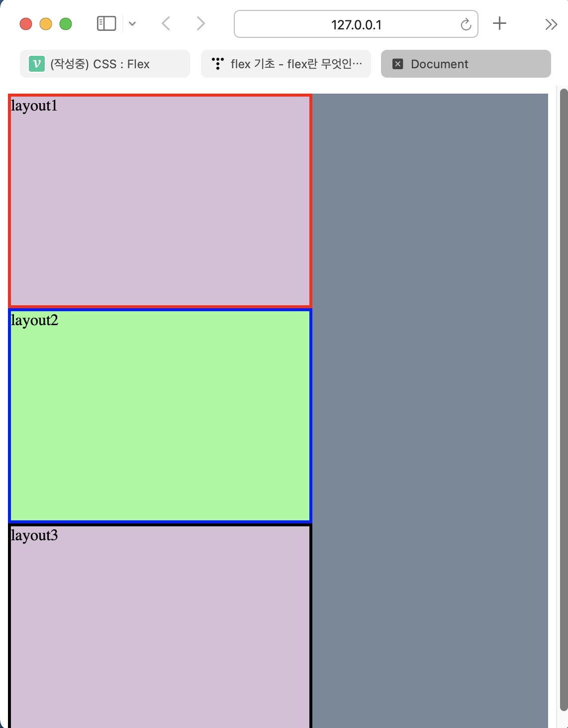
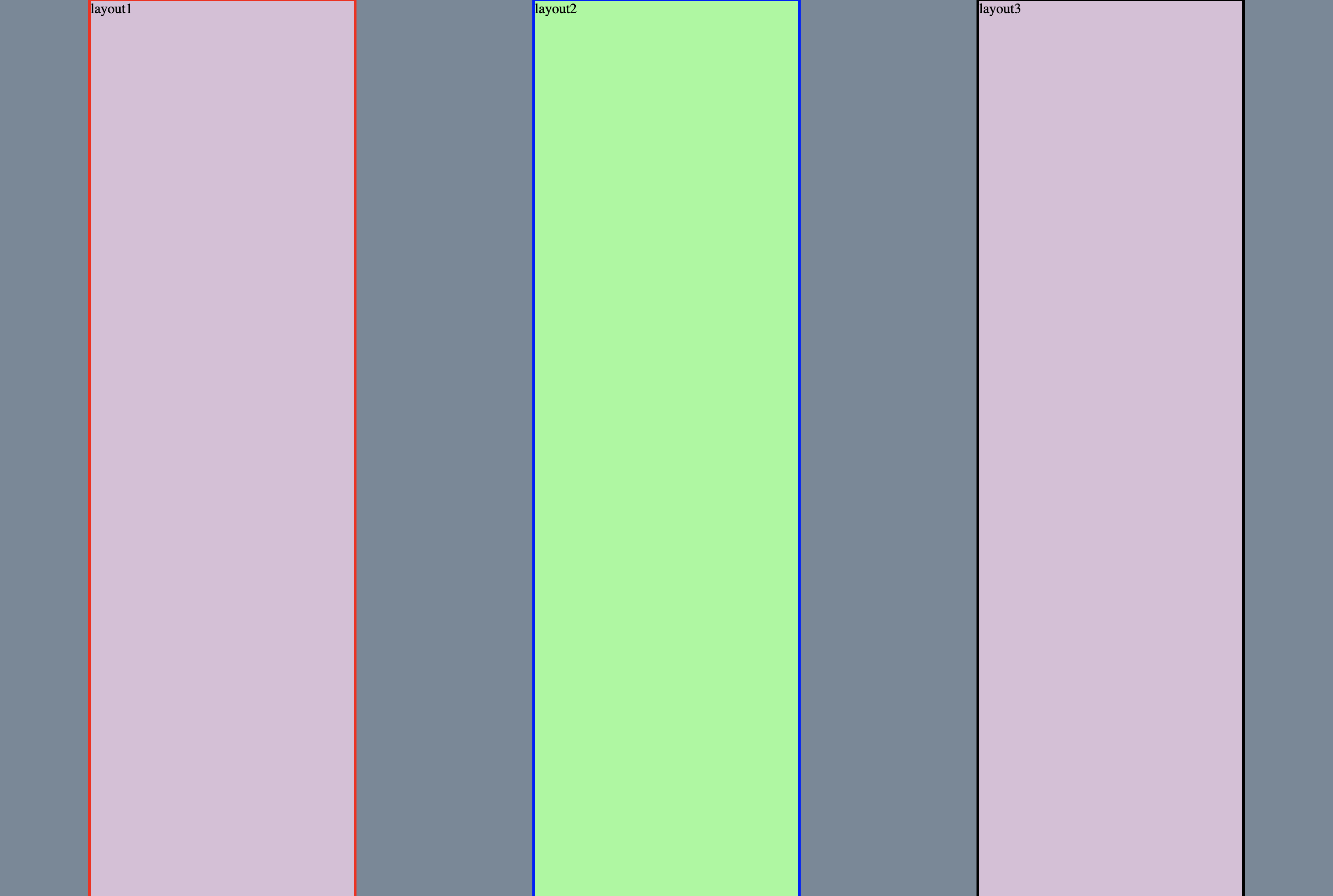
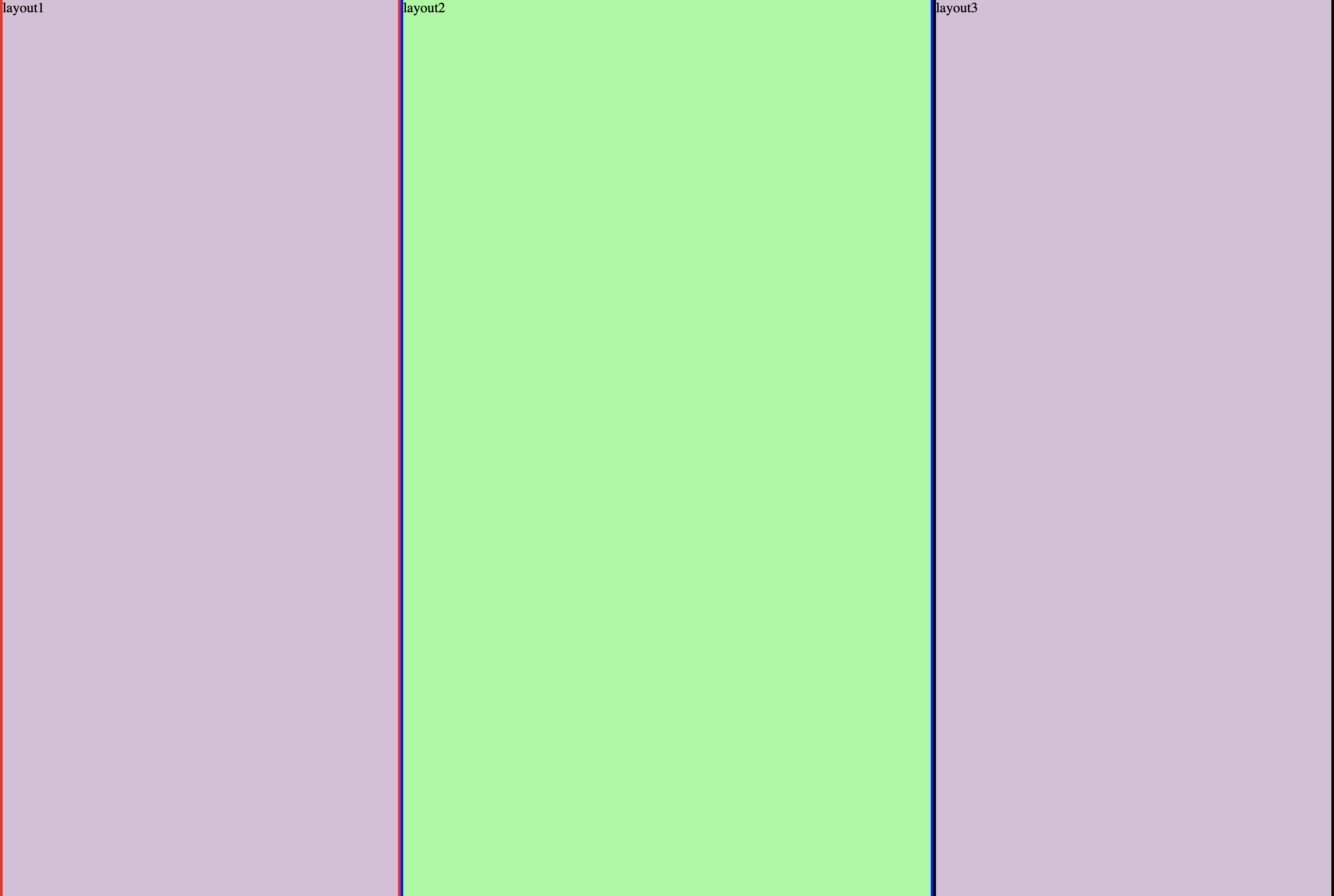
display: Flex 추가
.container {
    height: 100vh;
    background: lightslategray;
    display: flex;
}

.box1 {
    background: thistle;
    border: 3px solid red;
}


.box2 {
    background: palegreen;
    border: 3px solid blue;
}

.box3 {
    background: thistle;
    border: 3px solid black;
}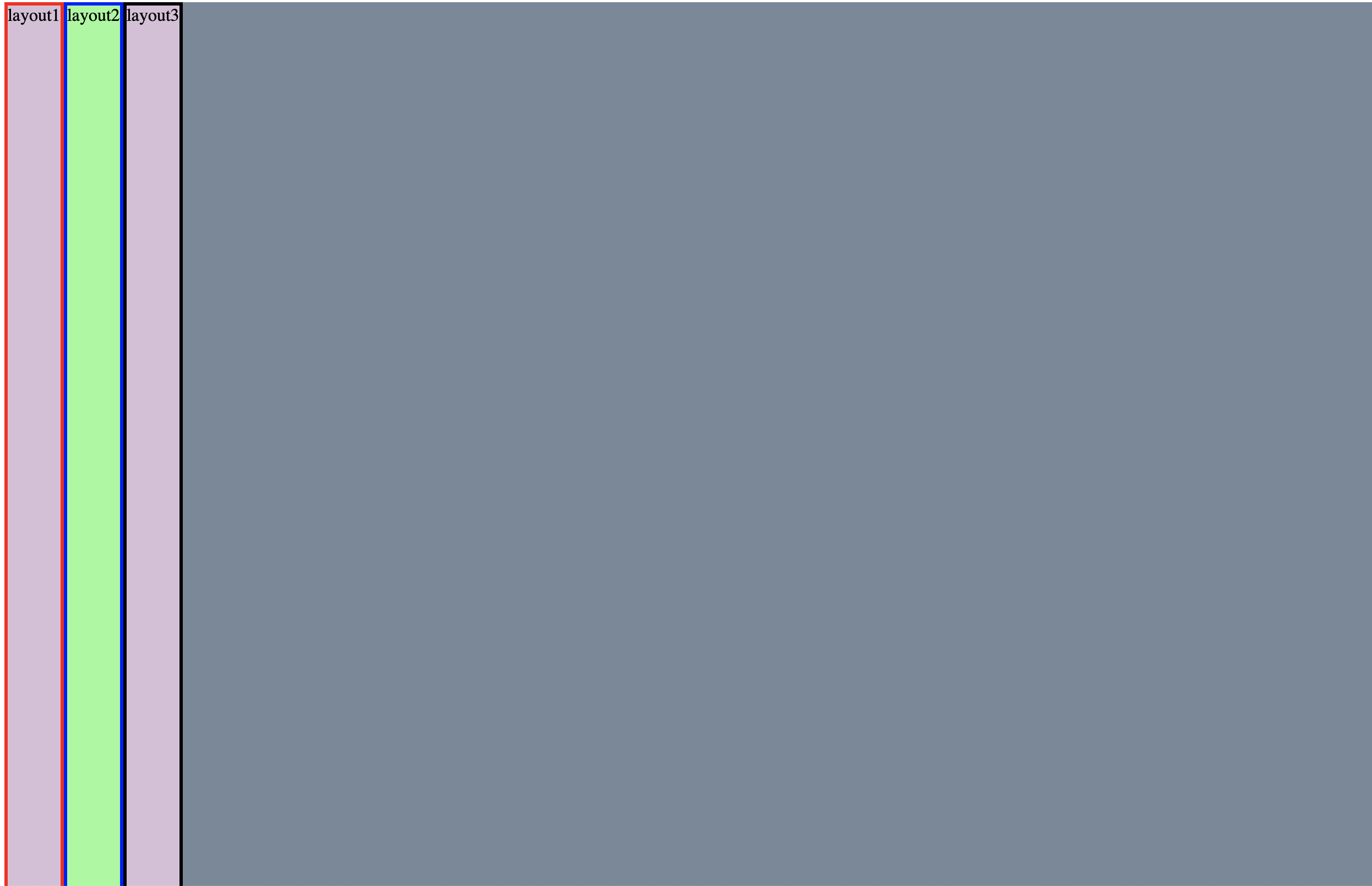
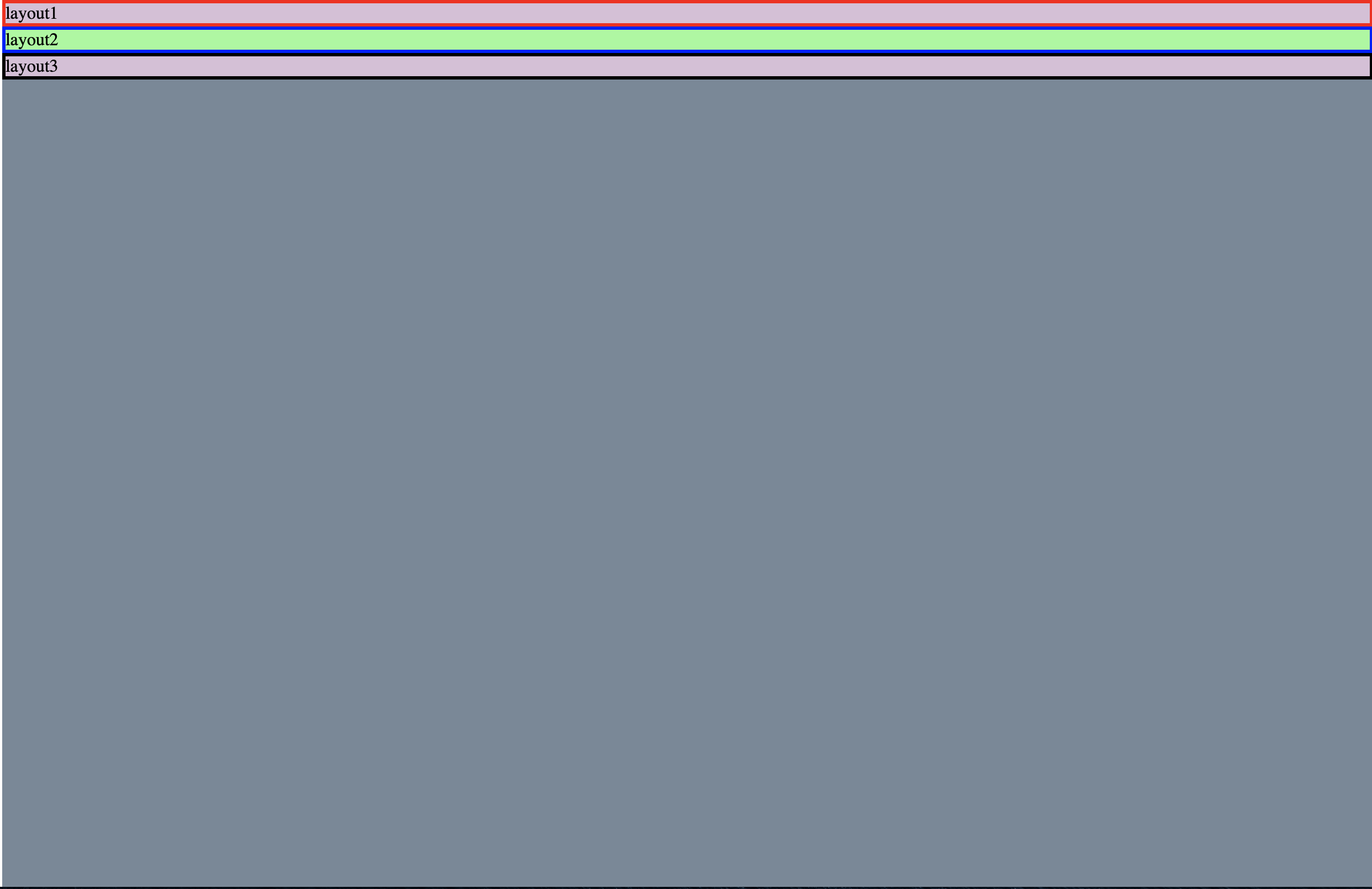
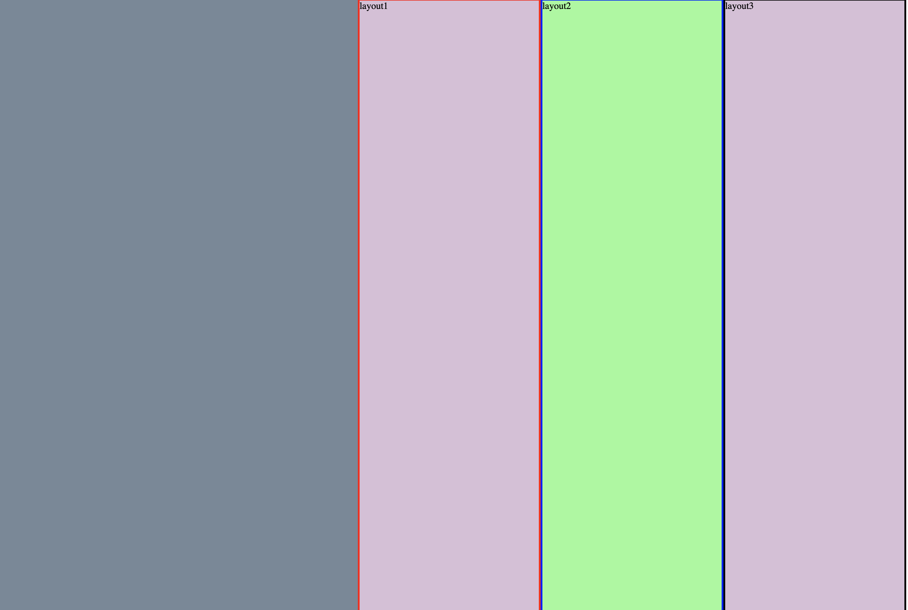
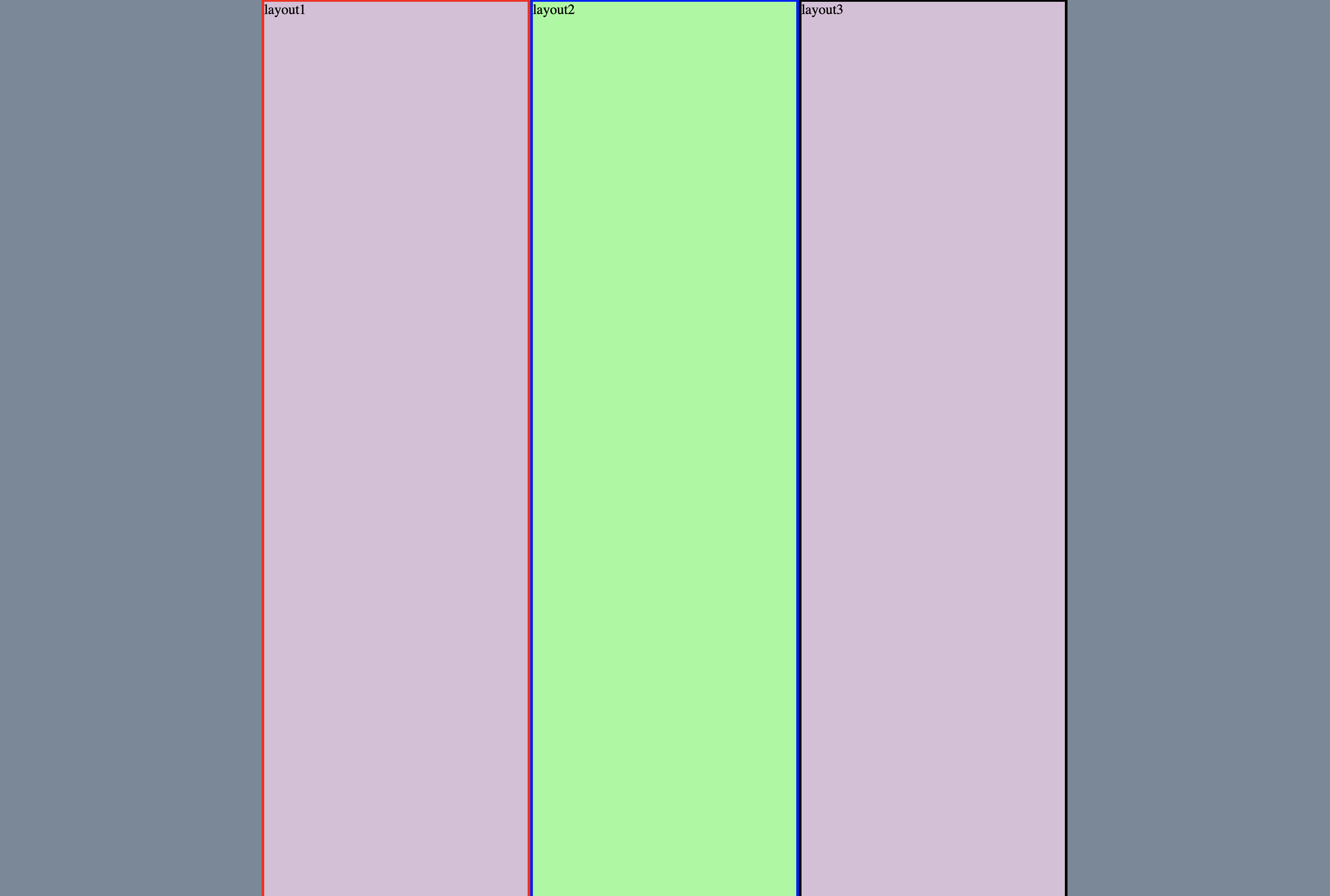
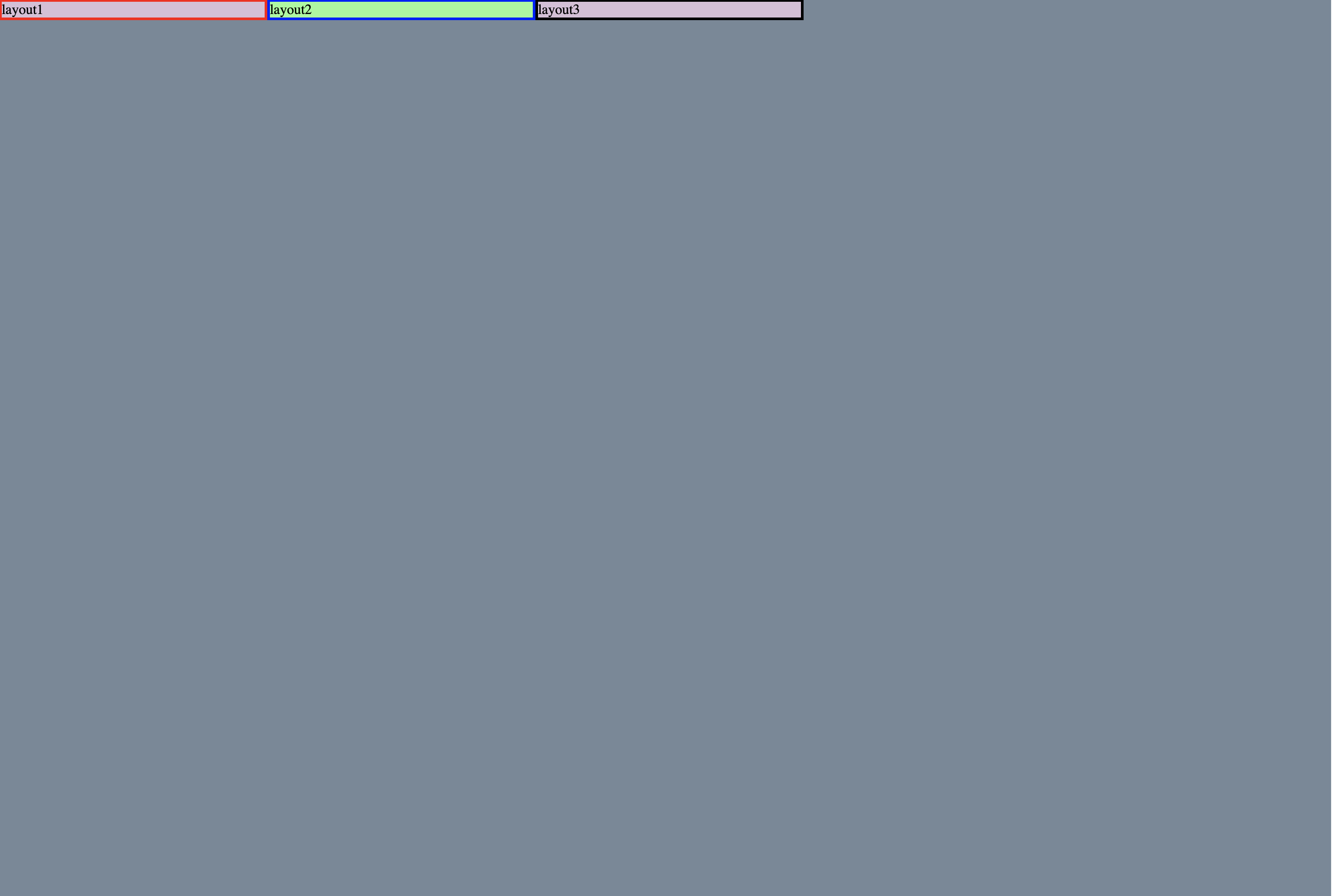
flex-direction : column 정렬 ( 기본값은 row)
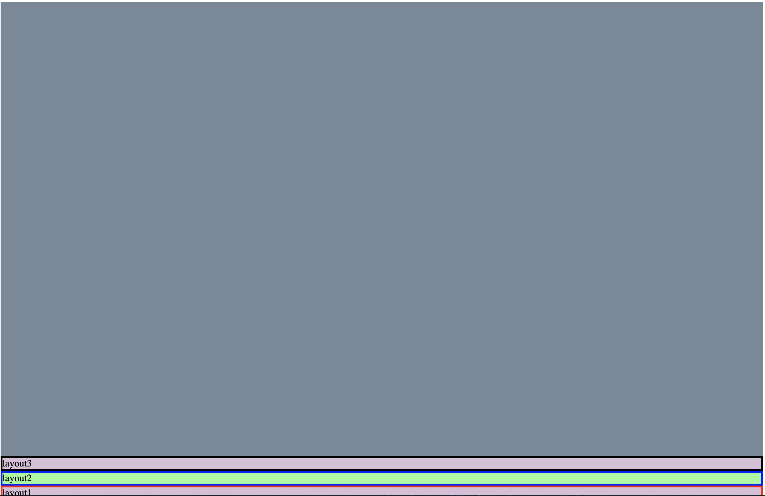
flex-direction : column-reverse (reverse를 추가하면 대칭으로 이동)
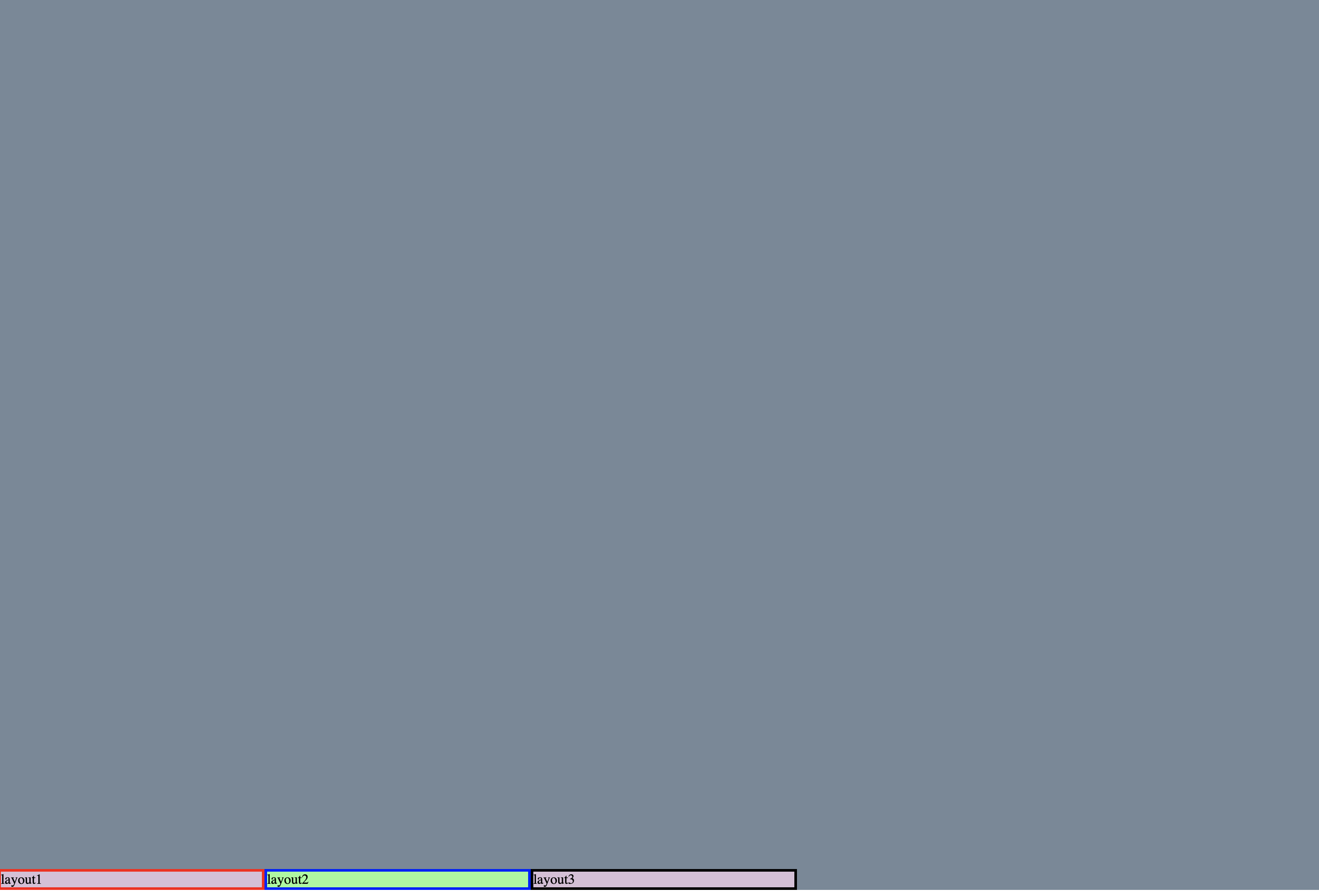
flex-wrap : wrap (기본값 nowrap)
컨테이너가 내부 item 보다 작을시 어떻게 보여질지 정함
보기 쉽게하기 위해 layout 높이 넓이 300px로 설정
기본값으로 줄였을때(nowrap)
wrap 값을 주고 줄였을때
justify-content : center (기본값 flex-start)
justify 키워드는 정렬방향으로 막대기(축)이 있다고 생각하면 편하다
flex-end
center
space-between 레이아웃의 일정거리를 두게 해준다
space-around 좌우 일정 여백
align-items : center (기본값 stretch)
justify가 정렬 방향이라면 align은 정렬 방향과 수직이 되게 막대기(축)이 있다고 생각하면 된다.
flex-start
flex-end
center
flex : 숫자
전체를 여백으로 인식 후 비율을 나눈다
알기 쉽게 css 코드 수정
.container {
    height: 100vh;
    background: lightslategray;
    display: flex;
    flex-direction: row;
    align-content: space-between;
}

.box1:nth-child(1){
    flex: 1;
}
.box2:nth-child(2){
    flex: 2;
}
.box3:nth-child(3){
    flex: 1;
}

.box1 {
    background: thistle;
    width: 300px;
    border: 3px solid red;
}


.box2 {
    background: palegreen;
    width: 300px;
    border: 3px solid blue;
}

.box3 {
    background: thistle;
    width: 300px;
    border: 3px solid black;
}
하나에게 flex : 1 을 주는 경우 그 flex값을 준곳이 늘어난다고 생각하면 된다.
.container {
    height: 100vh;
    background: lightslategray;
    display: flex;
    flex-direction: row;
    align-content: space-between;
}

.box3:nth-child(3){
    flex-grow: 1;
}

.box1 {
    background: thistle;
    width: 300px;
    border: 3px solid red;
}


.box2 {
    background: palegreen;
    width: 300px;
    border: 3px solid blue;
}

.box3 {
    background: thistle;
    width: 300px;
    border: 3px solid black;
}
그외 align-self(개인위치 설정), order(위치 바꾸기)