한국어 자료를 따로 찾지 못했어서 한국어로 정리한다!
새로 진행하는 프로젝트에서 특정 svg 4개를, body의 bg img처럼 고정해야하는 일이 생겼다.
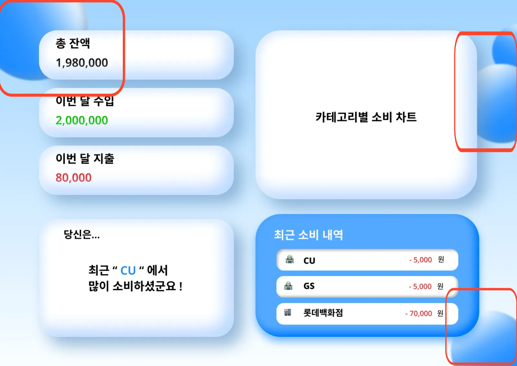
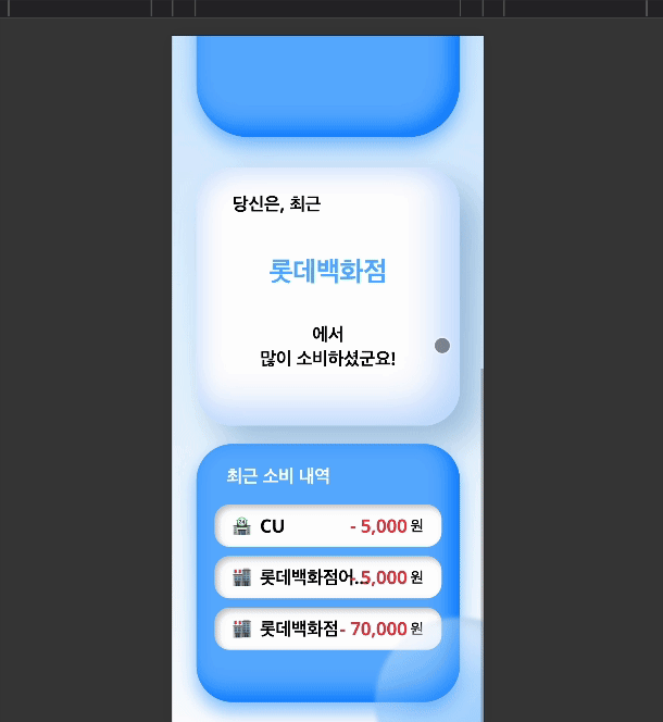
이 동그란 녀석들인데, 같이 프로젝트 진행하시는 figma에서 이어진 님이 만들어 주셨다.
처음 내가 생각한 시나리오는 아래와 같았다.
figma에서 추출한 css를 이용해 svg 태그를 만들고, body에 맞춰진 상대 경로에 맞춰야겠다.
아래와 같이 진행했다.
시도
<!doctype html>
<html lang="en">
	<head>
		<meta charset="UTF-8" />
		<link rel="icon" type="image/svg+xml" href="/vite.svg" />
		<meta name="viewport" content="width=device-width, initial-scale=1.0" />
		<title>Vite + React + TS</title>
	</head>
	<body>
		<svg id="topleftball" preserveAspectRatio="none"></svg>
		<svg id="toprightupball" preserveAspectRatio="none"></svg>
		<svg id="toprightdownball" preserveAspectRatio="none"></svg>
		<svg id="bottomrightball" preserveAspectRatio="none"></svg>
		<div id="root"></div>
		<script type="module" src="/src/main.tsx"></script>
	</body>
</html>
이제 각 svg에 맞는 css를 붙여주기만 하면 끝이다.
body {
	background: linear-gradient(
		180deg,
		rgb(171.06, 217.23, 255) 0%,
		rgb(250.75, 253.73, 255) 100%
	);
	overflow: hidden;
}

/* 피그마 프레임 사이즈 적용 */
#root {
	display: flex;
	justify-content: center;
	align-items: center;
	min-height: 100vh;
}

#topleftball {
	position: absolute;
	width: 19rem;
	height: 19rem;
	left: -5rem;
	top: -5rem;

	background: linear-gradient(
		180deg,
		#ffffff 0%,
		#5fb1ff 42.5%,
		#359dff 65.5%,
		#1d91ff 100%
	);
	box-shadow: inset -12px -12px 24px rgba(116, 162, 204, 0.6);
	filter: blur(2.5px);
	transform: rotate(61.54deg);
	border-radius: 50%;
}

body #toprightupball {
	position: absolute;
	width: 9rem;
	height: 9rem;
	right: -5rem;
	top: 4rem;

	background: linear-gradient(
		180deg,
		#ffffff 0%,
		#5fb1ff 42.5%,
		#359dff 65.5%,
		#1d91ff 100%
	);
	box-shadow: inset -12px -12px 24px rgba(116, 162, 204, 0.6);
	filter: blur(2.5px);
	transform: rotate(28.83deg);
	border-radius: 50%;
	overflow: hidden;
}

body #toprightdownball {
	position: absolute;
	width: 14rem;
	height: 14rem;
	right: -5rem;
	top: 9rem;

	background: linear-gradient(
		180deg,
		rgba(255, 255, 255, 0.45) 0%,
		rgba(95, 177, 255, 0.45) 42.5%,
		rgba(53, 157, 255, 0.45) 65.5%,
		rgba(29, 145, 255, 0.45) 100%
	);
	box-shadow: inset -12px -12px 24px rgba(116, 162, 204, 0.6);
	backdrop-filter: blur(2.5px);
	/* Note: backdrop-filter has minimal browser support */
	transform: rotate(-30deg);
	border-radius: 50%;
	overflow: hidden;
}

body #bottomrightball {
	/* Ellipse 4 */

	position: absolute;
	width: 14rem;
	height: 14rem;
	right: -5rem;
	bottom: -5rem;

	background: linear-gradient(
		180deg,
		rgba(255, 255, 255, 0.42) 0%,
		rgba(95, 177, 255, 0.42) 42.5%,
		rgba(53, 157, 255, 0.42) 65.5%,
		rgba(29, 145, 255, 0.42) 100%
	);
	box-shadow: inset -12px -12px 24px rgba(116, 162, 204, 0.6);
	filter: blur(2.5px);
	transform: rotate(-30deg);
	overflow: hidden;
	border-radius: 50%;
	z-index: 1;
}
하지만 개발은 내 생각대로 되지 않는다.
절망

분명히 body에도 overflow:hidden; 을 남겨주었는데, body값을 삐져나오는 상황이었다.
공 밑도 html영역이다..
postition을 fixed로도 바꿔봤지만 못생겼었다.
많은 자료들에서 position:absolute;는 부모 요소의 좌표를 바라본다는 내용이 많았다.
그래서 body에도 position:relative;를 주고도 해봤지만, 변함이 없었다.
svg태그를 많이 다뤄본 경험이 없기도 하고.. svg태그가 뭔가 잘못됐나 싶어서 이거만 2시간 넘게 찾아봤지만 결국 이게 문제가 아니란 것을 깨달았다.
희망
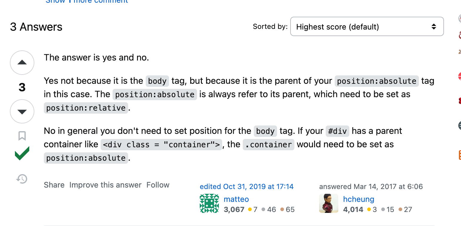
출처: https://stackoverflow.com/questions/42776206/body-position-relative
body말고 다른 relative인 부모 요소가 필요하다는 언급이다.
분명 봤는데 슬쩍 보고 넘어갔었다..
다른 글에서 방법을 찾았다.
https://stackoverflow.com/questions/50011614/overflow-hidden-on-an-absolute-positioned-svg
사연:
이게 왜 삐져 나오죠? ㅜㅜㅜ 도와주세요
나랑 완벽히 똑같은 상황이었다.. 답변은 마찬가지로 body에 바로 쓰지 말고, position:relative인 부모 안에 absolute를 쓰라는 것이었다.
해결
아래와 같이 바꿨다.
<!-- index.html-->
<!doctype html>
<html lang="en">
	<head>
		<meta charset="UTF-8" />
		<link rel="icon" type="image/svg+xml" href="/vite.svg" />
		<meta name="viewport" content="width=device-width, initial-scale=1.0" />
		<title>Vite + React + TS</title>
	</head>
	<body>
      <!-- relative를 해줄 부모 요소를 하나 감싼다 -->
		<div id="svgcontainer">
			<svg id="topleftball" preserveAspectRatio="none"></svg>
			<svg id="toprightupball" preserveAspectRatio="none"></svg>
			<svg id="toprightdownball" preserveAspectRatio="none"></svg>
			<svg id="bottomrightball" preserveAspectRatio="none"></svg>
			<div id="root"></div>
		</div>
		<script type="module" src="/src/main.tsx"></script>
	</body>
</html>
/* index.css */
/* 이거 하나 추가해줬다. */
#svgcontainer {
	position: relative;
	overflow: hidden;
}
결과는??
CSS 하나였지만.. 참 고생 많았다
결론
body에 position:absolute를 설정하면 페이지의 처음에 보이는 부분만이 아니라 전체 본문 요소(화면 밖 부분 포함)를 기준으로 절대 위치가 지정됩니다.
position:relative; 인 부모 요소를 꼭 감싸서 하시길 권장합니다 ㅎㅎ
꼭 해결하고 싶었던 이유
다른 사람에게 처음 디자인을 받고 UI를 구현하는 상황이었는데, 내가 구현하지 못한다고 해서 디자인 해준 사람을 괴롭히고 싶지는 않았다.
정말 못하는걸까? 할 수 있는데 귀찮아서 하지는 않을까? 한번 더 고민해보고 요구를 하는 것이 맞다고 생각한다.
오늘도 화이팅이다!