transition
transition : 모든 transition 속성을 한번에 사용.
transition-delay : 이벤트 발생 후 몇 초 후에 재생할지 지정.
transition-duration : 몇 초 동안 재생할지 지정.
transition-property : 어떤 속성을 변형할지 지정.
transition-timing-funtion : 수치 변형 함수를 지정.
tansition-timing-function
속도의 변화 지정, 수치를 변형하는 함수를 지정할 때 사용하는 속성
liner : 시작부터 끝까지 같은 속도로 트랜지션을 진행
ease : 처음에는 천천히 시작하여 점점 빨라지면서 마지막에느 천천히 끝냄 - 기본값
ease-in : 속도의 시작을 느리게 함
ease-in-out : 느리게 시작하고 느리게 끝냄
ease-out : 속도를 느리게 끝냄
<!DOCTYPE html>
<html lang="en">
<head>
<meta charset="UTF-8">
<meta name="viewport" content="width=device-width, initial-scale=1.0">
<title>Document</title>
<style>
* {
margin: 0;
padding: 0;
}
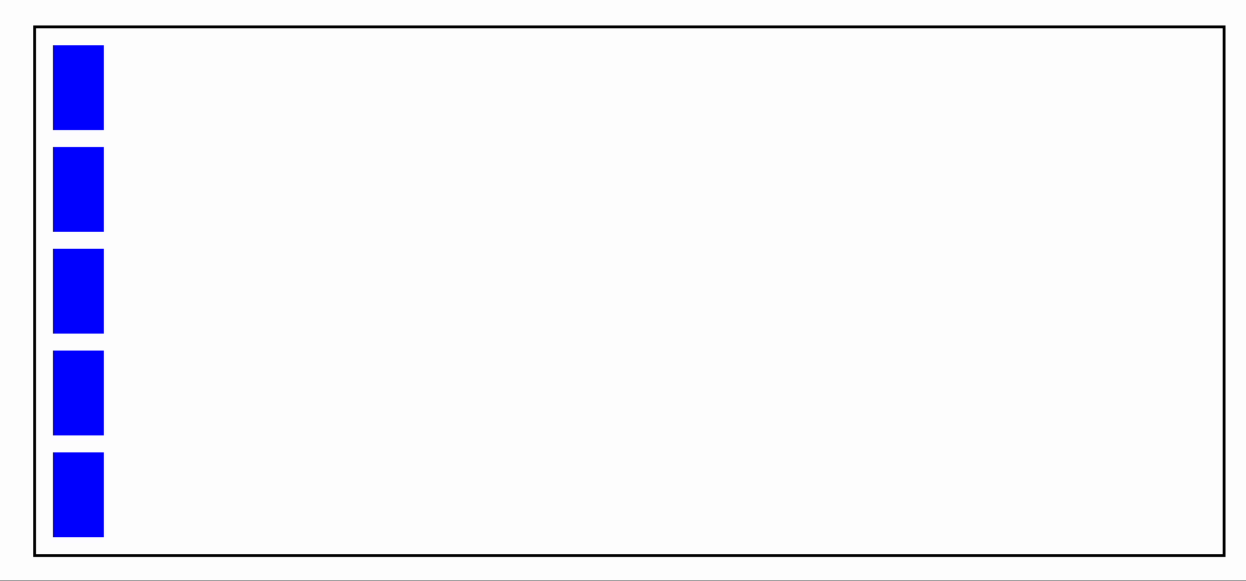
/* .box를 포함하는 영역 아이디 graph 박스의 영역 */
#graph {
width: 700px; border: 2px solid black; margin: 30px; overflow: hidden;
}
/* 클래스 box의 기본 스타일 지정 */
.box {
width: 30px; height: 50px; background-color: blue; margin: 10px;
transition-duration: 5s;
}
#graph:hover .box {
width: 500px;
/* graph에 마우스를 올리면 그 안에 box의 넓이가 500px 만큼 늘어남,
마우스를 올리는 대상과 변형되는 대상이 다름*/
}
/* delay 속성 추가로 지정
transition-delay : 이벤트가 발생하고 몇 초 기다린 후 애니메이션이 작동할지 설정하는 속성 */
.box:nth-child(1){ transition-delay: 1s;}
.box:nth-child(2){ transition-timing-function: ease;}
.box:nth-child(3){ transition-timing-function: ease-in;}
.box:nth-child(4){ transition-timing-function: ease-in-out;}
.box:nth-child(5){ transition-timing-function: ease-out;}
</style>
</head>
<body>
<div id="graph">
<div class="box"></div>
<div class="box"></div>
<div class="box"></div>
<div class="box"></div>
<div class="box"></div>
</div>
</body>
</html>