
ADsP
모의고사도 질린다...이제 다시 재수강을 해봐야겠다.
이제 곧 재수강이 열려있는것이 닫힐것이기 때문이다....
내일 배움 캠프
과제를 위해 팀플을 할것이다
팀장이 된 것은 것이고 사실 딱히 팀장이라고 할것이 있거나 그렇진 않는것 같다.
대신 메인페이지를 담당하게 됬으니 그만큼의 과제에대한 노력은 할것이다.
소개 웹페이지 만들기!!!
어제...어디까지 했더라..
벨로그에 쓰지 않은 부분도 밤에 막 생각이 나서 이것 저것 두당두당 한것같은데,.,...
우선
1.메인 페이지는 딸깍만 하게끔 만든다.
(네비,사진,토글 등을 활용하여서!)
2.그 페이지를 넘기면 각자가 사용할수있는 페이지가 나온다 그걸 자기 멋대로 꾸며주면 될것이다.
각자 조원의 위치를 구별하고 각자에게 메인페이지에 들어갈 사진과 멘트를 달라고 하는것으로 메인페이지 작업은 조금 끝이 났다.
그걸로 인해 개인페이지를 꾸며 볼것이다
개인페이지
같은 조원 분께서 아주 기초 틀을 만들어 주셨다 그것을 이용해서 수정하며 바꾸는것이 목표이다
기초틀

을 만들어 주셔서 여기서 조금씩 수정해 볼것이다
우선!!!
CSS 와 HTML 이 통합되어있어서 나누어주는 작업을 했다.!!!!
나누어서
각각 파일명
yurok.html과yullstyle.css변경했다
MBTI 부분을 따로 빼서 옆으로 옮기기
HTML
<span id="mbti-container">
	<div id="mbti-text">MBTI</div>
	<img src="scr/img/MBTI.png" id="mbti-image" />
</span>
코드를 추가해주고 이미지를 소스에서 받아와서 설정해준다.
CSS
#mbti-container {
    display: flex;
    justify-content: center;
    align-items: center;
    position: relative;
}
#mbti-text {
    position: absolute;
    top: -20px;
    left: 50%;
    transform: translateX(-50%);
    color: black;
    z-index: 2;
    font-weight: bold;
    padding: 2px 5px;
    border-radius: 5px;
}
#mbti-image {
    width: 300px;
    height: auto;
    border-radius: 10px;
    border: 2px solid #333;
    position: relative;
    z-index: 1;
    max-width: 100%;
}
이런식으로 변경을 하니 겨우 중앙을 맞추고 위아래 중구난방하던 친구를 붙잡을수 있었다.
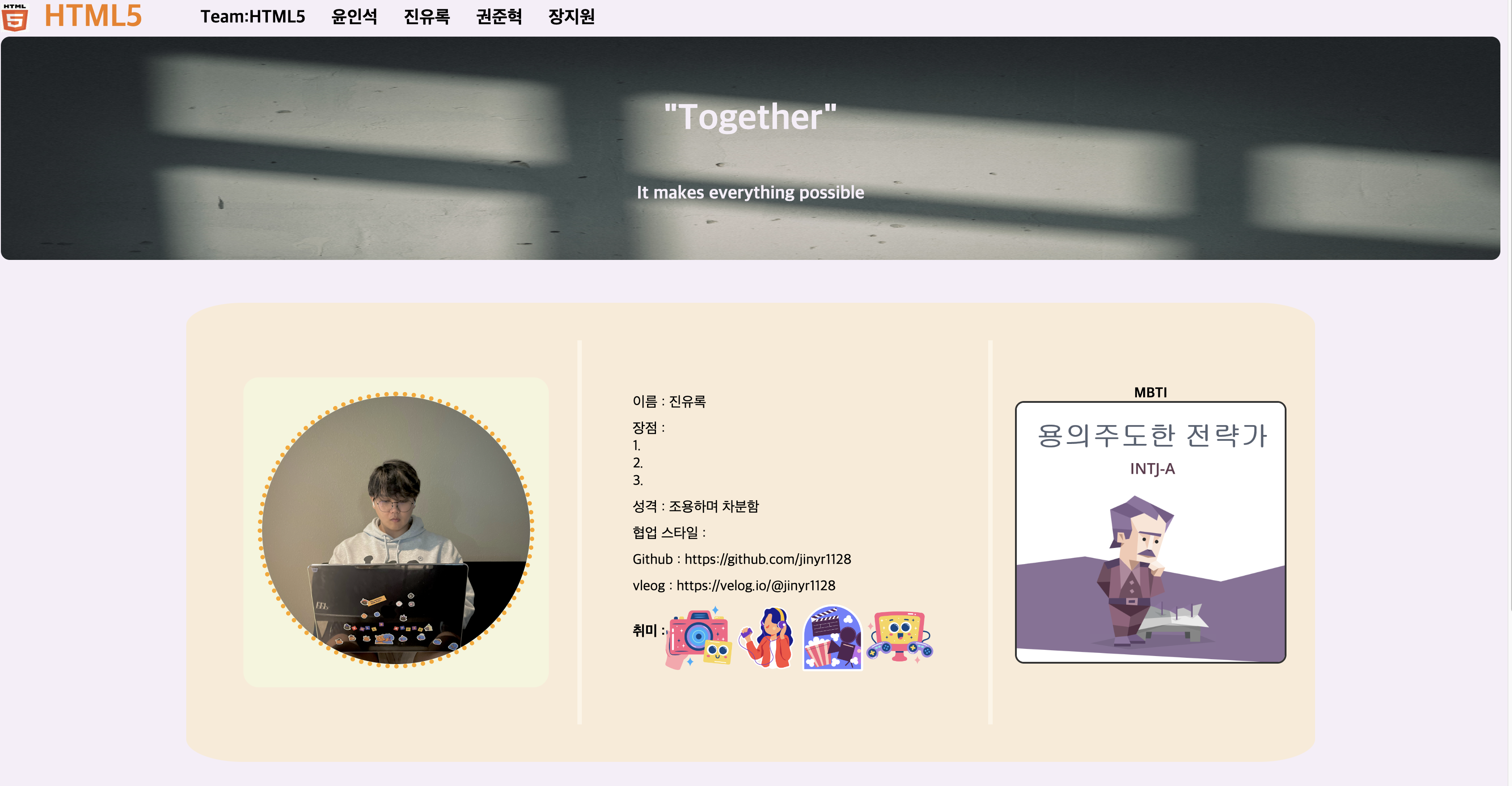
이정도 까지는 어찌 저찌 만들었는데 아냐 좀더 만들어야하며 밑도 꾸며줘야 하며 마치...양옆에 광고라도 있어야할것만 같은 느낌이 들었다....
깃과 벨로그에 링크를 걸기로 해서 수정할것이다.
밑으로는 사진을 추가하여 개인 페이지는 완성을 해주었다.
사진은 내가 좋아하는것으로 꾸미는 것인데
고양이 태국 바다 포켓몬..레고로 꾸몄다!!!!
HTML
<!DOCTYPE html>
<html lang="en">
<head>
    <meta charset="UTF-8">
    <meta name="viewport" content="width=device-width, initial-scale=1.0">
    <title>유록이네</title>
    <link rel="stylesheet" href="yullstyle.css">
    <link rel="preconnect" href="https://fonts.googleapis.com">
    <link rel="preconnect" href="https://fonts.gstatic.com" crossorigin>
    <link href="https://fonts.googleapis.com/css2?family=Gothic+A1:wght@200;300&family=Gowun+Dodum&display=swap" rel="stylesheet">
    <link rel="icon" href="scr/icons/logo.png" type="image/x-icon">
</head>
<body>
    <nav class="navigator">
        <img src="scr/icons/logo.png" alt="Website Icon" class="web-icon">
        <h3 class="web-name"><a href="index.html">HTML5</a></h3>
        <ul>
            <li><a class="nav-menu" href="https://www.team-page.com">Team:HTML5</a></li>
            <li><a class="nav-menu" href="https://www.jowon1.com">윤인석</a></li>
            <li><a class="nav-menu" href="https://www.jowon2.com">진유록</a></li>
            <li><a class="nav-menu" href="https://www.jowon3.com">권준혁</a></li>
            <li><a class="nav-menu" href="https://www.jowon4.com">장지원</a></li>
        </ul>
    </nav>

        <div id='title-center'>
            <img src="scr/img/title.jpg" alt="Title Image" id="title-image">
            <h1>"Together"</h1>
            <p>It makes everything possible</p>
        </div>

        <span id="bigcontainer">
            <span id="container">
                <span id="photo">
                    <img src="scr/img/profile.JPG"/>
                </span>

                <div id="vline">
                </div>

                <span id="info-content">
                    <div>이름 : 진유록</div>
                    <div>장점 : <br>1.근본적인 원인파악에 능합니다. <br>2.계획된 일은 무조건 계획에 맞추어 냅니다. <br>3.감정이든 상황이든 인내심이 강합니다.</div>
                    <div>성격 : 조용하며 차분함</div>
                    <div>협업 스타일 : 조력자 및 중재자 타입 </div>
                    <div>Github : <a href="https://github.com/jinyr1128" target="_blank">https://github.com/jinyr1128</a></div>
                    <div>vleog : <a href="https://velog.io/@jinyr1128" target="_blank">https://velog.io/@jinyr1128</a></div>
                    <span id="icons">
                        <h4>취미 : </h4>
                        <img src="scr/icons/hobby.png"/>
                        <img src="scr/icons/listening.png"/>
                        <img src="scr/icons/movie.png"/>
                        <img src="scr/icons/psgame.png"/>
                    </span>
                </span>
                <div id="vline">
                </div>
                <span id="mbti-container">
                    <div id="mbti-text">MBTI</div>
                    <img src="scr/img/MBTI.png" id="mbti-image" />
                </span>
            </span>
        </span>

        <div class="line">My Favorite Things</div>

        <div id="images">
            <span id="">
                <img src="scr/img/bike.JPG"/>
            </span>
            <span id="">
                <img src="scr/img/sea.JPG"/>
            </span>
            <span id="">
                <img src="scr/img/pet.png"/>
            </span>
            <span id="">
                <img src="scr/img/lego.JPG"/>
            </span>
            <span id="">
                <img src="scr/img/metamong.jpeg"/>
            </span>
        </div>

        <hr style="border:1px color= silver;" width="90%">
    </body>
    </html>
코드이고
CSS
body {
    background-color: #F5EEF8;
}

.frame {
    margin: 30px 150px;
    display: flex;
    flex-direction: column;
    align-items: center;
}

.navigator {
    display: flex;
    width: 100%;
    align-items: center;
}

li {
    display: inline;
    margin: 0;
    margin-left: 25px;
    font-size: 20px;
    font-weight: bold;
}

ul {
    margin: 0;
}

.web-name {
    margin: 0;
    font-size: 35px;
    margin-left: 8px;
    color: #F27D0C;
}
.web-name a {
    text-decoration: none;
    color: inherit;
}
.web-name a:visited {
    text-decoration: none;
    color: inherit;
}
.nav-menu {
    text-decoration: none;
    color: black;
}
.web-icon {
    width: 32px;
    height: 32px;
    margin-right: 8px;
    vertical-align: middle;
}
#photo img {
    border-radius: 70%;
    width: 300px;
    height: 300px;
    border: thick dotted orange
}
#container{
    margin-top: 2rem;
    padding: 2rem;
    display: flex;
    align-items: center;
    height: auto;
    flex-wrap: wrap;
    justify-content: center;
}
#photo {
    margin : 2rem;
    border-radius: 5%;
    background-color: beige;
    padding: 1rem;
}
#title-image {
    position: absolute;
    top: 0;
    left: 0;
    width: 100%;
    height: 100%;
    z-index: 1;
    border-radius: 10px;
}

#title-center {
    display: flex;
    flex-direction: column;
    justify-content: center;
    align-items: center;
    height: 250px;
    width: 100%;
    overflow: hidden;
    position: relative;
    z-index: 2;
}
#title-center h1, #title-center p {
    z-index: 3;
    font-weight: bold;
    position: relative;
    color: #F5EEF8;
}
#title-center h1 {
    font-size: 40px;
}

#title-center p {
    font-size: 20px;
}

#info-content {
    margin: 1rem;
    padding: 1rem;
    flex-grow: 1;
    display: flex;
    flex-direction: column;
    padding: 1rem;
}
#info-content div {
    margin-bottom: 10px;
}
#info-content div a {
    text-decoration: none;
    color: inherit;
}
#info-content a:hover {
    text-decoration: underline;
}
#mbti-container {
    display: flex;
    justify-content: center;
    align-items: center;
    position: relative;
}
#mbti-text {
    position: absolute;
    top: -20px;
    left: 50%;
    transform: translateX(-50%);
    color: black;
    z-index: 2;
    font-weight: bold;
    padding: 2px 5px;
    border-radius: 5px;
}
#mbti-image {
    width: 300px;
    height: auto;
    border-radius: 10px;
    border: 2px solid #333;
    position: relative;
    z-index: 1;
    max-width: 100%;
}
#images{
    display: flex;
    justify-content: center;
    margin: 2rem;
}
#images span img {
    width: 280px;
    height: 280px;
    margin: 10px;
    border-radius: 6px;
}
#images span img:hover {
    transform: scale(1.3);
}
#line {
    content: "◆ my favorite things";
}
.line{
    display:flex;
    flex-basis: 100%;
    align-items: center;
    color: rgba(0,0,0,0.35);
    font-size: 1.3rem;
    margin: 8px 0px;
}
.line::before{
    content: "---------------------";
    flex-grow: 1;
    margin: 0px 16px;
    background: rgba(0,0,0,0.35);
    height: 1px;
    font-size: 0px;
    line-height: 0px;
}
.line::after{
    content: "---------------------";
    flex-grow: 1;
    margin: 0px 16px;
    background: rgba(0,0,0,0.35);
    height: 1px;
    font-size: 0px;
    line-height: 0px;
}
#content span {
    display: flex;
    align-items: center;
    margin: 1rem;
}
#bigcontainer{
    display: flex;
    justify-content: center;
    margin-bottom: 2rem;
    margin-top: 1rem;
}
#container{
    background: antiquewhite;
    width: 1200px;
    height: 450px;
    border-radius: 5%;
}
#vline {
    border-left : thick solid oldlace;
    height : 430px;
    margin-right:25px;
}
#icons{
    display: flex;
    flex-direction: row;
}
#icons img{
    width: 75px;
    height: 75px;
}
이다 완전 처음이다 보니,,,뭔가 중복되거나 부족한 점이 있겠지만 지금으로서는 이러한 일들을 했다.
백엔드로 연결을 해서 데이터베이스를 쓰려고 하는데 뭔가 했던걸 다 갈아엎어야 하는 분위기가 나오고있다
우리는 미니프로젝트로 하고있는데 취지에 벗어나는 걿 막으며 해야하는게 힘들다...
수정사항 접수
1.\span\이 너무 많음
<span>을 <section>, <article>, <figure>등 을 이용해 교체작업....
이것만으로도 무슨 1시간이 뚝딱이네...?
        <section class="title-section">
         <article class="info-content">
         <section class="favorites">
등등 이런식으로 바꾸고 나서 .....CSS가 터져버렸다...목표는 복구와 원본보다 더 나아짐이다...
오늘은 이까지만 하기로 하였다...
내일 CSS에 #들을 다 아작내러 가볼것이다...
회고
팀프로젝트에서 내가 아직 백엔드에 대한 지식이 없어서
단순노동과도 같은 CSS와 프론트의 역할을 하고 있는데 재미가 아직은 있지만 나도 얼른 백엔드 지식을 쌓아서 나아가야겠다!!!
Algorithm
문제 1.배열의 유사도
문제 설명
두 배열이 얼마나 유사한지 확인해보려고 합니다. 문자열 배열 s1과 s2가 주어질 때 같은 원소의 개수를 return하도록 solution 함수를 완성해주세요.
제한사항
1 ≤ s1, s2의 길이 ≤ 100
1 ≤ s1, s2의 원소의 길이 ≤ 10
s1과 s2의 원소는 알파벳 소문자로만 이루어져 있습니다
s1과 s2는 각각 중복된 원소를 갖지 않습니다.
class Solution {
    public int solution(String[] s1, String[] s2) {
        int count = 0; // 공통된 원소의 개수를 저장할 변수 초기화

        // s1 배열의 각 원소에 대해 순회
        for(String str1 : s1) {
            // s2 배열의 각 원소와 비교
            for(String str2 : s2) {
                // 현재 s1의 원소와 s2의 원소가 일치하는 경우
                if(str1.equals(str2)) {
                    count++; // 카운트 증가
                    break; // 이미 일치하는 원소를 찾았으므로, 더 이상 s2를 검사할 필요가 없음. 따라서 내부 for문을 종료
                }
            }
        }

        return count; // 공통된 원소의 개수 반환
    }
}
문제 2. 숫자 찾기
문제 설명
정수 num과 k가 매개변수로 주어질 때, num을 이루는 숫자 중에 k가 있으면 num의 그 숫자가 있는 자리 수를 return하고 없으면 -1을 return 하도록 solution 함수를 완성해보세요.
제한사항
0 < num < 1,000,000
0 ≤ k < 10
num에 k가 여러 개 있으면 가장 처음 나타나는 자리를 return 합니다.
public class Solution {

    public int solution(int num, int k) {
        // num을 문자열로 변환
        String numStr = Integer.toString(num);

        // 문자열의 각 문자를 확인하면서 k와 일치하는지 검사
        for (int i = 0; i < numStr.length(); i++) {
            int digit = numStr.charAt(i) - '0'; // 현재 자릿수의 숫자
            if (digit == k) {
                // 숫자 k를 찾았으므로, 해당 숫자의 자릿수를 반환 (가장 큰 자리수부터 시작)
                return numStr.length() - i;
            }
        }

        // num에 k가 없으므로 -1을 반환
        return -1;
    }
}
이렇게 작성을 했는데
계속 테스트 케이스가 2번이 기댓값이 4인데 3으로 나오는게 의문이 들어 다시 풀어봤다.
그렇게 나는 계속 틀렸다...
틀리고 틀리고 틀리고있다.....뭐가 문제일까...
그렇게 오늘은 시간이 없어서
다음으로 넘어가요!!!!
회고
망할...테스트케이스를 1개만 통과못하는게 더 화가난다...왜지....
꼭 맞추고싶다....