flex basis 와 width
flex basis는 주축에만 적용되기 때문에 flex-direction이 column이라면 flex basis는 height를 제어하게 된다.
The flex-basis CSS property sets the initial main size of a flex item. It sets the size of the content box unless otherwise set with box-sizing.
그리고 MDN 문서에 따르면 flex item의 초기 크기를 지정한다고 하는데 아래 경우의 보라색 화살표를 보면 초기 크기를 확인 할 수 있다.
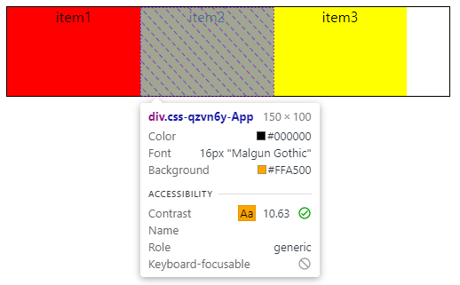
0) flex basis width만 주어졌을 때
.container {
  display: flex;
  border: 1px solid black;
  width: 500px;
}

.items {
  height: 100px;
  text-align: center;

  :nth-of-type(1) {
    background: red;
  }

  :nth-of-type(2) {
    background: orange;
  }

  :nth-of-type(3) {
    background: yellow;
  }

  width: 100px;
  flex-basis: 150px;
}
너비는 flex-basis: 150px; 값을 따르게 된다.
1) flex basis, width, flex-grow: 0
.items {
  /* 생략... */
  flex-grow: 0;
  width: 100px;
  flex-basis: 150px;
}
해당 경우에도 너비는 flex-basis: 150px; 값을 따르게 된다.
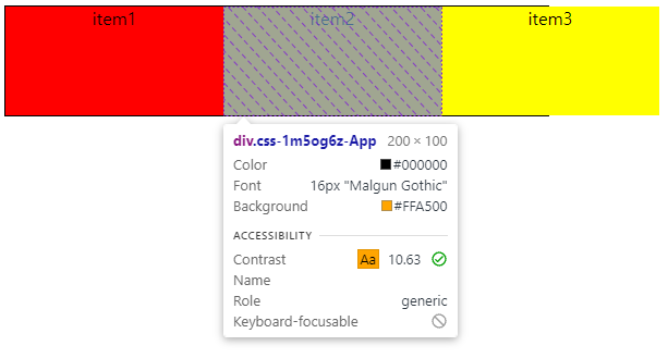
2) flex basis, width, flex-grow: 1
.items {
  /* 생략... */
  flex-grow: 1;
  width: 100px;
  flex-basis: 150px;
}
flex-grow가 1인 경우는 말그대로 남는 여백을 나눠가지기 때문에 150px에서 추가된 여백을 나눠서 얻게된 16px이 증가되어 166px을 가지게 된다.

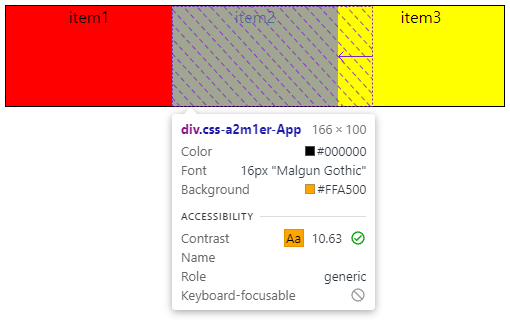
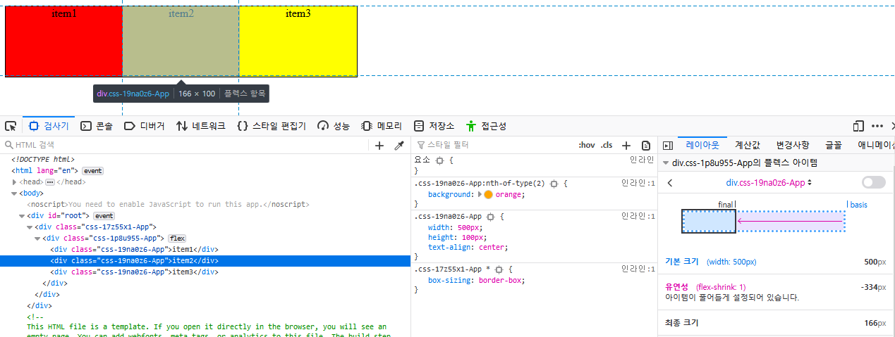
3) 1), 2) 경우에서 items이 container을 넘을 경우
.items {
  /* 생략... */
  flex-grow: 0;
  width: 100px;
  flex-basis: 200px; // 너비 늘림
}
.items {
/* 생략... */
flex-grow: 1;
width: 100px;
flex-basis: 200px; // 너비 늘림
}두 경우 다 item이 flex-basis값을 따르지만 컨테이너의 너비를 넘어가지 않게 된다.

4) flex basis, width, flex-shrink: 0
.items {
  /* 생략... */
  flex-shrink: 0;
  width: 100px;
  flex-basis: 150px;
}
너비는 flex-basis: 150px 값을 가지게 된다.
5) flex basis, width, flex-shrink: 1
.items {
  /* 생략... */
  flex-shrink: 1;
  width: 100px;
  flex-basis: 150px;
}
위의 경우에도 너비는 flex-basis: 150px 값을 가지게 된다.
6) 4), 5) 경우에서 items이 container을 넘을 경우
.items {
  /* 생략... */
  flex-shrink: 0;
  width: 100px;
  flex-basis: 200px; // 너비 늘림
}
container를 넘어서더라도 flex-basis: 200px;의 값을 가진다.
.items {
  /* 생략... */
  flex-shrink: 1;
  width: 100px;
  flex-basis: 200px; // 너비 늘림
}
container를 넘어서게되면 최대한 너비를 가질 수 있는 값을 가진다.
7) width만 있으면서 container을 넘을 경우
.items {
  /* 생략... */
  width: 500px;
}
이 경우에는 width 값만 지정했는데 왜 flex-basis값처럼 초기값이 보이는지는 모르겠다.
( firefox에서는 width로 표기된다. )

flex-shrink
해당 플렉스박스의 아이템들인 li요소들이 줄어들 때 부모 영역을 넘어설 때, flex-shrink 속성은 기본 값이 1이기 때문에 자동으로 아이템이 축소되어 아래와 같은 모습을 보이게 되었다.

그래서 flex-shrink: 0;를 선언해줌으로써 자동으로 아이템 너비가 축소되지 않게 할 수 있었다.
> li {
      flex-shrink: 0;
      font-size: 14px;
      font-weight: bold;
      padding: 0 1.5vw;
}