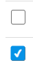
피그마에 있는 input checkbox와 동일하게 만들기 위해서 커스텀을 시작했다!
input checkbox 커스텀
1. label태그와 input태그 연결하기
일단 input태그 바로 밑에 label태그를 작성해준뒤, input의 id와 label의 for속성을 동일하게 작성하여 연결해준다.
                  <input type="checkbox" id="check" />
                  <label htmlForfor="check"></label>
React에서는 label의 for 속성을
htmlFor로 작성해야한다.<input type="checkbox" id="check" /> <label htmlForfor="check"></label>
2. css 작성하기
일단 기본 테마를 없애줍니다.
input[type="checkbox"] {
  display: none;
}
+ label을 붙여서 크기와 다른 스타일을 작성해줍니다.
input[type="checkbox"] + label {
  display: inline-block;
  width: 14px;
  height: 14px;
  border: 1px solid #707070;
  position: relative;
  border-radius: 2px;
}
::before 또는 ::after를 통해 check가 되었을 때의 style을 작성해줍니다.
input[type="checkbox"] + label::before {
  content: "";
  display: block;
  width: 14px;
  height: 14px;
  position: absolute;
  left: 0;
  top: 0;
}

input[type="checkbox"]:checked + label::before {
  content: "✔";
  color: white; /* 흰색으로 변경 */
  background-color: var(--primaryC);
  font-size: 9px;
  font-weight: 800;
  text-align: center;
  display: flex;
  justify-content: center;
  align-items: center;
  position: absolute;
  left: 50%;
  top: 50%;
  transform: translate(-50%, -50%); /* 정확한 중앙 정렬 */
  border-radius: 2px;
}

조금씩이라도 꾸준하게