🔶 CSS keyframe과 JavaScript를 통해 텍스트 슬라이드 애니메이션 넣기
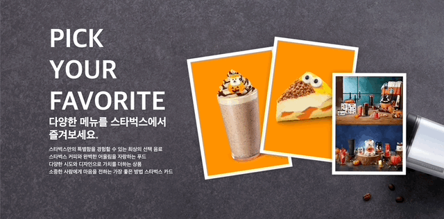
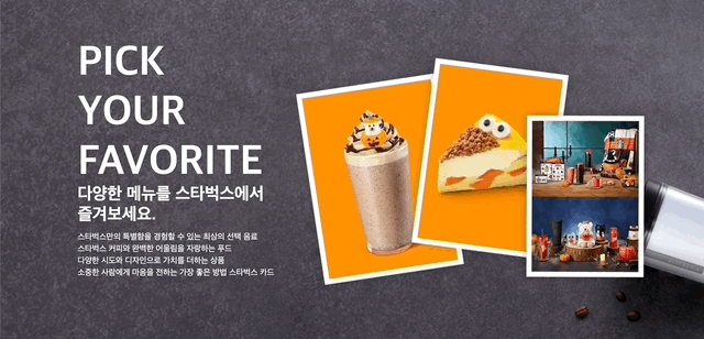
- 스타벅스 홈페이지 내에 있던 애니메이션을 따라해본다.
🔹 요약
- CSS에서 @keyframes를 생성하여 from과 to를 지정하여 애니메이션의 시작과 마지막의 결과물을 설정해 줌.
- 적용할 element에 animation으로 생성한 keyframe을 삽입.
- 스크롤바 일정 수준이상 내렸을 시에 slide out되는 효과는 JS에서 Scroll event를 통해 적용. (ScrollY 값이 일정 수준 이상일 때 애니메이션 발동)
🔹 문제점
-
스크롤바를 일정 수준 이상 내리면 slide out되는 애니메이션을 JS에서
event를 추가하여 적용했는데, span 태그로 작성한 description들만 slide out 애니메이션 적용이 안 됐었다. (아래 gif 첨부)
-
자바스크립트 파일에서
getElementsByClassName을 통해 가져온 것들만 제대로 적용이 안 되고 있던 것. (h1, h2 등은querySelector로 가져왔는데 이것들은 정상적으로 적용 됨)
❓ 원인: getElement 's' ByClassName을 유의하자.getElementById는 해당 id 단일 선택이라 문제 없다.
✅ 해결
방법 1. 아래와 같이, 클래스명 뒤에 [순서]를 입력할 것!
let s1 = document.getElementsByClassName("s1")[0];
방법 2. querySelector로 사용할 것.
let s1 = document.querySelector(".s1");
🔻 index.html
<!DOCTYPE html>
<html lang="en">
<head>
  <meta charset="UTF-8">
  <meta http-equiv="X-UA-Compatible" content="IE=edge">
  <meta name="viewport" content="width=device-width, initial-scale=1.0">
  <title>CSS Animation</title>
  <link rel="stylesheet" href="style.css">
</head>
<body>
  <section>
    <h1>PICK YOUR FAVORITE</h1>
    <h2>다양한 메뉴를 스타벅스에서 즐겨보세요.</h2>
    <span class="s1">스타벅스만의 특별함을 경험할 수 있는 최상의 선택 음료</span><br>
    <span class="s2">스타벅스 커피와 완벽한 어울림을 자랑하는 푸드</span><br>
    <span class="s3">다양한 시도와 디자인으로 가치를 더하는 상품</span>
    <span class="s4">소중한 사람에게 마음을 전하는 가장 좋은 방법 스타벅스 카드</span>
    <img class="photo" src="https://image.istarbucks.co.kr/upload/common/img/main/2022/2022_Halloween_pick_.png">
  </section>
  <script src="main.js"></script>
</body>
</html>
🔻 style.css
body {
  margin: 0;
  height: 2000px;
}
section {
  height: 800px;
  background: url(https://www.starbucks.co.kr/common/img/main/fav_prod_bg_new.jpg) fixed;
}
.photo {
  position: absolute;
  top: 100px;
  right: 100px;
}
h1 {
  font-size: 5em;
  width: 258px;
  color: white;
  font-family: sans-serif;
  position: absolute;
  top: 10px;
  left: 150px;
  animation: mySlide 1s ease-out;
}
h2 {
  font-size: 33px;
  width: 370px;
  color:white;
  position: absolute;
  top:330px;
  left: 150px;
  animation: mySlide 1s ease-out;
}
.s1 {
  font-size: 16px;
  width: 400px;
  color:white;
  position: absolute;
  top:450px;
  left: 150px;
  animation: mySlide 1s ease-out;
}
.s2 {
  font-size: 16px;
  width: 400px;
  color:white;
  position: absolute;
  top:473px;
  left: 150px;
  animation: mySlide 1s ease-out;

}
.s3 {
  font-size: 16px;
  width: 400px;
  color:white;
  position: absolute;
  top:496px;
  left: 150px;
  animation: mySlide 1s ease-out;

}
.s4 {
  font-size: 16px;
  width: 400px;
  color:white;
  position: absolute;
  top:519px;
  left: 150px;
  animation: mySlide 1s ease-out;

}
@keyframes mySlide {
  from {
    left: -100px;
    opacity: 0;
  }
  to {
    left: 150px;
    opacity: 1;
  }
}
@keyframes disappear {
  from {
    left: 150px;
    opacity: 1;
  }
  to {
    left: -100px;
    opacity: 0;
  }
}
🔻 main.js
let mainText = document.querySelector("h1");
let h2 = document.querySelector("h2");
let s1 = document.getElementsByClassName("s1")[0];
let s2 = document.getElementsByClassName("s2")[0];
let s3 = document.getElementsByClassName("s3")[0];
let s4 = document.getElementsByClassName("s4")[0];

window.addEventListener("scroll", function () {
  let value = window.scrollY;
  console.log("scroll", value);
  if (value > 300) {
    mainText.style.animation = "disappear 1s ease-out forwards";
    //scrollY의 값이 300 초과인 경우 애니메이션 발동.
    //style.css의 disappear keyframe 적용, forwards 속성은 처음 상태로 다시 되돌려 줌.
    h2.style.animation = "disappear 1s ease-out forwards";
    s1.style.animation = "disappear 1s ease-out forwards";
    s2.style.animation = "disappear 1s ease-out forwards";
    s3.style.animation = "disappear 1s ease-out forwards";
    s4.style.animation = "disappear 1s ease-out forwards";
  } else {
    mainText.style.animation = "mySlide 1s ease-out";
    //scrollY값이 300 이하인 경우 다시 Slide animation 동작.
    h2.style.animation = "mySlide 1s ease-out";
    s1.style.animation = "mySlide 1s ease-out";
    s2.style.animation = "mySlide 1s ease-out";
    s3.style.animation = "mySlide 1s ease-out";
    s4.style.animation = "mySlide 1s ease-out";
  }
});
😸