1. Prophet 이용한 1년치 웹 유입량 데이터 분석 (pinkwink 블로그)
 	import numpy as np
    import pandas as pd
    import matplotlib.pyplot as plt
    from prophet import Prophet

    %matplotlib inline
(1) 데이터 읽어오기
* 데이터 읽어온 후 Nan 값 제거
 pinkwink_web = pd.read_csv(
        "../data/05_PinkWink_Web_Traffic.csv",
        encoding="utf-8",
        thousands=",",
        names=["date", "hit"],
        index_col=0
    )
    pinkwink_web

pinkwink_web = pinkwink_web[pinkwink_web["hit"].notnull()]- 전체 데이터 시각화
pinkwink_web["hit"].plot(figsize=(12, 4), grid=True);(2) 경향분석 (Numpy 이용)
- Numpy 이용 경향성 분석 (trend)
- 다항식 회귀(Polynomial Regression) 모델을 사용. 다항식 함수 사용하여 데이터 근사하는 회귀 모델

`
(x, y 값 형성)
- x값은 0부터 pinkwink_web 데이터 길이까지 365개의 값
    ```
	time = np.arange(0, len(pinkwink_web))
- y축은 PinkWink 블로그의 일일 유입량
```
traffic = pinkwink_web["hit"].values(회귀함수 생성)
-
TREND 파악을 위한 다항식 회귀함수 생성
- np.polyfit() : 데이터에 적합한 다항식의 계수 구함
- np.poly1d() : 계수 적용한 다항식 생성
- 다항식은 1차, 2차, 3차, 15차 함수까지 4개 생성
``
pf1 = np.polyfit(time, traffic, 1)
f1 = np.poly1d(pf1)pf2 = np.polyfit(time, traffic, 2) f2 = np.poly1d(pf2) pf3 = np.polyfit(time, traffic, 3) f3 = np.poly1d(pf3) pf15 = np.polyfit(time, traffic, 15) f15 = np.poly1d(pf15)
(경향성과 데이터 비교)
- numpy로 만든 4종류의 trend 함수들과 실제 데이터를 그래프로 확인
- np.polyfit() : 데이터에 적합한 다항식의 계수 구함
- np.poly1d() : 계수 적용한 다항식 생성
- 다항식은 1차, 2차, 3차, 15차 함수까지 4개 생성
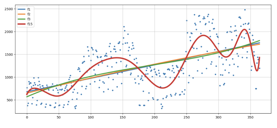
실제 데이터에 가장 맞는 경향성을 보이는 것은f15로 보임
(3) 오차 검증 (RMSE: rmse average: 제곱근오차평균)
-- 경향성 모델의 정확성 확인 지표 (RMSE: rmse average: 제곱근오차평균)
-- Numpy로 계산한 경향성과 실제 데이터의 오차가 얼마인지 확인해줄 error함수 생성
	def error(f, x, y):
    return np.sqrt(np.mean((f(x) - y) ** 2))

    print(error(f1, time, traffic))
    print(error(f2, time, traffic))
    print(error(f3, time, traffic))
    print(error(f15, time, traffic))
    --> 430.85973081109626
    --> 430.6284101894695
    --> 429.5328046676293
    --> 330.47773079342267
error() 함수로 검증한 결과도 f15가 가장 작음
(4) Prophet이용한 경향 분석 및 미래 데이터 예측
*-- 데이터 생성 (Phrophet에 학습시킬 DataFrame 형식 - 웹 유입량 데이터 변형시킴)
    df = pd.DataFrame({
            "ds": pinkwink_web.index,
            "y": pinkwink_web["hit"]
         })
    df.reset_index(inplace=True)
    del df["date"]
    df["ds"] = pd.to_datetime(df["ds"], format="%y. %m. %d.")
*-- 미래값 예측 (Phrophet으로 모델 생성 후 학습시킨 후 미래 예측값 얻어옴)
    model = Prophet(yearly_seasonality=True, daily_seasonality=True)
    model.fit(df);

    future = model.make_future_dataframe(periods=60)
    forecast = model.predict(future)
    forecast[["ds", "yhat", "yhat_lower", "yhat_upper"]].tail()
*-- 예측값 시각화
model.plot(forecast);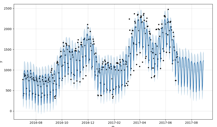
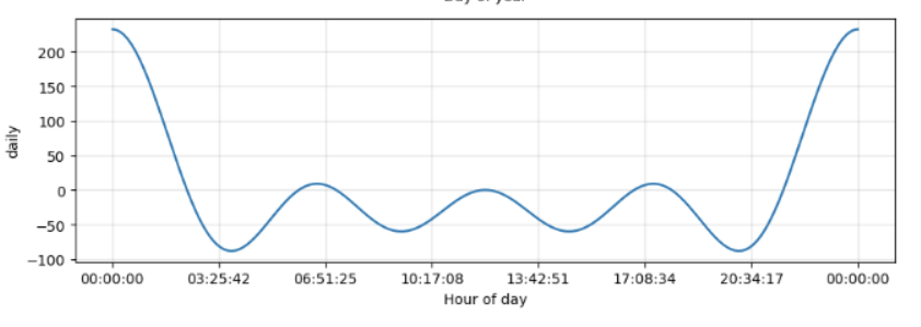
*-- 경향분석 (미래 예측 데이터 포함 경향 분석)
model.plot_components(forecast);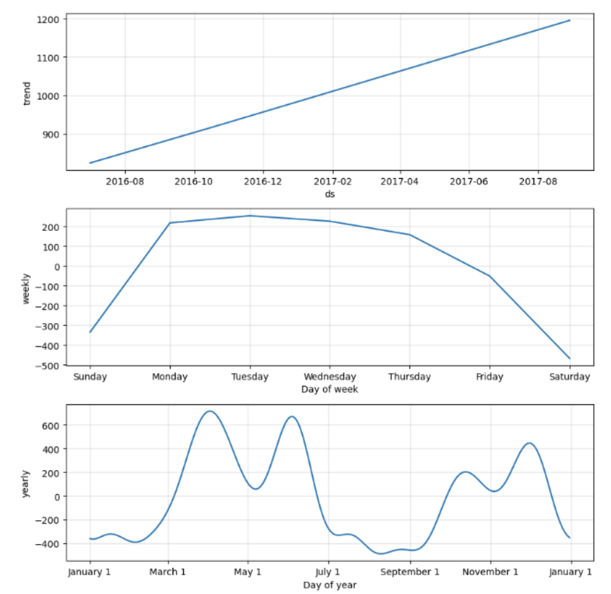
*-- 오차 검증 (제곱근 오차 평균)
    np.sqrt(np.mean((forecast["trend"]-df["y"])**2))
    //--> 536.0321309635455
Prophet이 분석한 경향은 실제 데이터 분포와 상당한 오차 존재하는 편
2. 종합분석
- 실제 데이터 vs. Numpy로 계산한 trend vs. Prophet으로 예측한 trend
    plt.figure(figsize=(14, 6))

    plt.scatter(time, traffic, s=10)
    plt.plot(fx, f1(fx), lw=4, label='Numpy Trend')
    ptrend = forecast.loc[:364, "trend"].values
    plt.plot(time, ptrend, lw=4, label='Prophet Trend')

    plt.grid(True, linestyle="-", color="0.75")
    plt.legend(loc=2)
    plt.show()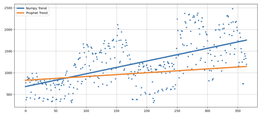
Prophet이 분석한 경향보다 Numpy로 계산한 경향이 실제 데이터 추세와 더 잘 맞아 보임