플러터 시작하기
-
VSCode에서
Command+Shift+P를 눌러flutter를 입력하고New Application Project를 선택하여 새 프로젝트를 생성 -
mainDart에서 main 클래스(?) 제외하고 모두 지운 후 MacterialApp import
-
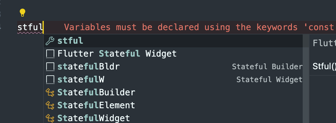
liib 폴더에 화면 폴더 및 파일 생성 후 stful입력하고 2번째꺼 선택하면 StatefulWidget 자동 생성된다.
-
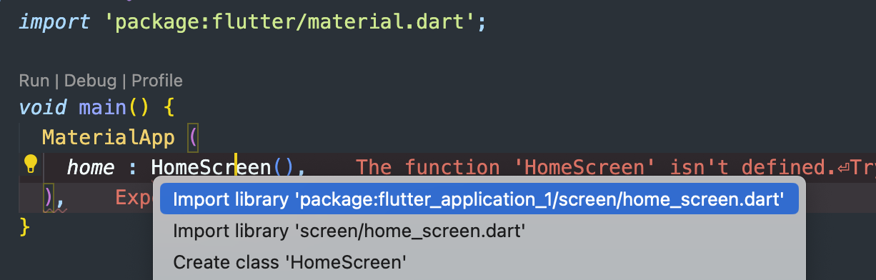
class이름 HomeScreen으로 변경 후 다시 main.dart가서 HomeScreen import(Command + . 하면 자동 import할 수 있음)
기본적인 것들
Material
-
기본 앱을 만들 때 공통된 디자인 요소를 줄수있는 라이브러리 같은것(구글식(안드로이드) 디자인 컨셉), Scaffold사용
-
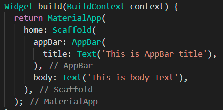
MaterialApp은 앱으로서 기능을 할 수 있도록 해주는 뼈대
Scaffold
-
플러터에서 기본적인 앱에서 디자인적인 뼈대를 구성하는 위젯
-
Scaffold은 구성된 앱에서 디자인적인 부분에서의 뼈대
-
MaterialApp 안에 home 위젯으로 Scaffold을 작성
SafeArea()
- 디바이스 노치에 콘텐츠 안가려지게 해줌
class _UniScreenState extends State<UniScreen> {
  @override
  Widget build(BuildContext context) {
    return Scaffold(
      body: SafeArea(
        child: SizedBox(
        .
        .
        .
- 위에만 쓰고 싶을 때
bottom: false
class _UniScreenState extends State<UniScreen> {
  @override
  Widget build(BuildContext context) {
    return Scaffold(
      body: SafeArea(
      	bottom: false,
        child: SizedBox(
        .
        .
        .
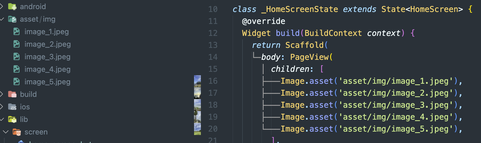
Image
-
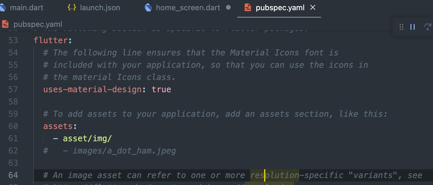
pubspec.yaml 파일에 assets: 입력 후 이미지 가져다 쓸 경로 입력
-
이미지 사용 시 해당 Screen 코드
fit 메서드
- 이미지 화면에서 어떻게 나올지 정함
- 거의
fit: BoxFit.cover를 주로 사용(css에서object-fit:cover같음) - cover는 화면의 비율대로 늘리기 때문에 이미지가 잘리는 경우가 많은것을 감수
Center() 위젯
- 자식 콘텐츠를 가운데 정렬
class _UniScreenState extends State<UniScreen> {
@override
Widget build(BuildContext context) {
return const Scaffold(
body: Center(child: Text('U&I')),
);
}
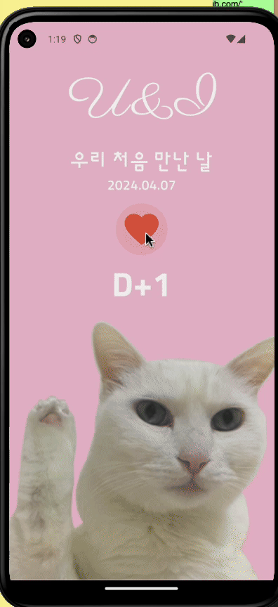
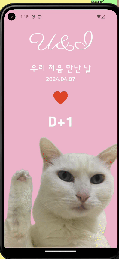
}IconButton()
- Icon 버튼으로 생성
 IconButton(
            onPressed: () {},
            icon: const Icon(Icons.favorite),
          ),
가로 최대사이즈로(반응형)
- Column나 Row를 SizedBox로 감싸고
width: MediaQuery.of(context).size.width,
return Scaffold(
      body: SizedBox(
        width: MediaQuery.of(context).size.width,
        child: Column(
          children: [
            const Text('U&I'),
            const Text('우리 처음 만난 날'),
            const Text('2024.04.08'),
            IconButton(
              onPressed: () {},
              icon: const Icon(Icons.favorite),
            ),
            const Text('D+1'),
          ],
        ),
      ),
    );
Expended()
- widget에서 나머지 전체를 차지하라는 의미를 가진 위젯(원본을 무시하고 현재 차지할 수 있는 크기에 최대한 크기만 차지하라고 할 수 있음)
- 콘텐츠가 화면에서 넘칠때 개발모드에서 방지턱같은게 뜨는것을 예방함
Align()
- 특정 위젯이 어디에 정렬을 해야되는지 모르면 height값줘도 최대한에 사이즈를 먹음
전
IconButton(
            onPressed: () {
              showCupertinoDialog(
                context: context,
                builder: (BuildContext context) {
                  return Container(
                    color: Colors.white,
                    height: 300,
                  );
                },
              );
            },
            icon: const Icon(Icons.favorite),
            iconSize: 60,
            color: Colors.red,
          ),
후
 IconButton(
            onPressed: () {
              showCupertinoDialog(
                context: context,
                builder: (BuildContext context) {
                  return Align(
                    alignment: Alignment
                        .bottomCenter, //특정 위젯이 어디에 정렬을 해야되는지 모르면 height값줘도 최대한에 사이즈를 먹음
                    child: Container(
                      color: Colors.white,
                      height: 300,
                    ),
                  );
                },
              );
            },
            icon: const Icon(Icons.favorite),
            iconSize: 60,
            color: Colors.red,
          ),
ThemeData()
- Flutter에서 앱의 전반적인 테마를 정의하는 데 사용
ThemeData 주요 속성
primarySwatch,primaryColor: 앱의 주 색상을 정의.accentColor: 강조 색상을 정의(버튼, 플로팅 액션 버튼 등에 사용).backgroundColor,scaffoldBackgroundColor: 배경 색상을 정의.fontFamily: 앱 전체에 사용할 기본 폰트 패밀리를 설정.textTheme: 텍스트 스타일링을 위한 테마를 정의. 예) 제목, 본문 텍스트 등에 대한 스타일을 설정.buttonTheme: 버튼 위젯의 기본 스타일을 설정.iconTheme: 아이콘의 기본 스타일을 설정.
사용예시
MaterialApp(
  theme: ThemeData(
    primarySwatch: Colors.blue,
    accentColor: Colors.amber,
    fontFamily: 'YourFontFamily',
    textTheme: TextTheme(
      headline1: TextStyle(fontSize: 72.0, fontWeight: FontWeight.bold),
      headline6: TextStyle(fontSize: 36.0, fontStyle: FontStyle.italic),
      bodyText2: TextStyle(fontSize: 14.0, fontFamily: 'Hind'),
    ),
  ),
  home: MyHomePage(),
);
개발짜🏃♀️