3D 버튼 애니메이션
마우스를 가져다 놨을 때 3D모션 처럼 버튼이 보여지는 전환 효과를 만들어 보자!
<div class="container">
<div class="item front">앞</div>
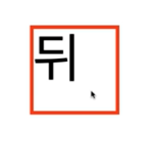
<div class="item back">뒤</div>
</div>우선 HTML같은경우에는 구조만 만들어주면 되기 때문에간단하게 container라는 class안에 처음 보여질 화면이 "item front" 클릭하였을 때 뒤에 보일 화면이 "item back"이다.
body{
padding 50px;
}
.container{
width:100px;
height:100px;
perspective:300px;
}
.container.item{
width:100px;
height :100px;
}
.container .item.front{
position:absolute;
transform: rotateY(0deg);
}
.container:hover .item.front{
transform:rotateY(180deg);
}
.container .item .back{
transform: rotateY(-180deg);
}
.container:back .item .back{
transform: rotateY(0deg);
}container에 크기를 지정을 안했을 시 컨테이너가 계속 늘어나려는 성질이 있기 때문에 우리가 회전하는 만큼의 사이즈만큼 크기를 지정해 주어야 한다.
또한 원근법이 추가되어 있지 않기 때문에 부모요소인 ".container"부분에 perspective속성을 추가해주어서 300px거리에서 지켜보는 효과를 추가해 주었다.
그리고 코드를 명확하게 해주기 위해서 '.container .item.front' 부분에 'transform:rotateY(0deg);'를 추가해주어 기본값이 아니라 명시적으로 0도에서 출발하여 회전하면 180도가 된다는 것을 확인할 수 있습니다.


LEVELING