하고 있는 사이드프로젝트에 기능이 추가되면서 대시보드와 비슷한 UI를 구현할 기회가 생겼다..! 해보고 싶었는데ㅎㅎ..
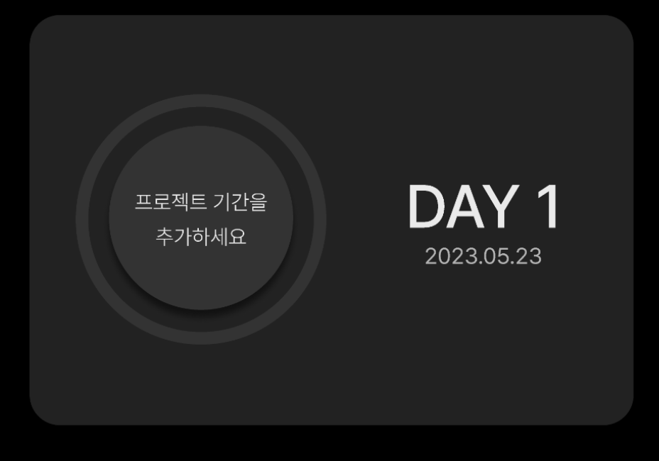
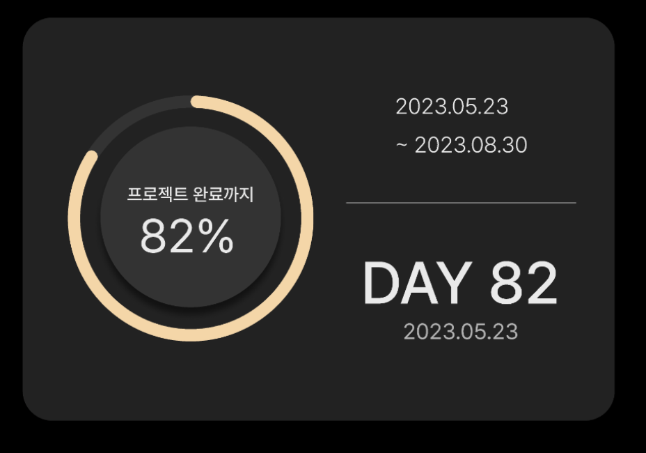
프로젝트 목표일을 설정하면 디데이와 진행 정도를 도넛 차트로 나타내는 기능을 구현해보았다.
초기 디데이
목표일 설정 시 디데이
스타일 컴포넌트
//전체 크기 지정
const DonutContainer = styled.div`
  position: relative;
  width: 180px;
  height: 180px;
`;

const StyledSVG = styled.svg`
  width: 100%;
  height: 100%;
`;
//외부 원
const OuterCircle = styled.circle`
  fill: none;
  stroke: var(--color-sub-4);
  stroke-width: 10;
`;
//진행 정도를 표시해주는 원 (노란색)
const ProgressCircle = styled.circle<{ progress: number }>`
  fill: none;
  stroke: var(--color-main-4);
  stroke-width: 10;
  stroke-dasharray: ${(props) => 2 * Math.PI * 90}; //원의 둘레로 점선의 패턴을 정의
  stroke-dashoffset: ${(props) => 2 * Math.PI * 90 * (1 - props.progress)}; //선이 그려지는 시작 위치를 조절
  stroke-linecap: round; //선 끝을 둥글게
  transform: rotate(-90deg); //디자인에 맞게 회전
  transform-origin: center;
`;

const InnerCircle = styled.circle` //안쪽 원
  fill: var(--color-sub-4);
  filter: drop-shadow(0 5px rgba(0, 0, 0, 0.5)); //그림자 효과
`;

const Text = styled.div<{ initial: boolean }>` //글씨 위치
  position: absolute;
  top: 50%;
  left: 50%;
  transform: translate(-50%, -50%);
  font-size: ${({ initial }) => (initial ? "14px" : "12px")};
  text-align: center;
  justify-content: center;
  color: var(--color-sub-1);
  line-height: 2;
  span {
    font-size: 32px;
  }
`;
React TS
<DonutContainer>
  <StyledSVG viewBox="0 0 200 200">
    {//cx, cy:  원의 중심의 x,y 좌표 r: 반지름 크기}
    <OuterCircle cx="100" cy="100" r="90" />
      <ProgressCircle
              cx="100"
              cy="100"
              r="90"
              progress={initial ? 0 : percent / 100}
       />
                <InnerCircle cx="100" cy="100" r="70" />
  </StyledSVG>
  <Text initial={initial ? true : false}>
  {initial ? (
   <>
   	프로젝트 기간을
   	<br />
   	추가하세요
   </>) :
   (
   <>
   	프로젝트 완료까지
   	<br />
   	<span>{percent}%</span>
   </>
  )}
  </Text>
</DonutContainer>
이것 저것 코딩일지 쓰는 프론트엔드 코린이