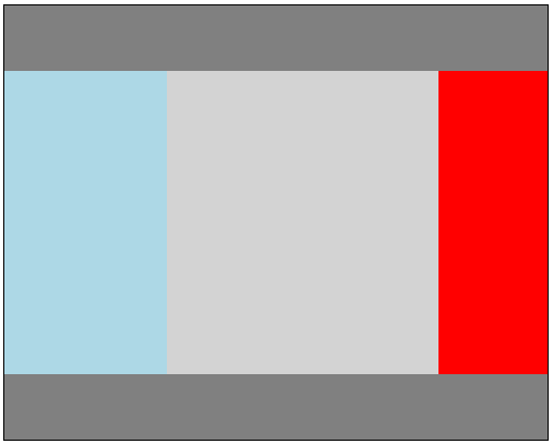
1번 문제
1-1. HTML
  <!-- 1번 문제 -->
    <div class="container">

        <div id="header"></div>
        <div id="center-container">
            <div class="center" id="left"></div><div class="center" id="center"></div><div class="center" id="right"></div>
        </div>
        <div id="footer"></div>

    </div>
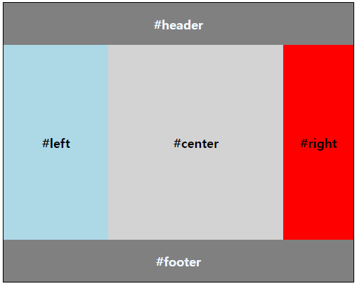
1-2. HTML(flexbox)
  <div class="container1">
        <div class="header item2">#header</div>
        <div class="center-container">
            <div class="center item" id="left">#left</div>
            <div class="center item" id="center">#center</div>
            <div class="center item" id="right">#right</div>
        </div>
        <div class="footer item2">#footer</div>
    </div>
2-1. CSS 부분
/* 컨테이너 */
.container {
    border: 1px solid ;
    width: 500px;
    height: 400px;

    box-sizing: border-box;
}

/* 헤더 */
#header {
    height: 15%;
    background-color: gray;
}

/* 센터 */
#center-container {
    height: 70%;
    background-color: antiquewhite;
}

/* 푸터 */
#footer {
    height: 15%;
    background-color: gray;
}


/* 센터 3분할 설정 */
.center{
    display: inline-block;
    height: 100%;
}


/* 센터 내부 박스 설정 */
#left{
    width: 30%;
    background-color: lightblue;
}

#center{
    width: 50%;
    background-color: lightgray;
}

#right {
    width: 20%;
    background-color: red;
}
2-2. CSS 부분(flexbox)
.item{
    display: flex;
    justify-content: center;
    align-items: center;
    font-size: large;
    font-weight: bold;
    /* 글자가 자식 */
}

.item2{
    display: flex;
    justify-content: center;
    align-items: center;
    font-size: large;
    font-weight: bold;
    color: aliceblue;
}


.container1 {
    border: 1px solid black;
    width: 500px;
    height: 400px;
    box-sizing: border-box;

    display: flex;

    flex-direction: column;

}

.header {
    height: 15%;
    background-color: gray;
}

.center-container {
    height: 70%;
    display: flex;
    flex-direction: row;
}

.footer {
    height: 15%;
    background-color: gray;
}

#left {
    width: 30%;
    background-color: lightblue;
}

#center {
    width: 50%;
    background-color: lightgray;
}

#right {
    width: 20%;
    background-color: red;
}
결과값
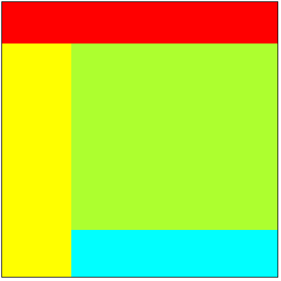
2번 문제
1-1. HTML
   <!-- 2번 문제 -->
    <div class="container2">
        <div id="header2"></div>
        <div id="main2">
            <!-- nav / content,footer 분할 -->
            <div class="main-2" id="nav"></div><div class="main-2" id="content-container">
                                                <!-- footer / content 분할-->
                                                <div id="content"></div>
                                               </div>
        </div>
    </div>
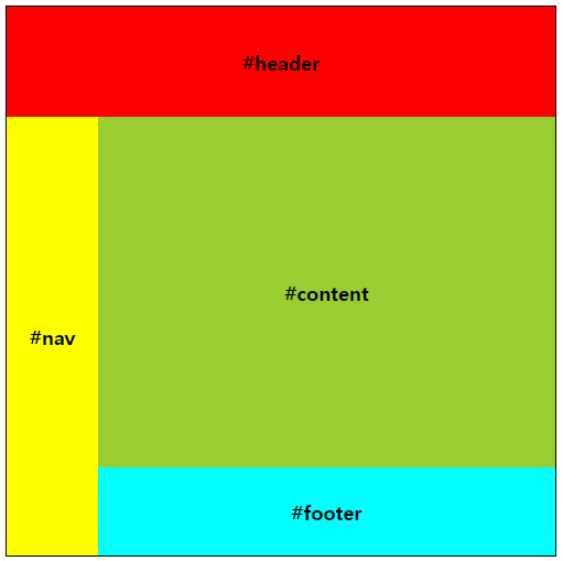
1-2. HTML(flexbox)
    <div class="container2">
        <div class="header2 item">#header</div>
        <div class="center-container2">
            <div class="center2 item" id="nav">#nav</div>
            <div class="center3">
                <div class="item" id="content2">#content</div>
                <div class="item" id="footer2">#footer</div>
            </div>
        </div>
    </div>
2-1. CSS 부분
/* 컨테이너 */
.container2{
    border: 1px solid black;
    width: 400px;
    height: 400px;

    box-sizing: border-box;
}

/* 헤더 */
#header2{
    height: 15%;
    background-color: red;
}

/*  메인 */
#main2{
    height: 85%;
}

/*  좌우 분할 내부 설정 */
.main-2{
    display: inline-block;
    width: 100%;
    height: 100%;
}

/* Nav */
#nav {
    width: 25%;
    background-color: yellow;
}

/* content + footer */
#content-container{
    width: 75%;
    background-color : aqua;
}

/* content */
#content{
    height: 80%;
    background-color: greenyellow;
}
2-2. CSS 부분(flexbox)
.container2 {
    border: 1px solid black;
    width: 500px;
    height: 500px;
    box-sizing: border-box;

    display: flex;

    flex-direction: column;
}

.header2{
    height: 20%;
    background-color: red;
}

.center-container2{
    height: 80%;
    background-color: bisque;

    display: flex;

    flex-direction: row;
}

#nav{
    width: 20%;
    background-color: yellow;
}

.center3{
    width: 100%;
    display: flex;
    flex-direction: column;
}

#content2{
    height: 80%;
    background-color: yellowgreen;
}

#footer2{
    height: 20%;
    background-color: aqua;
}
결과값