CSS Module?
레거시 프로젝트(과거에 진행이 끝난 프로젝트)에 리액트를 도입하거나, 클래스 이름을 짓는 규칙을 정하기 힘들거나 번거로울 때 사용하면 편리한 기술
순서
- 먼저
JavaScript파일을 만들어준다. 파일명.module.css로CSS파일을 만든다.css를 작업한다.JS파일에 이를 적용한다.classnames로 손쉽게 해보자.
1번
App.js
import React, { useState } from 'react';
import CheckBox from './components/CheckBox';

function App() {
  const [check, setCheck] = useState(false);
  const onChange = (e) => {
    setCheck(e.target.checked);
  };
  return (
    <div className="App">
      <CheckBox onChange={onChange} checked={check}>
        다음 약관에 모두 동의
      </CheckBox>
    </div>
  );
}

export default App;
먼저 약관에 동의할 지를 묻는 체크박스를 만들고, CheckBox.js파일을 만들어줌
react-icons를 yarn을 통해 add 해줌
yarn add react-icons그 후 파일 작성
CheckBox.js
import React from 'react';
import { MdCheckBox, MdCheckBoxOutlineBlank } from 'react-icons/md';

function CheckBox({ checked, children, ...rest }) {
  return (
    <div>
      <label>
        <input type="checkbox" checked={checked} {...rest} />
        <div>
          {checked ? (
            <MdCheckBox />
          ) : (
            <MdCheckBoxOutlineBlank />
          )}
        </div>
      </label>
      <span>{children}</span>
    </div>
  );
}

export default CheckBox;
2, 3번
기존의 체크박스는 숨기고, icons에서 가져온 체크박스를 사용하도록 하는 css파일을 작성
CheckBox.module.css
.checkbox {
  display: flex;
  align-items: center;
}

.checkbox label {
  cursor: pointer;
}

.checkbox input {
  width: 0;
  height: 0;
  position: absolute;
  opacity: 0;
}

.checkbox span {
  font-size: 1.125rem;
  font-weight: bold;
}

.icon {
  display: flex;
  align-items: center;
  font-size: 2rem;
  margin-right: 0.25rem;
  color: #adb5bd;
}

.checked {
  color: #339af0;
}
4번
CSS파일을 import한다.
여기서 주의할 점은 module이기 때문에 import와 from사이에 styles를 넣어준다.
CheckBox.js
import React from 'react';
import { MdCheckBox, MdCheckBoxOutlineBlank } from 'react-icons/md';
import styles from 'CheckBox.module.css';

function CheckBox({ checked, children, ...rest }) {
  return (
    <div className={styles.checkbox}>
      <label>
        <input type="checkbox" checked={checked} {...rest} />
        <div className={styles.icon}>
          {checked ? (
            <MdCheckBox className={styles.checked}/>
          ) : (
            <MdCheckBoxOutlineBlank />
          )}
        </div>
      </label>
      <span>{children}</span>
    </div>
  );
}

export default CheckBox;
결과를 확인해보자.
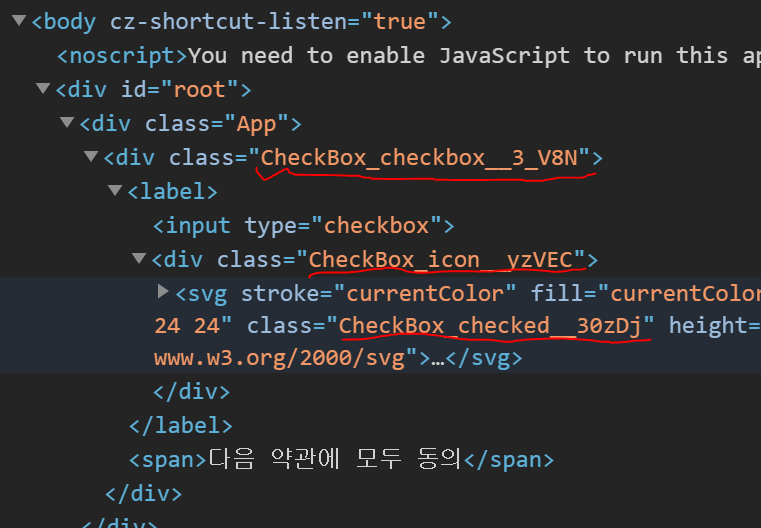
빨간 줄 을 보면 알 수 있듯이 클래스 이름이 굉장히 독특하게 되어있다.
한마디로 다른 클래스들과 겹치지 않는다는 소리다.
5번
classnames를 이용하면 좀 더 손쉽게 코드 작성을 할 수가 있다.
yarn add classnames위 코드를 터미널에 작성하여 추가해준 다음, 아래처럼 코드를 작성하자.
import React from 'react';
import { MdCheckBox, MdCheckBoxOutlineBlank } from 'react-icons/md';
import styles from './CheckBox.module.css';
import classNames from 'classnames/bind';

const cx = classNames.bind(styles);

function CheckBox({ checked, children, ...rest }) {
  return (
    <div className={cx('checkbox')}>
      <label>
        <input type="checkbox" checked={checked} {...rest} />
        <div className={cx('icon')}>
          {checked ? (
            <MdCheckBox className={cx('checked')} />
          ) : (
            <MdCheckBoxOutlineBlank />
          )}
        </div>
      </label>
      <span>{children}</span>
    </div>
  );
}

export default CheckBox;
결과값은 4번과 동일한데, bind를 통해 styles를 바인드 해줌으로써
좀 더 손쉽게 클래스 작성이 가능해진다.
만약, styles를 그대로 쓰려면
classNames={`${styles.classA} ${styles.classB}`}위와 같은 형태로 써야한다.
만약 sass를 쓰고 싶으면 파일명.module.sass를 쓰면 된다.

코딩의 고수가 되고 싶은 종한이