styled-components 를 많은 프로젝트에 적용해보았지만 이제서야 정리해본다.
설치
yarn add styled-components @types/styled-components
GlobalStyles
파일 작성
먼저 GlobalStyles 를 작성해보자. 앱 전체를 아우르는 스타일을 작성하는 파일이다. 아래 파일을 생성한다.
/src/Theme/GlobalStyles.ts/src/Theme/GlobalStyles.ts
reset 스타일이 세팅되어있는 styled-reset 모듈을 사용해도 좋다. 하지만 필자는 필자가 사용하는 태그들만 직접 리셋 해주는 것을 선호한다. 기본적으로 GlobalStyles 테스트를 위해 아래와 같은 CSS 코드를 작성 해주자.
import { createGlobalStyle } from 'styled-components';

const GlobalStyles = createGlobalStyle`

  html, body, div, p {
    margin: 0;
    padding: 0;
    box-sizing: border-box;
  }

  :root {
    --color__primary: #E75151;
  }
`;

export default GlobalStyles;
src/App.tsx
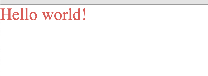
GlobalStyles 는 그냥 App.tsx 에서 가장 상단에 배치해주면 된다. 그리고 Text 컴포넌트를 작성해보았다.
import React from 'react';
import styled from 'styled-components'
import GlobalStyles from './Theme/GlobalStyles';

const Text = styled.p`
  color: var(--color__primary);
`;

function App() {
  return (
    <div>
      <GlobalStyles />
      <Text>Hello world!</Text>
    </div>
  )
}
이제 결과를 보자.
이렇게 간단히 끝났다. 하지만 여기서 typescript 를 적용 해보기 위해, disabled 상태에 따라 텍스트의 색상이 바뀌도록 만들어보자.
src/App.tsx
import React from 'react';
import styled, { DefaultTheme, StyledComponent } from 'styled-components'
import GlobalStyles from './Theme/GlobalStyles';

interface TextInterface {
  disabled: boolean;
}

const Text: StyledComponent<'p', DefaultTheme, TextInterface, never> = styled.p`
   ${(props: TextInterface) => props.disabled
      ? 'color: lightgray;'
      : 'color: var(--color__primary);'
   };
`;

function App() {
  const [ disabled, setDisabled ] = useState(false);
  return (
    <div>
      <GlobalStyles />
      <Text disabled={disabled} >Hello world!</Text>
      <button onClick={() => setDisabled(!disabled)}>Toggle</button>
    </div>
  )
}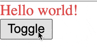
토글 버튼을 누르면 버튼 색상이 바뀌는 것을 확인할 수 있다.

작고 단단한 컴포넌트를 만들자.