[D3.js] responsvie & horizontal bar chart with React
이번 포스팅에서는 tooptip이 있는 horizontal bar chart를 만드는 과정을 소개합니다.
최근에 동아리에서 진행된 미니 프로젝트로 DDTI - 개발자/디자이너 성향 테스트를 만들게 되었습니다. 다른 성향테스트랑은 다른, 좀 더 재밌는 기능을 추가해볼 수는 없을까? 하고 생각하다가, 제가 최근에 공부한 D3.js를 이용하여 테스트 결과에 대한 차트를 만들어보면 재밌을 것 같아 유형별 인원수에 관한 Bar Chart를 추가하게 되었습니다.
chart를 그리기 위한 준비
[
  {
    title: "곰",
    img: "http://developer-designer-personality-test.s3-website.ap-northeast-2.amazonaws.com/77aa1a95da0ba6217fab2a7ac1ec4a36.png";
    count: 12;
    shortBio: "선비같은 곰";
  },
  ...
]
그래프에 사용되는 데이터는 다음과 같은 형식으로 이루어져있습니다. 여기서 count는 유형별 인원수로, 테스트 결과 곰에 해당하는 유형의 사람이 12명이라는 것을 의미합니다. img 소스는 tooltip에서 사용하게 됩니다.
<Canvas>
  <h2> {title} </h2>
  {windowWidth >= laptopWidth ? (
    <Tooltip ref={tooltipRef} />
  ) : (
    <div style={{ height: '3rem' }} />
  )}
  <ChartWrapper>
    <svg ref={ref} width={width} height={height}>
      <g
        className="x-axis"
        transform={`translate(${margin.left}, ${margin.top})`}
        />
      <g
        className="y-axis"
        transform={`translate(${margin.left - 10}, 0)`}
        />
    </svg>
    <Legend data={data} type={type} />
  </ChartWrapper>
</Canvas>
컴포넌트들은 다음과 같은 구조를 가지고 있습니다. 노트북 너비 이하가 됐을 때는 tooltip을 보여주지 않습니다. ChartWrapper 안에서 그래프가 그려질 영역인 svg 안에는 x축, y축을 위한 <g> 요소와, legend를 나타내는 <Legend> 컴포넌트를 가지고 있습니다.
xScale
horizontal bar chart이기 때문에 x축이 count값을 나타내게 됩니다. 0 ~ xMaxValue 사이의 값을 0 ~ graphWidth 사이의 값으로 맵핑하는 xScale 함수를 만듭니다. 연속적인 값을 가지기 때문에 d3의 scaleLinear을 사용합니다.
const xMaxValue = d3.max(data, (d) => d.count);
const xScale = d3
  .scaleLinear()
  .domain([0, xMaxValue])
  .range([0, graphWidth]);
yScale
y축은 각 유형의 이름으로, categorical value이기 때문에 d3의 scaleBand를 사용합니다. domain은 각각의 유형 이름(title)이 될 것이고, 이를 graph 상에서는 margin.top ~ graphHeight 사이의 값으로 나타냅니다.
 const yScale = d3
   .scaleBand()
   .range([margin.top, graphHeight])
   .domain(data.map((d) => d.title))
   .paddingOuter(0)
   .paddingInner(0.4);
Axis
앞에서 만들었던 xScale, yScale을 이용하여 축을 만듭니다.
 const xAxis = d3.axisTop(xScale);
  svg.select('.x-axis').call(xAxis);

const yAxis = d3
  .axisLeft(yScale)
  .ticks(data.length)
  .tickSizeInner(0)
  .tickSizeOuter(0);

svg.select('.y-axis').call(yAxis);
colorScale
d3에서는 scale-chromatic을 제공하기 때문에 다양한 색들을 그래프 상에서 표현할 수 있습니다. 간단한 그래프를 그릴 경우 색을 고민할 필요없이 바로 가져다 쓸 수 있습니다.
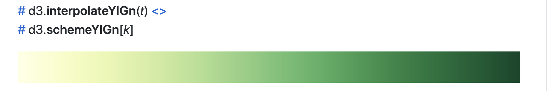
동물의 숲을 테마로 했기 때문에 노란색 ~ 초록색 사이의 색을 사용하기로 하겠습니다. d3.interpolateYlOrBr(t)는 [0, 1]의 값을 받아서 이 그라데이션에 존재하는 색상 중 하나로 반환합니다.
const color = d3.scaleLinear().domain([0, xMaxValue]).range([0, 1]);이 그래프에서는 count 값에 따라 더 진한 초록색을 보여주고 싶기 때문에, count 값을 [0, 1] 사이의 값으로 바꿔주는 함수가 필요합니다. 이를 위해 sclaeLinear을 사용합니다.
tooltip 만들기
바 차트 안에서 hovering event를 위한 함수를 만드는 과정입니다.
먼저 마우스가 올려졌을 때의 이벤트입니다. html 메서드를 사용하여 tooltip(div) 안에 img, span 태그를 추가하여 hover된 유형의 이미지와 이름을 나타내고, 투명도를 1로 만들어줍니다. hover된 bar는 투명도를 0.3으로 조정합니다.
const tooltip = d3.select(tooltipRef.current);

const mouseover = function (event, d) {
    if (windowWidth < laptopWidth) {
      return;
    }
    tooltip
      .html(
      `<img src=${d.img} alt=${d.shortBio}/><span>${d.shortBio} ${d.count}명</span>`
    )
      .style('left', xScale(d.count) - 170)
      .style('top', yScale(d.title) + yScale.bandwidth() + 5)
      .transition()
      .duration(200)
      .style('opacity', 1);
    d3.select(this).transition().duration(200).style('opacity', 0.3);
  };
마우스가 떠났을 때는 html을 비워주고, 투명도를 0으로 만듭니다. bar의 투명도도 다시 원래대로 1로 조정합니다.
const mouseleave = function () {
  if (windowWidth < laptopWidth) {
    return;
  }
  tooltip.html('  ').style('opacity', 0);
  d3.select(this).style('opacity', 1);
};
Bar Chart
이제 실제로 bar chart를 그리는 과정입니다.
horizontal bar chart이기 때문에 유형의 이름에 따라 bar의 y 값이 달라집니다. 이를 위해 앞에서 만들었던 yScale을 이용해 bar의 y 위치를 정합니다. 반면 x 위치는 모든 bar가 같은 곳에서 시작해야 하기 때문에, margin.left 다음에서부터 bar가 그려지게 됩니다.
bar의 height, width값은 앞에서 만들어두었던 xScale, yScale을 이용합니다. 이때 bar가 옆으로 길어지는 애니메이션을 위해 width에는 transition을 걸어줍니다.
bar의 색은 colorScale 단계에서 만들어두었던 color 함수를 사용합니다. 이 함수에 count 값을 넣어서 [0, 1] 사이의 값을 반환받고, d3.interpolateYlGn를 이용해 bar의 색을 지정해줍니다.
 svg
   .selectAll('.bar')
   .data(data)
   .join('rect')
   .attr('class', 'bar')
   .attr('x', margin.left)
   .attr('y', (d) => yScale(d.title))
   .attr('height', yScale.bandwidth())
   .on('mouseover', mouseover)
   .on('mouseleave', mouseleave)
   .transition()
   .duration(500)
   .attr('width', ({ count }) => xScale(count))
   .attr('fill', ({ count }) => d3.interpolateYlGn(color(count)));
Legend
bar chart에 legend를 추가해볼까요? d3에서 제공하는 메서드들로도 legend를 만들수는 있지만, React만을 이용하는 것이 더 간편하기 때문에 color와 관련된 메서드를 제외하고는 d3는 사용하지 않았습니다.
const Legend = ({ data, type }) => {
  const xMaxValue = d3.max(data, (d) => d.count);
  const colorScale = d3.scaleLinear().domain([0, xMaxValue]).range([0, 1]);

  return (
    <Wrapper>
      {data &&
        data.map(({ shortBio, name, count }) => (
          <li key={shortBio}>
            <svg width={14} height={14}>
              <rect
                width={14}
                height={14}
                fill={d3.interpolateYlGn(colorScale(count))}
              />
            </svg>
            <a
              target="_blank"
              rel="noreferrer"
              href={`/result/${type}/${name}`}
            >
              <span> {shortBio}</span>
            </a>
          </li>
        ))}
    </Wrapper>
  );
};
Responsive Bar Chart
화면 크기 변화에 따라 동적으로 bar chart를 다시 그리기 위한 과정입니다. 고정된 화면 크기만을 고려한다면 필요없는 과정입니다. 저는 화면 크기를 줄였을 때 차트가 잘리는 것이 싫기 때문에 반응형으로 만들었습니다.
먼저 useWindowDimensions hook을 사용하여 화면이 resize될 때마다 windowWidth, windowHeight 정보를 가져옵니다.
  // resize graph based on Window size
  useEffect(() => {
    setWidth(windowWidth < laptopWidth ? windowWidth * 0.8 : 500);
    setHeight(windowWidth < laptopWidth ? windowWidth * 0.6 : 300);

    const graphWidth = width - margin.left - margin.right;
    const graphHeight = height - margin.top - margin.bottom;

    createBarChart(graphWidth, graphHeight);
  }, [
    windowHeight,
    windowWidth,
    createBarChart,
    margin.left,
    margin.right,
    margin.top,
    margin.bottom,
    data.length,
]);useEffect를 사용하여 useWindowDimensions에서 가져온 windowWidth, windowHeight 값이 바뀔 때마다 graphWidth, graphHieght를 다시 계산하고 BarChart를 만드는 함수 createBarChart를 호출합니다.
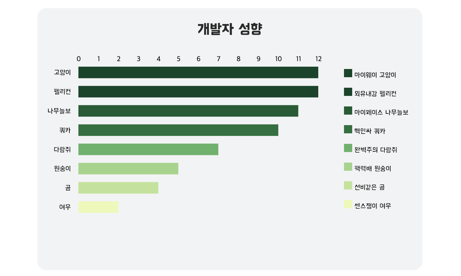
구현 결과
개발자는 고양이, 펠리컨 유형이 가장 많다는 것울 한 눈에 확인해볼 수 있네요!😄