저번 포스트까지 메뉴와 포스트를 보여주는 페이지까지 만들어주면서 진짜 기본적인 블로그의 역할을 하게 되었다. 하지만 개발을 진행하면서 너무 못생긴 UI 때문에 의욕도 안생기고 할맛이 안나서 이번 포스트에서는 UI/UX 약간의 변경? 및 다크모드를 추가해 줄 것이다.
다크모드 추가
필자는 styled-components 를 애용하고 있기 때문에 styled-components에서 지원하는 GlobalStyles와 ThemeProvider를 사용해서 다크모드를 구현해줄 것이다.
ThemeConfig.js생성
우선 첫번째로 ThemeConfig.js 파일을 생성해 준 후 해당 파일에 테마에 대한 css값들을 선언해주자.
// ThemeConfig.js

import { createGlobalStyle } from "styled-components";

export const lightTheme = {
    body: "#FFF",
    text: "#363537",
    toogleBorder: "#FFF",
    background: "#363537",
};

export const darkTheme = {
    body: "#363537",
    text: "#FAFAFA",
    toogleBorder: "6B8096",
    background: "#999",
};

export const GlobalStyles = createGlobalStyle`
    body {
        background: ${({ theme }) => theme.body};
        color: ${({ theme }) => theme.text};
        font-family: Tahoma, Helvetica, Arial, Roboto, sans-serif;
        transition: all 0.50s linear;
    }
`;
그후 _app.js 에서 ThemeProvider 로 감싸주기만 하면 끝이다.
<ThemeProvider theme={theme === "light" ? lightTheme: darkTheme}>
  <GlobalStyles/>
  <MainLayout theme={theme} setTheme={setTheme}>
    <Component {...pageProps} key={router.route}/>
  </MainLayout>
</ThemeProvider>
현재 프로젝트의 구조는 getLayout 에서 url 시작 주소를 통해 MainLayout 에 어떤 레이아웃을 보여줄지 담고있는데 개발블로그는 /dev 로 시작하거나 /posts 로 시작하는 url 이면 LayoutDevlog 로 보여주고있다 그럼 저 MainLayout 에 현재 담겨있는건 LayoutDevlog 인데 파라미터로 theme 와 setTheme 를 넘겨준 이유가 개발 블로그에서 주로 다크모드를 사용할것이기 때문이다.
토글 스위치 만들기
우선 다크모드와 라이트모드 변경은 간단한 토글스위치를 만들어서 변경해줄것이다.
우선 컴포넌트로 따로 빼서 만들어보자
// ToggleSwitch.js
import React, {useState} from "react";
import styled from "styled-components";
import {RightColor} from "./Color";

const SwitchLabel = styled.label`
    cursor: pointer;
    text-indent: -9999px;
    width: 40px;
    height: 20px;
    background: ${props  => (props.switchState ? "#FFF" :  RightColor)};
    display: block;
    border-radius: 100px;
    position: relative;

    &:after {
        content: "";
        position: absolute;
        left: ${props => (props.switchState ? "3px" : "calc(55%)")};
        top: 3px;
        width: 15px;
        height: 15px;
        background: ${props  => (props.switchState ? RightColor :  "#FFF")};
        border-radius: 90px;
        transition: 0.3s;
    }
`;

export default function ToggleSwitch({clickHandler}) {
    const [switchState, setSwitchState] = useState(true);

    return (
        <SwitchLabel switchState={switchState}>
            <input
                type="checkbox"
                checked={switchState}
                onChange={e => setSwitchState(!switchState)}
                onClick={clickHandler}
            />
        </SwitchLabel>
    )
};
혹시 나중에 토글스위치를 어떤용도로 사용하게 될지 몰라서 클릭 핸들러로 따로 파라미터를 받아 사용하게끔 빼뒀다.
그다음 LayoutDevlog 에 아래와같이 토글스위치를 추가해주면 완성!
// LayoutDevlog.js
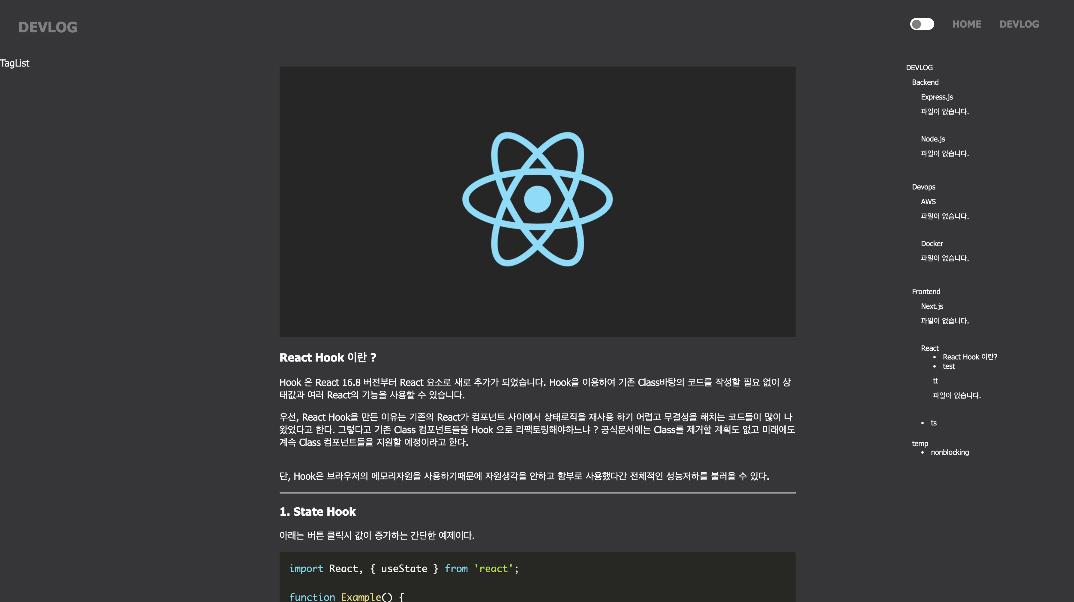
<ToggleSwitch clickHandler={e => toggleTheme(theme, setTheme)}/>결과 :::
버튼 클릭시 따로 background color 나 font color 를 설정해두지 않으면 Theme 의 색상을 따라간다. 그리고 메뉴도 지저분해보이던 아이콘과 border-left 의 점선도 빼버렸고 제목과 작성날짜, 수정날짜도 추가해 줬다.
추가
새로고침시 기존에 선택한 테마 적용이 필요할 것 같아 window 객체의 localStorage 를 사용해 테마를 저장해 둔걸로 사용하게끔 변경했다
function MyApp({Component, pageProps, router}) {
    const [theme, setTheme] = useState("dark");
    const MainLayout = getLayout(router.asPath);

    useEffect(() => {
        setTheme(window.localStorage.getItem("theme") ? window.localStorage.getItem("theme") : "dark");
    }, []);

    return (
        <ThemeProvider theme={theme === "light" ? lightTheme: darkTheme}>
            <GlobalStyles/>
            <MainLayout>
                <Component {...pageProps} key={router.route}/>
            </MainLayout>
            <DarkMode onClick={e => toggleTheme(theme, setTheme)} theme={theme}>
                {
                    theme === "light" ? <FiMoon size="25"/> : <BsSun size="25"/>
                }
            </DarkMode>
        </ThemeProvider>
    );
}
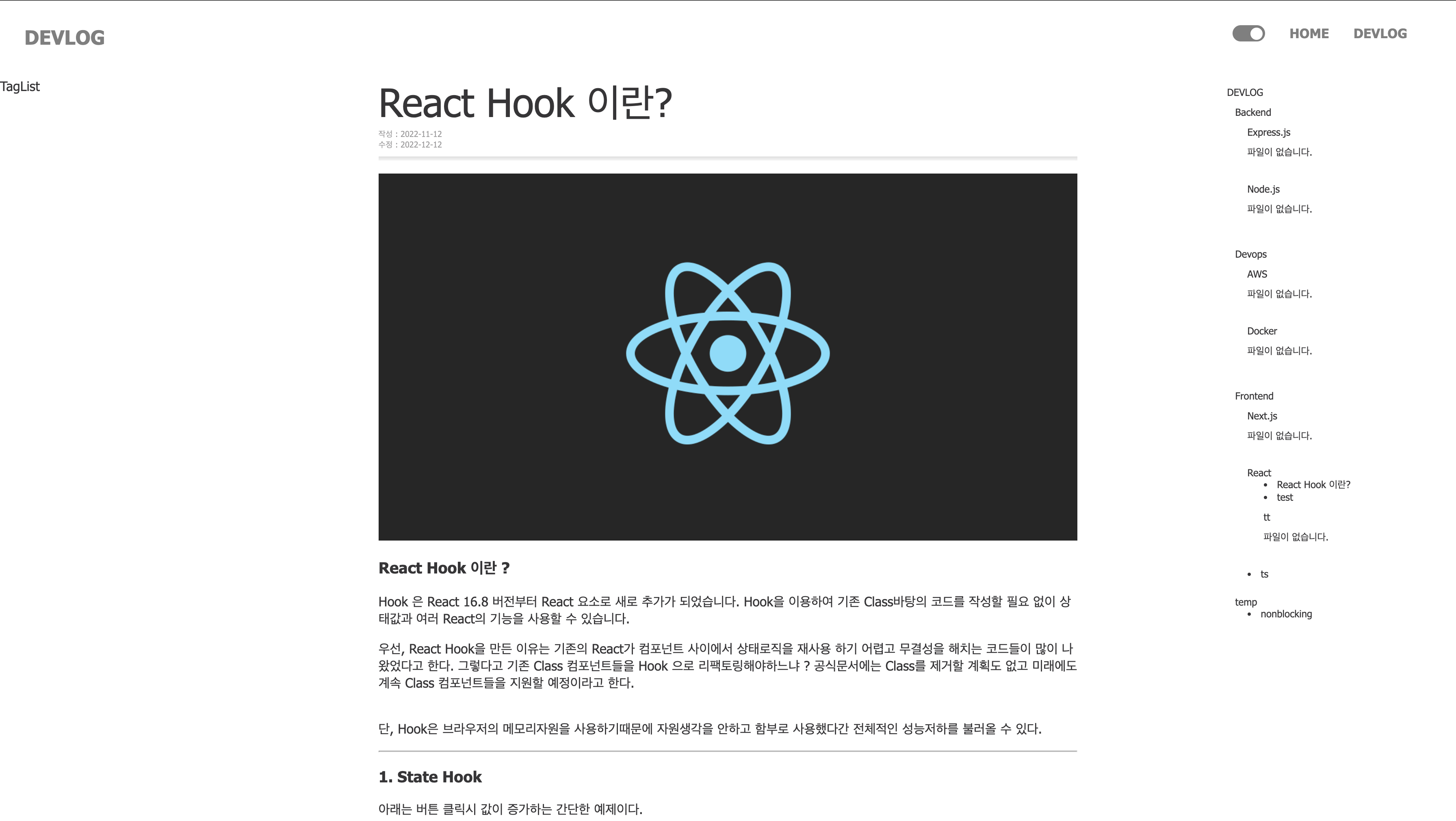
더불어 토글스위치를 사용하지 않고 화면 오른쪽 하단에 고정되게 변경했다
결과 :::