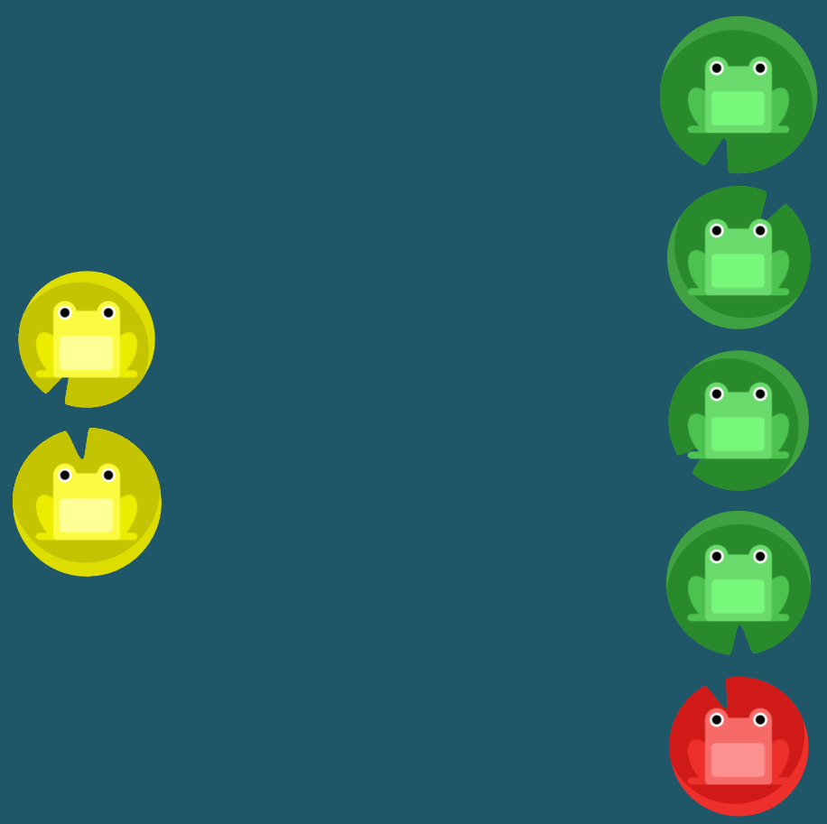
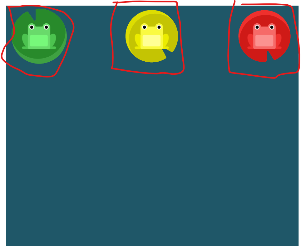
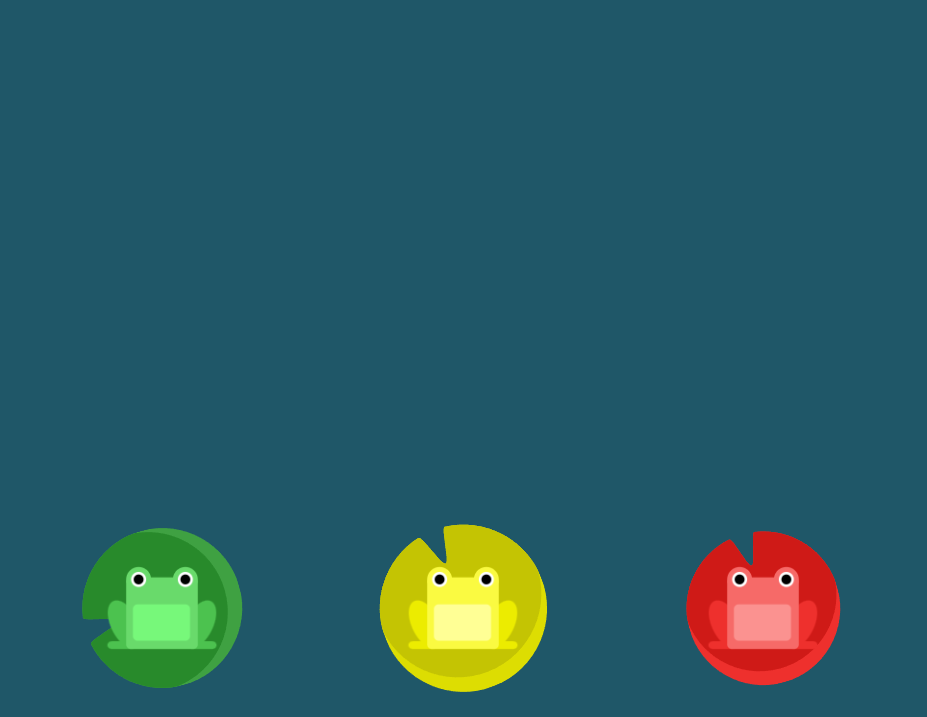
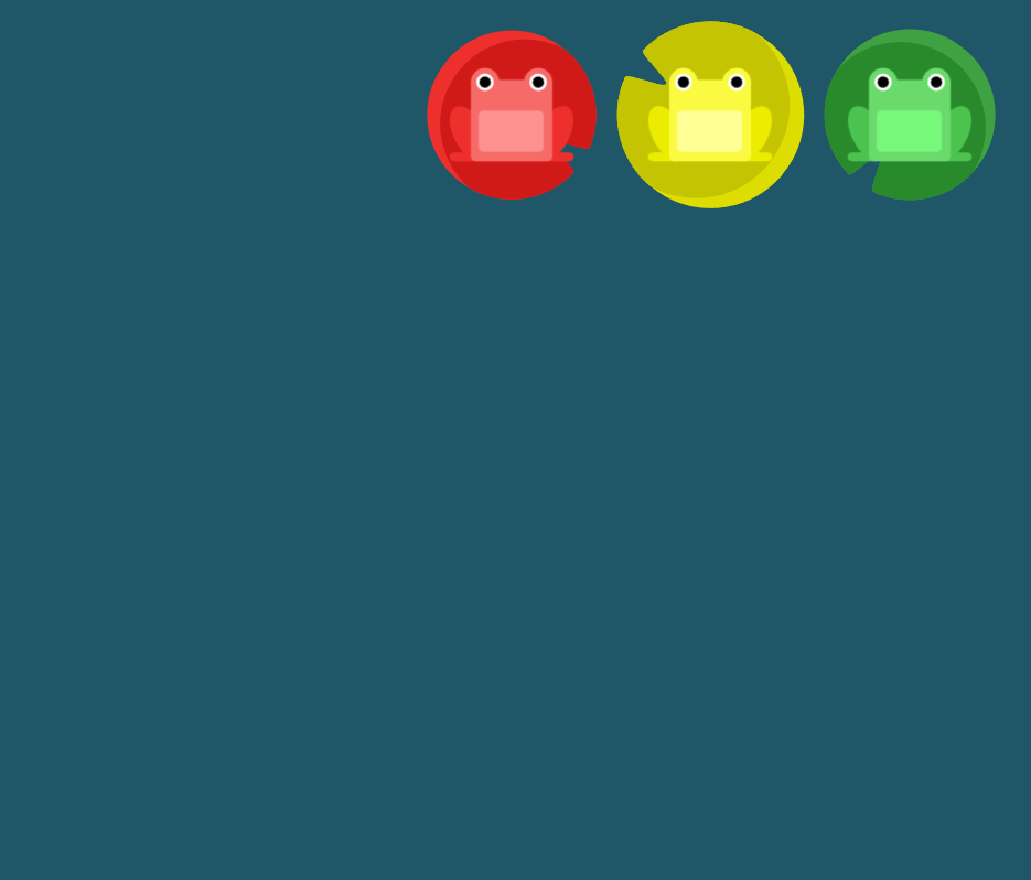
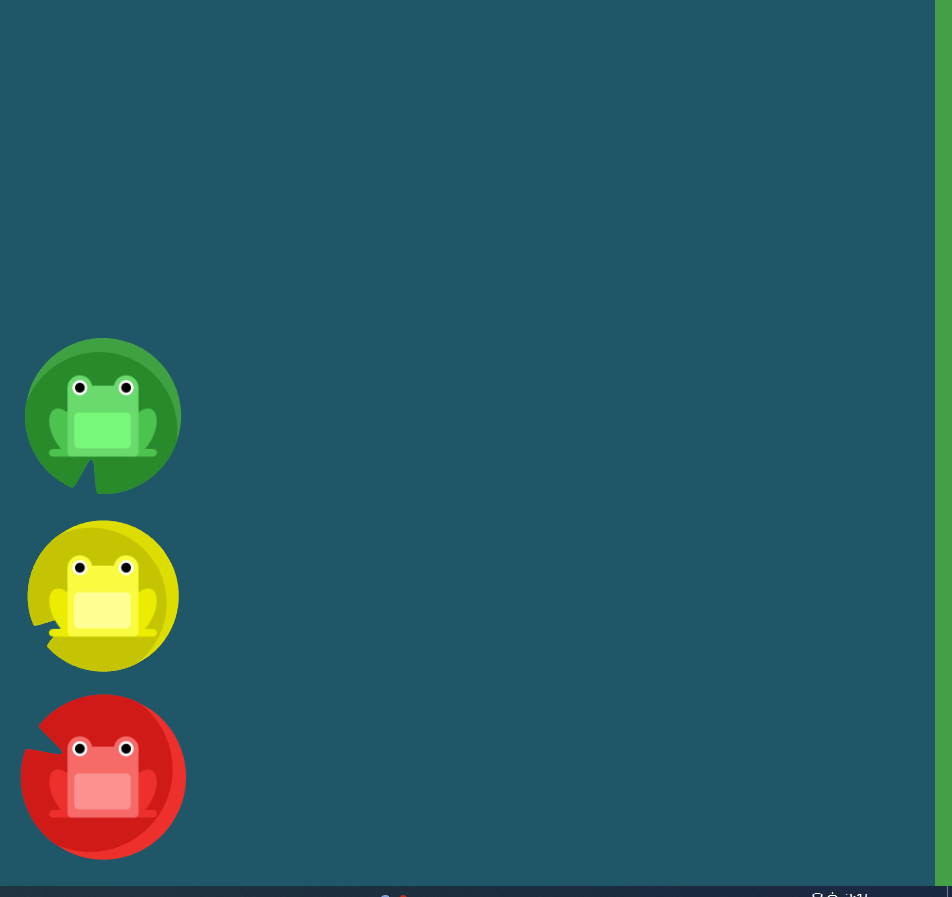
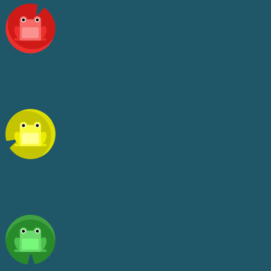
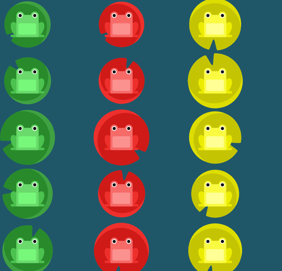
flex frog 과제
justify-content속성 이용
flex-start: 요소들을 컨테이너의 왼쪽으로 정렬합니다.
flex-end: 요소들을 컨테이너의 오른쪽으로 정렬합니다.
center: 요소들을 컨테이너의 가운데로 정렬합니다.
space-between: 요소들 사이에 동일한 간격을 둡니다.
space-around: 요소들 주위에 동일한 간격을 둡니다.
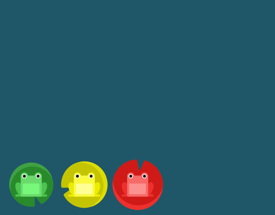
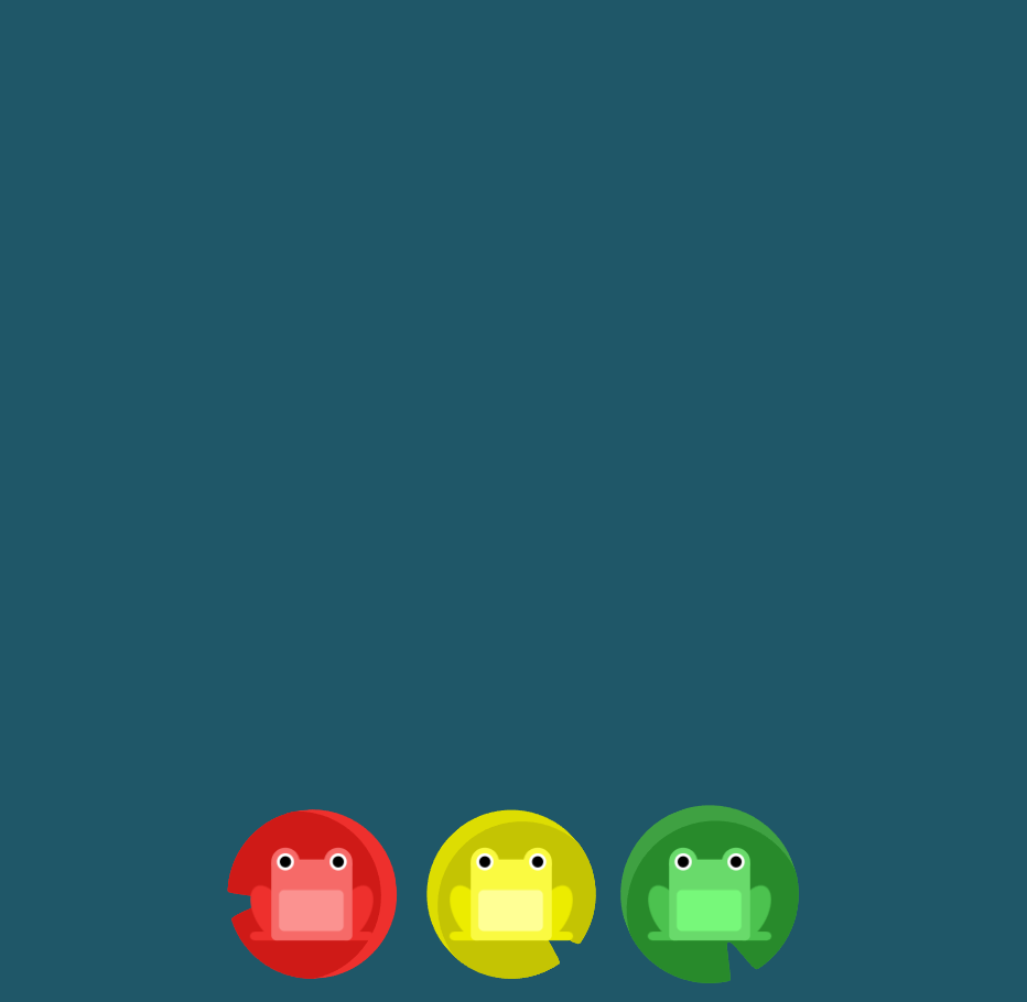
1번 문제
end를 이용하여 끝으로 보내기
#pond {
  display: flex;
justify-content: flex-end;
}
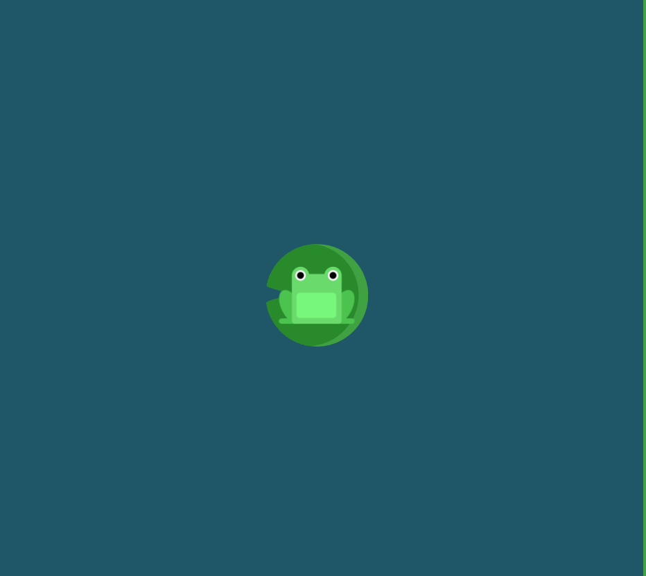
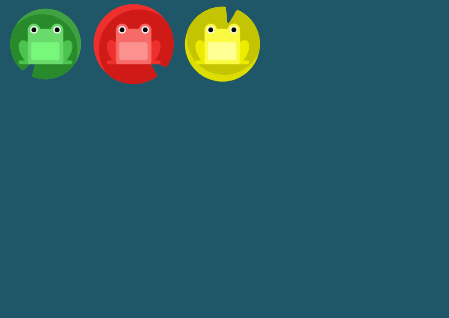
2번문제
center를 이용하여 중앙으로 이동
#pond {
display: flex;
justify-content: center;
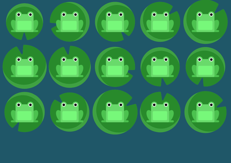
}
3번문제
around를 사용하여 주위에 동일한 간격으로 간격을 둔다
#pond {
  display: flex;
justify-content: space-around;
}
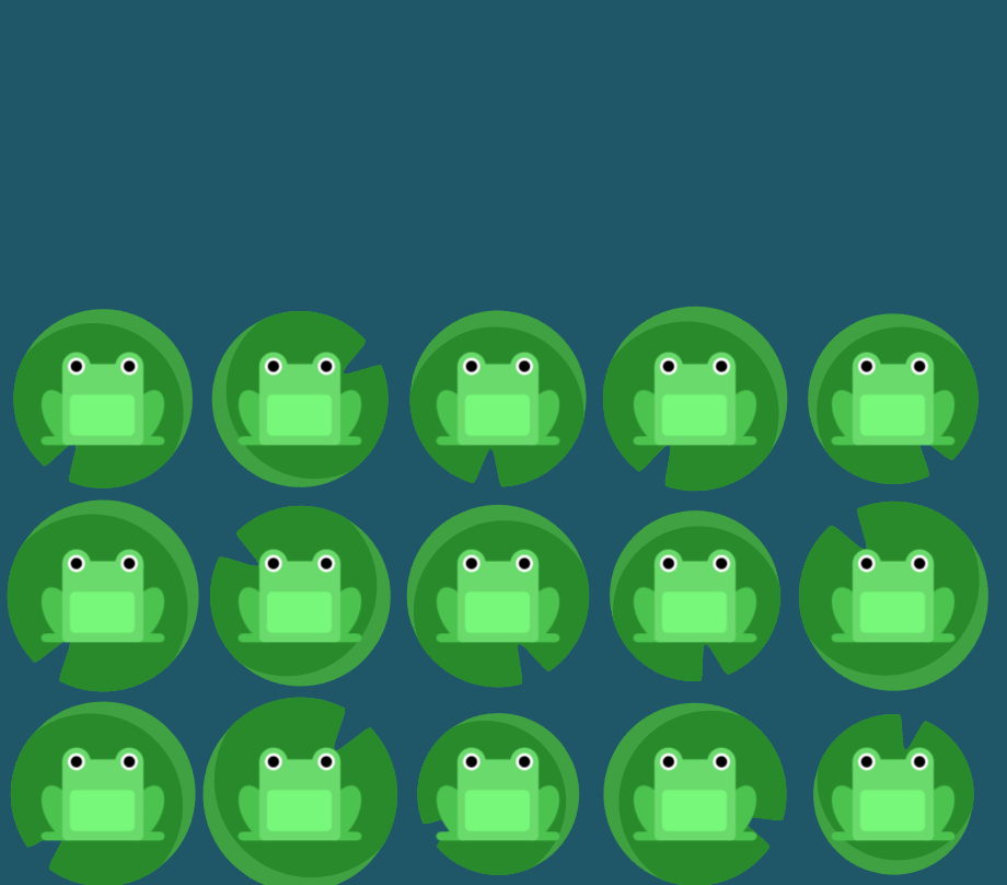
4번문제
space-between을 사용하여 요소들 사이에 동일한 간격을 둔다
#pond {
  display: flex;
justify-content: space-between;
}
align-items 요소 이용
flex-start: 요소들을 컨테이너의 꼭대기로 정렬합니다.
flex-end: 요소들을 컨테이너의 바닥으로 정렬합니다.
center: 요소들을 컨테이너의 세로선 상의 가운데로 정렬합니다.
baseline: 요소들을 컨테이너의 시작 위치에 정렬합니다.
stretch: 요소들을 컨테이너에 맞도록 늘립니다.
5번문제
flex-end를 이용하여 바닥으로 정렬하기
#pond {
  display: flex;
align-items: flex-end;
}
6번문제
justify-content와 align-items를 함께 사용하여 중앙으로 이동시키기
center를 이용한다
#pond {
  display: flex;
justify-content: center;
align-items: center;
}
7번문제
space-around와 flex-end를 사용하기
#pond {
  display: flex;
justify-content: space-around;
align-items: flex-end;
}
flex-direction요소 이용
row: 요소들을 텍스트의 방향과 동일하게 정렬합니다.
row-reverse: 요소들을 텍스트의 반대 방향으로 정렬합니다.
column: 요소들을 위에서 아래로 정렬합니다.
column-reverse: 요소들을 아래에서 위로 정렬합니다.
8번문제
row-reverse를 이용하여 반대방향으로 정렬하기
#pond {
  display: flex;
flex-direction: row-reverse;
}
9번문제
colum을 사용하여 위아래로 정렬 하기
#pond {
  display: flex;
flex-direction: column;
}
10번문제
flex-direction: row-reverse;로 좌우를 뒤집고
justify-content: flex-end; 다시 끝으로 보내기
#pond {
  display: flex;
flex-direction: row-reverse;
justify-content: flex-end;
}
11번 문제
flex-direction: column 으로 위아래 정렬하고
justify-content: flex-end로 아래끝으로 보내기
#pond {
  display: flex;
flex-direction: column;
justify-content: flex-end;
}
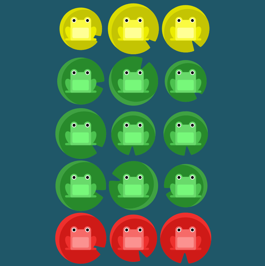
12번 문제
flex-direction: column-reverse; 위아래를 뒤집고
justify-content: space-between으로 간격 나누기
#pond {
  display: flex;
flex-direction: column-reverse;
justify-content: space-between
}
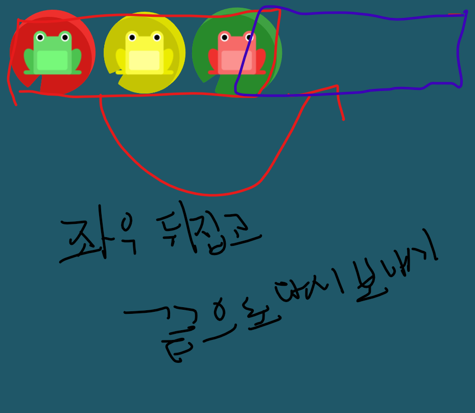
13번 문제
flex-direction: row-reverse으로 좌우 뒤집고
justify-content: center로 중앙으로보낸뒤
align-items: flex-end로 아래 끝으로 보내기
#pond {
  display: flex;
flex-direction: row-reverse;
justify-content: center;
align-items: flex-end;
}
order 요소 사용
order의 기본 값은 0이며, 양수나 음수로 바꿀 수 있습니다.
14번 문제
order: 1을 사용하여 뒤집기 가능
#pond {
  display: flex;
}

.yellow {
order: 1;
}
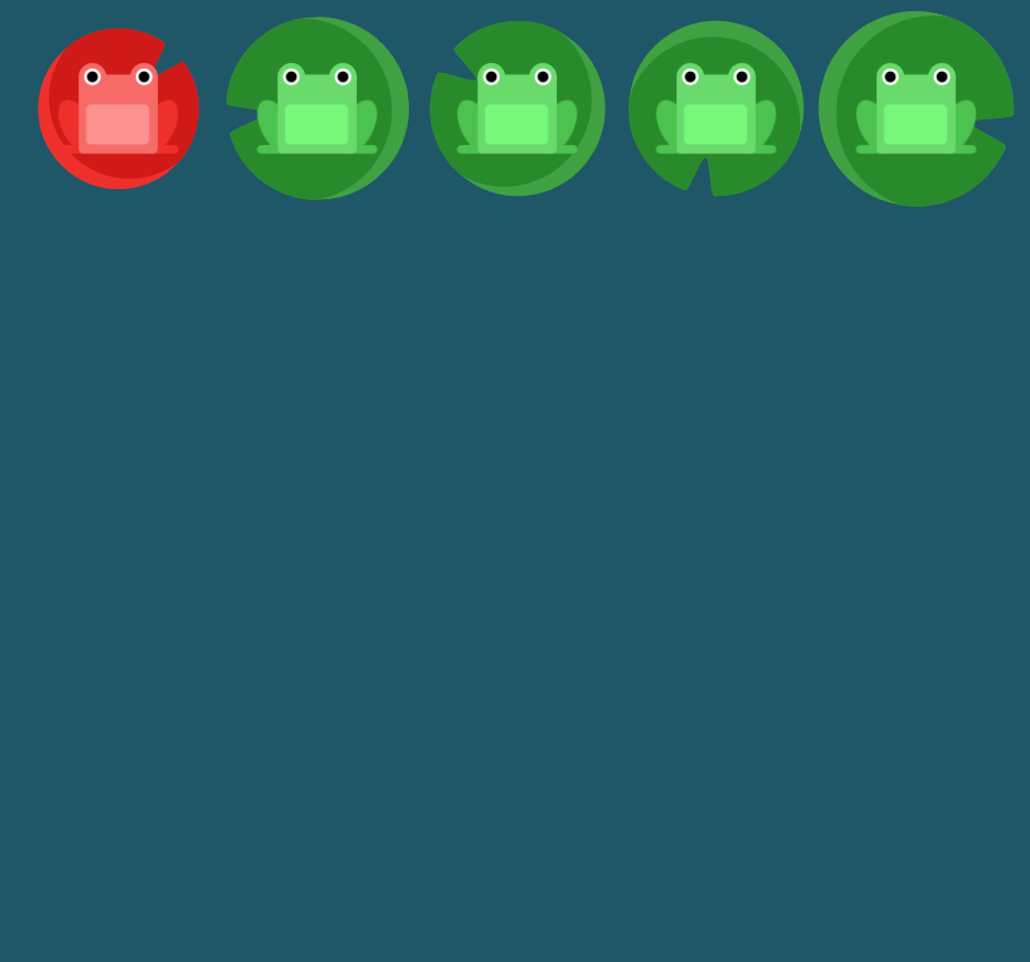
15번 문제
order: -1을 하면 순서의 처음으로 가능하다
#pond {
  display: flex;
}

.red {
order: -1;
}
align-self요소 사용
지정된 align-items 값을 무시하고 Flex 요소를 세로선 상에서 정렬합니다.
16번 문제
align-self:end를 이용하요 노란색 개구리만 아래로 내린다
#pond {
  display: flex;
  align-items: flex-start;
}

.yellow {
align-self: flex-end;
}
17번 문제
order로 노란개구리를 끝으로 보내고 flex-end로 아래 끝으로 보내기
#pond {
  display: flex;
  align-items: flex-start;
}

.yellow {
order:1;
align-self: flex-end;
}
flex-wrap속성 이용
nowrap: 모든 요소들을 한 줄에 정렬합니다.
wrap: 요소들을 여러 줄에 걸쳐 정렬합니다.
wrap-reverse: 요소들을 여러 줄에 걸쳐 반대로 정렬합니다.
18번 문제
flex-wrap을 이용해 여러줄에 겹쳐져 있는것을 정렬한다
#pond {
  display: flex;
flex-wrap: wrap;
}
19번 문제
flex-direction: column-reverse를 이용해 위아래로 정렬
flex-wrap: wrap; 여러줄에 겹친것을 정렬한다
#pond {
  display: flex;
flex-direction: column-reverse;
flex-wrap: wrap;
}
flex-flow
flex-direction과 flex-wrap이 자주 같이 사용되기 때문에, flex-flow가 이를 대신할 수 있습니다. 이 속성은 공백문자를 이용하여 두 속성의 값들을 인자로 받습니다
20번 문제
flex-flow: column wrap; 을 이용해 겹친것을 정렬
#pond {
  display: flex;
flex-flow: column wrap;
}
align-content속성 이용
flex-start: 여러 줄들을 컨테이너의 꼭대기에 정렬합니다.
flex-end: 여러 줄들을 컨테이너의 바닥에 정렬합니다.
center: 여러 줄들을 세로선 상의 가운데에 정렬합니다.
space-between: 여러 줄들 사이에 동일한 간격을 둡니다.
space-around: 여러 줄들 주위에 동일한 간격을 둡니다.
stretch: 여러 줄들을 컨테이너에 맞도록 늘립니다
21번 문제
align-content: flex-start을 이용하여 컨테이너 꼭대기 정렬
#pond {
  display: flex;
  flex-wrap: wrap;
align-content: flex-start;
}
22번 문제
align-content: flex-end을 이용하여 바닥에 정렬
23번 문제
flex-direction: column-reverse으로 위아래정렬
align-content: center으로 중앙에 정렬
#pond {
  display: flex;
  flex-wrap: wrap;
flex-direction: column-reverse;
align-content: center;
}
24번 문제
flex-direction: column-reverse으로 세로로 한줄로 만들고
flex-wrap: wrap-reverse로 여러 줄에 걸쳐 반대로 정렬합니다
justify-content: center로 중앙에 정렬해준다
align-content: space-between으로 사이에 동일한 간격을 둡니다
#pond {
  display: flex;
flex-direction: column-reverse;
flex-wrap: wrap-reverse;
justify-content: center;
align-content: space-between;

}