2.1 Our First Styled Component
install
yarn add styled-componentsimport
import styled from "styled-components"사용 구문
ex) div 태그의 경우
const App = () => {
	....
	return (
    	<Warp/>
        // 일반 html 태그를 사용하듯이 사용해준다. (대신 첫글자 대문자 사용)
        ....
    )
}

const Wrap = styled.div`
	// 항상 백틱으로 감싼다.
	display = flex;
    //css 구문이 들어가는 자리
`
2.2 Adapting and Extending
styled-components 에서 props를 통한 스타일링
import styled from "styled-components";

function App() {
  return <Box bgColor="teal" />;
}

const Box = styled.div`
  width: 100px;
  height: 100px;
  background-color: ${(props) => props.bgColor};
`;

export default App;

// props로 내려주는 부분과 받는부분의 이름을 일치시켜줘야한다.
styled-components 확장시키기
import styled from "styled-components";

function App() {
  return (
    <>
      <Box bgColor="teal" />
    // Circle 컴포넌트 또한 Box의 확장판이기 때문에 Box와 같이 props를 사용할 수 있다.
      <Circle bgColor="orange" />
    </>
  );
}

const Box = styled.div`
  width: 100px;
  height: 100px;
  background-color: ${(props) => props.bgColor};
`;
// 아래와 같은 구문으로 Box의 속성값을 모두 받을 수 있다. 재사용성이 좋아진다.
const Circle = styled(Box)`
  border-radius: 50%;
`;

export default App;
2.3 'As' and Attrs
어떠한 이유로 같은 스타일을 가지면서 다른 태그를 사용하고 싶다면?
import styled from "styled-components";

function App() {
  return (
    <>
      <Button>안녕!</Button>
    //as 키워드를 사용해 태그명을 바꿔서 사용해준다.
      <Button as="a" href="/">
        안녕!
      </Button>
    </>
  );
}

const Button = styled.button`
  display: block;
  background-color: orange;
  width: 100px;
  height: 50px;
  border-radius: 10px;
`;

export default App;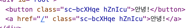
짠! a 태그로 변경된것을 확인할 수 있다.
태그의 속성값을 styled-components에 적용하는법
import styled from "styled-components";

function App() {
  return (
    <>
      <Input />
      <Input />
      <Input />
    </>
  );
}

const Input = styled.input.attrs({ required: true })`
  background-color: aliceblue;
`;

export default App;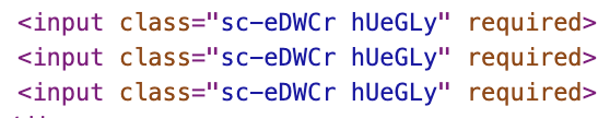
2.4 Animations and Pseudo Selectors
Pseudo selector 사용하기
import styled from "styled-components";

function App() {
  return (
    <>
      <Wrap>
        <Box>
          <span>나는 자식!</span>
        </Box>
      </Wrap>
    </>
  );
}

const Wrap = styled.div`
  display: flex;
`;

const Box = styled.div`
  height: 200px;
  width: 200px;
  background-color: aliceblues;
  // Pseudo-classes 두가지 방식으로 사용가능
  span:hover {
    font-size: 40px;
  }
  // '&'는 자기자신을 선택하는 선택자이다.
  span {
    font-size: 20px;
    &:hover {
      font-size: 40px;
    }
  }
`;

export default App;
2.5 Pseudo Selectors part Two
선택자를 사용할 때 태그명에 의존하고 싶지 않다면?
import styled from "styled-components";

function App() {
  return (
    <>
      <Wrap>
        <Box>
          <Text>나는 자식!</Text>
        </Box>
      </Wrap>
    </>
  );
}

const Wrap = styled.div`
  display: flex;
`;
const Text = styled.span`
  font-size: 20px;
`;
const Box = styled.div`
  height: 200px;
  width: 200px;
  background-color: aliceblues;
  ${Text} {
    &:hover {
      font-size: 40px;
    }
  }
`;

export default App;
${Text} 이렇게 선택할 컴포넌트명을 곧장 적어주면 끝!
2.6 Theme
//index.js

import React from "react";
import ReactDOM from "react-dom/client";
import App from "./App";
import { ThemeProvider } from "styled-components";

// object에 사용할 css 속성을 적어준다

//light 와 dark모드 적용을 위해서, 하위 컴포넌트에서 참조하는 속성의 이름을 일치시켜줘야 한다.

// 하위에서 컴포넌트에서 textColor라는 명칭 하나로 참조하기 때문이다.

const darkTheme = {
  textColor: "whitesmoke",
  backgroundColor: "#111",
};

const lightTheme = {
  textColor: "#111",
  backgroundColor: "whitesmoke",
};

const root = ReactDOM.createRoot(document.getElementById("root"));
root.render(
  // ThemProvider로 감싸주면 App 내부의 전체 컴포넌트에서 theme객체에 접근할 수 있다.
  <ThemeProvider theme={darkTheme}>
    <App />
  </ThemeProvider>
);
//App.js
import styled from "styled-components";
function App() {
return (
<>
<Wrapper>
<Title>Hello</Title>
</Wrapper>
</>
);
}
// provider로 전체 컴포넌트에서 theme이라는 이름으로 내려준 props(객체)를 통해 속성값을 가져올 수 있다.
const Title = styled.h1`
color: ${(props) => props.theme.textColor};
`;
const Wrapper = styled.div`
display: flex;
height: 100vh;
width: 100vw;
justify-content: center;
align-items: center;
background-color: ${(props) => props.theme.backgroundColor};
`;
export default App;