CSS 애니메이션
CSS 애니메이션은 여러 개의 CSS 스타일을 부드럽게 전환시켜주며 @keyframes를 활용하면 시간 순서대로 조절할 수 있는 애니메이션을 만들 수 있다
@keyframes
@keyframes 옆에 애니메이션 이름을 적어주고 시간 진행에 따른 상태를 작성해주면 된다. 시간 진행에 따른 상태는 form, to로 CSS속성과 속성값을 적어주거나 0%, 100%로 작성해도 된다. %로 작성할 경우에 0~100사이의 소수점까지도 작성이 가능하다. 해당 키프레임 애니메이션을 적용하고 싶은 요소에 animation 속성으로 키프레임 이름을 적어주면 사용가능하며 애니메이션 이름 옆에 다양한 속성을 작성해야한다.
@keyframes 애니메이션이름 {
	0% {   /* from 이라고 작성해도 됨.*/
		CSS속성 : 속성값;
	}

	50% {
		CSS속성 : 속성값;
	}

	100% {  /* to 라고 작성해도 됨.*/
		CSS속성 : 속성값;
	}
}
/* 시작은 0도, 30%에서는 90도, 60%에서는 180도, 100%에서는 360도 회전시키는 애니메이션 */
@keyframes lotate {
0% {
transform : rotate(0deg);
}
30% {
transform : rotate(90deg);
}
60% {
transform : rotate(180deg);
}
100% {
transform : rotate(360deg);
}
}animation 속성
animation에 띄어쓰기로 animation-name, animation-duration, animation-delay, animation-direction, animation-iteration-count, animation-play-state, animation-timing-function, animation-fill-mode에 대한 속성들을 한 번에 지정할 수도 있으며 각각 속성을 작성할 수 도 있다.
animation-name
animation 속성의 첫 번째 값이며, 애니메이션을 적용하고 싶은 요소에 @keyframes를 사용하여 만든 애니메이션 이름을 작성하면 된다.
.text {
	animation : lotate;
}

@keyframes textRotate {
  0% {
    transform: rotate(0deg);
  }
  100% {
    transform: rotate(360deg);
  }
}
animation-duration
animation 속성의 두번째 값이며 애니메이션이 재생될 시간이다. 작성하지 않을 경우에는 기본값이 0이며 밀리초(ms) 또는 초(s) 단위로 많이 작성한다.
.text {
	animation : lotate 3s;
}
animation-delay
animation의 재생시간을 미룰 수 있는 속성이며 시간 단위로 작성할 수 있다.
/* 3초 후에 실행 */
.text {
	animation : lotate 3s 3s;
}
animation-direction
animation 재생 방향을 지정할 수 있다.
- normal: 기본 값으로 재생이 끝나면 처음부터 다시 재생
- reverse: 역방향으로 재생
- alternate: 순방향부터 역방향까지 번갈아가며 재생
- alternate-reverse: 역방향부터 순방향까지 번갈아가며 재생
.text {
	animation : lotate 3s reverse;
}
animation-iteration-count
animation이 몇 번 재생될지 지정하며 기본 값은 1이다. infinite로 설정하면 무한반복되며, 소수점으로 작성할 경우 재생 도중에 처음 상태로 돌아가게 된다.
(재생 시간이 3초일 때, 0.5를 전달하면 1.5초 후 처음 상태로 돌아간다.)
/* 애니메이션 무한 반복 */
.text {
	animation : lotate 3s infinite;
}
/* 애니메이션 5번 반복 */
.text {
animation : lotate 3s 5;
}animation-play-state
애니메이션의 재생 상태를 설정할 수 있다. 기본 값은 running이며, pause를 값으로 지정하면 애니메이션을 정지시킬 수 있다.
/* 애니메이션 정지 */
.text {
	animation : lotate 3s pause;
}
animation-timing-function
애니메이션의 진행 속도를 조절할 수 있는 속성으로 애니메이션 중간에 속도가 어떻게 변화시킬지 정할 수 있다.
- ease: 기본 값, 애니메이션이 천천히 시작하고 중간에 빠르게 가속한 다음, 느리게 종료
- linear: 선형 타이밍 함수로 일정한 속도로 애니메이션을 진행
- ease-in: 애니메이션을 천천히 시작하고 빠르게 가속
- ease-out: 애니메이션을 빠르게 시작하고, 끝 부분은 느리게 감속
- ease-in-out: 애니메이션을 천천시 시작하고 빠르게 가속한 다음, 끝 부분은 느리게 종료
(ease와 비슷하지만 시작과 끝부분에서 더 느리게 감속) - cubic-bezier: 사용자 정의 함수로 타이밍 함수를 정의할 수 있다. cubic-bezier는 4개의 숫자 값을 가지며, 각각의 제어 포인트의 위치를 나타낸다. 시작과 끝 지점에서의 속도와 중간 부분에서의 속도를 조절할 수 있다. p1x와 p1y는 시작 포인트의 x와 y좌표이며, p2x와 p2y는 끝 부분의 x와 y좌표이다. 0부터 1까지의 값을 가질 수 있다. p1x가 0이면 시작 시점에서 속도가 없고 p2x가 0이면 끝 부분에서 속도가 없다
cubic-bezier(p1x, p1y, p2x, p2y)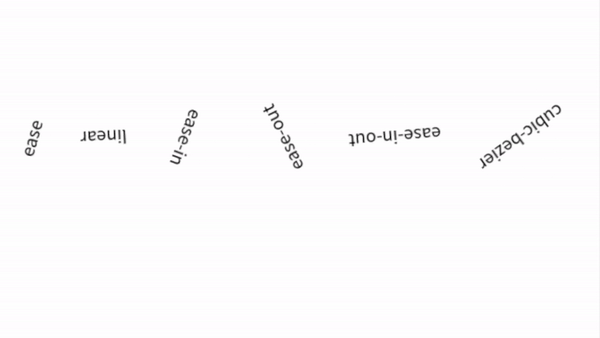
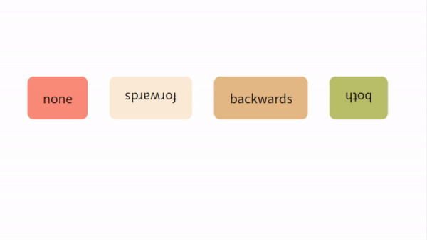
animation-fill-mode
애니메이션의 재생 전과 후의 상태를 지정한다.
- none: 기본 값, 재생 중이 아닌 경우 요소의 스타일을 유지
- forwards: 재생 중이 아닌 경우 마지막 키프레임 스타일을 유지
- backwards: 재생 중이 아닌 경우 첫 번째 키프레임 스타일을 유지
- both: 재성 전에는 첫 번째 키프레임 스타일, 재생 후에는 마지막 키프레임 스타일을 유지
바닥에 부딪치는 공
애니메이션의 다양한 속성들을 설정하여 바닥에 부딪치는 느낌의 공을 표현하였다. 0%일때보다 100%일때 크기도 커지게 속성을 주었으며 top, transform을 적용하여 위치도 변경하였다.
index.html
<!DOCTYPE html>
<html lang="en">
  <head>
    <meta charset="UTF-8" />
    <meta name="viewport" content="width=device-width, initial-scale=1.0" />
    <meta http-equiv="X-UA-Compatible" content="ie=edge" />
    <link rel="stylesheet" href="/index.css" />
  </head>
  <body>
    <div class="blue ball"></div>
    <div class="violet ball"></div>
  </body>
</html>
index.css
@keyframes blueBall {
  0% {
    top: 0px;
    background-color: #fff;
  }
  95% {
    width: 100px;
    background-color: rgb(76, 112, 179);
  }
  to {
    top: 300px;
    width: 115px;
    height: 90px;
    transform: translate(100px, 100px);
    background-color: rgb(56, 94, 165);
  }
}

@keyframes violetBall {
  0% {
    top: 0px;
    background-color: #fff;
  }
  95% {
    width: 150px;
    background-color: rgb(166, 85, 241);
  }
  to {
    top: 300px;
    width: 165px;
    height: 135px;
    transform: translate(100px, 100px);
    background-color: rgb(126, 59, 189);
  }
}

.ball {
  position: relative;
  top: 0;
  width: 100px;
  height: 100px;
  border-radius: 50%;
}

.blue {
  left: 100px;
  background-color: blue;
  animation: blueBall 1s 0.5s ease-in infinite alternate;
}

.violet {
  left: 250px;
  background-color: blueviolet;
  animation: violetBall 1s ease-in infinite alternate;
}