프로젝트를 하면서 슬라이드가 필요한 페이지가 생겼고 여러가지 swiper를 찾아보던 중 swiper 라이브러리를 사용하게 되었다. Navigation, Pagination, A11y, Autoplay 모듈이 포함되어 있어서 필요한 부분들을 편하게 사용할 수 있었다. 다음번에는 직접 슬라이드를 구현해보려고 한다.
swiper 라이브러리 설치 및 사용법
🔹 swiper 설치
npm 설치
npm install swiperyarn 설치
yarn add swiper🔹swiper 기본 사용법
import { Swiper, SwiperSlide } from 'swiper/react';
import 'swiper/swiper-bundle.css';
import SwiperCore, { Navigation, Pagination, A11y, Autoplay } from 'swiper';


// Swiper 모듈 설치
SwiperCore.use([Navigation, Pagination, A11y, Autoplay]);

// Swiper 컴포넌트
const YourSwiperComponent = () => {
  // Swiper 네비게이션을 위한 상태
  const [swiper, setSwiper] = useState(null);

  // Swiper 설정
  const swiperConfig = {
    slidesPerView: 4, // 한 화면에 보여질 슬라이드의 수를 설정
    spaceBetween: 20, // 슬라이드 간의 간격을 지정, 픽셀 단위
    // 이전/다음 버튼의 표시 여부와 사용할 클래스를 설정
    navigation: {
      nextEl: '.swiper-button-next',
      prevEl: '.swiper-button-prev',
    },
    // 페이지 표시를 설정
    // clickable 속성을 true로 설정하면 페이지를 클릭하여 해당 슬라이드로 이동
    pagination: {
      clickable: true,
    },
    // 자동 재생을 설정
    autoplay: {
      delay: 3000, // 자동 재생 간격 (밀리초 단위)
      disableOnInteraction: false, // true면 사용자 상호 작용 후 자동 재생을 중지
    },
  };

  return (
    <>
      // onSwiper는 Swiper 인스턴스를 얻을 때 호출되는 콜백 함수
      <Swiper {...swiperConfig} onSwiper={setSwiper}>
        {/* Swiper 슬라이드 추가 */}
        <SwiperSlide>
          <TilCard /* 슬라이드 안의 카드 추가 */ />
        </SwiperSlide>
      </Swiper>
      {/* 네비게이션 버튼 */}
      <PreNextButton className="swiper-button-prev" />
      <PreNextButton className="swiper-button-next" />
    </>
  );
};

export default YourSwiperComponent;
swiper 사용해보기
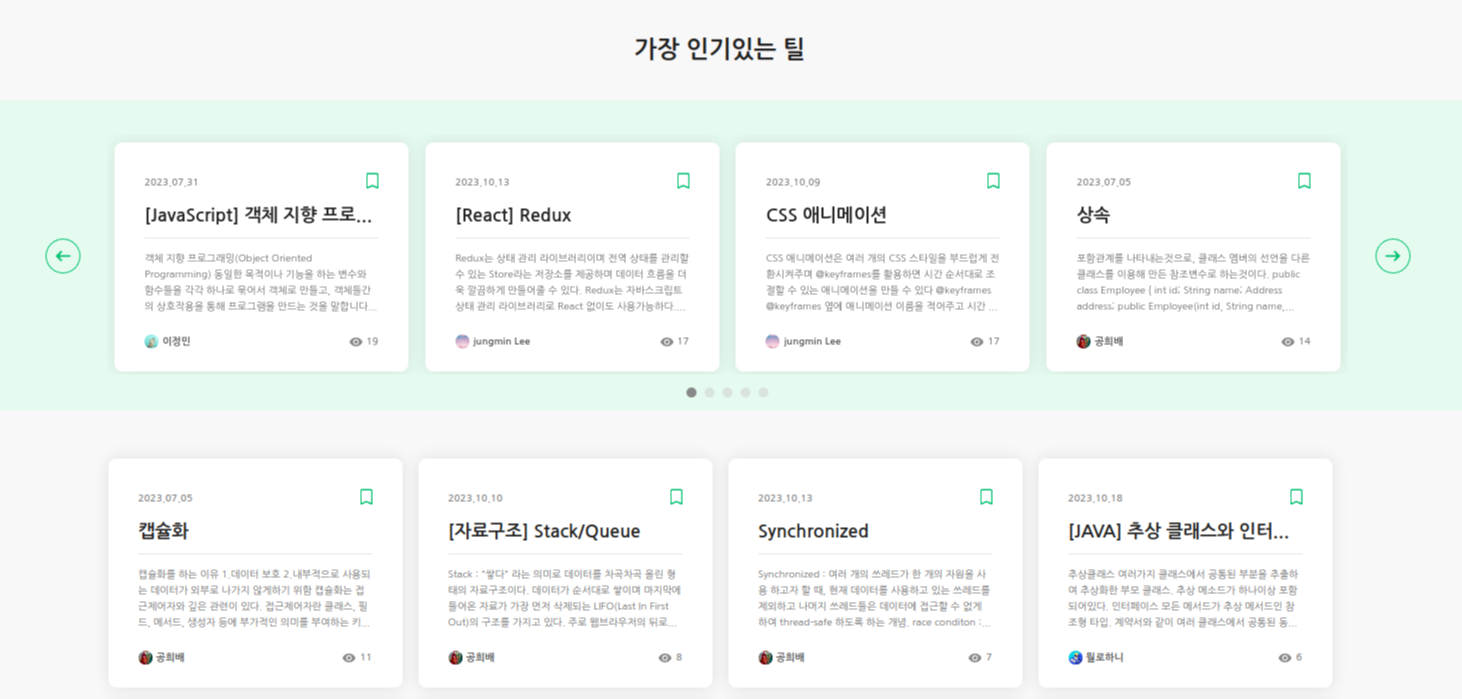
swiper를 사용하면서 기본적으로는 4개의 카드가 보이지만 반응형으로 제작되어 사이즈에 따라 슬라이드 수를 변경해주었다. renderBullet를 내가 원하는 css가 반영될 수 있도록 설정하였다. 반응형으로 자연스럽게 보여주는 부분이 생각처럼 되지 않아서 계속해서 수정했지만, 어느정도 자연스럽게 반응형으로 제작된 거 같다.
🔹swiper 프로젝트에 적용
import { useState, useEffect } from 'react';
import SwiperCore, { Navigation, Pagination, A11y, Autoplay } from 'swiper';
import { Swiper, SwiperSlide } from 'swiper/react';
import 'swiper/swiper-bundle.css';
import { useMediaQuery } from 'react-responsive';
import styled from 'styled-components';
import { TilWrapper, PreNextButton } from '../../../default/styled';
import TilCard from '../../../default/tilComponents/TilCard';

SwiperCore.use([Navigation, Pagination, A11y, Autoplay]);

function HotTilSwiper({ data }) {
  const [slideCount, setSlideCount] = useState(4);
  const isMobile = useMediaQuery({ maxWidth: 600 });

  useEffect(() => {
    const handelResize = () => {
      const windowWidth = window.innerWidth;
      if (windowWidth > 1300) {
        setSlideCount(4);
      } else if (windowWidth >= 900 && windowWidth <= 1300) {
        setSlideCount(3);
      } else if (windowWidth >= 600 && windowWidth < 900) {
        setSlideCount(2);
      } else {
        setSlideCount(1);
      }
    };

    window.addEventListener('resize', handelResize);

    return () => {
      window.removeEventListener('resize', handelResize);
    };
  }, [slideCount]);

  return (
    <SwiperWrapper>
      <SwiperInner>
        <StyledPagination className="swiper-pagination" />
        <PreNextButtonWrapper className="my-swiper-prev">
          <PreNextButton pre />
        </PreNextButtonWrapper>
        <TilWrapper hotlist>
          <Swiper
            spaceBetween={3}
            slidesPerView={isMobile ? 1 : slideCount}
            autoplay={{ delay: 3000, disableOnInteraction: false }}
            navigation={{
              prevEl: '.my-swiper-prev',
              nextEl: '.my-swiper-next',
            }}
            pagination={{
              clickable: true,
              renderBullet: (index, className) => {
                return `<span class="${className}"></span>`;
              },
              bulletClass: 'swiper-pagination-bullet',
              bulletActiveClass: 'swiper-pagination-bullet-active',
              el: '.swiper-pagination',
            }}
          >
            {data.map((data) => {
              return (
                <SlideContainer key={data.tilId}>
                  <li>
                    <TilCard data={data} />
                  </li>
                </SlideContainer>
              );
            })}
          </Swiper>
        </TilWrapper>
        <PreNextButtonWrapper className="my-swiper-next">
          <PreNextButton next />
        </PreNextButtonWrapper>
      </SwiperInner>
    </SwiperWrapper>
  );
}

export default HotTilSwiper;
🔹styled-components을 이용한 스타일 설정
const SwiperWrapper = styled.section`
  position: relative;
  width: 100vw;
  height: 310px;
  margin-top: 30px;
  background-color: var(--light-background-color);
  @media (max-width: 1200px) {
    height: 280px;
  }
`;

const SwiperInner = styled(TilWrapper)`
  width: 1380px;
  padding: 14px 0px;
  display: flex;
  align-items: center;
  justify-content: center;
  @media (max-width: 1400px) {
    width: 1240px;
  }
  @media (max-width: 1300px) {
    width: 900px;
  }
  @media (max-width: 1100px) {
    width: 640px;
  }
  @media (max-width: 700px) {
    width: 600px;
  }
  @media (max-width: 600px) {
    width: 350px;
  }
`;

const SlideContainer = styled(SwiperSlide)`
  height: 240px;
  display: flex;
  justify-content: center;
`;

const PreNextButtonWrapper = styled.div`
  display: flex;
  align-items: center;
  justify-content: space-around;
  width: 50px;
  height: 50px;
  @media (max-width: 1400px) {
    width: 35px;
    height: 35px;
  }
`;

const StyledPagination = styled.div`
  display: flex;
  justify-content: center;
  padding: 5px 0px;
  z-index: 1;
  .swiper-pagination-bullet {
    width: 10px;
    height: 10px;
    background-color: #ccc;
    border-radius: 50%;
    opacity: 0.5;
    transition: opacity 0.3s ease;
    &.swiper-pagination-bullet-active {
      opacity: 1;
      background-color: var(--color-gray8);
    }
  }
`;
Leejungmin