UI 컴포넌트의 필요성
화면이 복잡하고 다양해도 기본적인 레이아웃 구성 내부에서 반복적으로 사용되는 UI들이 있으며 UI 컴포넌트를 도입함으로써 코드량을 줄일 수 있으며 개발 기간 단축에도 기여할 수 있다는 장점이 있다.
디자인 시스템??
▷ UI 컴포넌트들의 모음을 구조화하는 방법으로 서비스를 만드는 데 공통적으로 사용한 컬러, 서체, 인터렉션, 각종 정책 및 규정에 관한 모든 컴포넌트를 정리해놓은 것이다. 시간과 비용을 줄이기 위해서 UI 패턴을 재사용하는 방식을 도입하고 있으며 재사용이 가능한 UI 컴포넌트들로 이루어져, 복잡하고 견고하며 사용자가 접근하기에 용이한 사용자 인터페이스를 구축할 수 있다.
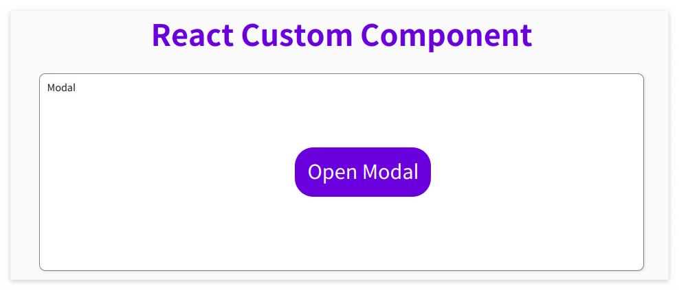
Modal Component
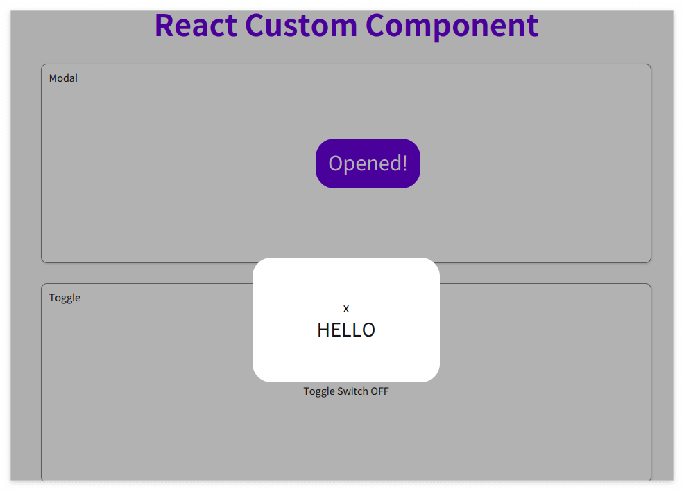
Modal UI 컴포넌트는 기존의 브라우저 페이지 위에 레이어를 까는 것으로 팝업창과는 차이가 있다.
Modal 버튼을 누르면 Modal 창이 껴지고 꺼질 수 있는 기능을 구현해보았다.
event 버블링을 막아주는 stopPropagation()을 사용하여 부모 자식간에 함께 적용되는 이벤트 함수 적용되지 않게 할 수 있다.
import { useState } from "react";
import styled from "styled-components";

//Modal을 구현하는데 전체적으로 필요한 CSS
export const ModalContainer = styled.div`
  display: flex;
  justify-content: center;
  align-items: center;
  height: 100%;
  position: relative;
`;

//Modal이 떴을 때의 배경을 깔아주는 CSS
//position을 fixed로 정하고 top, bottom, left, right를 모두 0으로 설정하면 화면에 꽉차게 설정
export const ModalBackdrop = styled.div`
  display: flex;
  justify-content: center;
  align-items: center;
  background-color: rgba(0, 0, 0, 0.3);
  position: fixed;
  top: 0;
  bottom: 0;
  left: 0;
  right: 0;
  z-index: 1;
`;

export const ModalBtn = styled.button`
  background-color: var(--coz-purple-600);
  text-decoration: none;
  border: none;
  padding: 20px;
  color: white;
  border-radius: 30px;
  cursor: grab;
`;

// attrs 메소드를 이용해서 아래와 같이 div 엘리먼트에 속성을 추가
export const ModalView = styled.div.attrs((props) => ({
  role: "dialog",
}))`
  // TODO : Modal창의 CSS를 보여줌
  display: flex;
  flex-direction: column;
  justify-content: center;
  align-items: center;
  font-size: 30px;
  background-color: white;
  width: 300px;
  height: 200px;
  border-radius: 30px;
  > button {
    background-color: #ffffff00;
    color: black;
    border: none;
    font-size: 20px;
  }
`;

//모달 창의 열고 닫힘 여부를 확인할 수 있는 state
export const Modal = () => {
  const [isOpen, setIsOpen] = useState(false);
  //모달 창 제어를 위한 핸들러 함수, change 이벤트 핸들러 (클릭할 때마다 상태가 Boolean 값으로 변경)
  const openModalHandler = () => {
    setIsOpen(!isOpen);
  };

  return (
    <>
      <ModalContainer>
        <ModalBtn
          onClick={openModalHandler}
          //클릭하면 Modal이 열린 상태(isOpen)를 boolean 타입으로 변경하는 메소드가 실행
        >
          {/*조건부 렌더링을 활용해서 Modal이 열린 상태(isOpen이 true인 상태)일 때는 ModalBtn의 내부 텍스트가 'Opened!' 로 Modal이 닫힌 상태(isOpen이 false인 상태)일 때는 ModalBtn 의 내부 텍스트가 'Open Modal'이 되도록 구현 */}
          {isOpen ? "Opened!" : "Open Modal"}
        </ModalBtn>
        {/* 조건부 렌더링을 활용해서 Modal이 열린 상태(isOpen이 true인 상태)일 때만 모달창과 배경이 뜰 수 있게 구현 */}
        {isOpen ? (
          <ModalBackdrop onClick={openModalHandler}>
            <ModalView onClick={(e) => e.stopPropagation()}>
              <button onClick={openModalHandler}>x</button>
              <div>HELLO</div>
            </ModalView>
          </ModalBackdrop>
        ) : null}
      </ModalContainer>
    </>
  );
};
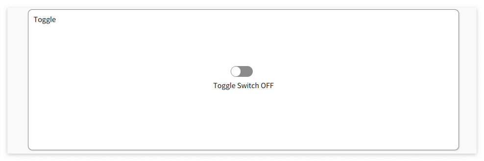
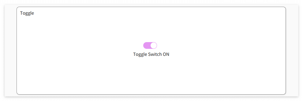
Toggle Component
Toggle UI 컴포넌트는 불이 켜지고 꺼지는 두가지 상태만을 가지고 있는 스위치이다.
import { useState } from "react";
import styled from "styled-components";

const ToggleContainer = styled.div`
  position: relative;
  margin-top: 8rem;
  left: 47%;
  cursor: pointer;
  > .toggle-container {
    width: 50px;
    height: 24px;
    border-radius: 30px;
    background-color: #8b8b8b;
    transition: 0.5s ease-in-out;
    //.toggle--checked 클래스가 활성화 되었을 경우
    &.toggle--checked {
      background-color: #d3abf1;
      transition: 0.5s ease-in-out;
    }
  }
  > .toggle-circle {
    position: absolute;
    top: 1px;
    left: 1px;
    width: 22px;
    height: 22px;
    border-radius: 50%;
    background-color: #ffffff;
    transition: 0.5s ease-in-out;
    //.toggle--checked 클래스가 활성화 되었을 경우
    &.toggle--checked {
      left: 27px;
      transition: 0.5s ease-in-out;
    }
  }
`;

const Desc = styled.div`
  display: flex;
  justify-content: center;
  margin-top: 10px;
`;

export const Toggle = () => {
  const [isOn, setisOn] = useState(false);
  const toggleHandler = () => {
    //isOn의 상태를 변경하는 메소드
    setisOn(!isOn);
  };

  return (
    <>
      <ToggleContainer
        onClick={toggleHandler}
        //클릭하면 토글이 켜진 상태(isOn)를 boolean 타입으로 변경하는 메소드가 실행
      >
        <div className={`toggle-container ${isOn ? "toggle--checked" : ""}`} />
        {/* <div onClick={toggleHandler} className={isOn? "toggle--checked toggle-container" : 'toggle-container'}/> */}
        <div className={`toggle-circle ${isOn ? "toggle--checked" : ""}`} />
        {/* <div onClick={toggleHandler} className={isOn? "toggle--checked toggle-circle" : 'toggle-circle'}/> */}
      </ToggleContainer>
      {/*Toggle Switch가 ON인 상태일 경우에 텍스트를 'Toggle Switch ON', 그렇지 않은 경우 'Toggle Switch OFF' */}
      <Desc>{isOn ? "Toggle Switch ON" : "Toggle Switch OFF"}</Desc>
    </>
  );
};
Tab Component
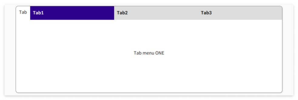
Tab UI 컴포넌트는 동일한 메뉴에서 뷰를 전환할 때 사용한다.
import { useState } from "react";
import styled from "styled-components";

const TabMenu = styled.ul`
  background-color: #dcdcdc;
  color: rgba(73, 73, 73, 0.5);
  font-weight: bold;
  display: flex;
  flex-direction: row;
  list-style: none;
  border-radius: 0px 10px 0px 0px;
  margin-bottom: 7rem;

  .submenu {
    display: flex;
    align-items: center;
    padding: 10px;
    width: 100%;
    height: 50px;
    transition: 0.5s;
  }

  .focused {
    background: darkblue;
    color: white;
    transition: 0.5s;
  }

  & div.desc {
    text-align: center;
  }
`;

const Desc = styled.div`
  text-align: center;
`;

export const Tab = () => {
  //Tab Menu 중 선택된 Tab이 선택되어 있는지 확인
  // currentTab 상태와 currentTab을 갱신하는 함수
  const [currentTab, setCurrentTab] = useState(0);

  const menuArr = [
    { name: "Tab1", content: "Tab menu ONE" },
    { name: "Tab2", content: "Tab menu TWO" },
    { name: "Tab3", content: "Tab menu THREE" },
  ];

  const selectMenuHandler = (index) => {
    //현재 선택된 Tab Menu 가 갱신
    setCurrentTab(index);
  };

  return (
    <>
      <div>
        <TabMenu>
          {/*li 엘리먼트의 class명의 경우 선택된 tab 은 'submenu focused', 나머지 2개의 tab은 'submenu'*/}
          {menuArr.map((el, index) => {
            return (
              <li
                key={index}
                className={currentTab === index ? "submenu focused" : "submenu"}
                onClick={() => selectMenuHandler(index)}
              >
                {el.name}
              </li>
            );
          })}
        </TabMenu>
        <Desc>
          <p>{menuArr[currentTab].content}</p>
        </Desc>
      </div>
    </>
  );
};
Tag Component
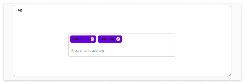
Tag UI 컴포넌트는 레이블 지정을 통해 구성이나 분류에 도움이 되는 키워드 집합을 만들 때 자주 사용된다.
import { useState } from "react";
import styled from "styled-components";
export const TagsInput = styled.div`
margin: 8rem auto;
display: flex;
align-items: flex-start;
flex-wrap: wrap;
min-height: 48px;
width: 480px;
padding: 0 8px;
border: 1px solid rgb(214, 216, 218);
border-radius: 6px;
> ul {
display: flex;
flex-wrap: wrap;
padding: 0;
margin: 8px 0 0 0;
> .tag {
width: auto;
height: 32px;
display: flex;
align-items: center;
justify-content: center;
color: #fff;
padding: 0 8px;
font-size: 14px;
list-style: none;
border-radius: 6px;
margin: 0 8px 8px 0;
background: var(--coz-purple-600);
> .tag-close-icon {
display: block;
width: 16px;
height: 16px;
line-height: 16px;
text-align: center;
font-size: 14px;
margin-left: 8px;
color: var(--coz-purple-600);
border-radius: 50%;
background: #fff;
cursor: pointer;
}
}
}
> input {
flex: 1;
border: none;
height: 46px;
font-size: 14px;
padding: 4px 0 0 0;
:focus {
outline: transparent;
}
}
&:focus-within {
border: 1px solid var(--coz-purple-600);
}
`;
export const Tag = () => {
const initialTags = ["CodeStates", "kimcoding"];
const [tags, setTags] = useState(initialTags);
const removeTags = (indexToRemove) => {
setTags(tags.filter((el) => el !== tags[indexToRemove]));
};
const addTags = (event) => {
//tags 배열에 새로운 태그를 추가하는 메소드
//이미 입력되어 있는 태그인지 검사하여 이미 있는 태그라면 추가x
//아무것도 입력하지 않은 채 Enter 키 입력시 메소드 실행x
//태그가 추가되면 input 창 비우기
let newTag = event.target.value;
if (event.key === "Enter" && newTag.length === 0)
return (event.target.value = "");
if (event.key === "Enter" && !tags.includes(newTag)) {
setTags([...tags, newTag]);
event.target.value = "";
}
};
return (
<>
<TagsInput>
<ul id="tags">
{tags.map((tag, index) => (
<li key={index} className="tag">
<span className="tag-title">{tag}</span>
<span
className="tag-close-icon"
onClick={() => removeTags(index)}
>
{/*삭제 아이콘을 click 했을 때 removeTags 메소드가 실행 */}
×
</span>
</li>
))}
</ul>
{/* 키보드의 Enter 키에 의해 addTags 메소드가 실행 */}
<input
className="tag-input"
type="text"
onKeyUp={(event) => {
addTags(event);
}}
placeholder="Press enter to add tags"
/>
</TagsInput>
</>
);
};
Autocomplete Component
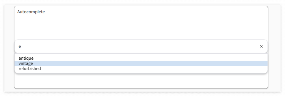
Autocomplete UI는 텍스트 input 값을 입력하면 드롭다운으로 input값과 유사한 추천 검색어를 보여주는 자동 완성 기능이다.
import { useState, useEffect } from "react";
import styled from "styled-components";
const deselectedOptions = [
"rustic",
"antique",
"vinyl",
"vintage",
"refurbished",
"신품",
"빈티지",
"중고A급",
"중고B급",
"골동품",
];
const boxShadow = "0 4px 6px rgb(32 33 36 / 28%)";
const activeBorderRadius = "1rem 1rem 0 0";
const inactiveBorderRadius = "1rem 1rem 1rem 1rem";
export const InputContainer = styled.div`
margin-top: 8rem;
background-color: #ffffff;
display: flex;
flex-direction: row;
padding: 1rem;
border: 1px solid rgb(223, 225, 229);
border-radius: ${inactiveBorderRadius};
z-index: 3;
box-shadow: 0;
&:focus-within {
box-shadow: ${boxShadow};
}
> input {
flex: 1 0 0;
background-color: transparent;
border: none;
margin: 0;
padding: 0;
outline: none;
font-size: 16px;
}
> div.delete-button {
cursor: pointer;
}
`;
export const DropDownContainer = styled.ul`
background-color: #ffffff;
display: block;
margin-left: auto;
margin-right: auto;
list-style-type: none;
margin-block-start: 0;
margin-block-end: 0;
margin-inline-start: 0px;
margin-inline-end: 0px;
padding-inline-start: 0px;
margin-top: -1px;
padding: 0.5rem 0;
border: 1px solid rgb(223, 225, 229);
border-radius: 0 0 1rem 1rem;
box-shadow: ${boxShadow};
z-index: 3;
> li {
padding: 0 1rem;
&.selected {
background-color: #d2e1f3;
}
}
`;
export const Autocomplete = () => {
const [hasText, setHasText] = useState(false);
const [inputValue, setInputValue] = useState("");
const [options, setOptions] = useState(deselectedOptions);
const [selected, setSelected] = useState(-1);
/**
* Autocomplete 컴포넌트는 아래 3가지 state가 존재
* - hasText state는 input값의 유무를 확인
* - inputValue state는 input값의 상태를 확인
* - options state는 input값을 포함하는 autocomplete 추천 항목 리스트를 확인
*/
// 상하 화살표 키 입력 시 dropdown 항목을 선택하고, Enter 키 입력 시 input값을 선택된 dropdown 항목의 값으로 변경하는 handleKeyUp 함수
const handleKeyUp = (event) => {
if (event.key === "ArrowDown" && selected < options.length - 1) {
setSelected(selected + 1);
}
if (event.key === "ArrowUp" && selected > -1) {
setSelected(selected - 1);
}
if (event.key === "Enter") {
setInputValue(options[selected]);
setOptions(
deselectedOptions.filter((el) => el.includes(options[selected]))
);
}
};
useEffect(() => {
setSelected(-1);
if (inputValue === "") {
setHasText(false);
}
}, [inputValue]);
//input과 dropdown 상태 관리를 위한 handler
const handleInputChange = (event) => {
/**
* handleInputChange 함수는
* - input값 변경 시 발생되는 change 이벤트 핸들러
* - input값과 상태를 연결시킬 수 있게 controlled component로 만들 수 있고
* - autocomplete 추천 항목이 dropdown으로 시시각각 변화되어 보여질 수 있도록 상태를 변경
* handleInputChange 함수를 완성하여 아래 3가지 기능을 구현
* onChange 이벤트 발생 시
* input값 상태인 inputValue가 적절하게 변경
* input값 유무 상태인 hasText가 적절하게 변경
* autocomplete 추천 항목인 options의 상태가 적절하게 변경, options의 상태에 따라 dropdown으로 보여지는 항목이 달라짐
*/
setHasText(true);
setInputValue(event.target.value);
setOptions(
deselectedOptions.filter((el) => el.includes(event.target.value))
);
};
const handleDropDownClick = (clickedOption) => {
/**
* autocomplete 추천 항목을 클릭할 때 발생되는 click 이벤트 핸들러
* - dropdown에 제시된 항목을 눌렀을 때, input값이 해당 항목의 값으로 변경되는 기능을 수행
* onClick 이벤트 발생 시
* input값 상태인 inputValue가 적절하게 변경
* autocomplete 추천 항목인 options의 상태가 적절하게 변경
*/
setInputValue(clickedOption);
setOptions(deselectedOptions.filter((el) => el.includes(clickedOption)));
};
const handleDeleteButtonClick = () => {
/**
* input의 오른쪽에 있는 X버튼 클릭 시 발생되는 click 이벤트 핸들러, input값을 한 번에 삭제하는 기능
* onClick 이벤트 발생 시 input값 상태인 inputValue가 빈 문자열
*/
setInputValue("");
};
return (
<div className="autocomplete-wrapper">
<InputContainer>
{/* TODO : input 엘리먼트를 작성하고 input값(value)을 state와 연결합니다. handleInputChange 함수와 input값 변경 시 호출될 수 있게 연결합니다. */}
<input
type="text"
value={inputValue}
onKeyUp={handleKeyUp}
onChange={handleInputChange}
></input>
{/* TODO : 아래 div.delete-button 버튼을 누르면 input 값이 삭제되어 dropdown이 없어지는 handler 함수를 작성합니다. */}
<div className="delete-button" onClick={handleDeleteButtonClick}>
×
</div>
</InputContainer>
{/* TODO : input 값이 없으면 dropdown이 보이지 않아야 합니다. 조건부 렌더링을 이용해서 구현하세요. */}
{hasText ? (
<DropDown
selected={selected}
options={options}
handleComboBox={handleDropDownClick}
/>
) : null}
</div>
);
};
export const DropDown = ({ selected, options, handleComboBox }) => {
return (
<DropDownContainer>
{/*input 값에 맞는 autocomplete 선택 옵션이 보여지는 역할 */}
{options.map((el, idx) => (
<li
className={idx === selected ? "selected" : ""}
onClick={() => handleComboBox(el)}
key={idx}
>
{el}
</li>
))}
</DropDownContainer>
);
};
ClickToEdit Component
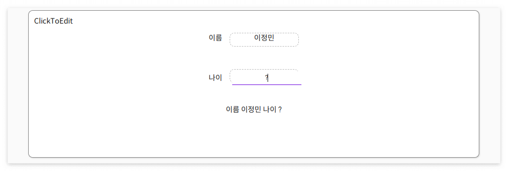
ClickToEdit 컴포넌트는 input창을 클릭하면 수정 가능하고, input 창이 아닌 다른 곳을 클릭하면 수정한 내용이 반영된다.
import { useEffect, useState, useRef } from "react";
import styled from "styled-components";

export const InputBox = styled.div`
  text-align: center;
  display: inline-block;
  width: 150px;
  height: 30px;
  border: 1px #bbb dashed;
  border-radius: 10px;
  margin-left: 1rem;
`;

export const InputEdit = styled.input`
  text-align: center;
  display: inline-block;
  width: 150px;
  height: 30px;
`;

export const InputView = styled.div`
  text-align: center;
  align-items: center;
  margin-top: 3rem;

  div.view {
    margin-top: 3rem;
  }
`;

export const MyInput = ({ value, handleValueChange }) => {
  const inputEl = useRef(null);
  const [isEditMode, setEditMode] = useState(false);
  const [newValue, setNewValue] = useState(value);

  useEffect(() => {
    if (isEditMode) {
      inputEl.current.focus();
    }
  }, [isEditMode]);

  useEffect(() => {
    setNewValue(value);
  }, [value]);

  const handleClick = () => {
    //isEditMode 상태를 변경
    setEditMode(true);
  };

  const handleBlur = () => {
    //Edit가 불가능한 상태로 변경
    setEditMode(false);
    handleValueChange(newValue);
  };

  const handleInputChange = (e) => {
    //저장된 value를 업데이트
    setNewValue(e.target.value);
  };

  return (
    <InputBox>
      {isEditMode ? (
        <InputEdit
          type="text"
          value={newValue}
          ref={inputEl}
          //포커스를 잃으면 Edit가 불가능한 상태로 변경되는 메소드가 실행
          onBlur={handleBlur}
          //변경 사항이 감지되면 저장된 value를 업데이트 되는 메소드가 실행
          onChange={handleInputChange}
        />
      ) : (
        <span
          onClick={handleClick}
          //클릭하면 Edit가 가능한 상태로 변경
        >
          {newValue}
        </span>
      )}
    </InputBox>
  );
};

const cache = {
  name: "김코딩",
  age: 20,
};

export const ClickToEdit = () => {
  const [name, setName] = useState(cache.name);
  const [age, setAge] = useState(cache.age);

  return (
    <>
      <InputView>
        <label>이름</label>
        <MyInput
          value={name}
          handleValueChange={(newValue) => setName(newValue)}
        />
      </InputView>
      <InputView>
        <label>나이</label>
        <MyInput
          value={age}
          handleValueChange={(newValue) => setAge(newValue)}
        />
      </InputView>
      <InputView>
        <div className="view">
          이름 {name} 나이 {age}
        </div>
      </InputView>
    </>
  );
};