styled-components 재사용 가능한 컴포넌트 만들기
✏️ 들어가기
LuckyPear 스터디에서 진행하고 있는 소규모 프로젝트에서 배워온 것들을 활용하여, 여태까지 주먹구구식으로 짰던 방향에서 좀 더 실무에 가깝고 효율적인 방향으로 짤 수 있도록 고민하고 있습니다.
오늘 소개하고자 하는 것은 Styled-components를 활용한 재사용 가능한 컴포넌트 입니다❗️
🤔 재사용성 고려하기
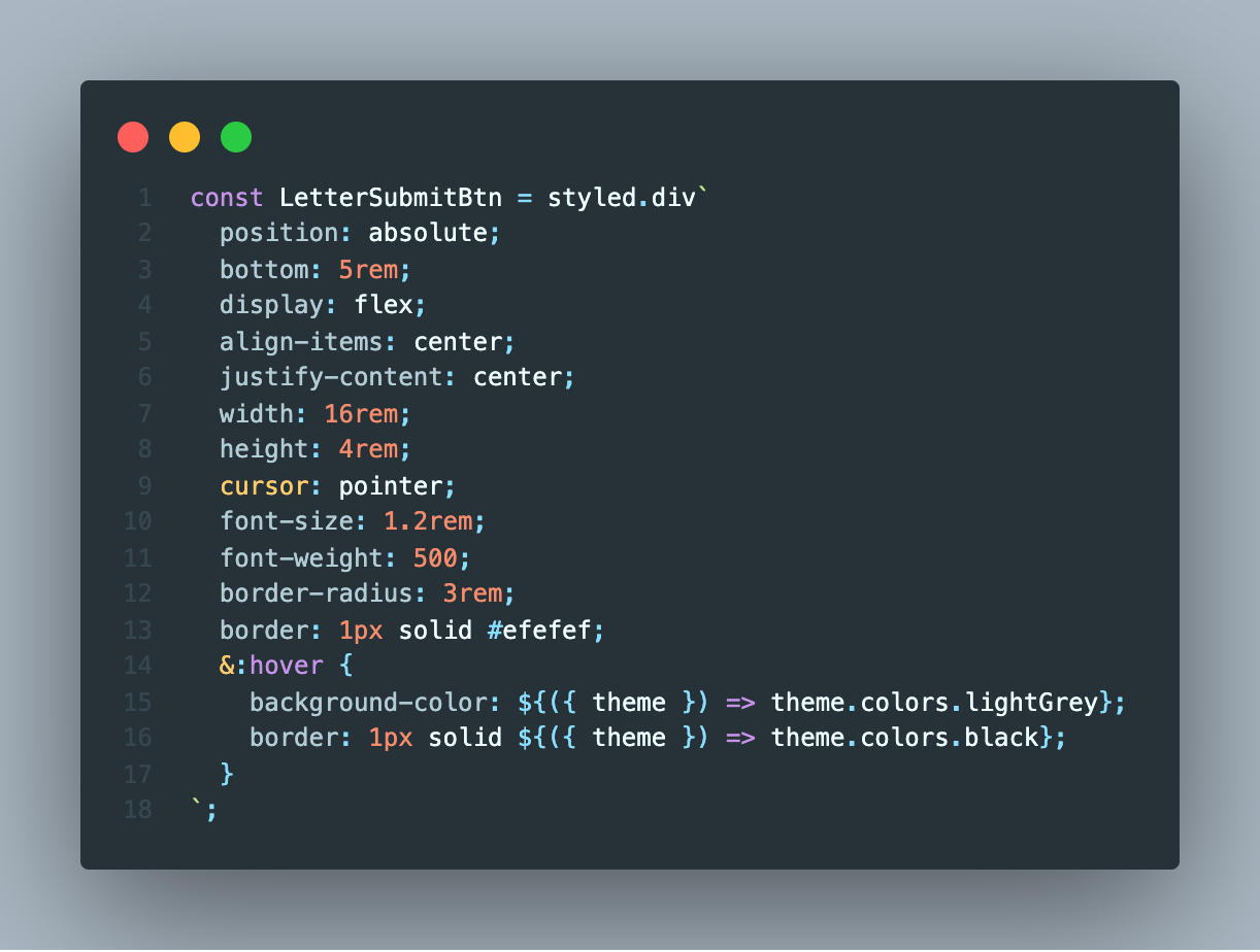
간단한 편지를 보내는 화면에서 "보내기" 버튼을 구현한 모습인데, 어차피color의 구성은 비슷할 것이므로 재사용이 가능한 형태로 바꾸고자 고민하였습니다.
데코레이터 패턴 을 들어보셨나요?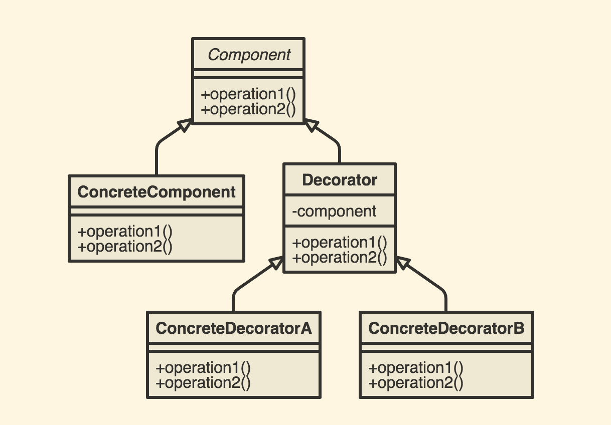 하나의 컴포넌트에 추가적인
 decorator를 붙여서 재사용성이 가능하도록 만들 수 있습니다.
이 패턴을 활용한 방법이 styled-components에도 존재합니다.
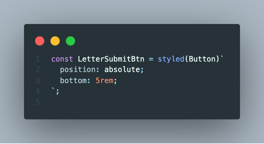 미리 결과를 보여드리자면, 재사용이 가능한
Button 에, position: absolute; bottom: 5rem; 을 decorator로 붙여서 만든 모습입니다❗️
🙌 직접 해보기
Button 을 재사용이 가능하도록 구현하고자 한다면, 먼저 어떤 속성을 입력받을 지를 고민해야 합니다.
저는 크게 3가지의 속성을 추가하기로 했습니다.
- color (버튼 내부의 text color)
- bgColor (버튼의 background-color)
- btnSize (버튼의 size)
1. property에 대한 type 정의하기
Button.tsx
export interface ButtonProps {
  bgColor?: ColorType;
  color?: ColorType;
  btnSize?: 'large' | 'mid';
  onClick?: (event: React.MouseEvent<HTMLDivElement, MouseEvent>) => void;
}
typescript 로 구현하였기 때문에 Button에 들어갈 property에 대한 type을 추가해 주었습니다.
<button>태그를 이용해 구현하지 않고, <div> 태그를 이용할 예정이므로 추가로 onClick 에 대한 return type도 지정해 주었습니다.
2. 컴포넌트의 형태 작성
const Button: React.FC<ButtonProps> = ({ children, color, bgColor, btnSize, ...props }) => {
  return (
    <Wrapper color={color} bgColor={bgColor} btnSize={btnSize} {...props}>
      {children}
    </Wrapper>
  );
};
실제로 Button 컴포넌트가 가질 형태입니다.
type을 정의했듯, color과 bgColor, btnSize를 property로 가지는 형태이고 {children} 은
LetterPage.tsx (Button을 사용하는 page)
import Button from '../../components/Button';

<LetterSubmitBtn onClick={handleSubmit}>보내기</LetterSubmitBtn>
// {children} === "보내기"
다음과 같이 Button 내부에 쓰여질 코드 및 텍스트들을 의미합니다.
3. color, bgColor, size를 이용한 custom 및 적용
type StyleType = Pick<ButtonProps, 'color' | 'bgColor' | 'btnSize'>;
type SizeType = Pick<ButtonProps, 'btnSize'>;
먼저 각각 스타일에 대한 type을 지정해 주었습니다.
굳이 필요하지 않은 과정이라고 생각할 수 도 있겠으나, Typescript를 좀 더 정확하게 사용하기 위해 Pick을 이용하여
사용하는 속성들에 대한 타입만 가져올 수 있도록 하였습니다. 자세한 건 예시를 보면 좀 더 이해가 쉬울 것이라 생각합니다.
Button.tsx
const sizeStyles = css<SizeType>`
  ${({ btnSize }) =>
    btnSize === 'large' &&
    css`
      width: 16rem;
      height: 4rem;
      font-size: 1.2rem;
    `}
  ${({ btnSize }) =>
    btnSize === 'mid' &&
    css`
      width: 16rem;
      height: 4rem;
      font-size: 1.2rem;
      border-radius: 3rem;
    `}
`;
다음은 size에 대한 custom을 한 부분입니다. import styled,{css} from 'styled-components' 를 통해 가져올 수 있는 css는
property에 따른 조건부 스타일링을 할 경우에 여러줄의 스타일을 적용할 수 있습니다.
이 부분에선 btnSize property만 사용하고 있으므로, ButtonProps type 에서 btnSize 만 뽑아와서 SizeType 으로 사용하고 있습니다.
const Wrapper = styled.div<StyleType>`
  display: flex;
  align-items: center;
  justify-content: center;
  font-weight: 500;
  cursor: pointer;
  color: ${({ theme, color }) => color || theme.colors.black};
  background-color: ${({ bgColor }) => bgColor};
  ${sizeStyles};
  &:hover {
    background-color: ${({ theme }) => theme.colors.lightGrey};
    border: 1px solid ${({ theme }) => theme.colors.black};
  }
`;
전체적인 Button의 Wrapper를 나타내는 부분입니다.
onClick 을 제외한 style에 관련된 모든 property를 사용하였으므로 StyleType을 적용해 준 모습이고
위에서 정의한 sizeStyles 또한 추가해 주었습니다.
4. defaultProps 적용
Button.defaultProps = {
  btnSize: 'mid',
};
만약 별도의 속성을 지정하지 않고 호출할 때, 기본적으로 속성들을 지정하고 싶은 경우 다음과 같이 기본 속성을 지정하여 사용할 수 있습니다.
const Button: React.FC<ButtonProps> = ({ children, color, bgColor, btnSize="mid", ...props }) => {
  return (
    <Wrapper color={color} bgColor={bgColor} btnSize={btnSize} {...props}>
      {children}
    </Wrapper>
  );
이와 같은 역할을 해 줄 수 있습니다.
😆 마치며
완성된 코드는 여기서 확인하실 수 있습니다!
이번 방학동안 진행했던 쿠키파킹 프로젝트에서 다뤄보지 못했던 typescript 라던지,
해커톤 특성상 빠르게 개발해야 되는 부분들 때문에 모듈화에 좀 더 신경쓰지 못했던 점을 보완해서 공부하는 과정이 너무 재밌어서
앞으로 좀 더 효율적인 코드를 짤 수 있는 방법에 대해 알아보고 경험해서 같이 공유하고자 합니다❗️
감사합니다 :)

4개의 댓글

To the best of my humble knowledge anything apart from this has never been or something like this. I want to know what actually works better and properly for my web site coursework writing. I would add to your kind information that if you continue writing these types of comment than no body is going to help you whatsoever.
It doesn't work anymore. what If ask you do the same for my cipd website and let me just know about the shortcomings and loopholes
clicked! Well basically theme of any website can best be described as the presentation and overall look and feel of your website like Irish essay writing service which may include the color scheme of your website and the brand identity or Logo of your website. Whereas Web Template is the raw structure consists of some of core web technologies like HTML CSS and JavaScript with pictures and some text place holder and it can be customized easily to turn that up into working and functioning website.