여러 아이콘들을 하나의 이미지로 만들어서 사용합니다.
background-image와 background-position, background-size 등을 이용하여 하나의 이미지에서 해당하는 아이콘만 보여주는 것입니다.
피그마에서 SVG 코드 복사
피그마에서 여러 이미지를 동시에 클릭하고 svg로 복사하면 쉽게 sprites 이미지를 얻을 수 있습니다.
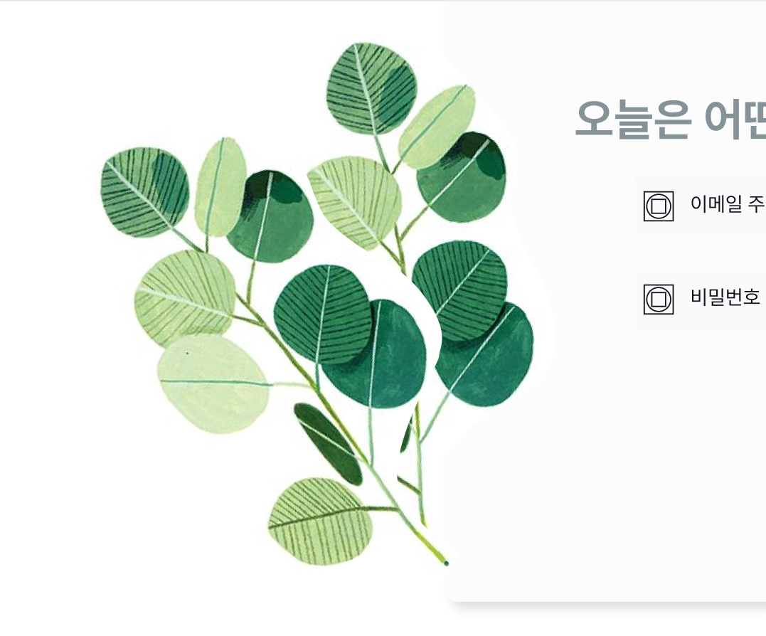
식물 이미지는 두 개가 별도로 되어있습니다. 이 부분에 대해서 두 개를 모두 클릭한 후 우클릭으로 다음과 같이 들어가 줍니다.
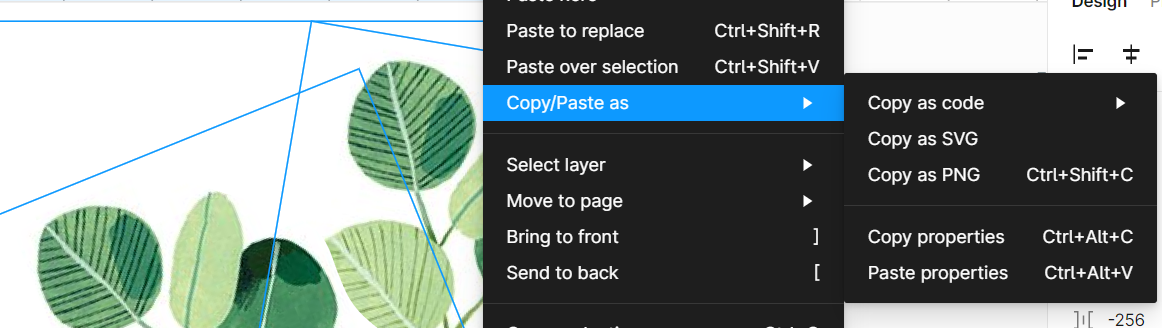
copy as SVG를 눌러주시면 svg코드로 복사가 됩니다!
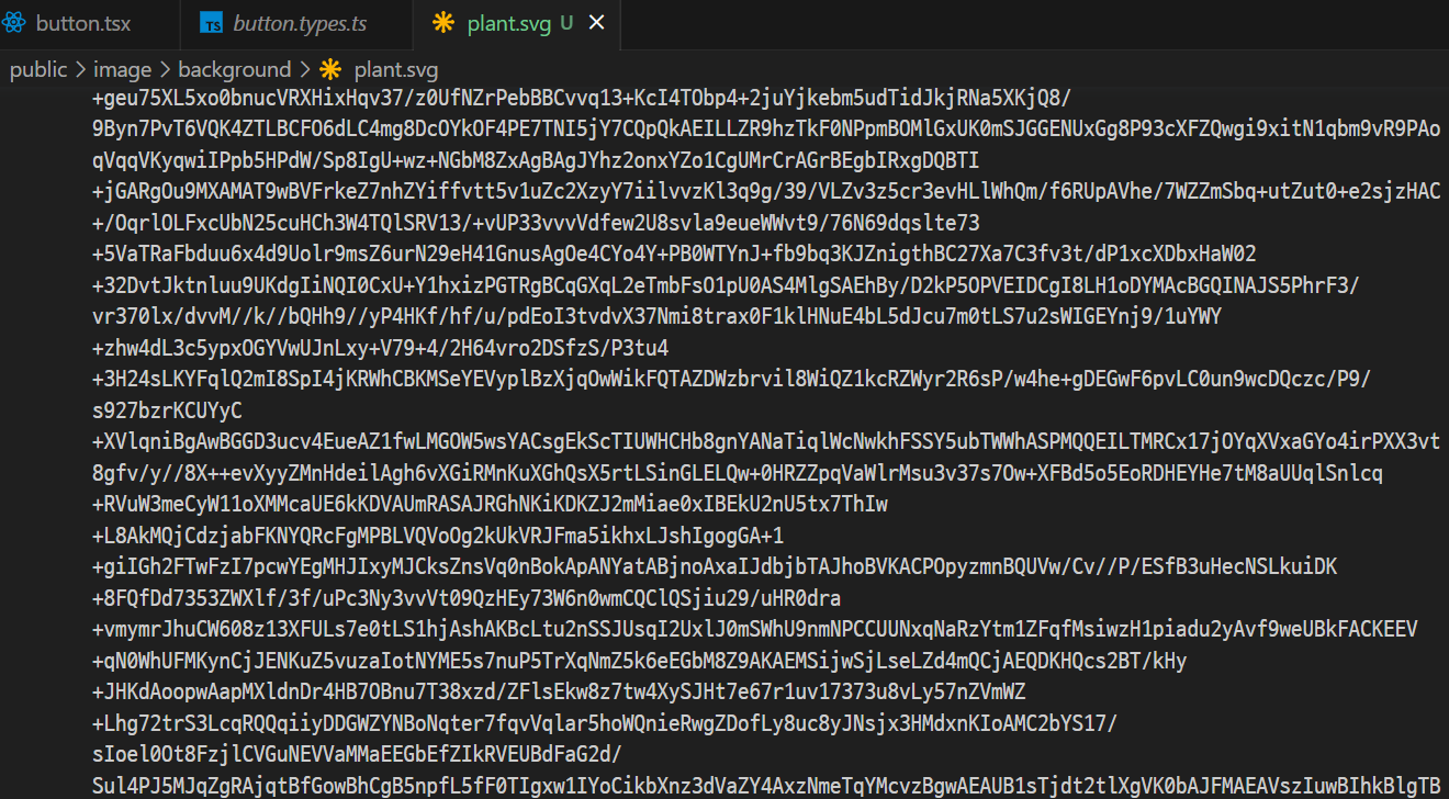
이미지를 포함하고 있어 엄청난 코드가 나왔습니다만 이런식으로 피그마에서 svg 이미지를 바로 가지고 올 수 있습니다.
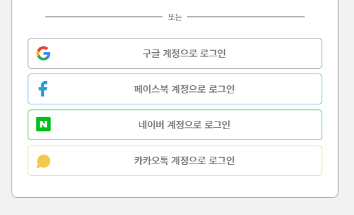
저는 소셜 로그인에 적용할 아이콘을 다음처럼 가지고 왔습니다.

피그마에서 선택한 간격을 그대로 가지고 오기 때문에, 피그마 자체에서 간격을 좀 확인하고 가지고 오시는 걸 추천드립니다!
실습 코드
index.html
아이콘을 적용하기 위해 소셜 로그인 버튼들을 html로 작성을 해주었습니다.
	<section class="section2">
        <h2 class="a11y-hidden">소셜 로그인</h2>
        <p>또는</p>
        <div class="social-btns">
          <button type="button" class="social google">
            <span>구글 계정으로 로그인</span>
          </button>
          <button type="button" class="social facebook">
            <span>페이스북 계정으로 로그인</span>
          </button>
          <button type="button" class="social naver">
            <span>네이버 계정으로 로그인</span>
          </button>
          <button type="button" class="social kakao">
            <span>카카오톡 계정으로 로그인</span>
          </button>
        </div>
      </section>
style.css
다음은 해당 아이콘 svg를 활용하여 작성한 css 입니다. 필요한 부분만 가지고 왔기 때문에, 실제로는 적용한 속성과는 차이가 있습니다!
.section2 .social::before {
    content: "";
    background-image: url(../images/icons.svg);
    background-position: center top;
    background-size: 100%;
    background-repeat: no-repeat;
}

.social.facebook::before {
    background-position: center top -65px;
    background-size: 100%;
}

.social.naver::before {
    background-position: center bottom -60px;
    background-size: 100%;
}

.social.kakao::before {
    background-position: center bottom 2px;
    background-size: 100%;
}
최종 결과
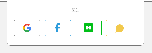
노트북 화면이 작다보니 어쩔 수 없이 반응형을 해야한달까요..? 디자인대로 똑같이 하다보면 모달창이 화면 밖으로 나가버리는 일이 생깁니다🥲 반응형 코드는 사진 아래에 작성했습니다!
style.css
.section2 .social-btns {
    display: flex;
    flex-direction: column;
    flex-basis: auto;
    flex-grow: 0;
    flex-shrink: 1;
    height: 100%;
}

.section2 .social {
    display: flex;
    width: 100%;
    color: var(--767676);
    font-size: 1em;
    font-weight: 500;
    text-align: center;
    border-radius: 5px;
    border: 1px solid var(--767676);
    padding: 1vh;
    margin-bottom: 1vh;
    align-items: center;
    /* max-height: 50px; */
}

.section2 .social span {
    margin: auto;
    text-align: center;
}

.section2 .social::before {
    content: "";
    display: block;
    width: 5vh;
    height: 5vh;
    max-width: 30px;
    max-height: 30px;
    background-image: url(../images/icons.svg);
    background-position: center top;
    background-size: 100%;
    background-repeat: no-repeat;
    margin-left: 0;
}

.social.facebook {
    border-color: #2D9CDB;
}

.social.facebook::before {
    background-position: center top -65px;
    background-size: 100%;
}

.social.naver {
    border-color: #00BF18;
}

.social.naver::before {
    background-position: center bottom -60px;
    background-size: 100%;
}

.social.kakao {
    border-color: #F2C94C;
}

.social.kakao::before {
    background-position: center bottom 2px;
    background-size: 100%;
}

/*media query*/
@media screen and (max-height:750px) {
    .section2 .social-btns {
        flex-basis: 30px;
        display: flex;
        flex-direction: row;
        flex-wrap: wrap;
        gap: 2vh;
    }

    .section2 .social {
        max-width: calc(25% - 2vh);
        min-height: 45px;
        justify-content: center;
    }

    .section2 .social span {
        clip: rect(1px, 1px, 1px, 1px);
        clip-path: inset(50%);
        width: 1px;
        height: 1px;
        margin: -1px;
        overflow: hidden;
        padding: 0;
        position: absolute;
    }
}
대부분 상대단위를 쓰고, 모달의 높이가 벗어나는 것이기 때문에 화면 높이에 따라서 달라지도록 설정했습니다! 참고로 mediaquery부분의 span에 작성한 스타일은 웹접근성을 고려한 숨김처리입니다.
결론
반응형으로 레이아웃이 심하게 변동되는 경우 css sprites보다는 개별 이미지로 넣는게 좋다는 것을 깨달았습니다. 반응형으로 하다보니 기준점이 이동되면서 이미지의 위치가 흔들리는 것을 조정하는 게 일이었습니다. 다만 미디어쿼리를 통해서 충분히 조정이 가능한 부분이기도 합니다. 여러 아이콘들을 하나의 이미지로 일정하게 만들어두어 이미지를 불러오는 일이 적어지는 게 가장 큰 장점인 것 같습니다.