자바스크립트-9일차
학습한 내용
JavaScript 기초/ 실습 - (실습) 포트폴리오 웹페이지 만들기
실습1. 캐러셀
이전, 다음 버튼으로 이미지 이동하기
<h1>Mini Carousel</h1>
  <div class="window">
    <ul class="container">

      <li class="cell">5</li>
      <li class="cell">1</li>
      <li class="cell">2</l>
      <li class="cell">3</li>
      <li class="cell">4</li>
    </ul>
  </div>
  <div class="button-container">
    <button class="prev">previous</button>
    <button class="next">next</button>
  </div>
위와 같이 prev, next 버튼을 활용하여 자바스크립크 작성
  <script>
  const container = document.querySelector(".container");
const prevBtn = document.querySelector(".prev");
const nextBtn = document.querySelector(".next");

(function addEvent(){
  prevBtn.addEventListener('click', translateContainer.bind(this, 1));
  nextBtn.addEventListener('click', translateContainer.bind(this, -1));
})();

function translateContainer(direction){
  const selectedBtn = (direction === 1) ? 'prev' : 'next';
  container.style.transitionDuration = '500ms';
  container.style.transform = `translateX(${direction * (100 / 5)}%)`;
  container.ontransitionend = () => reorganizeEl(selectedBtn);
}

function reorganizeEl(selectedBtn) {
  container.removeAttribute('style');
  (selectedBtn === 'prev') ? container.insertBefore(container.lastElementChild, container.firstElementChild): container.appendChild(container.firstElementChild);
}
</script>- bind는 연결한다는 뜻
- = () => : 화살표 함수, 함수를 재사용 많이 안하고, 짧게 쓸 때 사용
- (100 / 5)}% : 나누기가 아니라 %라서 띄어쓰기 하면 안 됨.
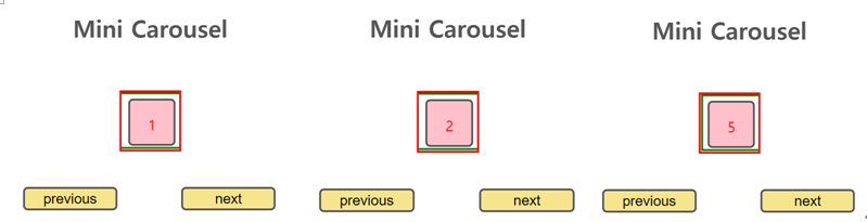
- next버튼과 prev버튼 기능이 잘 되는 것을 확인 가능
실습2. 포트폴리오 웹페이지 만들기
1) header 영역
html
<header>
    <div class="container">
      <h1>
        <button>LOGO</button>
      </h1>
      <nav>
        <ul>
          <li>
            <button>About</button>
          </li>
          <li>
            <button>Features</button>
          </li>
          <li>
            <button>Portfolio</button>
          </li>
          <li>
            <button>Contact</button>
          </li>
        </ul>
      </nav>
    </div>
  </header>
css
/* 기준 너비를 유지하는 역할  */
.container{
    width:1140px;
    margin:0 auto;
  }
/* 스크롤 내리더라고 헤더 상단 고정 */
header{
    position:fixed;
    color: white;
    top:0;
    z-index:1;   /*header가 위로 오게 하기 위해 지정 */
    width:100%;
    padding:1rem;
}

header .container{
    display:flex;
    justify-content:space-between; /*양 끝으로 배치 */
    align-items:center;   /*수직정렬*/
    width: 100%;
}

header nav ul{
    display:flex;  /*메뉴 가로 배치*/
  }

header nav ul li{
    padding:10px;
  }

header button{
    background: transparent; /* 투명하게 */
    border:0;
    cursor: pointer;
    color: white;
}

header h1 button{ /* 로고 */
    font-size: 2rem;
    font-weight: bold;
    color: white;
  }

header nav ul li button{
    font-size: 1.2rem;
  }
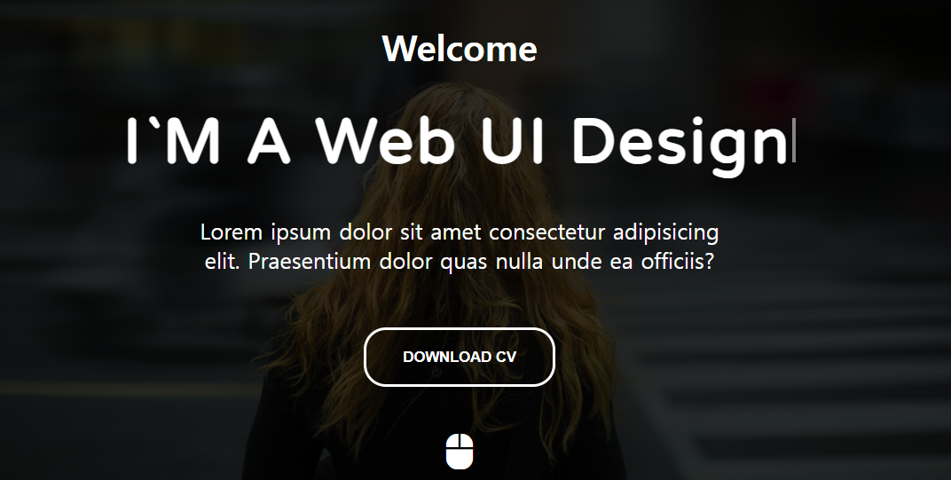
2) main 영역
html
<main id="main">
    <div class="container">
      <h4>Welcome</h4>
      <!-- 13.10.1에서 span 태그의 내용이 비워집니다. -->
      <h2>I`M A <span>Front-End Developer</span></h2>
      <p>Lorem ipsum dolor sit amet consectetur adipisicing elit. Praesentium dolor quas nulla unde ea officiis?</p>
      <button class="download">DOWNLOAD CV</button>
      <button class="mouse"><i class="fa-solid fa-computer-mouse"></i></button>
    </div>
  </main>
css
main{
    width: 100%;
    height: 100vh;
    background: linear-gradient(rgba(0,0,0,0.8), rgba(0,0,0,0.8)) ,url('../images/me.jpg') center center;
    background-size: cover;
    display: flex;
    justify-content: center;
    align-items: center;
    text-align: center;
    color: white;
}

main h4{
    font-size: 2rem;
}
main h2{
    font-size: 3.5rem;
    margin: 2rem 0;
    letter-spacing: 3px;
    font-family: 'Varela Round', sans-serif;
}
main p{
    max-width: 500px;
    margin: 0 auto;
    font-size: 1.25rem;
}

main button.download{
    background-color: transparent;
    color: white;
    border: 3px solid white;
    padding: 1rem 2rem;
    border-radius: 20px;
    margin-top: 3rem;
    font-weight: bold;
    cursor: pointer;
}

/* 아이콘 폰트로 추가한 마우스 모양의 버튼 스타일 속성, 애니메이션 추가 */
main button.mouse{
    background-color: transparent;
    border: none;
    color: white;
    font-size: 2rem;
    position: absolute;
    bottom: 1rem;
    left: 50%;
    transform: translateX(-50%);
    animation: upDown 1s ease-in-out infinite;
}
@keyframes upDown{
    0%{bottom: 1rem;}
    50%{bottom: 1.5rem;}
    100%{bottom: 1rem;}
}

/* | 깜빡 거리는 것 애니메이션 */
main h2 span::after{
    content: ""; /* 내용 없음 */
    height: 40px;
    width: 3px;
    background-color: white;
    display: inline-block;
    animation: blink .7s ease-in-out infinite;
}
@keyframes blink{
    0%{opacity: 1;}
    100%{opacity: 0;}
}- 마우스 아이콘이 위아래로 움직이는 애니메이션을 구현
- 애니메이션을 통해 | 부분을 깜빡 거리는 것처럼 구현
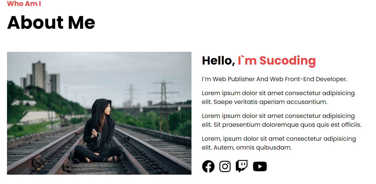
3) about me 영역
html
<section id="about" class="about">
    <div class="container">
      <div class="title">
        <h4>Who Am I</h4>
        <h2>About Me</h2>
      </div>
      <div class="about-self">
        <div class="left">
          <img src="./images/me_alone.jpg" alt="">
        </div>
        <div class="right">
          <h3>Hello, <strong>I`m Sucoding</strong></h3>
          <p>I`m Web Publisher And Web Front-End Developer.</p>
          <p>Lorem ipsum dolor sit amet consectetur adipisicing elit. Saepe veritatis aperiam accusantium.</p>
          <p>Lorem ipsum dolor sit amet consectetur adipisicing elit. Sit praesentium doloremque quos quis est officiis.</p>
          <p>Lorem, ipsum dolor sit amet consectetur adipisicing elit. Autem, omnis quibusdam.</p>
          <div class="social">
            <a href="#">
              <i class="fa-brands fa-facebook"></i>
            </a>
            <a href="#">
              <i class="fa-brands fa-instagram"></i>
            </a>
            <a href="#">
              <i class="fa-brands fa-twitch"></i>
            </a>
            <a href="#">
              <i class="fa-brands fa-youtube"></i>
            </a>
          </div>
        </div>
      </div>
    </div>
  </section>
css
/* 전체 글꼴, 배경색 */
section{
    font-family: 'Poppins', sans-serif;
    padding: 5rem 0;
}
section:nth-child(2n){
    background-color: #f8f8f8;
}
/* 섹션의 제목 영역 */
section.title{
    margin-bottom: 3rem;
}
section .title h4{
    font-size: 1.35rem;
    color: #ed4848;
    position: relative;
}
section .title h2{
    font-size: 3.5rem;
}
section .title p{
    font-size: 1.15rem;
}

/* about-self 클래스 안에서 left, right 클래스 구성
    절반으로 구성 width:50%;
아래쪽 이미지, 글자 */
section .about-self::after{
    content: "";
    clear: both;
    display: block;
}
section .about-self .left{
    width: 50%;
    float: left;
}
section .about-self .left img{
    max-width: 100%;
}
section .about-self .right{
    width: 50%;
    float: left;
    padding: 0 2rem;
}
section .about-self .right h3{
    font-size: 2.25rem;
    margin-bottom: 1rem;
}
section .about-self .right h3 strong{
    color: #ed4848;
}
section .about-self .right p{
    font-size: 1.15rem;
    margin: 1rem 0;
}

section .about-self .right .social a{
    font-size: 2.5rem;
    margin-right: 0.2rem;
}- 제목 title같은 경우는 다음에 등장할 영역들이랑 동일하기에 같은 class를 주어 css에서 한 번 설정 후 간편하게 작성해 준다.
4) whid i do 영역
html
<section id="features" class="do">
    <div class="container">
      <div class="title">    <!-- title 영역 앞이랑 유사 -->
        <h4>Features</h4>
        <h2>What I Do</h2>
      </div>
      <!-- 사각형 모양으로 3단 분리된 본문 -->
      <div class="do-me">
        <div class="do-inner">  <!-- 하나의 사각형을 나타내는 do-inner 클래스-->
          <div class="icon">
            <i class="fa-brands fa-html5"></i>
          </div>
          <div class="content">
            <h3>HTML5</h3>
            <p>Lorem ipsum dolor sit amet consectetur adipisicing elit. Illo culpa magni laboriosam sit excepturi quibusdam adipisci, vero debitis?</p>
          </div>
        </div>
        <div class="do-inner">  <!-- 하나의 사각형을 나타내는 do-inner 클래스-->
          <div class="icon">
            <i class="fa-brands fa-css3-alt"></i>
          </div>
          <div class="content">
            <h3>CSS3</h3>
            <p>Lorem ipsum dolor sit amet consectetur adipisicing elit. Illo culpa magni laboriosam sit excepturi quibusdam adipisci, vero debitis?</p>
          </div>
        </div>
        <div class="do-inner">  <!-- 하나의 사각형을 나타내는 do-inner 클래스-->
          <div class="icon">
            <i class="fa-brands fa-bootstrap"></i>
          </div>
          <div class="content">
            <h3>BootStrap v5.0</h3>
            <p>Lorem ipsum dolor sit amet consectetur adipisicing elit. Illo culpa magni laboriosam sit excepturi quibusdam adipisci, vero debitis?</p>
          </div>
        </div>
      </div>
    </div>
  </section>
css
section .do-me::after{
    content: "";
    clear: both;
    display: block;
}
/* 사각형 만들기 */
section .do-me .do-inner{
    background-color: white;
    width: 30%;
    padding: 2rem;
    float: left;
    margin-right: 5%;
    cursor: pointer;
}
section .do-me .do-inner:last-child{
    margin-right: 0;
}
section .do-me .do-inner .icon i{
    font-size: 2.5rem;
    color: #ff6a6a;
}
section .do-me .do-inner .content h3{
    font-size: 2rem;
    margin: 1rem 0;
}
section .do-me .do-inner:hover{
    background-color: lightcoral;
    color: white;
}
section .do-me .do-inner:hover i{
    color: white;
}- 제목은 전체 스타일에 적용하게 작성했으므로 What I Do 영역의 제목에도 같은 디자인이 적용되어서 표시
- do-inner 클래스로 그룹 지은 본문만 스타일을 작성
- hover를 통해 마우스가 위에 있을 때, 배경색, 텍스트 색, 아이콘 색 변경
5) background 영역
html
<div class="bg"></div>- 배경 영역은 단순한 디자인적 요소라서 div 태그로 묶어줌
css
.bg{
background: url('../images/background.jpg') center center;
background-size: cover;
background-attachment: fixed; /* 이미지 고정 */
height: 650px;
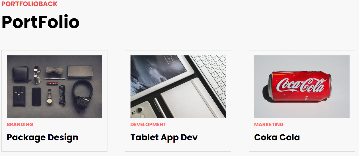
}6) portfolio 영역
html
<section id="portfolio" class="portfolio">
    <div class="container">
      <div class="title">
        <h4>PORTFOLIOBACK</h4>
        <h2>PortFolio</h2>
      </div>
      <div class="portfolio-me">
        <div class="portfolio-inner">
          <img src="images/mock1.png" alt="">
          <strong>BRANDING</strong>
          <h3>Package Design</h3>
        </div>
        <div class="portfolio-inner">
          <img src="images/mock2.png" alt="">
          <strong>DEVELOPMENT</strong>
          <h3>Tablet App Dev</h3>
        </div>
        <div class="portfolio-inner">
          <img src="images/mock3.png" alt="">
          <strong>MARKETING</strong>
          <h3>Coka Cola </h3>
        </div>
        <div class="portfolio-inner">
          <img src="images/mock4.png" alt="">
          <strong>APP</strong>
          <h3>FaceBook Clone</h3>
        </div>
        <div class="portfolio-inner">
          <img src="images/mock5.png" alt="">
          <strong>APP</strong>
          <h3>Netflix Clone</h3>
        </div>
        <div class="portfolio-inner">
          <img src="images/mock6.png" alt="">
          <strong>WEB</strong>
          <h3>FirmBee Web</h3>
        </div>
      </div>
    </div>
</section>- what_i_do 영역과 유사
css
section .portfolio::after{
    content: "";
    clear: both;
    display: block;
}
/* 사각형 꾸미기 */
section.portfolio .portfolio-inner{
    width: 30%;
    margin-right: 5%;
    padding: 1rem 1rem 1.5rem 1rem;
    float: left;
    background-color: #f8f8f8;
    border: 1px solid #ccc;
    margin-bottom: 3rem;
}
section.portfolio .portfolio-inner:nth-child(3n){
    margin-right: 0;
}
section.portfolio .portfolio-inner img{
    width: 100%;
    display: block;
}
section.portfolio .portfolio-inner strong{
    color: #ff6a6a;
    margin: 0.5rem 0;
    display: block;
}
section.portfolio .portfolio-inner h3{
    font-size: 1.75rem;
}- 본문의 디자인은 조금 다르지만, 레이아웃은 What I Do 영역의 본문과 동일. 따라서 사각형 스타일 적용 후, 복사
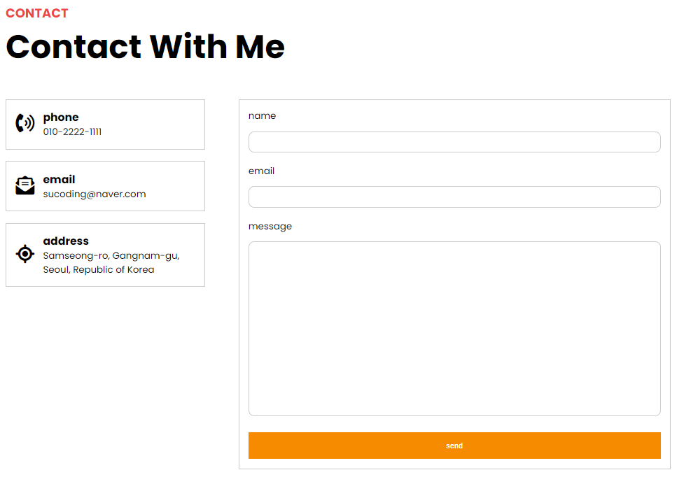
7) Contact With Me 영역
- html
  <section id="contact" class="contact">
    <div class="container">
      <div class="title">
        <h4>CONTACT</h4>
        <h2>Contact With Me</h2>
      </div>

      <!-- Contact With Me 영역의 본문은 크게 왼쪽(phone, email, address)과 오른쪽(입력 양식 폼)으로 나눌 수 있습니다. 그래서 다음과 같이 contact-me 클래스를 가지는 div 태그 안에 left 클래스를 가지는 div 태그와 right 클래스를 가지는 div 태그로 영역을 구분합니다. -->
      <div class="contact-me">
        <div class="left">
          <div class="card">
            <div class="icon">
              <i class="fa-solid fa-phone-volume"></i>
            </div>
            <div class="info-text">
              <h3>phone</h3>
              <p>010-2222-1111</p>
            </div>
          </div>
          <div class="card">
            <div class="icon">
              <i class="fa-solid fa-envelope-open-text"></i>
            </div>
            <div class="info-text">
              <h3>email</h3>
              <p>sucoding@naver.com</p>
            </div>
          </div>
          <div class="card">
            <div class="icon">
              <i class="fa-solid fa-location-crosshairs"></i>
            </div>
            <div class="info-text">
              <h3>address</h3>
              <p>Samseong-ro, Gangnam-gu, Seoul, Republic of Korea</p>
            </div>
          </div>
        </div>
        <div class="right">
          <form action="#">
            <div class="form-group">
              <label for="name">name</label>
              <input type="text" id="name">
            </div>
            <div class="form-group">
              <label for="email">email</label>
              <input type="text" id="email">
            </div>
            <div class="form-group">
              <label for="msg">message</label>
              <textarea id="msg"></textarea>
            </div>
            <button>send</button>
          </form>
        </div>
      </div>
    </div>
  </section>
css
section .contact .contact-me::after{
    content: "";
    display: block;
    clear: both;
}
section.contact .contact-me .left{
    width: 30%;
    float: left;
}
section.contact .contact-me .right{
    width: 65%;
    float: left;
    margin-left: 5%;
    margin-bottom: 2rem;
    border: 1px solid #ccc;
    padding: 1rem;
}
/* left -> card */
section.contact .contact-me .left .card{
    border: 1px solid #ccc;
    padding: 1rem;
    display: flex;
    align-items: center;
    margin-bottom: 1.25rem;
}
section.contact .contact-me .left .card .icon i{
    font-size: 2rem;
    margin-right:  5px;
}

/* right - form */
section.contact .contact-me .right .form-group{
    margin-bottom: 1.25rem;
}
section.contact .contact-me .right .form-group label{
    display: block;
    margin-bottom: 0.85rem;
}
section.contact .contact-me .right .form-group input{
    padding: 0.625rem;
    width: 65%;
    outline: none;
    border: 1px solid #ccc;
    border-radius: 10px;
}

section.contact .contact-me .right .form-group input:focus{
    border: 1px solid #719ece;
    box-shadow: 0 0 10px #719ece;
}
section.contact .contact-me .right .form-group textarea{
    height: 300px;
    width: 100%;
    resize: none;
    border: 1px solid #ccc;
    border-radius: 10px;
}
section.contact .contact-me .right .form-group textarea:focus{
    outline: none;
    border: 1px solid #719ece;
    box-shadow: 0 0 10px #719ece;
}
section.contact .contact-me .right button{
    width: 100%;
    padding: 1rem;
    background-color: #f78b00;
    border: none;
    color: white;
}- focus 가상 클래스 선택자로 입력 요소에 커서가 활성화되면 테두리와 그림자 효과 추가
- textarea 요소에 커서 활성화가 되면 테두리와 그림자 효과 추가
8) 자바스크립트 작성
8-1) 메인 영역의 타이핑 효과
// 타이핑 효과 - 배열로 저장해서 한글자 씩 쓰는 것
// span 요소 노드 가져오기
const spanEl = document.querySelector("main h2 span");
const txtArr = ['Web Publisher', 'Front-End Developer', 'Web UI Designer', 'UX Designer', 'Back-End Developer'];
let index = 0;
let currentTxt = txtArr[index].split(""); // 한글자로 나누는 것

function writeTxt(){
    spanEl.textContent += currentTxt.shift();
    if (currentTxt.length !== 0){
        setTimeout(writeTxt, Math.floor(Math.random() * 100));
    }else{
        currentTxt = spanEl.textContent.split("");
        setTimeout(deleteTxt, 3000);
    }
}
writeTxt();

// 삭제
function deleteTxt(){
    currentTxt.pop();
    spanEl.textContent = currentTxt.join("");
    if (currentTxt.length !== 0){
        setTimeout(deleteTxt, Math.floor(Math.random() * 100));
    }else{
        index = (index + 1) % txtArr.length; // index 초과하는 것 방지
        currentTxt = txtArr[index].split("");
        writeTxt();
    }
}- 화면에 표시할 문장 배열을 만듬
- 배열에서 요소를 하나 가져온 뒤, split으로 나눠 주기
- 할당된 배열 요소를 앞에서부터 shift() 이용해 한 개씩 출력
- if 문으로 할당된 배열의 길이가 0인지 확인. 0이 아니라면 계속 출력. setTimeout()의 두 번째 인자는 밀리초 의미. random을 통해 작성되는 글자 속도 달라지게 설정
- 배열이 모두 출력되고 비었다면 deleteTxt() 함수 호출
- pop를 통해 뒤에서 한글자 씩 추출하여 삭제되는 것처럼 표현
- join을 통해 요소를 하나의 문자열로 합침
- if 문에서 index를 1 증가시키는데, index의 숫자가 배열 길이를 넘지 않게 하기 위해서 1을 더하고 길이로 나눠준다.
8-2) 스크롤 이벤트
- header영역의 nav를 클릭하였을 때 해당 영역으로 이동
// 스크롤 이벤트 연결하기
const scollMoveEl = document.querySelectorAll("[data-animation-scroll='true']");
for(let i = 0; i < scollMoveEl.length; i++){
  scollMoveEl[i].addEventListener('click', function(e){
    const target = this.dataset.target;
    animationMove(target);
  });
}- 자바스크립트에 새롭게 추가된 data-animation-scroll='true' 기능을 써야 함
- 사용하기 위해서 html파일에도 연결해줘야 함
<ul>
          <li>
            <button data-animation-scroll="true" data-target="#about">About</button>
          </li>
          <li>
            <button data-animation-scroll="true" data-target="#features">Features</button>
          </li>
          <li>
            <button data-animation-scroll="true" data-target="#portfolio">Portfolio</button>
          </li>
          <li>
            <button data-animation-scroll="true" data-target="#contact">Contact</button>
</li>- data 사용하는 방법 https://developer.mozilla.org/ko/docs/Learn/HTML/Howto/Use_data_attributes
- dataset 의 설명
https://developer.mozilla.org/en-US/docs/Web/API/HTMLElement/dataset
학습한 내용 중 어려웠던 점 또는 해결못한 것들
해결방법 작성
학습 소감
오늘을 마지막으로 자바스크립트 학습이 끝이 났다. 적지 않은 양을 빠르게 학습을 하다보니, 개념이 뒤섞이고 헷갈리는 부분이 있었다. 학습을 통해 많이 코딩 해본 부분은 눈과 손에 익어 쉬웠지만, 생소한 코드들은 아직 어려운 것 같다. 실습을 통한 페이지를 만들 때도 여전히 html구조에서 어려움이 있었다. 각 영역들을 div, id, class를 어떻게 설정하고 어떻게 구조화하는 연습과 자바스크립트 코딩 연습을 많이해여 겠다.

예비 프론트엔드 개발자