Compound Components Pattern 을 이용해서, Form Component 리펙토링 하기
Form 컴포넌트를 Compound Component Pattern을 사용해서 리펙토링 해보자
리펙토링을 하는 이유
예시)
예를 들어, form 을 만들면서 disabled 값을 input 에 넣었을 때, input 과 관련된 label button 들도 모두 한번에 disabled 와 관련된 스타일 및 속성 값들을 넣어줘야 하는데
모든 태그에 값에 맞춰서 스타일링 을 하기 복잡할 것 이고, 많은 form 들을 다루다 보면 한두개를 빼먹을 경우가 생긴다.
<form
  className="mx-auto mt-20 flex max-w-2xl flex-col border bg-white p-10"
  >
  <label className={getDisabledStyle(isDisabled)}>라벨 텍스트</label>
  <input
    type="text"
    disabled={isDisabled}
    className={getDisabledStyle(isDisabled)}
    />
</form>

...

<form
  className="mx-auto mt-20 flex max-w-2xl flex-col border bg-white p-10"
  >
  <label className={ /* disabled 에 따른 스타일 작성을 하지 못할 수 있다. */ }>라벨 텍스트</label>
  <input
    type="text"
    disabled={isDisabled}
    className={getDisabledStyle(isDisabled)}
    />
</form>
Form 컴포넌트 만들기 (공통된 폼 컴포넌트 사용을 위함)
이를 위해서 각 1.상태값을 받고 2.상태값에 따른 스타일 및 속성 변경 을 시켜주는 컴포넌트를 만들어서 사용 할 수 있도록 해서 실수를 잡아주고 공통된 형태로 사용 할 수 있게 만들어 준다고 하자.
// 선언
import React from 'react'
import { getDisabledStyle } from '../utils'

type Props = {
  isDisabled?: boolean
  id?: string
  label?: string
  value: string
  onChangeValue: React.ChangeEventHandler<HTMLInputElement>
  onSubmit: React.FormEventHandler<HTMLFormElement>
}

const Form = ({ isDisabled, label, id, value, onChangeValue, onSubmit }: Props) => {
  return (
    <form
      onSubmit={onSubmit}
      className="mx-auto mt-20 flex max-w-2xl flex-col border bg-white p-10"
    >
      <label htmlFor={id} className={getDisabledStyle(isDisabled)}>
        {label}
      </label>
      <input
        type="text"
        disabled={isDisabled}
        className={`${getDisabledStyle(
          isDisabled
        )} rounded-lg border border-gray-900 bg-gray-50 p-2`}
        value={value}
        onChange={onChangeValue}
      />
    </form>
  )
}

export default Form
// 사용
import React, { useState } from 'react'
import Form from './features/Form/components/Form'
const App = () => {
const [value, setValue] = useState('')
const onChangeValue: React.ChangeEventHandler<HTMLInputElement> = (e) => {
setValue(e.target.value)
}
const onSubmit: React.FormEventHandler<HTMLFormElement> = (e) => {
e.preventDefault()
console.log(value)
}
return (
<Form
isDisabled
value={value}
onChangeValue={onChangeValue}
onSubmit={onSubmit}
label="아이디 입력"
/>
)
}
export default App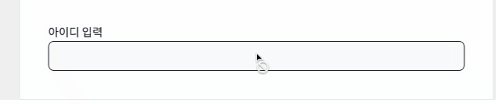
이러한 형태가 나올 텐데, 이렇게 하고 폼을 사용 하여도 가능 하다.
하지만, 요구사항이 아래와 같이 변경 되었다고 하자.
-
label에 있는disabeld에 따른 스타일이아이디관련한label일 때는disabled스타일 반영이 되지 않는다 -
label에 있는disabeld에 따른 스타일이비밀번호관련한label일 때는disabled스타일 반영해야 한다
그러면 이 2개의 요구사항에 맞추기 위해서 Form Component 를 다시 만들 거나 Props 에 분기를 해줄 수 있는 값을 받아야 한다.
현재 폼과 관련 된 요구사항 을 위해 컴포넌트를 새로 만들어야 하는 상황 과 공통된 컴포넌트를 재활용 하고자 하는 개발자의 마인드 가 충돌 하게 되었다.
이를 위해서 재활용 가능 하며 확장성(컴포넌트 제어를 상위 컴포넌트에서 할 수 있어야 함) 있는 컴포넌트를 만드는 것이 필요해졌다. 이때 사용 할 수 있는 것이 Compound Component 이다.
Compound Component 란,
선언적이고확장성이 있는 리엑트 컴포넌트 디자인 패턴child component를props-driling을 통해 관리하지 않고contextAPI와 같은 상태 관리 툴로child component를 관리 한다.
- *props 를 사용하지 않는다는 것은 아닙니다:)
왜 Compound Components Pattern 인가
장점
선언적인 컴포넌트 사용확장성이 있는 컴포넌트 사용- 요구사항 변경에 따른
유연한 변경에 유리함
단점
- 컴포넌트를 제대로 사용하기 위해서
{jsx},{tsx}코드량이 늘어난다 - 제대로 사용하지 않으면 오류가 발생하기 쉽다.
-ContextAPI등을 사용하기 때문에 - 공통 상태를 내려주는
Provider가 있어, 일반적인Component구조와 다르다
리펙토링 해보기
리팩토링 하기 전에,
우리의 목표는, 하나의 컴포넌트 사용으로 여러 요구사항에 맞춰서 컴포넌트를 설계 할 수 있어야 한다.
어떤 식으로 리팩토링을 할까?
React Component 라이브러리 차크라UI 를 살펴보자.
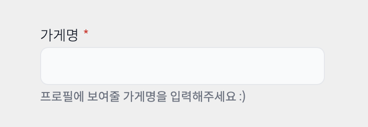
<FormControl>
  <FormLabel>Email address</FormLabel>
  <Input type='email' />
  <FormHelperText>We'll never share your email.</FormHelperText>
</FormControl>
FormControl의 child component 로 FormLabel Input FormHelperText 가 있다.
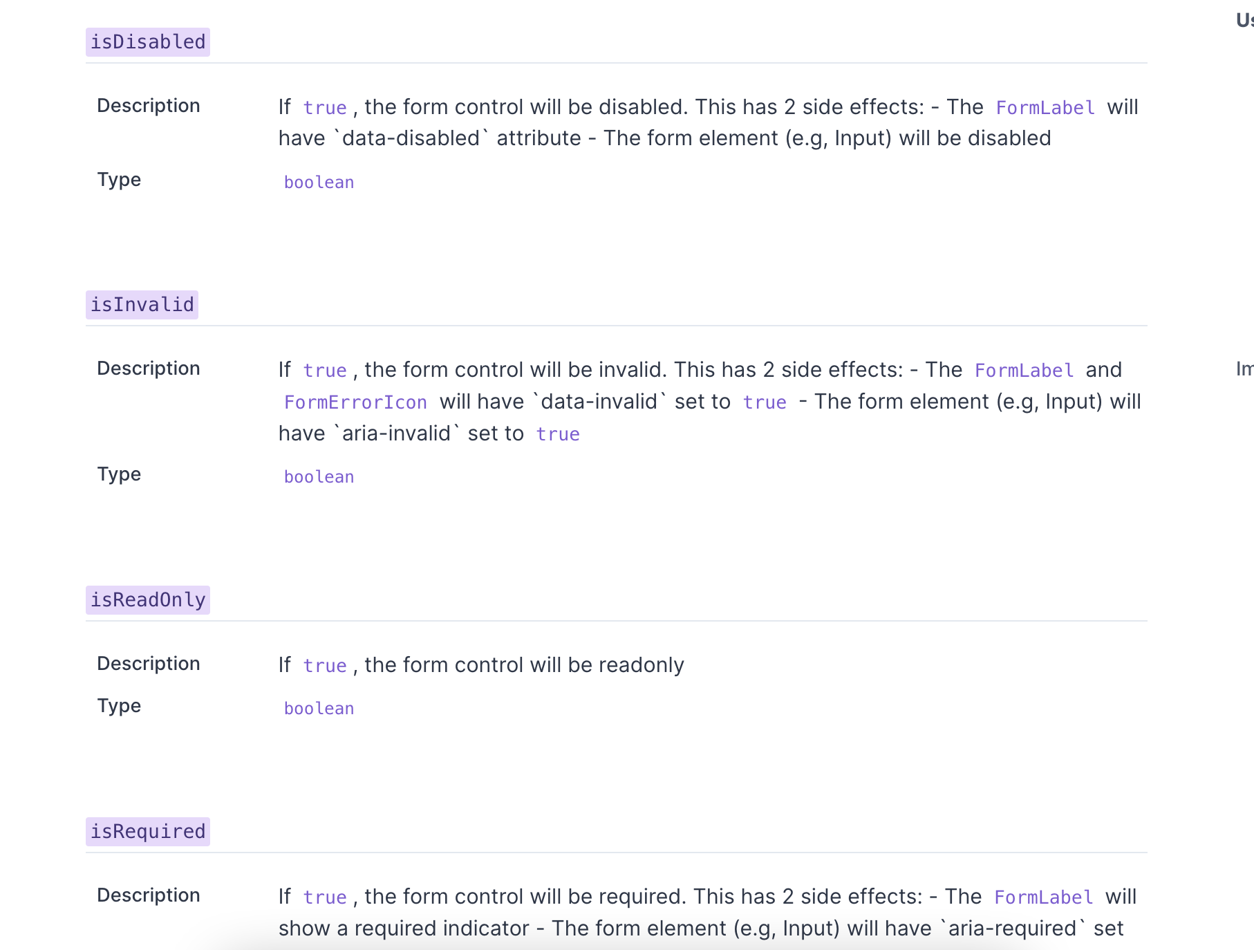
또한, FormControl 의 Props 로 isDisabled isInvalid isReadonly isRequired 등이 있고 이에 따른 child component의 변경 사항이 적혀 있는 것을 확인 할 수 있다.
<FormControl isDisabled isInvalid isReadOnly isRequired>
  <FormLabel>Email address</FormLabel>
  <Input type='email' />
  <FormHelperText>We'll never share your email.</FormHelperText>
</FormControl>
처럼 FormControl 에 Props 로 내려준 것이 아래에 따로 선언한 child component에 영향을 끼칠 수 있도록 만들어보는 것이 목표이다.
Form Control 만들기
먼저, Form Control 에 들어온 Props 가 Form Label, Input, Form HelperText 에 직접적으로 영향을 끼치기 위해서
contextAPI 를 사용해서 childComponent 에 공통 value 를 내려 줄 것이다.
Form Context Provider
import React, { createContext, PropsWithChildren, useMemo } from 'react'
import { FormProviderProps } from '../types'

const defaultValue: FormProviderProps = {}

export const FormContextAPI = createContext(defaultValue)

const FormContextProvider = ({
  children,
  isInvalid,
  isRequired,
  isDisabled,
}: PropsWithChildren<FormProviderProps>) => {
  const providerProps: FormContext = useMemo(
    () => ({
      isInvalid,
      isRequired,
      isDisabled,
    }),
    [isInvalid, isRequired, isDisabled]
  )

  return <FormContextAPI.Provider value={providerProps}>{children}</FormContextAPI.Provider>
}

export default FormContextProvider
FormContextProvider 컴포넌트로 들어오는 Props 들을 FormContextAPI.Provider 의 value 값으로 바로 넘겨주도록 한다.
Form Control
import React, { forwardRef } from 'react'
import FormContextProvider from '../../context/FormContextProvider'
import { FormProviderProps } from '../../types'

type Props = FormProviderProps &
  React.DetailedHTMLProps<React.FormHTMLAttributes<HTMLFormElement>, HTMLFormElement>

const FormControl = forwardRef<HTMLFormElement, Props>(
  ({ children, isInvalid, isRequired, isDisabled, className, ...props }, ref) => {
    return (
      <FormContextProvider isInvalid={isInvalid} isRequired={isRequired} isDisabled={isDisabled}>
        <form ref={ref} className={className} {...props}>
          {children}
        </form>
      </FormContextProvider>
    )
  }
)

export default FormControl
FormContextProvider 에 넘겨주는 Props 를 받아 넘겨주고 나머지는 form 에 대한 속성들로 채운다.
그리고 children 에는, FormContextAPI 을 사용하는 컴포넌트를 넣어주기로 한다.
useFormContext
import { useContext } from 'react'
import { FormContextAPI } from '../context/FormContextProvider'

const useFormContext = () => {
  const context = useContext(FormContextAPI)
  if (context === undefined) {
    throw new Error('useFormContext는 FormControl 안에서 사용 되어야 합니다.')
  }
  return context
}

export default useFormContext
FormContextAPI 를 사용하는 컴포넌트를 많이 사용 할 것이기 때문에 따로 커스텀 훅으로 만들어 놔 사용 할 수 있도록 하자.
FormLabel
import React, { forwardRef } from 'react'
import useFormContext from '../../hooks/useFormContext'
import { getStyleByProps } from '../../utils'

const FormLabel = forwardRef<
  HTMLLabelElement,
  React.DetailedHTMLProps<React.LabelHTMLAttributes<HTMLLabelElement>, HTMLLabelElement>
>(({ className, children, htmlFor, ...props }, ref) => {
  const { isDisabled, isRequired } = useFormContext()

  return (
    <label
      ref={ref}
      className={`text-sm font-light text-gray-900 ${getStyleByProps({ isDisabled })} ${className}`}
      htmlFor={htmlFor}
      {...props}
    >
      {children}
      {isRequired && <span className="pl-1 text-sm text-red-600">*</span>}
    </label>
  )
})

export default FormLabel
FormContext 로 부터 isDisabled, isRequired 를 받아 오고, 이에 따른 스타일 및 text 를 추가해준다.
FormInput
import React, { forwardRef } from 'react'
import useFormContext from '../../hooks/useFormContext'
import { getStyleByProps } from '../../utils'

const FormInput = forwardRef<HTMLInputElement, React.InputHTMLAttributes<HTMLInputElement>>(
  ({ value, className, ...props }, ref) => {
    const { isInvalid, isRequired, isDisabled } = useFormContext()

    return (
      <input
        value={value}
        ref={ref}
        aria-invalid={isInvalid}
        disabled={isDisabled}
        required={isRequired}
        className={`block w-full rounded-lg border bg-gray-50 p-2 text-sm text-gray-900 ${getStyleByProps(
          { isInvalid, isRequired, isDisabled }
        )} ${className}`}
        {...props}
      />
    )
  }
)

export default FormInput
FormInput 또한 Context 로 부터 속성을 받아와 Props-driling 이 아닌 상태를 Hooks 로 호출하여 상태를 읽어 그에 따른 스타일 및 태그 속성들을 지정 해준다.
Usage
import React from 'react'
import useInput from '../hooks/useInput'
import FormControl from './FormControl'
import FormInput from './FormInput'
import FormLabel from './FormLabel'

const FormWithInputAndLabel = () => {
  const [id, , onChangeID] = useInput()
  const [password, , onChangePassword] = useInput()

  return (
    <div>
      <FormControl className="flex w-full shrink-0 flex-col gap-3 p-2" isDisabled>
        <FormLabel className="cursor-auto">아이디</FormLabel>
        <FormInput className="w-full" value={id} onChange={onChangeID} />
      </FormControl>
      <FormControl className="flex w-full shrink-0 flex-col gap-3 p-2" isDisabled>
        <FormLabel>패스워드</FormLabel>
        <FormInput className="w-full" value={password} onChange={onChangePassword} />
      </FormControl>
    </div>
  )
}

export default FormWithInputAndLabel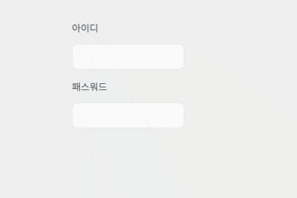
Form Control 에만 isDisabled를 설정 해주었음에도 불구하고 password 에 해당하는 label 에 disabeld 를 나타내는 스타일을 확인 할 수 있다.
하지만, ID 에 해당하는 label 은 사용하는 곳에서 style을 변경시켜줘, isDisabled 에 지정된 스타일과 다른 스타일을 지정 해줄 수 있다.
장점 과 단점
장점
-
앞서 만들어본 예제 처럼, 사용하는 곳에서 스타일을 변경 할 수 있다는 등의
유연성을 갖을 수 있게 되었다 -
또한, 각 컴포넌트를 선언하여 사용하기 때문에 어떤 컴포넌트 사용할 것인지 사용하는 입장에서 제어를 할 수 있다는 장점이 있다.
제어의 역전 -
컴포넌트의 위치 및 각 때에 맞춰서 변경 이 가능이 편하다.
단점
Provider를 만들어야한다.- 잘못된 설계 또는 설계에 따른 컴포넌트를 사용하지 않으면 오류가 발생 할 수 있다.
참고자료