main.dart 파일에 stless라고 작성 후 Tab 키 누르면 위젯을 상속한 class가 생성됨 → 클래스 이름 작성해주기
import 'package:flutter/material.dart';
void main() {
runApp(const MyApp());
}
class MyApp extends StatelessWidget {
const MyApp({Key? key}) : super(key: key);
Widget build(BuildContext context) {
return MaterialApp(
);
}
}⇒ MaterialApp()을 사용하면 구글에서 제공하는 디자인을 사용할 수 있다.
- Material Design을 사용하려면 아래와 같은 코드가 입력되어 있어야 함 → pubspec.yaml
flutter:
  uses-material-design: true
⇒ Cupertino~()를 사용하면 아이폰 관련 위젯 사용 가능하다.
위젯
글자 - Text(’글내용’)
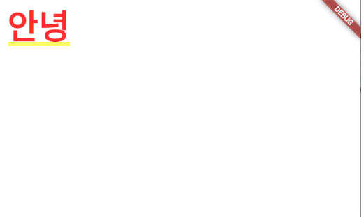
MaterialApp(
  home: Text('안녕')
)
- 글자 스타일의 색 변경
-
Colors.색
-
Color(0xffffffff) → 꼭 rgb 삽입 전 0xff를 넣어야 함
-
Color.fromRGBO()
Text( '글자임',
  style : TextStyle( color : Colors.red )
)
-
아이콘 - Icon(Icons.아이콘이름)
- 아이콘 이름은 flutter 홈페이지에 있음
- 컬러와 사이즈 변경 가능 → Icon(Icons.아이콘이름, 컬러 or 사이즈 )
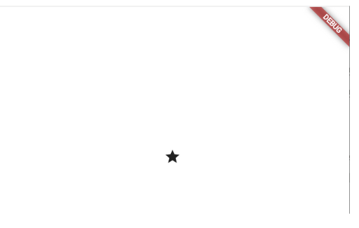
MaterialApp(
  home: Icon(Icons.star)
)
이미지 - Image.asset(’경로’)
- assets 폴터를 생성해서 이미지를 삽입하면 됨
- 이미지 삽입 후 등록 먼저 해야함
- pubspec.yaml 파일에 flutter 찾아서 assets: - assets/ 작성 → assets/ 는 이 파일 안에 있는 것을 모두 사용하겠다는 의미
flutter:
  assets:
    - assets/
- pubspec.yaml 파일에 flutter 찾아서 assets: - assets/ 작성 → assets/ 는 이 파일 안에 있는 것을 모두 사용하겠다는 의미
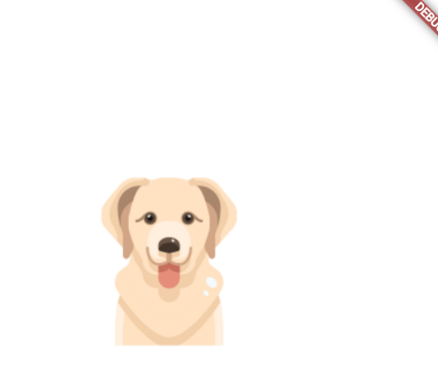
MaterialApp(
  home: Image.asset('assets/dog.png')
)
네모박스 - Container() or SizedBox()
- SizedBox() → width, height, child만 필요한 박스의 경우 사용
- Flutter의 사이즈 단위는 LP
- 50LP == 1.2cm
- 사이즈를 지정할 때는 어디서부터 어디까지 범위를 정해야한다.
// 크기 지정을 안해줘서 화면에서 안보임
MaterialApp(
home: Container()
)
// 폭, 높이, 색상 적용 -> 컴퓨터가 박스를 어디서부터 가로세로를 그려야할지 모르기 때문에 안보임
MaterialApp(
home: Container(width : 50, height : 50, color: Colors.blue)
)
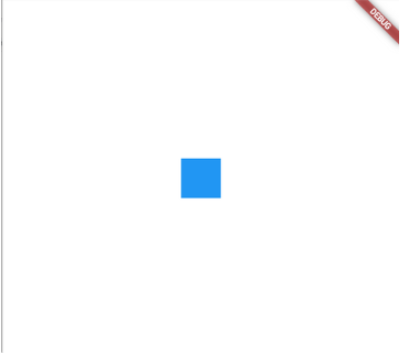
// 좌표를 찍어줘야 폭, 높이, 색상이 적용됨
MaterialApp(
home: Center(
child: Container(width : 50, height : 50, color: Colors.blue)
)
)
- 박스에 여백주는 법
-
margin: EdgeInsets.all(20) or EdgeInsets.fromLTRB(0, 0, 0, 0) -
padding: EdgeInsets.all(20) or EdgeInsets.fromLTRB(0, 0, 0, 0)margin: EdgeInsets.all(30), padding: EdgeInsets.fromLTRB(10, 20, 30, 40),
-
- decoration
-
박스 테두리, 그림자, 박스 둥글게 등등 가능
-
decoration: BoxDecoration( border: Border.all(color: Colors.black)) -
만약 decoration을 사용하는 경우엔 Container() 의 색을 지정해주고 싶은 경우 decoration 안에 지정해줘야 함
- color, shape, boxShadow, gradient, image, borderRadius 등MaterialApp( home: Scaffold( appBar: AppBar(title: Text('앱임')), body: Container( width: 50, height: 50, decoration: BoxDecoration( border: Border.all(color: Colors.black) ), ), ) ) // 이건 불가능 -> 에러 뜸 MaterialApp( home: Scaffold( appBar: AppBar(title: Text('앱임')), body: Container( width: 50, height: 50, color: Colors.blue, decoration: BoxDecoration( color: Colors.blue, border: Border.all(color: Colors.black) ), ), ) )
-
- 박스 위치 정렬
-
중앙 정렬
- Center()로 Container() 감싸기MaterialApp( home: Scaffold( appBar: AppBar(title: Text('앱임')), body: Center( child: Container( width: 50, height: 50, color: Colors.blue, ), ), ) ) -
그외 정렬
- Align()으로 Container() 감싸고 그 윗 줄에 alignmemt: Alignment.정렬방법 해주면 됨MaterialApp( home: Scaffold( appBar: AppBar(title: Text('앱임')), body: Align ( alignment: Alignment.bottomCenter, child: Container( width: 50, height: 50, color: Colors.blue, ), ), ) )
-
- 박스 너비 꽉차게
-
double.infinty 해주면 됨
Container( width : double.infinity, height : 50, color : Colors.blue )
-
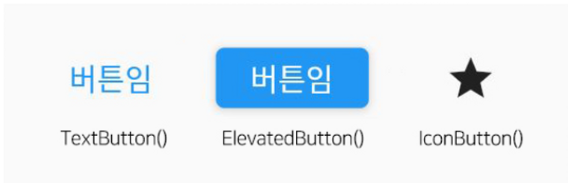
버튼 아이콘 - TextButton(), IconButton(), ElevatedButton() 중 택1
- child: 와 onPressed: 파라미터를 꼭 삽입해줘야 함
- onPressed: → 버튼 눌렀을 때 실행해줄 코드(함수)
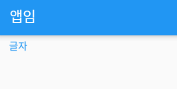
- TextButton()
TextButton( child: Text('글자'), onPressed: (){} )- IconButton()
- 아이콘 버튼
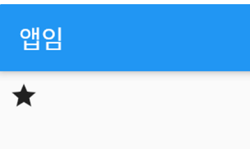
IconButton( icon: Icon(), onPressed: (){} )- ElevatedButton()
- 버튼 배경색이 적용돼서 나오고 클릭 시 클릭 효과가 보여짐
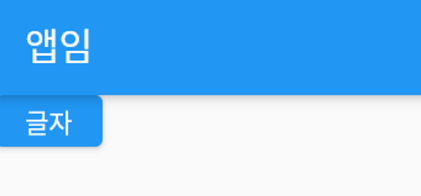
ElevatedButton( child: Text('글자'), onPressed: (){} )- Flexible() - Row() or Column() 안에 박스를 여러 개 배치할 때 백준율 단위로 주기
    Row(
      children : [
        Flexible( child: Container(color : Colors.blue), flex : 1 ),
        Flexible( child: Container(Color : Colors.green), flex : 1 )
      ]
)- Expanded() - Row() or Column() 안에서 박스 하나만 꽉채우고 싶은 경우
글자 입력 - TextField()
-
TextField 양옆에 아이콘 넣고 싶으면 icon: 파라미터
- icon: 파라미터 대신 prefixIcon:, suffixIcon: 이런 파라미터도 있다
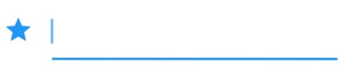
TextField( decoration: InputDecoration( icon: Icon(Icons.star), ), ), -
border 주려면 enabledBorder: 파라미터
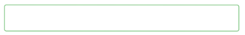
TextField( decoration: InputDecoration( enabledBorder: OutlineInputBorder( borderSide: BorderSide( color: Colors.green, width: 1.0, ), ), ), )- 커서찍혔을 때, 에러일 때 등 테두리를 변경하고 싶으면 enabledBorder: 뿐만 아니라 border:, focusedBorder:, disabledBorder:, errorBorder:, focusedErrorBorder: 이런 파라미터도 있다
- border를 하단만 주려면
TextField( decoration: InputDecoration( enabledBorder: UnderlineInputBorder(), ), ),- OutlineInputBorder() 위젯은 상하좌우 테두리를 주고
- UnderlineInputBorder() 위젯은 하단 테두리만 주고
- InputBorder.none 위젯 쓰면 테두리를 없애줌
- 이 위젯들 안에서 border 두께, 색상 이런거 커스터마이징하면 된다
-
테두리 둥글게 하고 싶으면 borderRadius :
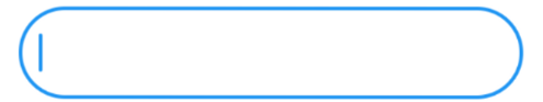
TextField( decoration: InputDecoration( enabledBorder: OutlineInputBorder( borderRadius: BorderRadius.circular(30), ), ), ), -
border 없애기 & 배경색 입히기
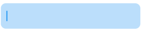
TextField( decoration: InputDecoration( filled: true, fillColor: Colors.blue.shade100, enabledBorder: OutlineInputBorder( borderSide: BorderSide.none, ) ), ), -
힌트 띄우기
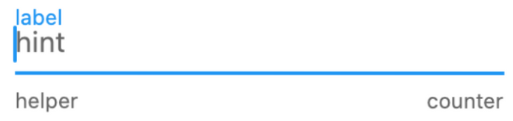
TextField( decoration: InputDecoration( hintText: 'hint', helperText: 'helper', labelText: 'label', counterText: 'counter' ), ),- 4개 중 원하는 것 골라서 사용
- 스타일 주고 싶으면 hintStyle: TextStyle(color: Colors.green), 사용
