📌
사이트 명: KIA 자동차 반응형 (Redesign)
제작 기간: 22.09.02 ~ 22.09.05 (4일 소요)
사용 언어: html, scss, jQuery, java script
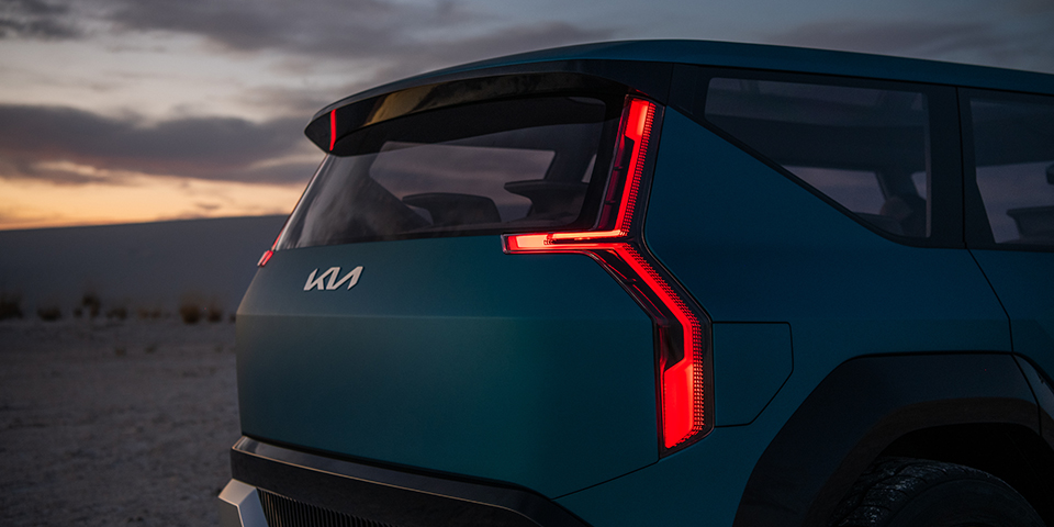
[KIA 자동차 반응형 WEB 제작 작업]
GSAP를 활용하여 다양한 스크롤 애니메이션 기능들을 구현한
반응형 웹 페이지입니다. swiper, scrolltrigger를 사용했습니다.
💡Learning point
- scss 미디어 쿼리
- loading page
- font-size: clamp()
- GSAP 스크롤 애니메이션
- 마우스 커서 변경
1. scss 미디어 쿼리
scss 미디어 쿼리는 css보다 비교적 사용하기가 간편한데, _mixin.scss 파일에 breakpoint를 변수로 담아두고 이를 _main.scss에서 @include로 호출해서 사용하는 방식이다.
_mixin.scss 작성 방법
/*반응형 화면 크기*/
$mobile-max: 767px; //320
$tablet-max: 1023px; // 768
$tablet-min: 768px; // 768
$desktop-max: 1200px; //1024
$desktop-min: 1024px; //1024


/*반응형, 브라우저 크기가 767px 이하일때*/
@mixin mobile{
    @media (max-width: $mobile-max){
      @content;
    }
  }

/*반응형, 브라우저 크기가 768이상, 1023px 이하일때*/
@mixin tablet{
   @media (min-width: $tablet-min) and (max-width: $tablet-max){
      @content;
   }
 }
@include 호출하여 적용시키기
h3 {
  font-size: 19px;
  line-height: 1.2;
  font-weight: 700;
  color: rgb(124, 124, 124);
  font-family: "KIA";
  //태블릿 사이즈에서 적용할 스타일
  @include tablet {
    font-size: 25px;
    line-height: 3rem;
  }
  //모바일 사이즈에서 적용할 스타일
  @include mobile {
    font-size: 5vw;
    line-height: 1.3;
  }
}
2. loading page

로딩 페이지가 끝난 후, 비디오와 메인 텍스트 애니메이션이 시작하도록 설정했다.
[css]
//로딩 페이지
.page-load{
    // display: none;
    position: fixed;
    width: 100vw;
    height: 100vh;
    background: #f9f9f9;
    z-index: 1000;
    .content-wrap{
        position: absolute;
        display: flex;
        top: 0;
        left: 0;
        width: 100vw;
        height: 100vh;
        justify-content: center;
        align-items: center;
    }
    .logo{
        width: 150px; height: 50px;
        opacity: 0;
        path{fill:#000}
    }
}
[js]
//로딩 화면 전후 애니메이션
    const video = document.getElementById('main-video');
    //video라는 변수에 요소를 담아준다

    load.addLabel('label')
    //addLabel을 사용해서 하위 애니메이션을 동시에 시작시킨다
    .to('.page-load .logo',{opacity:1, delay:.2, duration:2},'label')
    // .to('.page-load .logo',{opacity:0, delay:3, duration:2},'label')
    .to('.page-load',{delay:4, opacity:0, onComplete:function(){$('.page-load').remove(); mainTxt.play(); video.play();}},'label')
    load.play();
3. font-size: clamp()
폰트 사이즈를 지정해야 하는 영역에서는 해당 분기점에 따라 유동적으로 조절이 가능하도록 clamp()를 적용해주었다. 반응형 웹이다 보니 화면 사이즈가 줄어들거나 늘어날 때에 알맞게 폰트 사이즈가 조절되어야 어색하지 않은데, 사이즈마다 일일이 작성하는 대신 font-size: clamp(최솟값, 선호 값, 최댓값)을 사용하면 최솟값보다 작아지지 않고 최댓값보다 커지지 않는 내에서 조절이 된다.
.desc {
  font-size: clamp(60px, 10vw, 150px);
  //최솟값 60px, 선호값10vw, 최댓값150px
  line-height: 1;
  font-weight: 900;
  color: #fff;
}
4. GSAP 스크롤 애니메이션
4-1. 텍스트 좌우 스크롤

[html]
스크롤 시 적용돼야할 좌우 x축 값이 다르기 때문에 GSAP에서 작성하는 대신
data값으로 넣어둔 후, 변수로 담아서 각각 호출하는 방식을 이용했다.
<div class="text-scroll scroll2">
  <div class="txt-wrap">
    <span class="row1" data-x="-50">Movement <em>Movement</em> Movement <em>Movement</em> Movement <em>Movement</em></span>
    <span class="row2" data-x="50"><em>Movement</em> Movement <em>Movement</em> Movement <em>Movement</em> Movement</span>

  </div>
</div>
[css]
두 줄이 좌우 반대로 스크롤돼야하기 때문에 정렬 지점을 반대로 잡아줘야 함!
.text-scroll {
  width: 100%;
  line-height: 1;
  font-weight: 700;
  white-space: nowrap;
  //화면 사이즈에 맞게 폰트 사이즈가 조절되도록 clamp()적용
  font-size: clamp(63px, 20vw, 240px);
  padding: 10vw 0;
  overflow: hidden;
  .txt-wrap {
    em {
      color: transparent;
      -webkit-text-stroke-width: 1px;
      -webkit-text-stroke-color: rgba(255, 255, 255, 0.8);
      -webkit-text-fill-color: #000;
      margin: 0 3vw;
    }
  }
  .row1 {
    color: rgba(255, 255, 255, 0.8);
    display: flex;
    //시작점 정렬
    justify-content: flex-start;
  }
  .row2 {
    color: rgba(255, 255, 255, 0.8);
    display: flex;
    //시작점 정렬
    justify-content: flex-end;
  }
}
[js]
윗줄은 오른쪽으로, 아랫줄은 왼쪽으로 스크롤되도록 data값 호출
//텍스트 스크롤
const slideTxt = document.querySelectorAll("[data-x]");

slideTxt.forEach((item) => {
  xVal = item.dataset.x;
  //각 텍스트 영역에 담긴 data-x값을 변수로 담는다.

  gsap.from(item, {
    scrollTrigger: {
      trigger: item,
      start: "top 100%",
      end: "+=200%",
      // markers:true,
      scrub: 1
    },
    xPercent: xVal
    //-50, 50의 값이 각각 적용됨
  });
});
4-2. 페이드업 영역
[html]
<section class="sc-discover" data-y>
  ... 이하 생략
</section>
[js]
//discover 영역
$("[data-y]").each(function (i, l) {
  gsap.from(l, {
    scrollTrigger: {
      trigger: l,
      start: "0% 70%",
      end: "center 70%",
      // markers:true,
      scrub: 1
    },
    opacity: 0,
    yPercent: 20
  });
});
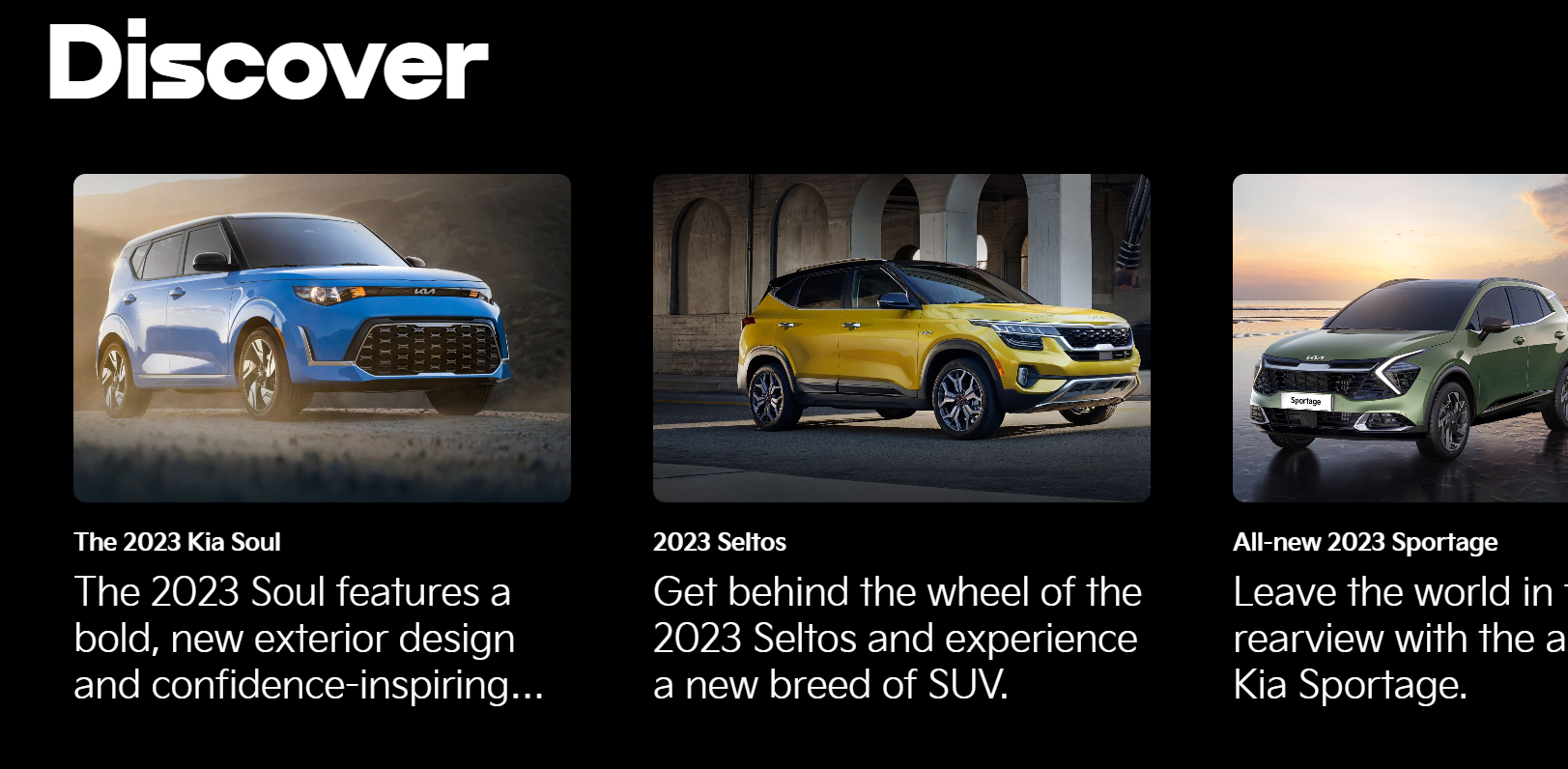
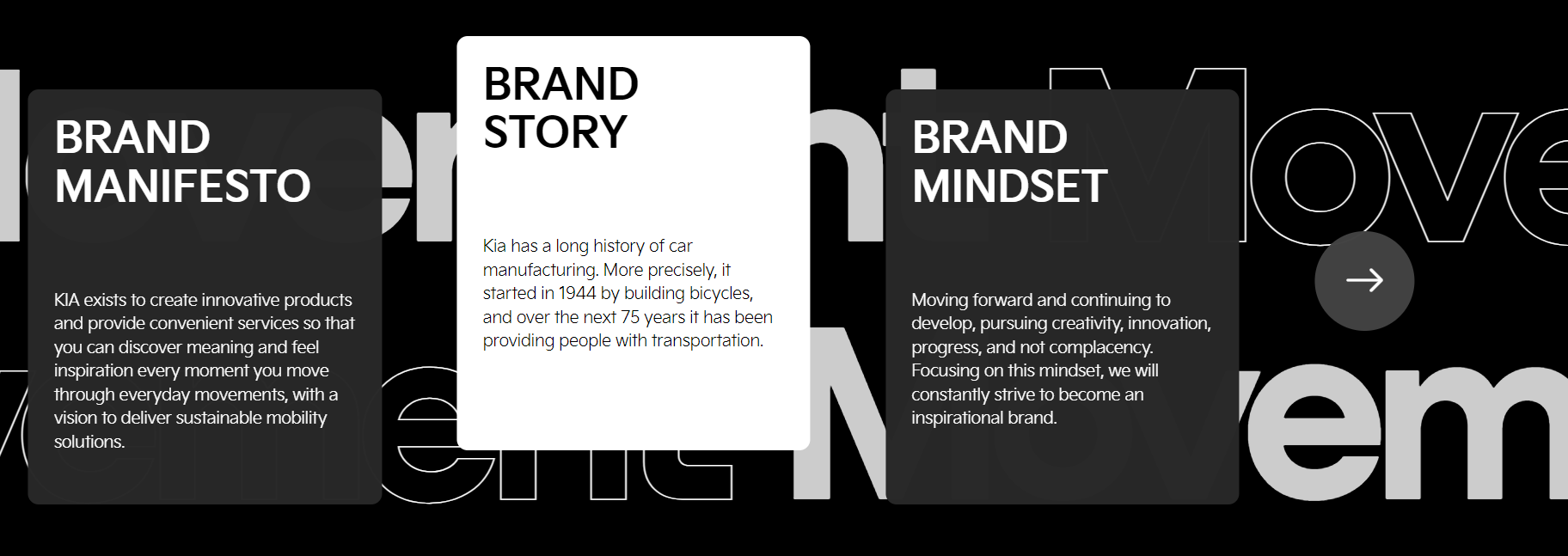
4가지 요소가 좌우 반복하며 순차적으로 fade되어야 하기 때문에,부모 요소에 data값을 주고 그 자식들에게 gsap를 적용시킨 후, 순차적으로 떠오르게끔 stagger 값도 설정해주었다!
//데이터 영역
$("[data-data]").each(function (i, item) {
const child = $(this).find(">*");
direction = $(this).data("data") === "left" ? -10 : 10;
//item.dataset.data랑 같음
gsap.from(child, {
scrollTrigger: {
trigger: item,
start: "top 90%",
end: "bottom top"
// markers:true,
// scrub:1
},
opacity: 0,
xPercent: direction,
stagger: 0.2
});
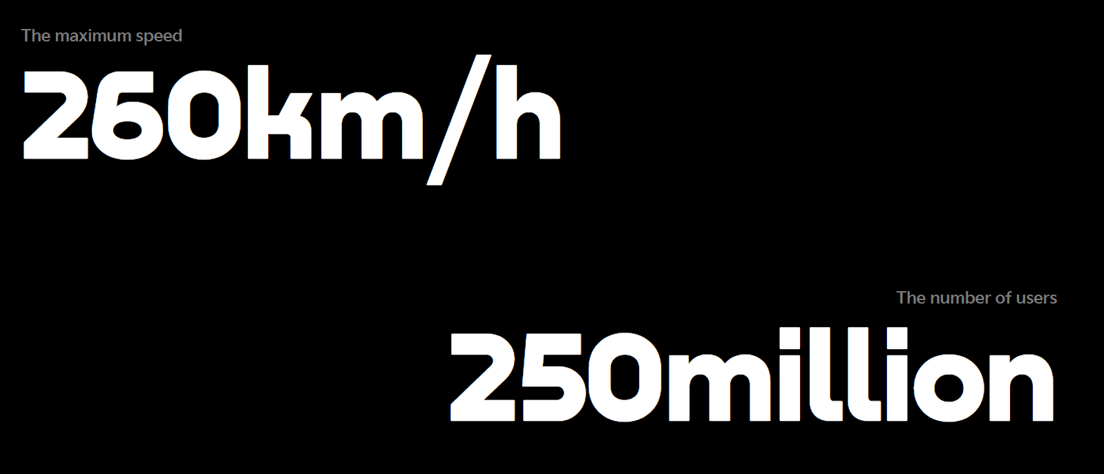
});4-3. 텍스트 스크롤과 동시에 스크롤되는 컨텐츠
배경으로 텍스트 스크롤이 깔리고, 그 위로 컨텐츠가 동시에 스크롤되는 영역은
화면 사이즈마다 시작점과 끝점을 조절해줘야 해서 matchMedia 속성을 활용했다.
//텍스트 스크롤 + group-movement 스크롤 영역
ScrollTrigger.matchMedia({
  // large
  "(min-width: 1024px)": function () {
    const movement = gsap.timeline({
      scrollTrigger: {
        trigger: ".sc-movement",
        start: "top top",
        end: "bottom 40%",
        // markers:true,
        scrub: 1,
        pin: true
      }
    });
    movement.to(".sc-movement .group-movement", { xPercent: -120 });
  },

  // medium
  "(min-width: 768px) and (max-width: 1023px)": function () {
    const movement = gsap.timeline({
      scrollTrigger: {
        trigger: ".sc-movement",
        start: "top top",
        end: "+=200%",
        // markers:true,
        scrub: 1,
        pin: true
      }
    });
    movement.to(".sc-movement .group-movement", { xPercent: -170 });
  },
  // small
  "(min-width: 320px) and (max-width: 767px)": function () {
    const movement = gsap.timeline({
      scrollTrigger: {
        trigger: ".sc-movement",
        start: "top top",
        end: "+=200%",
        // markers:true,
        scrub: 1,
        pin: true
      }
    });
    movement.to(".sc-movement .group-movement", { xPercent: -350 });
  }
});
5. 마우스 커서
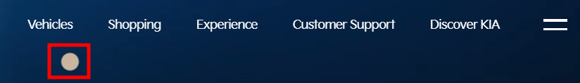
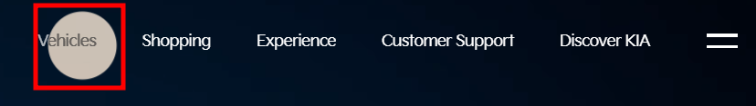
cursor라는 부모 요소 안에 pointer라는 자식 요소를 만들었다.
hover할 때 효과를 주려고 e.clientx,y값으로 위치를 조절했더니 덜컹거리듯이 보여서 자식 요소를 꾸미고 그 요소를 position: absolute에 transform: translate(-50%, -50%)값을 줘서 가운데 정렬했음.
PC버전 외에는 보이지 않도록 display: none 처리하고, a태그 영역에는 cursor: pointer, body에는 cursor: defalt로 다시 기본값 적용해주었다.
[css]
a {
  @include tablet {
    cursor: pointer;
  }
  @include mobile {
    cursor: pointer;
  }
  //기본 커서 안 보이게
  cursor: none;
}
body {
  font-family: "Nekst", "KIA";
  font-size: 14px;
  line-height: 20px;
  color: #fff;
  background: #000;
  overflow-x: hidden;
  //기본 커서 안 보이게
  cursor: none;
  @include tablet {
    cursor: default;
  }
  @include mobile {
    cursor: default;
  }
}
.cursor {
//스크롤 시에도 따라와야하기 때문에 부모 요소 fixed로 고정
position: fixed;
font-size: 0;
top: 0;
left: 0;
z-index: 9999;
pointer-events: none;
mix-blend-mode: difference;
.pointer {
//자식 요소는 가운데 정렬
position: absolute;
transform: translate(-50%, -50%);
border-radius: 50%;
transition: width 0.2s, height 0.2s;
background: rgba(255, 255, 255, 0.8);
width: 20px;
height: 20px;
border: none;
}
//하버할 땐 커서의 크기가 커지도록 설정했다.
&.hover {
.pointer {
width: 60px;
height: 60px;
}
}
}5-1. clientX, clientY 메서드
위 메서드는 클라이언트 영역 내의 가로,세로 좌표를 제공하며, 여기서 클라이언트 영역은 현재 보이는 브라우저 화면이 기준이 된다. 따라서, 스크롤바가 움직이더라도, 특정 지점의 clientX, clientY의 값은 동일함.
clientX : 브라우저 페이지에서의 X좌표 위치를 반환하나 스크롤은 무시하고 해당 페이지의 상단을 0으로 측정
clientY : 브라우저 페이지에서의 Y좌표 위치를 반환하나 스크롤은 무시하고 해당 페이지의 상단을 0으로 측정
//마우스 커서 효과
//마우스가 움직일 때의 mousemove 이벤트 추가
$("body").mousemove(function (e) {
//현재 클라이언트 영역 내의 가로, 세로 좌표 값 제공
  x = e.clientX;
  y = e.clientY;

  gsap.to(".cursor", {
    x: x,
    y: y,
    //커서가 따라다니는 속도
    duration: 0.1
  });
});

//하버 시 커서 효과
//해당 영역에 hover시 디자인이 변경되도록 적용
$("[data-hover]").hover(
  function (e) {
    $(".cursor").addClass("hover");
  },
  function () {
    $(".cursor").removeClass("hover");
  }
);

//로딩 페이지가 끝난 후 body 스크롤 및 커서 나타나도록
const load = gsap.timeline({
  paused: true,
  onStart: function () {
    $("body").addClass("hidden");
    $(".cursor").hide();
  },
  onComplete: function () {
    $("body").removeClass("hidden");
    $(".cursor").show();
  }
});