
Styled Components
Styled Components는 현재 가장 인기있는 css-in-js 라이브러리 이다. 기존의 스타일링 방법은 class에 매우 신경을 많이 써야한다. 그러나 Styled Components는 백틱을 이용한 리터럴의 안쪽에 스타일을 정의 하는 방식을 사용한다. Styled Components의 기능에 대해서 예제를 만들어가며 공부!!
Install
yarn add styled-components
사용방법
// 설치해준 styled-components 라이브러리에서 styled를 가져온다.

// styled-components를 이용해 간단한 컴포넌트를 만들어보자.
import styled from "styled-components";

const Button = styled.button`
  all: unset;
  padding: 10px 100px;
  border: 1px solid #393939;
  border-radius: 5px;
`;

function CommonButton({ text }) {
  return <Button>{text}</Button>;
}

export default CommonButton;- 위 CommonButton을 필요한 곳에서 사용해준다.
import styled from "styled-components";
import CommonButton from "./Button";
const Container = styled.div`
height: 100vh;
display: flex;
flex-direction: column;
justify-content: center;
align-items: center;
`;
const Title = styled.span`
font-size: 20px;
font-weight: 600;
margin-bottom: 20px;
`;
export default function App() {
return (
<div className="App">
<Container>
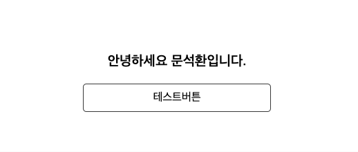
<Title>안녕하세요 문석환입니다.</Title>
<CommonButton text="테스트버튼" />
</Container>
</div>
);
}결과
🚀 props
// props를 이용해 css를 Control 가능하다.
// Button.js

const Button = styled.button`
  all: unset;
  padding: 10px 100px;
  border: 1px solid #393939;
  border-radius: 5px;
  background-color: ${(props) =>
    props.propsValue < 200 ? "bisque" : "lightblue"};
`;

function CommonButton({ text, propsValue }) {
  return <Button propsValue={propsValue}>{text}</Button>;
}
CommonButton을 사용한 컴포넌트에서 props로 propsValue를 전달 받았다. 중요한 것은 이 전달받은 props를
styled-components에서도 사용할 수 있다는 것이다.
전달받은 propsValue를 사용해 조건문을 통해 버튼 배경색을 Control한 테스트 코드이다.
🚀 스타일 상속
상속이란 용어는 코딩 공부를 하면 항상 따라오는 용어이다. 스타일 상속도 마찬가지로 이해하자.
BaseBtn라는 공통 스타일을 가지는 styled-components를 구현하고 이를 상속받는 두개의 Button를 구현해보자.
const BaseBtn = styled.button`
  all: unset;
  border: 1px solid black;
  border-radius: 5px;
  padding: 5px 10px;
  margin-bottom: 20px;
`;

const FirstBtn = styled(BaseBtn)`
  background-color: bisque;
`;

const SecondBtn = styled(BaseBtn)`
  background-color: lightblue;
`;

return (
    <>
      <FirstBtn>상속 버튼1</FirstBtn>
      <SecondBtn>상속 버튼2</SecondBtn>
    </>
결과 화면

🚀 Nesting & GlobalStyle
Pure CSS와 SASS의 차이는 바로 nesting 기능의 존재에 있다.
Styled Components는 nesting 기능을 지원한다.
따라서 모든 것들을 컴포넌트화 하지않고 구현이 가능해진다.
또한 GlobalStyle을 이용해 전체 React Project의 Style을 지정해 줄 수 있다.
Nesting
const FirstBtn = styled(BaseBtn)`
  background-color: bisque;
  transition-duration: 0.5s;
  span {
    font-size: 20px;
    font-weight: 600;
    color: hotpink;
  }
  :hover {
    transform: scale(1.2);
  }
`;
Nesting을 이용해서 FirstBtn 안의 span태그를 스타일링 해줬고 hover을 이용해 마우스 올렸을때 scale 변경해주었다.
GlobalStyle
import {createGlobalStyle} from "styled-components";

const GlobalStyle = createGlobalStyle`
   *{
      box-sizing:border-box;
   }
   a{
      text-decoration:none;
   }
`

function App(){
	return (
      <div>
         <GlobalStyle>
            <Router>
            </Router>
         </GlobalStyle>
      </div>
      )
}
기본적으로 GlobalStyle은 하위 모든 컴포넌트들에게 다 적용이 되기 때문에 위 코드와 같이 Project를 진행한다고 했을때 Router를 감싸는 곳에 적용을 해줘야한다.
Mixin & Group
- CSS 그룹을 의미하고 다중 상속이 가능하기 때문에 재사용 가능한 스타일들을 유연하게 사용 가능
- CSS 키워드로 CSS그룹을 만들고 사용할 컨테이너에서 적용 가능
const MixinCSS = (radius) => css`
  all: unset;
  border: 1px solid black;
  border-radius: ${radius}px;
  padding: 5px 10px;
  margin-bottom: 20px;
`;

const BaseBtn = styled.button`
  ${MixinCSS(5)}
`;
자주 사용되는 CSS를 그룹화하여 재사용한다면 매우 유용 할 것이라고 생각한다.
함수 처럼 값을 전달해서 style할 수 있기 때문에 재사용성이 매우 뛰어나다.
Extra Attributes
- Custom Attribute를 부여 하고 싶을때 사용한다.
- Input 태그에 대한 컴포넌트를 구현하며 설명 하겠다.
type이 text인 Input 구현 (attr)
const TextInput = styled.input.attr(props=>({
	type:"text",
}))`
   border:1px solid black;
   border-radius:3px;
`

return (
   <form>
      <Input placeholder="username"/>
   </form>
)
Input Component 제작 한 경우
// Input.js

const IInput = styled.input`
   border:1px solid black;
   border-raidus:3px;
`

function Input(){
   return (
      <IInput/>
   )
}

// Login.js

return(
   <form>
      <Input type="text" placeholder="username"/>
   </form>
)
이 경우에는 Login.js의 Input의 props가 Input.js의 IInput에 전달되지 않았기 때문에 제대로 적용 X
해결방법
// Input.js

const IInput = styled.input`
   border:1px solid black;
   border-raidus:3px;
`

function Input(props){
   return (
      <IInput {...props}/>
   )
}

// Login.js

return(
   <form>
      <Input type="text" placeholder="username"/>
   </form>
)
props로 전달되는 type과 placeholder를 IInput에서 적용 시켜줘야 한다.
- props.type , props.placeholder를 이용해 적용 해주면 코드가 지저분함
- ES6의 Spread Operator을 이용해 구현
- {...props} => type="text" placeholder="username"
Animation
- styled components의 keyframes를 이용해 애니메이션을 구현할 수 있다.
const rotate = keyframes`
  from{
    transform:rotate(0deg);
  }
  to{
    transform:rotate(360deg);
  }
`;

const Animation = styled.div`
  padding: 20px;
  background-color: bisque;
  margin-top: 10px;
  animation: ${rotate} 1s linear infinite;
`;

return (
   <Animation>🚗</Animation>
)
Styled Reset
Install
npm i styled-reset
GlobalStyle에서 사용할 수 있는 라이브러리로 reset css를 적용해주는 라이브러리이다.
- GlobalStyle에서 ${reset}을 추가해 적용