[CSS] flex x축 Overflow 현상

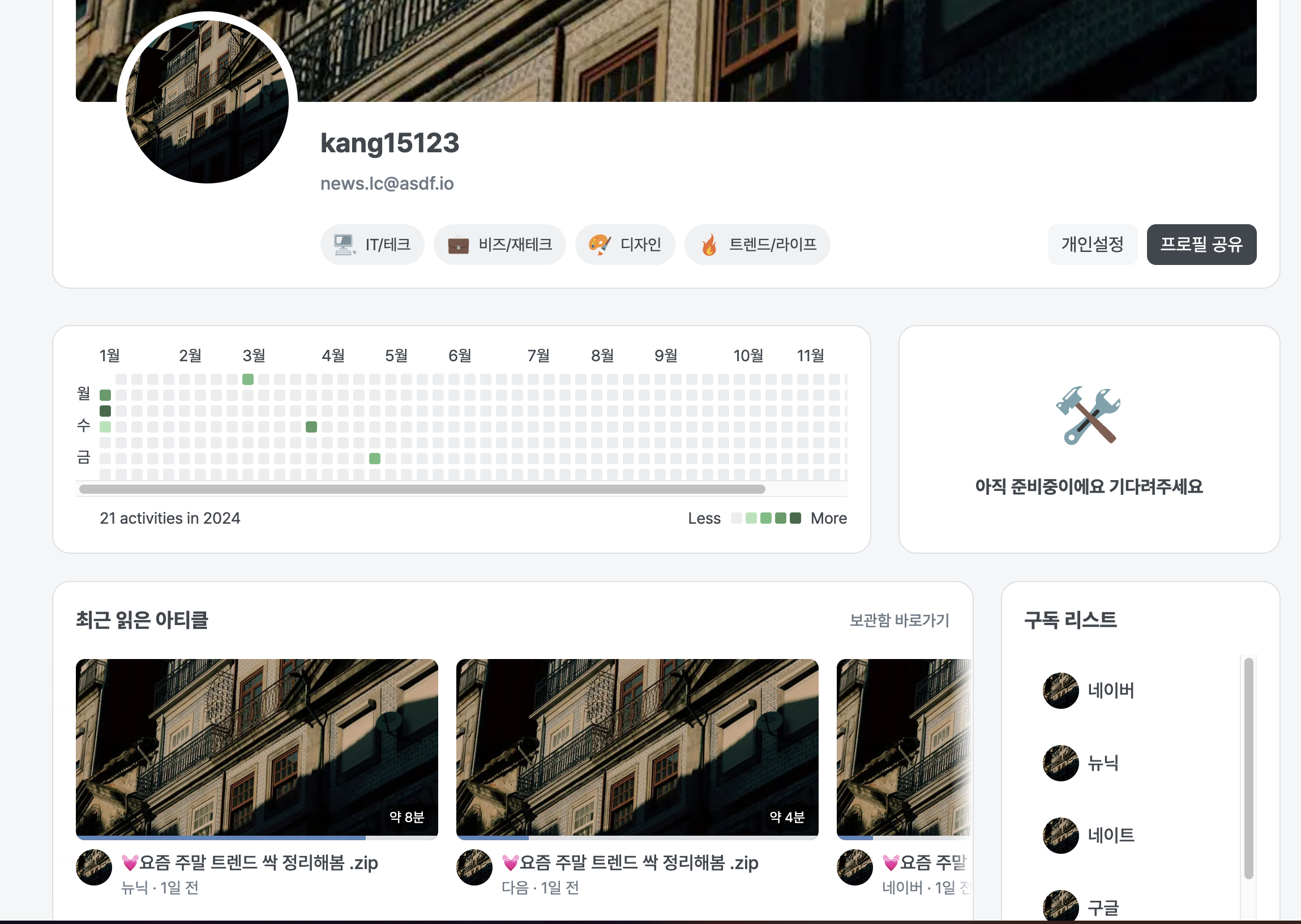
최근 읽은 아티클 부분의 뉴스레터 요소들을 overflow x를 스크롤을 주고 싶어서 부모 요소에 flex-basis: 70%를 줘서 overflow 스크롤을 구현하고 싶었는데 바로 위에 사진처럼 overflow가 적용되지 않고 그대로 요소들을 밀어 내고 있다. 이런 오류와 관해서 여러가지 자료를 조사해보다가 display: flex일때 min-width에 관련해서 해결방안을 찾을 수 있었다.
해결방안
일단 먼저 짚고 넘어가야 할 것이 있다. 바로 width:auto에 관해서이다. width:auto의 기준은 2가지로 나눌 수 있다. inline일 때, 그리고 block일 때이다. inline일 때 auto는 자식 너비를 기준으로 width가 측정이 된다. 그리고 block일때 auto는 부모 넓이(100%) - (좌우 maring) = width로 측정이 된다. 이 개념을 머릿속에 넣고 해결방법을 살펴보자
min-width 특성
<section className="h-fit basis-3/4 space-y-5 rounded-2xl border border-gray-100 bg-white py-5">
      <div className="flex items-center justify-between px-5">
        <p className="text-lg font-bold">최근 읽은 아티클</p>
        <Link
          href="/inbox"
          className="text-sm font-medium text-gray-500 hover:text-blue-400">
          보관함 바로가기
        </Link>
      </div>
      <div
        className="relative bg-white before:absolute before:left-0 before:z-30 before:h-full before:w-5 before:bg-gradient-to-r
      before:from-white before:content-['']
      after:absolute after:right-0
      after:top-0
      after:z-30 after:h-full after:w-5 after:bg-gradient-to-l after:from-white after:content-['']">
        <div className=" flex gap-4 overflow-x-scroll px-5">
          {recentNewLetterList.map((newsItem) => (
            <NewsCard key={newsItem.id}>
              <NewsCard.Thumbnail
                imgSrc={newsItem.image.thumbnail}
                readingPercentage={newsItem.info.readingPercentage}
                readingTime={newsItem.info.readingTime}
                alt="뉴스카드 썸네일"
              />
              <NewsCard.Content>
                <NewsCard.Profile
                  width="w-8"
                  height="h-8"
                  rounded="rounded-full"
                  imgSrc={newsItem.image.profile}
                  alt="뉴스카드 프로필"
                />
                <div className="p-0 md:pr-6">
                  <NewsCard.Title type="main" content={newsItem.info.title} />
                  <NewsCard.Title
                    type="sub"
                    content={`${newsItem.info.name} · 1일 전`}
                  />
                </div>
              </NewsCard.Content>
            </NewsCard>
          ))}
        </div>
      </div>
    </section>
CSS에서 min-width는 기본적으로 width, max-width보다 우선시 되어진다. 어찌보면 당연한 얘기이다 최소의 높이를 설정하기 때문에 min-width의 기본값은 auto이다. 위에 사진처럼 flex가 되면 item들이 inlin-block으로 바뀌고 inline-block일때 width: auto는 아까 언급했 듯이 자식 기준으로 width가 만들어진다. 코드를 보면 다 필요없이 최상단 section태그부터 아까 위에 사진의 레이아웃이 넘친 flex item이다.
나는 처음에 section tag에 basis-3/4을 사용함으로 써 넓이를 정했으므로 overflow가 잘 동작할 줄 알았는데 min-width: auto가 기본값이고 그 auto는 inline-block일 때 자식 넓이를 기준으로 측정된다.
그래서 자식넓이는 위에 사진을 보다시피 기존 레이아웃보다 훨씬 큰 값을 가지므로 overflow된 것이다. 즉 min-widh: auto는 여러개의 카드컴포넌트를 담고있는 div의 넓이다.
해결 방법은 min-widh:0으로 설정하면 basis-3/4속성대로 width가 정해질 것 이고 아래와 같이 overflow-x-scroll로 잘 렌더링이 된다.