해당 포스팅은 MUI v4, React v16 에서 최신 버전으로 마이그레이션 하면서 발생한 문제를 해결하면서 조사했던 방법을 기록한 내용입니다!
무엇이 문제인가?
MUI v5 는 React v18 과 호환이 안되는 부분이 있습니다. 예를 들어서 이전 버전의 MUI 에서는 디자인을 커스텀마이징 하기 위해서 withstyles 라는 함수를 사용했습니다. MUI v5 부터는 해당 함수가 legacy 가 되었고, 해당 함수를 담고 있는 패키지 또한 React v18 과 호환이 안되면서 설치가 안되는 문제가 발생했습니다.
해결방안
최신 버전의 MUI를 활용하면서 MUI 컴포넌트를 커스텀마이징 할 수 있는 방법을 알아봅시다.
const AntSwitchComponent = withStyles((theme: Theme) =>
  createStyles({
    root: {
      width: 40,
      height: 19,
      padding: 0,
      display: 'flex',
      justifyContent: 'flex-start',
    },
    buttonBase: {
      justifyContent: 'flex-start',
    },
    switchBase: {
      width: 30,
      height: 19,
      padding: 2,
      color: theme.palette.common.white,
      justifyContent: 'flex-start',
      '&$checked': {
        transform: 'translateX(12px)',
        color: '#4285f4',
        justifyContent: 'flex-end',
        '& + $track': {
          opacity: 1,
          backgroundColor: '#D1D7E2',
        },
      },
    },
    thumb: {
      width: 16,
      height: 16,
      boxShadow: 'none',
    },
    track: {
      textAlign: 'left',
      width: 40,
      height: 19,
      borderRadius: 16 / 2,
      opacity: 1,
      backgroundColor: '#D1D7E2',
    },
    checked: {},
  }),
)(Switch);
위 코드는 기존 MUI 컴포넌트 입니다. MUI v5 로 마이그레이션을 하면서 @mui/material 패키지의 styled 를 활용, mui 고유의 클래스를 오버라이딩 하여 디자인을 커스텀마이징 할 수 있습니다.
import { Switch, SwitchProps, styled as MUIStyled } from "@mui/material";

const AntSwitchComponent = MUIStyled(Switch)<SwitchProps>({
  color: "#fff",
  width: 40,
  height: 19,
  padding: 0,
  display: "flex",
  justifyContent: "flex-start",
  "& .MuiButtonBase-root": {
    justifyContent: "flex-start",
  },
  "& .MuiSwitch-switchBase": {
    width: 30,
    height: 19,
    padding: 2,
    color: (props: any) => props.theme.color,
    justifyContent: "flex-start",
    "& .Mui-checked": {
      transform: "translateX(12px)",
      color: "#4285f4",
      justifyContent: "flex-end",
      "& .MuiSwitch-track": {
        opacity: 1,
        backgroundColor: "#D1D7E2",
      },
    },
  },
  "& .MuiSwitch-thumb": {
    width: 16,
    height: 16,
    boxShadow: "none",
  },
  "& .MuiSwitch-track": {
    textAlign: "left",
    width: 40,
    height: 19,
    borderRadius: 16 / 2,
    opacity: 1,
    backgroundColor: "#D1D7E2",
  },
});
해당 프로젝트에서는 @emotion/styled 를 사용하고 있습니다. emotion 의 styled 와 함수가 중복되기 때문에 mui 의 styled 를 MUIStyled 로 alias 하였습니다.
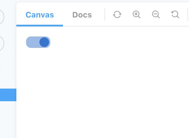
Customizing 된 AntSwitch
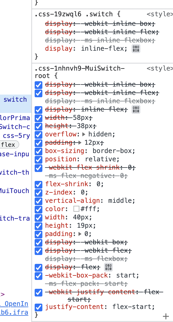
Customizing 된 Class
위의 방식을 활용하면 MUI v5 에서도 쉽게 디자인을 커스텀마이징 할 수 있겠습니다.
안녕하세요! 주니어 웹 개발자입니다 😆