공부하며 모르거나 헷갈렸던 내용을 정리중입니다.
반응형 정사각형 만들기
페이지 제작중 반응형 정사각형 만드는곳에서 막혔다.
width, height 크기를를 px이나 %로 아무리해도 답이 없었다.
구글링을 통해 방법을 찾았고 아래와 같다.
html
- 컨텐츠를 감쌀 box div를 만들고 안에 컨텐츠를 넣는다.
<div class="box">
      <img class="content" src="https://images" alt="images"/>
</div>
css
- 감싸는 box의 사이즈를 설정한다.
- befor 또는 after로 가상요소를 만들고 padding-bottom 100%를 준다.
(width와 똑같은 사이즈의 height가 적용된것처럼 보인다.)
여기까지가 반응형 정사각형 만드는 방법이고, 만약 컨텐츠가 있다면,
- .content 사이즈를 부모요소의 100%를 준다.
- .box를 기준으로 컨텐츠에 position을 통해 위치를 적용한다.
.box {
position: relative;
width: 50%;
background-color: skyblue;
}
.box::after {
display: block;
content: "";
padding-bottom: 100%;
}
.content {
position: absolute;
top: 0;
left: 0;
width: 100%;
height: 100%;
object-fit: cover;
border-radius: 50%;
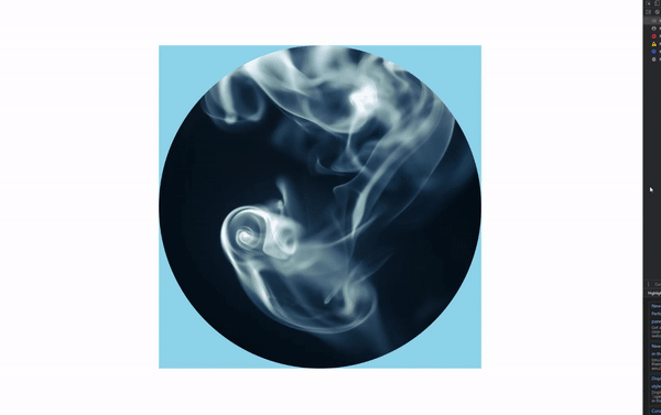
}결과화면

꾸준히!