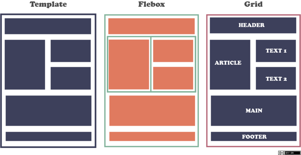
CSS - Flex와 Grid
- 웹 페이지를 만드는데 있어서 레이아웃 구성이 되게 힘들고 중요합니다. 그래서! CSS에서는 Flex와 Grid를 사용하여 레이아웃을 만들 수 있습니다. 이번 글에서는 Flexbox와 Grid의 개념, 특징, 사용법, 예제 코드, 그리고 두 가지의 차이점에 대해 설명하겠습니다!!
🔥 1. Flex란?
1.1 개념
- Flexbox(Flexible Box Layout)는 CSS의 레이아웃 모듈로, 주로 1차원 레이아웃을 구성하는 데 사용됩니다.
- Flexbox를 사용하면 요소들을 쉽게 정렬하고 배치할 수 있으며, 공간을 효율적으로 활용할 수 있습니다.
- Flexbox는 주로 수평 또는 수직 방향으로 요소를 정렬하는 데 좋습니다.
1.2 주요 특징
1차원 레이아웃유연한 크기 조정정렬 및 배치정렬 속성- 행 또는 열 중 하나의 방향으로만 요소를 배치합니다. 즉, 한 방향으로만 정렬할 수 있습니다.
- 요소의 크기를 자동으로 조정하여 공간을 최적화합니다. 이를 통해 다양한 화면 크기에 적응할 수 있습니다.
- 요소를 중앙 정렬, 양쪽 정렬, 간격 조정 등 다양한 방식으로 정렬할 수 있습니다.
- justify-content, align-items, flex-direction 등의 속성을 사용하여 요소의 정렬 방식을 조정할 수 있습니다.
1.3 사용법
- Flexbox를 사용하기 위해서는 부모 요소에 display: flex;를 설정해야 합니다.
- 이후 자식 요소에 다양한 Flexbox 속성을 적용하여 레이아웃을 조정할 수 있습니다.
const UserProfileMainContainer = styled.main`
  display: flex;
`;

const UserProfileMainProfile = styled.section`
  flex: 2.5;
`;

const UserProfileMainIntroduce = styled.article`
  flex: 4.5;
`;

const UserProfileMainLevel = styled.aside`
  flex: 3;
`;

const UserProfileSubContainer = styled.div`
  display: flex;
  flex: 1;
`;

const UserProfileStudy = styled.section`
  flex: 2.6;
`;

const UserProfileWritePost = styled.section`
  flex: 7.4;
`;
- 부모 요소에
display: flex를 설정하면, 이 요소의 자식들이 flex 컨테이너 안에서 배치됩니다. 자식 요소들은 자동으로 flex 아이템이 되며, 한 줄 혹은 여러 줄로 나란히 배치됩니다.
예시에서는 UserProfileMainContainer와 UserProfileSubContainer가 flex 컨테이너로 설정되었습니다. flex: <숫자>;
flex 속성은 flex 아이템의 크기를 설정하는 데 사용됩니다. 주로 비율로 작동하며, 다른 아이템들과 비교해 얼마나 공간을 차지할지를 결정합니다. 여기서 숫자가 클수록 해당 아이템이 더 많은 공간을 차지합니다.
예를 들어 UserProfileMainProfileContainer는 flex: 2.5;로 설정되어 있어, 전체 가용 공간의 2.5배를 차지하게 됩니다.
UserProfileMainIntroduceContainer는 flex: 4.5;로 설정되어, 이 아이템은 더 많은 공간을 차지합니다.
UserProfileMainLevelContainer는 flex: 3;으로, 그 사이의 공간을 차지하게 됩니다.flex: 1;은 아이템이 flex 컨테이너 안에서 동일한 비율로 공간을 차지하겠다는 의미입니다. UserProfileSubContainer가 그 예입니다. 다른 아이템들과 비슷한 공간을 차지하게 됩니다.- 제 코드에서 UserProfileStudyContainer와 UserProfileWritePostContainer는 각각 2.6과 7.4로 설정되어 있어, 비율적으로 서로 다른 크기를 차지하면서도 화면 크기에 맞게 적응합니다.
1.4 예제 코드
<!DOCTYPE html>
<html lang="ko">
<head>
    <meta charset="UTF-8">
    <meta name="viewport" content="width=device-width, initial-scale=1.0">
    <title>Flexbox 예제</title>
    <style>
        .container {
            display: flex;
            justify-content: center; /* 수평 중앙 정렬 */
            align-items: center; /* 수직 중앙 정렬 */
            height: 100vh; /* 전체 화면 높이 */
        }
        .item {
            flex: 1; /* 모든 아이템이 동일한 크기로 확장 */
            margin: 10px;
            padding: 20px;
            background-color: #4CAF50;
            color: white;
            text-align: center;
        }
    </style>
</head>
<body>
    <div class="container">
        <div class="item">아이템 1</div>
        <div class="item">아이템 2</div>
        <div class="item">아이템 3</div>
    </div>
</body>
</html>
🔥 2. Grid란?
2.1 개념
- Grid는 CSS의 또 다른 레이아웃 모듈로, 2차원 레이아웃을 구성하는 데 사용됩니다.
- Grid를 사용하면 행과 열을 동시에 정의하여 복잡한 레이아웃을 쉽게 만들 수 있고, 대규모 레이아웃을 구성할 때 많이 사용합니다.
2.2 주요 특징
2차원 레이아웃,정확한 위치 지정,반응형 디자인,간격 조정- Grid는 행과 열을 동시에 다룰 수 있어 복잡한 레이아웃을 쉽게 구성할 수 있습니다.
- 각 요소의 위치를 정확하게 지정할 수 있으며, 이를 통해 복잡한 디자인을 구현할 수 있습니다.
- Grid는 다양한 화면 크기에 맞춰 레이아웃을 조정할 수 있는 기능을 제공합니다. fr 단위를 사용하여 비율 기반의 레이아웃을 쉽게 만들 수 있습니다.
- grid-gap 속성을 사용하여 요소 간의 간격을 쉽게 조정할 수 있습니다.
2.3 사용법
- Grid를 사용하기 위해서는 부모 요소에 display: grid;를 설정하고, grid-template-columns와 grid-template-rows 속성을 사용하여 행과 열을 정의합니다.
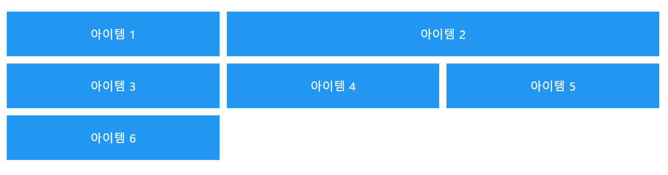
2.4 예제 코드
<!DOCTYPE html>
<html lang="ko">
<head>
    <meta charset="UTF-8">
    <meta name="viewport" content="width=device-width, initial-scale=1.0">
    <title>Grid 예제</title>
    <style>
        .container {
            display: grid;
            grid-template-columns: repeat(3, 1fr); /* 3개의 열을 동일한 비율로 설정 */
            gap: 10px; /* 요소 간의 간격 */
            padding: 20px;
        }
        .item {
            background-color: #2196F3;
            color: white;
            text-align: center;
            padding: 20px;
        }
        .item:nth-child(2) {
            grid-column: span 2; /* 2개의 열을 차지 */
        }
    </style>
</head>
<body>
    <div class="container">
        <div class="item">아이템 1</div>
        <div class="item">아이템 2</div>
        <div class="item">아이템 3</div>
        <div class="item">아이템 4</div>
        <div class="item">아이템 5</div>
        <div class="item">아이템 6</div>
    </div>
</body>
</html>
3. Flexbox와 Grid의 차이점
| 특성 | Flexbox | Grid |
|---|---|---|
| 차원 | 1차원 레이아웃 | 2차원 레이아웃 |
| 사용 용도 | 간단한 레이아웃 및 요소 정렬 | 복잡한 레이아웃 구성 |
| 정렬 방식 | 요소의 크기와 정렬을 유연하게 조정 | 각 요소의 위치를 명확하게 지정 |
| 간격 조정 | margin을 사용 | grid-gap 속성 사용 |
| 반응형 디자인 | 유연한 크기 조정 | 비율 기반의 레이아웃 구성 가능 |
4. 결론
-
Flex랑 Grid 둘 다 웹 개발할 때 핵심이 되는 기술입니다! 상황에 따라 잘 골라 쓰는 게 관건입니다. 간단하게 정렬하고 싶다면 Flex로 가고, 복잡하고 디테일한 레이아웃을 짜야 한다면 Grid가 찰떡인 것 같습니다.. 진짜 개발할 때 Flex와 Grid를 적재적소에 잘 활용하면 웹 디자인 고수가 될 것 같습니다.. 결국, 뭐든 상황에 맞는 선택이 중요하다는 것!
