5회차강의
- 1:33:42부터
1. 오늘 배운 내용
1. Z - Index
- 말그대로 Z축에 영향을 미치는 속성
<div class="z-one"></div>
<div class="z-two"></div>
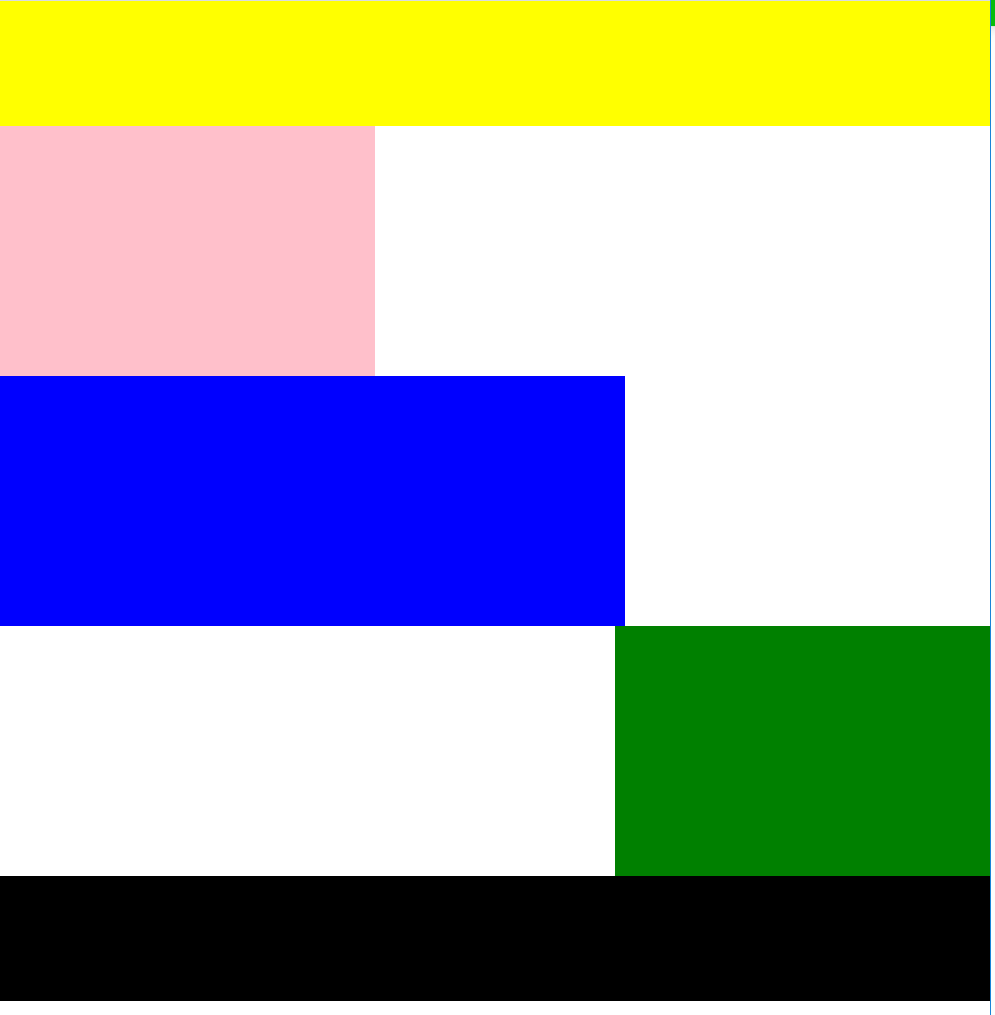
.z-one {
position: absolute;
width: 200px;
height: 400px;
background-color: yellow;}
.z-two {
position: absolute;
width: 200px;
height: 300px;
background-color: blue;}
-
이렇게 3차원 포지션값인
relative,absolute나fixed를 쓰면 겹침 -
간단하게 말해서
z-index는 우선순위결정 -
아무값도 없으면 최초값은 0
-
더 높은숫자가 위로 올라옴
z-index: 20;- 따로 단위가 필요하지도 않음
-
형제관계에선 순수 3차원(
absolute나fixed) 포지션을 줄때
첫번째한테 겹쳐짐 -
두번째 한테주면 안겹쳐짐,, 이라는데 2개이상의 경우엔 어케되는걸까
- 직접해봐도 잘 이해는안됨..흠
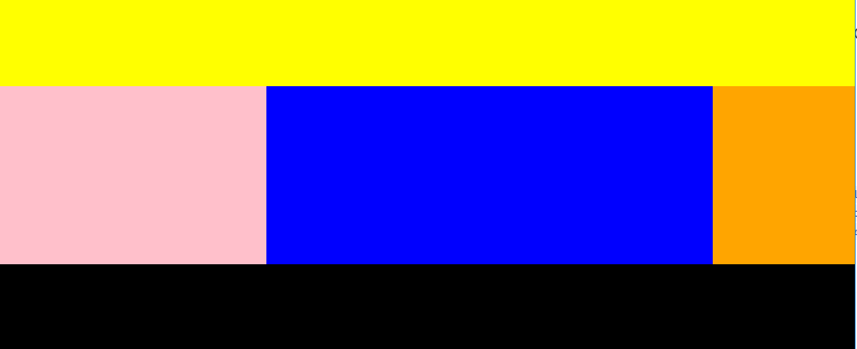
2. float 와 clear
- 왼쪽끝, 오른쪽끝 에서 부터 정렬? 하는느낌
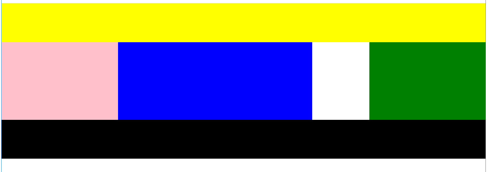
<header></header>
<div class="left"></div>
<div class="center"></div>
<div class="right"></div>
<footer></footer>
header{ width: 100%; height: 100px; background-color: yellow;} .left{ float: left; width: 100px; height: 200px; background-color: pink;} .center{ width: 300px; height: 200px; background-color: blue;} .right{ width: 100px; height: 200px; background-color: green;} footer{ width: 100%; height: 100px; background-color: black;}- 이렇게
left에만float을 써서left값을 주면
center영역과 left영역이 겹쳐서 표시됨. - float가 띄운단 의미도 가지고있으니까 공중에 띄운단식으로 이해
- 일부 3차원적인 요소를 가짐
- 이렇게
- 다음부분
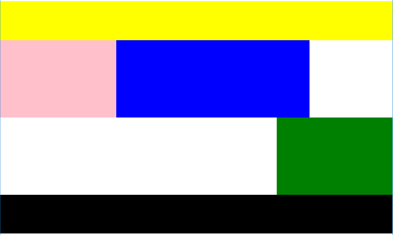
header{ width: 100%; height: 100px; background-color: yellow;} .left{ float: left; width: 100px; height: 200px; background-color: pink;} .center{ float: left; width: 300px; height: 200px; background-color: blue;} .right{ float: right; width: 100px; height: 200px; background-color: green;} footer{ width: 100%; height: 100px; background-color: black;}- 이렇게 가운데 3개를 모두 띄우면 left,center,right는 잘 정렬되도
공중에 뜬 상태라서footer가header바로밑에 붙어서 겹쳐보임
- 이렇게 가운데 3개를 모두 띄우면 left,center,right는 잘 정렬되도
- 다음부분
footer{ width: 100%; height: 100px; background-color: black;}footer부분에clear를 붙여준다. 그러면float을 마지막으로 사용한태그 그다음에clear를 보통넣는다.both는left,right효과를 끈단의미
1. 주의점
- 브라우저 폭을 줄이면, 일단 위 예시기준에서 center 부분이랑 right부분이 만나면 레이어가 틀어지면서 right부분이 한칸 떨어지고 다음에 더줄여서 left랑 center가 함께들어갈 공간이 없으면 또 틀어지면서 left랑 center가 분리됨.
-
ex)
-
방지하기위해선 부모의 크기가 가변값이면안됨
-
항상 고정으로 유지해줘야 안틀어짐
-
section으로 감싸줘봄<header></header> <section> <div class="left"></div> <div class="center"></div> <div class="right"></div> </section> <footer></footer>section{ width: 1400px; height: 200px; background-color: orange;}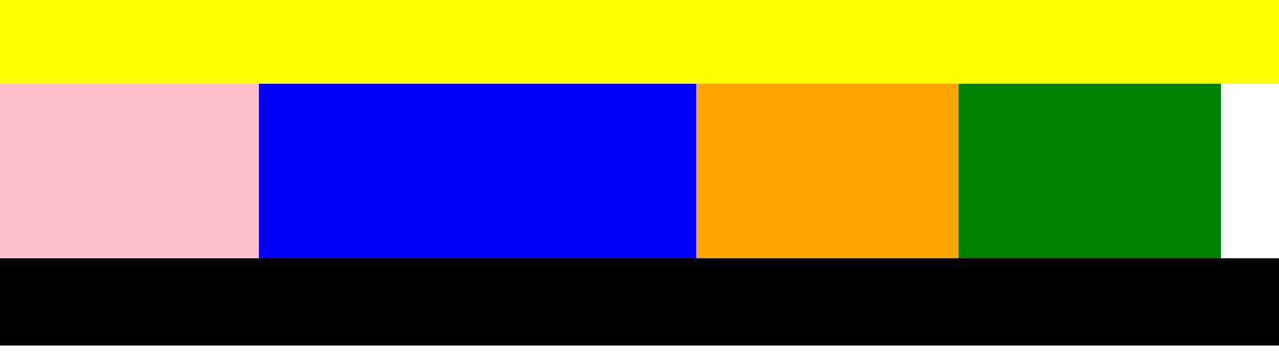
- 이렇게됨
- 부모의값은 모두의 합 길이를 수용해야함
-
아니면 처음부터
width를 가변값인%를주면 감쌀필요없이 알아서 잘작동한다.left{ float: left; width: 30%; height: 200px; background-color: pink;} .center{ float: left; width: 20%; height: 200px; background-color: blue;} .right{ float: right; width: 50%; height: 200px; background-color: green;}section의height값을 없애면 지정했던 orange색이 사라짐.- 자식이 3차원 비스무리한 거라서 부모에게 영향을 줄수없음.
float을 사용할땐 포지션이static이나relative를 사용해야함.- 순수 3차원 값이
absolute랑fixed는 같이 사용못함.
4-1. 실무팁
-
clear쓸때 따로 한개 만들어서 쓰자<div class="left-2"></div> <div class="right-2"></div> <footer></footer>.left-2{ float: left; width: 100px; height: 150px; background-color: yellow;} .right-2{ float: right; width: 100px; height: 150px; background-color: blue;} footer{ width: 100%; height: 100px; background-color: black;}-
여기서
clear를 사용할때 관례같은거<div class="clearfix"></div>.clearfix{ clear: both;}
4-2. 실무팁
-
-
overflow랑float같이쓰기<section> <div class="left-2"></div> <div class="right-2"></div> <div class="clearfix"></div> <footer></footer> </section>section{ overflow: hidden; width: 800px; background-color: orange;}- 이렇게 하면 위에서 말했던 주의점과 다르게 section부분에 오렌지색이 나타난다
- 같이 쓰면 자식의 높이값을 부모가 인식하게 만든다.
3. overflow
- 칸 지정했는데 그부분이 지정한 영역을 넘칠때 처리하는거
overflow: hidden; overflow-y: scroll; overflow-x: scroll;hidden은 말그대로 숨기는거x,y:scroll도 말그대로 x,y방향으로 스크롤할수있게 하는거
4. flex
-
html
	<div class="container">
		<div class="item one"></div>
		<div class="item two"></div>
		<div class="item three"></div>
	</div>
.container{ display: flex; width: 1000px; border: solid 10px red;} .item { width: 200px; height: 300px;} .one{ background-color: yellow;} .two{ background-color: blue;} .three{ background-color: orange;}-
display:flex는 x축으로 정렬한다 왼쪽부터 시작해서 오른쪽으로 -
방향을 바꾸고싶으면
flex-direction기본값은row(x축),
coulmn(y축) / 역방향은 뒤에-reverse4-1.
flex-wrap
flex-wrap: nowrap; flex-wrap: wrap;-
container부분을wrap을 활용하면 각각
-nowrap는 지정해진 수치까지 조절할만큼 레이어를 유지하면서 묶여있음
-warp는 부모의width값에따라 레이어가 틀어짐4-2.
flex-flow
flex-flow: row wrap; -
-
flex-direction과flex-wrap을 동시에 입력할때
5. 정렬
- x축 기준
justify-content: flex-start;
justify-content: center;
justify-content: end;
justify-content: space-between;
justify-content: space-around;
- y축 기준
align-items: flex-start;
align-items: flex-end;
align-items: center;
align-items: bassline;
- flexbox help
-
여기드가면 금방 일듯,
start는 시작점end는 끝지점center는 가운데
space-between은 간격 ,space-around끝지점에도 간격,bassline은 각각 모양 가장 아랫줄 기준으로
-
중앙 정렬
<div class="center-1"></div>.center-1{ width: 300px; height: 300px; background-color: yellow; margin: 0 auto;}margin사용- 블럭요소를 사용할때
.center-2{
	position: relative;
	width: 300px;
	height: 300px;
	background-color: blue;
	left: 50%;
	margin-left: -150px;}
position: relative와left50%값을주면 왼쪽면을 기준으로 50%만큼 이동하기때문에margin-left로 width의 절반을 당겨온다.- 단점으론 width가 변경될때마다 margin-left도 변경해야함
2. 어려웠던 점
- 처음부터 z-index를 할때, 마지막 부분에 형제끼리 앞에있는애 바꾸면 겹치고 뒤에있는애를 바꾸면 안겹치고 먼가 갑자기 복잡해지고,,
- 배워가는 점이 많으니까 점점 헷갈리기 시작함
3. 해결법
- 일단은 구글링으로 하고 직접 따로 더적어서 계속 반복해봄
- 전에 배운거 다시 읽고 다시한번 코드 직접 써보고 반복
4. 소감
- 슬슬 머릿속이 혼란스럽다